Welcome, Guest. Please login or register.

Login with username, password and session length

 
Advanced search

1411507 Posts in 69374 Topics- by 58429 Members - Latest Member: Alternalo

April 26, 2024, 06:39:00 AM

Need hosting? Check out Digital Ocean
(more details in this thread)
TIGSource ForumsCommunityDevLogsDungeon Dice (testers wanted)
Pages: 1 [2]
Print
Author Topic: Dungeon Dice (testers wanted)  (Read 5171 times)
dustin
Level 6
*


View Profile
« Reply #20 on: September 01, 2010, 01:40:30 PM »

OK the tip about the black borders really helps.

As for the stuff not being text anymore yeah I need to work on that.  I need to draw the three symbols and also turn them from text into bars hopefully like you're hp bars have. 

Making the main character bigger really helps a lot.  I'm suprised it gives it so much perspective through such a simple change.

i like your idea for a text box saying what's happening I think I'll have to add that in sometime maybe.

Here is my current wip:


Quote
Yep! Now that YOU did the GUI.. it looks AWESOME. I'm going to keep a tab on this game! Smiley Keep up the good work!

*subs to this topic*

Quote
Anyways, you're making great progress with it, so keep at it.

Thanks, I'm glad other people can see the improvement and not just me Smiley  It's strange it feels like the more times I do it the better it looks even though I end up just deleting a lot of the stuff I've done.
Logged
jwk5
Guest
« Reply #21 on: September 01, 2010, 02:01:33 PM »

Sometimes improvement is not what you add but rather what you take away. The important part is that through this constant chain of addition and subtraction you're learning what works and what doesn't and you're narrowing things down to a final vision.
Logged
Guard
Level 0
***

Java's cool.


View Profile
« Reply #22 on: September 01, 2010, 03:08:10 PM »

"Perfection is achieved not when there is something left to add but when there's nothing left to take away" Wink

Liking the new bars.But maybe you could size down the HP text? It's overlapping the image of hearts.
Logged

Programming since Sept 2009
Web Developing since 2006
dustin
Level 6
*


View Profile
« Reply #23 on: September 01, 2010, 03:59:13 PM »

Yeah I'll get the hp text working better when I convert it into a status bar type thing.


Just a quick gui update.  Most of the stuff today has been behind the scenes type work.  The number are how many of each item you have.  I'm trying to think of a more elegant way to work it but it's hard.

Logged
fraxcell
Level 5
*****


View Profile
« Reply #24 on: September 01, 2010, 04:13:58 PM »

I think placing the number somewhere inside the box would look better; perhaps the lower right corner? I'd also place the enemies stats on the other side of the enemy, on the far right side of the screen so that they don't in between the player and the monster.

It's an 800% improvement from the original HUD though, I look forward to how this turns out Smiley
Logged

RCIX
Guest
« Reply #25 on: September 01, 2010, 05:22:47 PM »

Regarding the numbers, something like this could work better:


with the 5s up in the corner instead of big like that last example.
Logged
jwk5
Guest
« Reply #26 on: September 01, 2010, 05:30:14 PM »

I was just about to suggest the same thing... My cursor was literally above the "Post" button. Oh well, lol. Great minds think alike.

Anyways, as mentioned you can put the numbers on the corners of the item boxes but also you can place the numbers for health and damage directly over their icons as well if you scale up the size of the icons a bit.


"Gain 1 health when damage player" is pretty unnecessary, maybe you could just make the enemy's attack icon look like vampire teeth or something to symbolize the leeching.

One last thing, edit your rope icon a bit. It looks like a straw not a rope (it is very rigid). Try making it a bit more curvy and string-like.

Other than those issues, things are shaping up really nicely. I have a feeling this project will pan out nicely in the end. Keep it up!
Logged
Guard
Level 0
***

Java's cool.


View Profile
« Reply #27 on: September 01, 2010, 05:37:10 PM »

Yeah ninjutsu63 has the right idea. Ditch that font you're using now. It's not made for it. Try these fonts: Delicious Heavy, Accidental Presidency, etc.

Here... I spent a good 45 minutes doing this. It's a bunch of fonts that I like coupled into one. I'm pretty sure 99% of these are free to download. If not; I must have bought 'em. Anyway the font you're using is Hobo Std. I've used it. Hehe - for cartoon-y feel.

Here is the fonts used in order (excluding the title of image)


1. Accidental Presidency
2. BigNoodleTitling
3. Delicious Heavy
4. Bebas
5. FixedDisplay
6. Huggable
7. Futura LT Bold
8. Headline One
9. Headline Two
10. Homespun TT BRK
11. Kenyan Coffee
12. League Gothic

title font: Fine Line

Personally, I think all of these fonts/logos look great. You just need the right one for the feel/theme to be suitable.


*OK these are all the good fonts that I found going through alphabetaically and some were random. I have more*

*@jwk5: That's EXACTLY what I am talking about. Good job!*
Logged

Programming since Sept 2009
Web Developing since 2006
dustin
Level 6
*


View Profile
« Reply #28 on: September 01, 2010, 07:05:29 PM »

Wow so much feedback/help it's great!

Quote
Insert Quote
I think placing the number somewhere inside the box would look better; perhaps the lower right corner? I'd also place the enemies stats on the other side of the enemy, on the far right side of the screen so that they don't in between the player and the monster.

It's an 800% improvement from the original HUD though, I look forward to how this turns out Smiley

Yeah I put them inside the box now like you and others suggested, it does look better.  I see what you mean about the enemies stats so did that too.

It's fun for me to watch it change too, I don't know how it'll turn out Smiley.

Quote
with the 5s up in the corner instead of big like that last example.

Thanks for the image it totally convinced me that it does look better up there.


Quote
Anyways, as mentioned you can put the numbers on the corners of the item boxes but also you can place the numbers for health and damage directly over their icons as well if you scale up the size of the icons a bit.

Great suggestion about the numbers over the icons, that looks much better and saves space.

Quote
"Gain 1 health when damage player" is pretty unnecessary, maybe you could just make the enemy's attack icon look like vampire teeth or something to symbolize the leeching.

One last thing, edit your rope icon a bit. It looks like a straw not a rope (it is very rigid). Try making it a bit more curvy and string-like.

Other than those issues, things are shaping up really nicely. I have a feeling this project will pan out nicely in the end. Keep it up!

OK I removed the gain 1 health thing but I added a text box.  That way when the vamp attacks/other special powers kick in it'll pop up there and notify the player that way so they are not just completly confused.  That text wasn't just for the vamp, I plan on all the bad guys having something unique about them.

Yeah the ropes not so good yet.  I'll try to make it curvier like a rope should be.  Yeah I'm liking the way this is starting to look and I think the first version will be done soon (that being the version with 4 items and 5 or so monster that you fight after that I plan on keeping the combat the same but turning it into more of an adventure with lots of encounters instead of just 1 dungeon dive)

Quote
Yeah ninjutsu63 has the right idea. Ditch that font you're using now. It's not made for it. Try these fonts: Delicious Heavy, Accidental Presidency, etc.

Here... I spent a good 45 minutes doing this. It's a bunch of fonts that I like coupled into one. I'm pretty sure 99% of these are free to download. If not; I must have bought 'em. Anyway the font you're using is Hobo Std. I've used it. Hehe - for cartoon-y feel.

Wow! thanks that is so helpful.  Plus they all look so good with the gradients/shadow etc. you've used.  Something like that would look so good on a title screen.

I choose to use Huggable but I've been switching between that and Declicous Heavy so we'll see what it ends up as.

Also I notice a lot of you used stroked text in your examples, unfortunately cs3 can't do stroked dynamic text so I'm having to use an outer glow of black.  Hopefully it looks ok.

Here is the gui now...

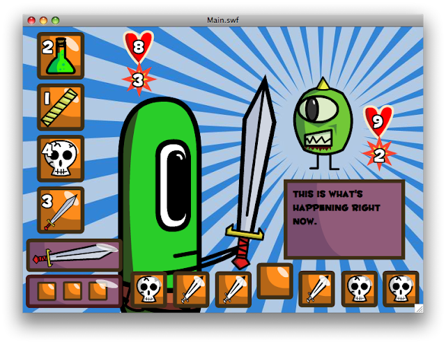
I was a bit overwhelmed by the orange so I added some purple in.

And here is the store wip...


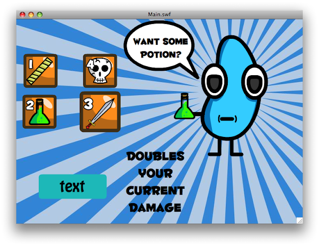
So in addition to graphics stuff I got nice transition to the store and back.  Frames+gotoAndStop were giving me a huge headache so I transitioned it all over to just movie clips that I show or hide.  Seems to be much better this way.  I also made the buttons a bit more interactive.  They now respond to mouse up/down in addition to over/off.  Also, the multiples of items works now.  I can tell easily when the player looses but I'm not forcing you back to the store yet as it was annoying for play testing reasons.

Thanks so much everyone for the help.  It really is helping a lot and I'm sure I'll use this advice on other games to come.  I do feel a bit bad about how much my current design resembles a bunch of the mock ups done here for me.  Hopefully no one minds.

Tomorrow/Tonight I think I'll get started on

Story
Intro/tutorial type deal
Logged
Guard
Level 0
***

Java's cool.


View Profile
« Reply #29 on: September 01, 2010, 07:38:55 PM »

You're welcome! Took a while to do but even I liked it! I think Huggable would be a great choice since it's curvy-feel suits the feel of your game. In the screen of "This is what's happening right now".. I think it would look better if the color was white. More clarity. Try it -- but that's just my opinion.

Other than that, the store GUI looks great! Not to mention those monsters/creatures. Very original.  Epileptic

Also try making it so the "dobules your damage" text has black border with white colored text. See how that looks.
« Last Edit: September 01, 2010, 08:11:59 PM by Guard » Logged

Programming since Sept 2009
Web Developing since 2006
dustin
Level 6
*


View Profile
« Reply #30 on: September 02, 2010, 10:48:17 AM »

Yeah I'm liking huggable a lot

I changed both texts to be white with a black border and your right they both look better/more readable that way.

I just whipped up a kind of tutorial for when someone just starts the game.  I haven't worked to much on the wording figuring I'll finalize it when the game is closer to done.  I do want to show people/get suggestions on the style in which the tutorial is done so instead of posting screen shots here is the .swf of the first battle of the game.


http://www.swfcabin.com/open/1283450640

This way people can also see how everything looks in motion.

Quote
Other than that, the store GUI looks great! Not to mention those monsters/creatures. Very original.  Epileptic

Thanks! I'm glad you like the creatures.  I have a fun time drawing them.
Logged
Guard
Level 0
***

Java's cool.


View Profile
« Reply #31 on: September 02, 2010, 10:54:12 AM »

Yeah that's the word I am looking for: readability.

Quote
Thanks! I'm glad you like the creatures.  I have a fun time drawing them.
Yeah! I mean, I could draw those but the thing is -- YOU have the creativity and imagination to draw them. That's what makes them so great!

on you're new swfcabin swf you JUST posted.. what font are you using -- times new roman or Gerogia?
Logged

Programming since Sept 2009
Web Developing since 2006
dustin
Level 6
*


View Profile
« Reply #32 on: September 02, 2010, 03:48:12 PM »

Quote
on you're new swfcabin swf you JUST posted.. what font are you using -- times new roman or Gerogia?

Arg I forgot to embed the font I guess. I meant to reupload it but...

Flash CS3 is being the most annoying thing ever today.  It crashed this morning (which is fine as it had been running for 3 days or so).  Anyway I go to open up my .fla file and it crashes on opening.  I restart my computer and then it works.  I do some work on the tutorial and upload it to swf cabin.  Then I read your comment and try to re export it with embeded fonts.  It now crashes on exporting.  So I spend the rest of the day trying to get it to work again and nope.  It either crashes on opening the .fla or on exporting the movie.  So I think i'm just going to have to completely delete cs3 and install it again from scratch so I guess that's what I'm doing tomorrow...

Anyway I got the tutorial done today and I drew this new monster since I couldn't work on the code at all really.

He hides out in his leaf all day and comes and steals stuff at night I think...

Logged
dustin
Level 6
*


View Profile
« Reply #33 on: September 03, 2010, 09:39:55 AM »

So I got flash to compile my code.  For some reason huggable must have become currupted and was crashing cs3.  I reinstalled the font from a different source and now it works all right.

So I redid the notification for when you defeat a monster and are given a choice on whether to head back to the store or not.  What do people think of the buttons?


I also added stuff to the store...


Can you tell that the gold next to the items is how much that particular item costs?  I'll probably also put it in the dialogue box at the bottom but it seems a pain to look down there every time.
Logged
Guard
Level 0
***

Java's cool.


View Profile
« Reply #34 on: September 03, 2010, 11:50:51 AM »

Looks great! One suggestion. The gold 'how much it costs' coin looks out of place. Try making it SMALLER and put it on the lower right corner of the box it costs. So where it has skull and it says 4 on the top left... well put the coin symbol and the cost of it on the bottom right...
Logged

Programming since Sept 2009
Web Developing since 2006
dustin
Level 6
*


View Profile
« Reply #35 on: September 08, 2010, 12:32:33 PM »

Quote
Looks great! One suggestion. The gold 'how much it costs' coin looks out of place. Try making it SMALLER and put it on the lower right corner of the box it costs. So where it has skull and it says 4 on the top left... well put the coin symbol and the cost of it on the bottom right...

Yep I moved the coins down there and made them a bit smaller and it does fit in much better.  I need some people to test out the game mostly to see if anything doesn't make sense/the instructions are clear etc.  Right now it will only have 4 enemies, so I'll probably add 2 or 4 more by the end of it all but other then that it shouldn't change much.

Please let me know if anyone is interested, to anyone who is I'll either just email you the .swf or email you a link where it can be played.

Thanks!
Logged
Guard
Level 0
***

Java's cool.


View Profile
« Reply #36 on: September 08, 2010, 02:15:10 PM »

Oh oh! Me! me!! pick me!!  Big Laff
Logged

Programming since Sept 2009
Web Developing since 2006
Pages: 1 [2]
Print
Jump to:  

Theme orange-lt created by panic