Demon's Crest:Somebody posted it before, but it was a single, scaled and blurred screenshot; it hardly does the game justice, so i'll provide some shots of my own. a few of them have certain layers turned off, so if you find that firebrand is inexplicably missing that would be why.

I adore the underwater segments in this game.
Flashback: Also mentioned before, but a similar situation as Demon's Crest. Oversized, blurred screenshots, so i'll provide two of my own.
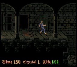
 Nosferatu
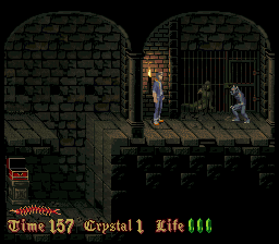
:
This game is not very well known; which is a shame, graphically speaking it is fantastic (the "gameplay" on the other hand is a little bit lacking, although more on the level of flawed brilliance rather than sour-mediocrity). It's sense of atmosphere and ambiance is exceptional.
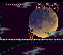
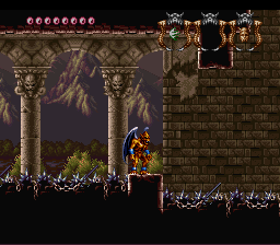
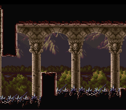
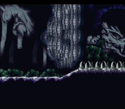
Super Castlevania IV:
Super Castlevania IV is kind of an interesting case, graphically speaking; the sprites themselves are not at all good, often bordering between bad and just above mediocre. but that's not really the point - super castlevania IV, as a game, is much more about the environments and the composition of all of the games visual elements; the character, the hud, the enemies and the multi-layered backgrounds, than any singular element.
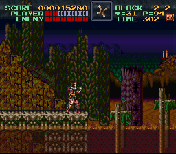
In some ways, even with the individual elements in the background you can tell that the game is vaguely prototypical; it was a very early SNES release, after all. I should elaborate on what I mean: some of the tiling is odd and it isn't uncommon for background elements to get kind of an odd, gaudy "flat" look to them.
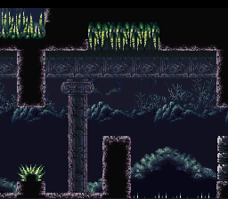
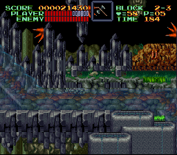
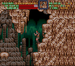
but the way the game is illustrated somehow makes that charming. i think, ultimately, there are two factors that make super castlevania IV stick out, graphically speaking: the first, is its usage of color. Like the NES castlevania's before it, SCIV prides itself on utilizing a large array of bizarre (yet sullen and earthy) tones in its backgrounds, both within individual elements and between the differing elements. A good example of the latter is the cave, above, which utilizes yellow-browns and faded blues for the tiles, but the background itself is a surreal green; another good example of the aforementioned comes from...
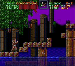
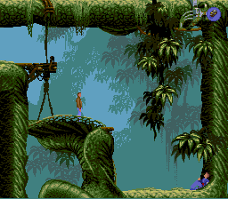
the water ruins segment in level 3, which merges browning architecture with bright green foliage, blue water, and a deep, saturated purple sky.
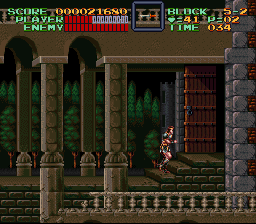
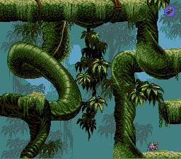
these two shots are two of my favorites from the game, both of which exemplify a grand sense of import utilizing very few set-pieces and understated color schemes; these two, especially the latter, bring composition to the forefront.
 Developer
