|
RCIX
Guest
|
 |
« on: September 10, 2010, 02:51:52 AM » |
|
I'm working on a turn-based battle game similar to Pokemon in my spare time, and i wanted some critique on my planned battle screen design: 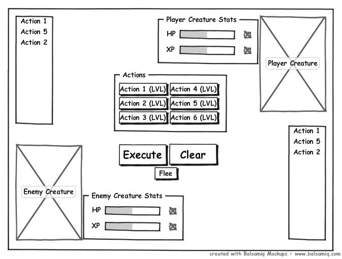 It needs a bit of explaining. Since one of my planned mechanics is that the in-game characters will execute sequences of actions simultaneously within a "turn", you have the list on either side displaying the actions to be executed (enemy actions are only displayed when the turn is executing). I plan to provide some sort of annotation to indicate which list goes to which creature, but other than that the UI should be complete. So, whaddya think? |
|
|
|
|
 Logged
|
|
|
|
|
starsrift
|
|
« Reply #1 on: September 10, 2010, 03:46:16 AM » |
|
IMHO, I think you need to showcase your creatures more, rather than tuck them away in the corners.
|
|
|
|
|
Logged
|
"Vigorous writing is concise." - William Strunk, Jr.
As is coding.
I take life with a grain of salt.
And a slice of lime, plus a shot of tequila.
|
|
|
|
increpare
Guest
|
|
« Reply #2 on: September 10, 2010, 03:48:03 AM » |
|
What other UI designs have you considered?
|
|
|
|
|
Logged
|
|
|
|
|
sodap
|
|
« Reply #3 on: September 10, 2010, 05:35:48 AM » |
|
What other UI designs have you considered?
what a good question to ask. I'm just starting to iterate my designs and really explore possibilities and its really one of the keys to good design. I've been so stupid all this time of just half assing it and going with the first "good" thing that comes up to my mind. Not only the first idea is hardly ever the best solution, but it also allows to take parts of different ideas to make a new one. It helps a lot. |
|
|
|
|
Logged
|
|
|
|
|
jwaap
|
|
« Reply #4 on: September 10, 2010, 05:40:53 AM » |
|
If you really want a super efficient UI, I recommend looking into this: http://en.wikipedia.org/wiki/Fitts%27s_lawbuttons on edges are always easier to reach, etc. Good stuff. |
|
|
|
|
Logged
|
|
|
|
Sorano
Level 6

Game Designer / Double Stallion Games


|
|
« Reply #5 on: September 10, 2010, 05:44:31 AM » |
|
I agree that that your creatures should be more front and center. Your visual content should be unified.
A menu in the middle of the screen is probably not the best way to go about it. Try doing research on similar games that ask you to collect/control like Pokémon, Digimon, Jade Cocoon, Monster Rancher, Robopon and other similar games.
|
|
|
|
|
Logged
|
|
|
|
|
ink.inc
Guest
|
|
« Reply #6 on: September 10, 2010, 12:02:28 PM » |
|
Basically parroting what everyone else said:
Way cluttered. You've got pictures on the side and a big honking text box in the middle. I personally prefer it when games have a minimal UI as possible, leaving the artwork as the focal point.
|
|
|
|
|
Logged
|
|
|
|
|
J. R. Hill
|
|
« Reply #7 on: September 10, 2010, 03:17:16 PM » |
|
From an aesthetic point-of-view, there's a lot of unused space. Using the center of the screen for input is fine, and considering your game is turn-based and not necessarily maximized, I don't see the need to move the buttons to the corner of the screen. I'd definitely do some serious rearranging or resizing just to clear up all the open space, though. Right now the negative space is the equivalent of two portraits.
|
|
|
|
|
Logged
|
hi
|
|
|
magnum_opus
Level 1

|
|
« Reply #8 on: September 10, 2010, 05:49:08 PM » |
|
What about?  rejiggering sizes as necessary |
|
|
|
|
Logged
|
|
|
|
|
RCIX
Guest
|
|
« Reply #9 on: September 10, 2010, 05:59:06 PM » |
|
IMHO, I think you need to showcase your creatures more, rather than tuck them away in the corners.
I agree that that your creatures should be more front and center. Your visual content should be unified.
A menu in the middle of the screen is probably not the best way to go about it. Try doing research on similar games that ask you to collect/control like Pokémon, Digimon, Jade Cocoon, Monster Rancher, Robopon and other similar games.
Thanks! I'll look at those for ideas  What other UI designs have you considered?
what a good question to ask. I'm just starting to iterate my designs and really explore possibilities and its really one of the keys to good design. I've been so stupid all this time of just half assing it and going with the first "good" thing that comes up to my mind. Not only the first idea is hardly ever the best solution, but it also allows to take parts of different ideas to make a new one. It helps a lot. This is my first shot, and i figured getting feedback sooner rather than later would be helpful. I'm new to the UI design game. Anyway, here's my revised version: 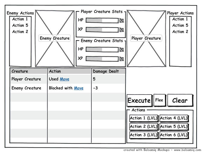 This version uses the now-condensed space to display an action history. Warning - while you were typing a new reply has been posted. You may wish to review your post. It's funny, i went with something very similar |
|
|
|
|
Logged
|
|
|
|
|
starsrift
|
|
« Reply #10 on: September 10, 2010, 11:12:53 PM » |
|
Again, all IMHO - your creature picture sizes haven't changed, just the placement. Now you've got a huge honkin' "history" list taking up ~40% of your real estate. If I were you, I'd ask myself - is the action history really that engaging for the game?
I'm at work right now, so I can't really even MSPaint something up for you, but I'd recommend 3 discrete sections. Take 10-20% from an edge (bottom, side, or top) and put your history list there(scrollable) and your buttons. Split the remainder of the screen down the middle and devote that space to your creatures. Superimpose the health bars and queues at the (bottom or top) and sides of the creature depiction space, respectively.
|
|
|
|
|
Logged
|
"Vigorous writing is concise." - William Strunk, Jr.
As is coding.
I take life with a grain of salt.
And a slice of lime, plus a shot of tequila.
|
|
|
|
sereneworx
|
|
« Reply #11 on: September 11, 2010, 12:21:50 AM » |
|
I think it's important that you not just use up space because you feel you need to. Or rather, not overuse space ineffectively. You also need to think more in terms of how the screen will be read by the player. I assume that the first things you want them to see are: Own creature, available action. Enemy creature, available actions. Next, it stands to reason that the player needs to know the stats, so: Player stats. Enemy Stats. Then, the player needs to know what actions they can use, and the buttons to use them: Usable Actions, Controls. Attack history is less important, so can be something of an afterthought, I would think. Something like this:  |
|
|
|
|
Logged
|
|
|
|
|
Xion
|
|
« Reply #12 on: September 11, 2010, 12:35:14 AM » |
|
I was about to say something like that. Just because you have screen space doesn't mean it must be filled with stuff. Not only because if there is information is everywhere then it'll take that much longer to sort through it to find the information I as a player actually want to know, but also because, as a visual thing, it needs a flow throughout, a clear focus, and a place where I can rest my eyes much like a composed image. Serene's example is groovy because it has all of those things, and thinking about the information you want to present in a hierarchical manner as he did lets you figure out where things need to be along the flow of the screen. [/2 cents]
|
|
|
|
|
Logged
|
|
|
|
|
RCIX
Guest
|
|
« Reply #13 on: September 11, 2010, 12:38:25 AM » |
|
That helps a ton guys, thanks! I'll evolve my design some more towards Serene's suggestion, and get back to ya. If you don't mind, serene, i might actually just cop a bit of your style when actually making the UI if you don't mind. You could get a credit in the game if you want. OK, here's round 3: 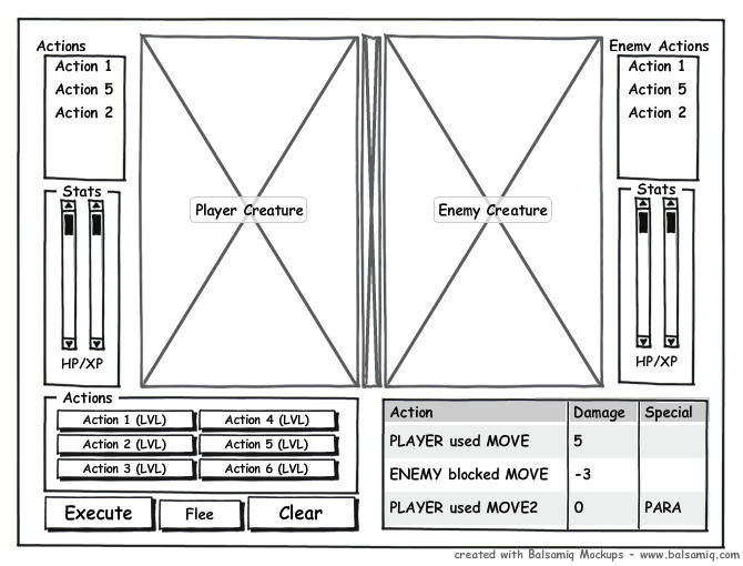 and here's the Balsamiq XML markup if you want to edit that directly: <mockup version="1.0" skin="sketch" measuredW="1115" measuredH="533" mockupW="640" mockupH="480">
<controls>
<control controlID="13" controlTypeID="com.balsamiq.mockups::Canvas" x="465" y="43" w="640" h="480" measuredW="100" measuredH="70" zOrder="0" locked="false" isInGroup="-1"/>
<control controlID="14" controlTypeID="com.balsamiq.mockups::Image" x="575" y="58" w="200" h="320" measuredW="77" measuredH="79" zOrder="1" locked="false" isInGroup="-1">
<controlProperties>
<borderStyle>none</borderStyle>
<text>Player%20Creature</text>
</controlProperties>
</control>
<control controlID="43" controlTypeID="__group__" x="489" y="378" w="286" h="96" measuredW="286" measuredH="96" zOrder="2" locked="false" isInGroup="-1">
<groupChildrenDescriptors>
<control controlID="0" controlTypeID="com.balsamiq.mockups::FieldSet" x="0" y="0" w="286" h="96" measuredW="200" measuredH="170" zOrder="0" locked="false" isInGroup="43">
<controlProperties>
<text>Actions</text>
</controlProperties>
</control>
<control controlID="1" controlTypeID="com.balsamiq.mockups::Button" x="11" y="18" w="129" h="22" measuredW="100" measuredH="28" zOrder="1" locked="false" isInGroup="43">
<controlProperties>
<size>11</size>
<text>Action%201%20%28LVL%29</text>
</controlProperties>
</control>
<control controlID="2" controlTypeID="com.balsamiq.mockups::Button" x="11" y="40" w="129" h="22" measuredW="100" measuredH="28" zOrder="2" locked="false" isInGroup="43">
<controlProperties>
<size>11</size>
<text>Action%202%20%28LVL%29</text>
</controlProperties>
</control>
<control controlID="3" controlTypeID="com.balsamiq.mockups::Button" x="11" y="62" w="129" h="22" measuredW="100" measuredH="28" zOrder="3" locked="false" isInGroup="43">
<controlProperties>
<size>11</size>
<text>Action%203%20%28LVL%29</text>
</controlProperties>
</control>
<control controlID="4" controlTypeID="com.balsamiq.mockups::Button" x="139" y="18" w="129" h="22" measuredW="101" measuredH="28" zOrder="4" locked="false" isInGroup="43">
<controlProperties>
<size>11</size>
<text>Action%204%20%28LVL%29</text>
</controlProperties>
</control>
<control controlID="5" controlTypeID="com.balsamiq.mockups::Button" x="139" y="40" w="129" h="22" measuredW="100" measuredH="28" zOrder="5" locked="false" isInGroup="43">
<controlProperties>
<size>11</size>
<text>Action%205%20%28LVL%29</text>
</controlProperties>
</control>
<control controlID="6" controlTypeID="com.balsamiq.mockups::Button" x="139" y="62" w="129" h="22" measuredW="100" measuredH="28" zOrder="6" locked="false" isInGroup="43">
<controlProperties>
<size>11</size>
<text>Action%206%20%28LVL%29</text>
</controlProperties>
</control>
</groupChildrenDescriptors>
</control>
<control controlID="47" controlTypeID="__group__" x="480" y="58" w="93" h="134" measuredW="93" measuredH="134" zOrder="3" locked="false" isInGroup="-1">
<groupChildrenDescriptors>
<control controlID="0" controlTypeID="com.balsamiq.mockups::List" x="9" y="18" w="76" h="116" measuredW="100" measuredH="126" zOrder="0" locked="false" isInGroup="47">
<controlProperties>
<text>Action%201%0AAction%205%0AAction%202</text>
</controlProperties>
</control>
<control controlID="1" controlTypeID="com.balsamiq.mockups::Label" x="0" y="0" w="93" h="13" measuredW="50" measuredH="25" zOrder="1" locked="false" isInGroup="47">
<controlProperties>
<text>Actions</text>
</controlProperties>
</control>
</groupChildrenDescriptors>
</control>
<control controlID="72" controlTypeID="__group__" x="997" y="58" w="93" h="134" measuredW="93" measuredH="134" zOrder="6" locked="false" isInGroup="-1">
<groupChildrenDescriptors>
<control controlID="0" controlTypeID="com.balsamiq.mockups::List" x="9" y="18" w="76" h="116" measuredW="100" measuredH="126" zOrder="0" locked="false" isInGroup="72">
<controlProperties>
<text>Action%201%0AAction%205%0AAction%202</text>
</controlProperties>
</control>
<control controlID="1" controlTypeID="com.balsamiq.mockups::Label" x="0" y="0" w="93" h="13" measuredW="95" measuredH="25" zOrder="1" locked="false" isInGroup="72">
<controlProperties>
<text>Enemy%20Actions</text>
</controlProperties>
</control>
</groupChildrenDescriptors>
</control>
<control controlID="73" controlTypeID="com.balsamiq.mockups::Image" x="775" y="58" w="20" h="320" measuredW="77" measuredH="79" zOrder="7" locked="false" isInGroup="-1"/>
<control controlID="74" controlTypeID="com.balsamiq.mockups::Image" x="795" y="58" w="200" h="320" measuredW="77" measuredH="79" zOrder="8" locked="false" isInGroup="-1">
<controlProperties>
<borderStyle>none</borderStyle>
<text>Enemy%20Creature</text>
</controlProperties>
</control>
<control controlID="75" controlTypeID="com.balsamiq.mockups::Button" x="489" y="474" w="103" h="34" measuredW="85" measuredH="31" zOrder="4" locked="false" isInGroup="-1">
<controlProperties>
<size>16</size>
<text>Execute</text>
</controlProperties>
</control>
<control controlID="76" controlTypeID="com.balsamiq.mockups::Button" x="592" y="477" w="80" h="31" measuredW="50" measuredH="28" zOrder="5" locked="false" isInGroup="-1">
<controlProperties>
<text>Flee</text>
</controlProperties>
</control>
<control controlID="78" controlTypeID="com.balsamiq.mockups::Button" x="672" y="474" w="103" h="34" measuredW="64" measuredH="31" zOrder="9" locked="false" isInGroup="-1">
<controlProperties>
<size>16</size>
<text>Clear</text>
</controlProperties>
</control>
<control controlID="90" controlTypeID="__group__" x="489" y="192" w="-1" h="-1" measuredW="71" measuredH="186" zOrder="10" locked="false" isInGroup="-1">
<groupChildrenDescriptors>
<control controlID="0" controlTypeID="com.balsamiq.mockups::FieldSet" x="0" y="0" w="71" h="186" measuredW="200" measuredH="170" zOrder="0" locked="false" isInGroup="90">
<controlProperties>
<text>Stats</text>
</controlProperties>
</control>
<control controlID="1" controlTypeID="__group__" x="15" y="15" w="41" h="138" measuredW="41" measuredH="138" zOrder="1" locked="false" isInGroup="90">
<groupChildrenDescriptors>
<control controlID="0" controlTypeID="com.balsamiq.mockups::VerticalScrollBar" x="0" y="0" w="-1" h="138" measuredW="16" measuredH="100" zOrder="0" locked="false" isInGroup="1"/>
<control controlID="1" controlTypeID="com.balsamiq.mockups::VerticalScrollBar" x="25" y="0" w="-1" h="138" measuredW="16" measuredH="100" zOrder="1" locked="false" isInGroup="1"/>
</groupChildrenDescriptors>
</control>
<control controlID="2" controlTypeID="com.balsamiq.mockups::Label" x="14" y="153" w="42" h="25" measuredW="42" measuredH="23" zOrder="2" locked="false" isInGroup="90">
<controlProperties>
<size>12</size>
<text>HP/XP</text>
</controlProperties>
</control>
</groupChildrenDescriptors>
</control>
<control controlID="91" controlTypeID="__group__" x="1007" y="190" w="-1" h="-1" measuredW="71" measuredH="186" zOrder="11" locked="false" isInGroup="-1">
<groupChildrenDescriptors>
<control controlID="0" controlTypeID="com.balsamiq.mockups::FieldSet" x="0" y="0" w="71" h="186" measuredW="200" measuredH="170" zOrder="0" locked="false" isInGroup="91">
<controlProperties>
<text>Stats</text>
</controlProperties>
</control>
<control controlID="1" controlTypeID="__group__" x="15" y="15" w="41" h="138" measuredW="41" measuredH="138" zOrder="1" locked="false" isInGroup="91">
<groupChildrenDescriptors>
<control controlID="0" controlTypeID="com.balsamiq.mockups::VerticalScrollBar" x="0" y="0" w="-1" h="138" measuredW="16" measuredH="100" zOrder="0" locked="false" isInGroup="1"/>
<control controlID="1" controlTypeID="com.balsamiq.mockups::VerticalScrollBar" x="25" y="0" w="-1" h="138" measuredW="16" measuredH="100" zOrder="1" locked="false" isInGroup="1"/>
</groupChildrenDescriptors>
</control>
<control controlID="2" controlTypeID="com.balsamiq.mockups::Label" x="14" y="153" w="42" h="25" measuredW="42" measuredH="23" zOrder="2" locked="false" isInGroup="91">
<controlProperties>
<size>12</size>
<text>HP/XP</text>
</controlProperties>
</control>
</groupChildrenDescriptors>
</control>
<control controlID="92" controlTypeID="com.balsamiq.mockups::DataGrid" x="794" y="386" w="296" h="122" measuredW="286" measuredH="148" zOrder="12" locked="false" isInGroup="-1">
<controlProperties>
<text>Action%2C%20Damage%2C%20Special%0APLAYER%20used%20MOVE%2C%205%0AENEMY%20blocked%20MOVE%2C%20-3%0APLAYER%20used%20MOVE2%2C%200%2C%20PARA%0AENEMY%20is%20PARALYSED</text>
</controlProperties>
</control>
</controls>
</mockup>
|
|
|
|
« Last Edit: September 11, 2010, 01:08:53 AM by RCIX »
|
Logged
|
|
|
|
|
sereneworx
|
|
« Reply #14 on: September 11, 2010, 01:01:55 AM » |
|
Do whatever you want. Glad I could help. |
|
|
|
|
Logged
|
|
|
|
|
starsrift
|
|
« Reply #15 on: September 11, 2010, 02:05:12 AM » |
|
Serene/RCIX rnd3, nicely done, almost exactly what I was trying to describe. :D
I think that looks very good!
|
|
|
|
|
Logged
|
"Vigorous writing is concise." - William Strunk, Jr.
As is coding.
I take life with a grain of salt.
And a slice of lime, plus a shot of tequila.
|
|
|
Sorano
Level 6
Game Designer / Double Stallion Games
|
|
« Reply #16 on: September 11, 2010, 04:11:56 AM » |
|
Serene's mock-up is bully.  |
|
|
|
|
Logged
|
|
|
|
|
agj
|
|
« Reply #17 on: September 11, 2010, 09:28:47 AM » |
|
All these mockups so far have one critical flaw, in my opinion, and it's that the 'action' buttons have no apparent relation to the 'actions' queue. There's several ways you can connect them: by placing them side by side, by creating a subdivision of the screen space they both inhabit, by connecting them with some element (like a line), and more.
Another, more minor thing, I see as a problem, is the symmetry. In Pokemon games you can clearly tell which is your monster, but in these mockups you can't. Just breaking the symmetry might do the trick, but especially if the controls are visually tied to the picture and stats of the playable character.
|
|
|
|
|
Logged
|
|
|
|
|
RCIX
Guest
|
|
« Reply #18 on: September 11, 2010, 03:12:30 PM » |
|
All these mockups so far have one critical flaw, in my opinion, and it's that the 'action' buttons have no apparent relation to the 'actions' queue. There's several ways you can connect them: by placing them side by side, by creating a subdivision of the screen space they both inhabit, by connecting them with some element (like a line), and more.
Another, more minor thing, I see as a problem, is the symmetry. In Pokemon games you can clearly tell which is your monster, but in these mockups you can't. Just breaking the symmetry might do the trick, but especially if the controls are visually tied to the picture and stats of the playable character.
Revision 4, then:  I took some more of starsrift's suggestions and tweaked the design to be more minimalistic. The action list is now contained with the buttons (that may need some work actually, but i like it). Maybe if i shrink the button panel and add a small history thing next to it *shrugs* |
|
|
|
|
Logged
|
|
|
|
|
RCIX
Guest
|
|
« Reply #19 on: September 12, 2010, 03:47:57 PM » |
|
Ugh, sorry about that, don't know how i missed actually adding in the image >.<. Here it is: 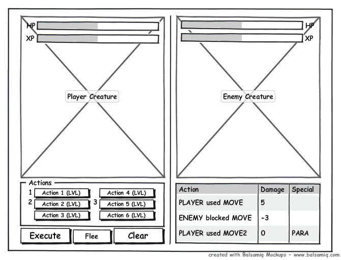 |
|
|
|
|
Logged
|
|
|
|
|
 Developer
