|
Nugsy
|
 |
« Reply #140 on: March 19, 2011, 04:00:00 PM » |
|
I made a few changes based on suggestions. I also made the joystick slightly more readable, and rounded the other corners on the percentage bars. Basic changes:  Seperate joystick:  Final bar moved over:  I personally prefer the bar overlapping, i think it looks a bit strange with the stick just floating on the left. |
|
|
|
|
 Logged
|
|
|
|
|
Tycho Brahe
|
|
« Reply #141 on: March 19, 2011, 04:01:42 PM » |
|
I still prefer, the overlapping  I like both, but to me the overlapping one still wins out. |
|
|
|
|
Logged
|
|
|
|
|
:^)
|
|
« Reply #142 on: March 19, 2011, 04:30:58 PM » |
|
I didn't think of skooching it to the left a bit. That looks grand.  |
|
|
|
|
Logged
|
|
|
|
|
ANtY
|
|
« Reply #143 on: March 19, 2011, 04:53:38 PM » |
|
I would like to see them on forums  |
|
|
|
|
Logged
|
|
|
|
phubans
Indier Than Thou
Level 10

TIG Mascot


|
|
« Reply #144 on: March 22, 2011, 06:21:11 PM » |
|
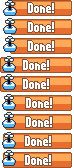
I'm also behind Nugsy's iteration. Can we get this implemented already so I don't have to keep staring at dull salmon-colored bars?
EDIT: Maybe Derek's holding out because the blue gets lost in the rest of the forums interface? Not to rock the boat since we're so close to having something final, but what if we took the orange on the "DONE!" bar and applied it to all of the bars? Sure, the 100% one won't stand out anymore, but it might be worth a look. The orange works great with the blue & white color scheme of the forum. Just an idea.
|
|
|
|
|
Logged
|
|
|
|
|
Nugsy
|
|
« Reply #145 on: March 25, 2011, 06:14:08 AM » |
|
 Made changes based on what Mr Hubans said. Not sure how i feel about this, thought i'd put it up so people can have a look. |
|
|
|
|
Logged
|
|
|
|
|
st33d
Guest
|
|
« Reply #146 on: March 25, 2011, 06:18:01 AM » |
|
Orange "done" looks better
After all, the language of the site uses orange to indicate interactivity - so an orange game is ready to play. A blue game is more like body copy.
|
|
|
|
|
Logged
|
|
|
|
|
Nugsy
|
|
« Reply #147 on: March 25, 2011, 06:22:12 AM » |
|
Also did a quick dirty mockup:  I much prefer the orange done over the blue done. It stands out far more. Edit:After looking at the mockup, i realised the outline on the orange done could use some softening.  |
|
|
|
|
Logged
|
|
|
|
|
Tycho Brahe
|
|
« Reply #148 on: March 25, 2011, 08:27:24 AM » |
|
Mabye harden up the uncompleted ones as well? just so they stand out a bit more, or have ones that are 50% or more harder...
|
|
|
|
|
Logged
|
|
|
|
|
Nugsy
|
|
« Reply #149 on: March 25, 2011, 01:01:13 PM » |
|
Something like this?  Comparison: Before After
Edit: I just realised i made the text darker by accident! Haha. It's more readable though, so that's fine by me. |
|
|
|
|
Logged
|
|
|
|
|
Μarkham
|
|
« Reply #150 on: March 25, 2011, 04:51:39 PM » |
|
 Various levels of overlapping because I hate tangents, with the original at the top. Edit:  |
|
|
|
« Last Edit: March 25, 2011, 05:28:59 PM by Μarkham »
|
Logged
|
|
|
|
|
mokesmoe
|
|
« Reply #151 on: March 25, 2011, 11:25:44 PM » |
|
I prefer the original.
|
|
|
|
|
Logged
|
|
|
|
phubans
Indier Than Thou
Level 10
TIG Mascot
|
|
« Reply #152 on: March 26, 2011, 12:00:32 AM » |
|
I agree, the blue bars with orange done looks the best.
|
|
|
|
|
Logged
|
|
|
|
|
Nugsy
|
|
« Reply #153 on: March 29, 2011, 09:24:09 AM » |
|
I am honoured!  I like the decision of going with the animated one too. Makes the finished games stand out that little bit more.  |
|
|
|
|
Logged
|
|
|
|
|
Doktor_Q
|
|
« Reply #154 on: March 29, 2011, 05:54:18 PM » |
|
The new ones look much better.
|
|
|
|
|
Logged
|
|
|
|
|
Conker534
Guest
|
|
« Reply #155 on: March 30, 2011, 02:00:39 PM » |
|
The new ones look much better.
I agree ^_^ |
|
|
|
« Last Edit: March 31, 2011, 03:36:42 PM by Conker »
|
Logged
|
|
|
|
|
Nugsy
|
|
« Reply #156 on: March 31, 2011, 03:13:32 PM » |
|
Just noticed Derek updated the first post with the new icons. It makes some of the thread a bit misleading!  |
|
|
|
|
Logged
|
|
|
|
|
Player 3
|
|
« Reply #157 on: March 31, 2011, 04:29:49 PM » |
|
Just noticed Derek updated the first post with the new icons. It makes some of the thread a bit misleading! That's what you get for agreeing to the terms of the Yuliminati. |
|
|
|
|
Logged
|
|
|
|
|
BlueSweatshirt
|
|
« Reply #158 on: April 02, 2011, 11:21:33 AM » |
|
New icons needs transparency. [EDIT]  |
|
|
|
|
Logged
|
|
|
|
|
gimymblert
|
|
« Reply #159 on: April 03, 2011, 07:33:13 AM » |
|
I would like a "fail" button so I can stop following project that have obviously been reboot like tile quest  edit: But with a less shameless name: I dunno  |
|
|
|
|
Logged
|
|
|
|
|
 Community
