|
JoGribbs
Guest
|
 |
« Reply #20 on: December 11, 2010, 03:40:10 PM » |
|
I assume this was a pot (?)  I think that you made the sprite, put it on the background and realised it didn't stand out enough, and that's why you put the white outline around it. I don't like white outlines, since there are much better ways to make sprites readable. The first problem was the weird browny colour. It blended too much with the dark green grass, so then the sprite became hard to read. The intention (I think) was to differentiate the rim of the pot from the body. You should remember that people recognise things better by their silhouettes, even if all the details are there. It's better to get the shape right than rely on colours like that. I replaced the weird brown with a darker pink, and re-did the outline in black. The black outline does enough to say 'this is a gameplay element' distinct, from say the flowers, without seeming obnoxious like the white outline. It also defines the shape of the pot much more clearly. the darker pink also unifies the colour scheme, making it clearer that this is one distinct object. I usually don't think about it this much but yeah. EDIT: Upon further reflection, I see my outline doesn't fit with the whole 'washed out-ness' of the other objects. I'd go for a softer one than pure blac (tho I think my thought process still stands). EDITEDIT: Like this:  |
|
|
|
|
 Logged
|
|
|
|
|
Ishi
|
|
« Reply #21 on: December 11, 2010, 03:43:28 PM » |
|
To me the blue roof on the building looks lower down than the grass. I think it could do with being brighter and more in-keeping with the colour of the bricks, so it pops out as being a solid object.
I like the cliff tiles, haven't seen any like that before.
|
|
|
|
|
Logged
|
|
|
|
|
Joshua
|
|
« Reply #22 on: December 11, 2010, 04:23:25 PM » |
|
 Scaled up 2x Scaled up 2xA mockup for a small game I am working on. I like it so far, but feel it can be much improved upon. Comments, criticisms? |
|
|
|
|
Logged
|
|
|
|
|
Ishi
|
|
« Reply #23 on: December 11, 2010, 04:36:16 PM » |
|
The perspective on the boxes and barrel feels a bit odd - the floor tiles are proper squares, but the top faces of the boxes and barrel are vertically squashed. (I'm assuming the boxes are supposed to be exact cubes.)
So it might be worth fixing the perspective on those objects, or making the floor tiles non-square to match it. The second option would make everything fit a bit better with the player sprite which is very side-on.
|
|
|
|
|
Logged
|
|
|
|
|
J. R. Hill
|
|
« Reply #24 on: December 11, 2010, 05:54:52 PM » |
|
Agree with Ishi. If you make the floor tiles vertically shorter, everything will gel.
Also, the black scratch-marks or oil-spill needs to be a lot lighter or more liquidy.
|
|
|
|
|
Logged
|
hi
|
|
|
|
Kevin
Guest
|
|
« Reply #25 on: December 11, 2010, 08:31:34 PM » |
|
Your character is giving me a total earthbound vibe. This is a good thing. Here's my take:  I'll try to explain... Some of the outlines seem too close to the background in terms of colour, so I darkened them. I also removed a bunch of the outline colours, opting instead to use a single dark colour for all of them. When you get this close to black, the colours all pretty much look the same (unless you zoom in really close), and I find using fewer colour tends to help unify the palette and make things look more consistent anyway. This is more of a preference thing, and very nitpicky, so take it for what it's worth. ♥ There was some banding going on in some of the tiles. I... can't think of a good way to explain banding in words, but basically, some of the colours stacked together form a gradient, making things look blurry (see the example in the image, where the two grays and the background do this). There was a bit of this going on in the oil drum's highlights too, and I think I mostly failed to fix it. I tried to incorporate some anti-aliasing there to smooth things out. Play around with it, maybe. You may get better results than me. Also tried to smooth out the oil trail. Oh, and I added a second arm to the little guy. Because just. These are really great sprites and tiles. Especially the little guy. He's very cute and is completely packed with character and love. As always, hope the edit doesn't offend (seriously guys, tell me and I'll stop). Seems rude to just draw on someone else's work, but I just find it easier to explain when I have a visual aide. |
|
|
|
|
Logged
|
|
|
|
|
J. R. Hill
|
|
« Reply #26 on: December 11, 2010, 10:31:09 PM » |
|
Also, the tile shading has a light-source from the front-left, but the paper and crates look like it's top-down or something, and the barrel is confusing me. I really like what you've got, but I also really love to nitpick.  |
|
|
|
|
Logged
|
hi
|
|
|
|
Ishi
|
|
« Reply #27 on: December 12, 2010, 02:21:20 AM » |
|
I think we should establish that this thread is all about nitpicking and edits so no-one has to apologise for it.
|
|
|
|
|
Logged
|
|
|
|
|
PogueSquadron
|
|
« Reply #28 on: December 12, 2010, 08:50:47 AM » |
|
When the art is about painting pixel by pixel, I'd expect the thread to be nothing BUT nitpicking, hehe.  |
|
|
|
|
Logged
|
|
|
|
|
|
|
ink.inc
Guest
|
|
« Reply #30 on: December 12, 2010, 10:46:49 AM » |
|
I've seen this piece before....
|
|
|
|
|
Logged
|
|
|
|
|
RotateMe
|
|
« Reply #31 on: December 12, 2010, 11:11:12 AM » |
|
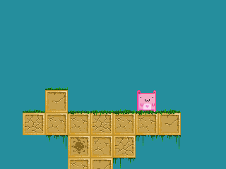 Tried my hand at pixeling, I have almost no experience in this so c&c is appreciated. No experience? Those blocks look awesome! The only thing I can say is that I'd try around with the background color some more, maybe a little less satuated and brighter blue would work better. Also some clouds or mountainlines in the background would make this a really great piece. |
|
|
|
|
Logged
|
|
|
|
|
PogueSquadron
|
|
« Reply #32 on: December 12, 2010, 11:13:59 AM » |
|
Maybe this is just the thought of an outsider (haven't been here long), but does anyone feel that possibly the character and the blocks don't really feel like they belong together? The pink character is very graphic and cute and simple, but the blocks feel more detailed and subtle. Perhaps the pink character could use a little more of that subtlety to have it match the environment it's in?
|
|
|
|
|
Logged
|
|
|
|
|
Joshua
|
|
« Reply #33 on: December 12, 2010, 12:20:27 PM » |
|
@Ishi: Ah, the perspective is wonky.  I wanted to keep the floor fairly regular to make pushing the crates/oil drums around easier. I have a few thoughts on how to make it work better. @Kevin: Whoa! Totally rocking my world(in a good way)! I see the banding now, unfortunately I'm not experienced enough to see it until it's pointed out to me. Definitely inspired by Earthbound, glad you could see a little bit of that. Everyone thanks for the lessons, back to the pixel forge...
|
|
|
|
|
Logged
|
|
|
|
|
Ishi
|
|
« Reply #34 on: December 12, 2010, 12:34:07 PM » |
|
Maybe this is just the thought of an outsider (haven't been here long), but does anyone feel that possibly the character and the blocks don't really feel like they belong together? The pink character is very graphic and cute and simple, but the blocks feel more detailed and subtle. Perhaps the pink character could use a little more of that subtlety to have it match the environment it's in?
Yeah I was thinking that too. Very bold, cartoony character with rather texturey tiles. The shading on the brick borders seems a bit off - there's not really a definite light source. There are also lots of colours without much variation which makes it feel a bit messy to me (until I got really close it looked like it was a bit jpegged or something). Did a quick edit to try and make the tiles a bit closer to the character's style. More chunky shading is the main thing I did, with solid areas of light and dark. I didn't do anything to the cracks.  |
|
|
|
|
Logged
|
|
|
|
siiseli
Level 6


|
|
« Reply #35 on: December 12, 2010, 10:38:14 PM » |
|
Looks loads better, thanks for the input.
|
|
|
|
|
Logged
|
|
|
|
|
Jetrel
|
|
« Reply #36 on: December 12, 2010, 10:54:33 PM » |
|
use the rotate tool...to get the basic shape then do all the filling in by hand
this is how I'd go about it. This is how I'd go about it, too. . Seems rude to just draw on someone else's work, but I just find it easier to explain when I have a visual aide. Let's be pre-emptive here, before "it" happens.  PSA: everyone in this thread should probably come in here with a tacit agreement that it's okay for other people to offer paintovers, without asking, on their work. It's nigh impossible to do C&C without it, because a picture is worth a thousand words - there are some things that are trivial to draw, and nearly impossible to explain. I can't think of a single art forum that really functions whilst having to ask every time before doing a paintover. This is a common hangup amongst newbies - because your art feels like a personal expression, other people correcting it can seem like a personal insult. It's a bit like someone insulting your religion. I've seen this happen dozens of times; seen people flip out, sometimes quit projects because of this. To be brutal: grow up. You're here to improve your art, so treat your art like it's not above criticism. Treat it like code - coders aren't insulted when someone corrects their work; instead they're usually grateful*. This is very hard to get over, but we'll all benefit immensely if we do. * or else they have buggy code. |
|
|
|
« Last Edit: December 12, 2010, 11:26:43 PM by Jetrel »
|
Logged
|
|
|
|
|
Relix
|
|
« Reply #37 on: December 13, 2010, 12:34:21 AM » |
|
This might be wrongish topic for this but, I need help dealing with the style choices. I think I finally have something nice, then I discover another style or technique and start from scratch. Repeat until my head pops. Might be a common problem, but it would be nice to get progress instead of just trying millions of different styles when I though I had already settled with one.
|
|
|
|
|
Logged
|
|
|
|
|
Kevin
Guest
|
|
« Reply #38 on: December 13, 2010, 01:35:21 PM » |
|
This might be wrongish topic for this but, I need help dealing with the style choices. I think I finally have something nice, then I discover another style or technique and start from scratch. Repeat until my head pops. Might be a common problem, but it would be nice to get progress instead of just trying millions of different styles when I though I had already settled with one.
I find doing pre-pixel concept art stuff helps with this. Establish your style first, do some rough sketches and designs, then move on to sprites and animation and stuff. Sketches tend to be easier to produce than pixels, and figuring stuff out before hand can save a lot of wasted work. As for actually just choosing a style... that's a little harder. Generally though I'd say it's best to stick with whatever you start with, unless you have a really solid reason for changing everything. Doing a ton of pixel work, deciding I'm unsatisfied and starting over (multiple times) has wasted more time and killed more projects than I care to admit (hint: it's all of them). |
|
|
|
|
Logged
|
|
|
|
|
J. R. Hill
|
|
« Reply #39 on: December 13, 2010, 03:07:00 PM » |
|
If you really can't choose, just make different levels in different styles.
|
|
|
|
|
Logged
|
hi
|
|
|
|
 Developer
