|
Joshua
|
 |
« Reply #40 on: December 13, 2010, 04:36:01 PM » |
|
...Doing a ton of pixel work, deciding I'm unsatisfied and starting over (multiple times) has wasted more time and killed more projects than I care to admit (hint: it's all of them).
+1 Concerning the projects I have finished; I found a style that I was happy with and I could quickly produce art in. |
|
|
|
|
 Logged
|
|
|
|
|
Relix
|
|
« Reply #41 on: December 14, 2010, 07:36:24 AM » |
|
I find doing pre-pixel concept art stuff helps with this. Establish your style first, do some rough sketches and designs, then move on to sprites and animation and stuff. Sketches tend to be easier to produce than pixels, and figuring stuff out before hand can save a lot of wasted work. That might work for some people, but I can't draw anything. For me, using the lil mouse with my wrong arm (I'm leftie) is a lot easier than using flimsy pen on a flimsy paper with my flimsy arm. I tried to stuff by drawing them on a paper and then pixeling over the scan, but it turned out worse than just plain pixeling. As for actually just choosing a style... that's a little harder. Generally though I'd say it's best to stick with whatever you start with, unless you have a really solid reason for changing everything. Doing a ton of pixel work, deciding I'm unsatisfied and starting over (multiple times) has wasted more time and killed more projects than I care to admit (hint: it's all of them).
...maybe I'll just stick with this style then for now... Expect because I'm still quite new to pixeling (started in fall '09), it's takes a while to do even the basic sprite with this style (sample in my signature). Moving to a simpler and easier style would be valid reason. ...but then I want to do nicer looking sprites again, braegh. If you really can't choose, just make different levels in different styles.
Sounds like a fun, but worktastic idea. |
|
|
|
|
Logged
|
|
|
|
|
Kevin
Guest
|
|
« Reply #42 on: December 14, 2010, 08:12:45 AM » |
|
Moving to a simpler and easier style would be valid reason.
I'd say so, yeah. Another thing that's helped me to actually get work done lately is lowering my expectations a bit and going with a style that's, above all else, quick and easy to work with. Anyway, nice, simple, clean sprites often look just as good as, if not better than, big, overly detailed ones. |
|
|
|
|
Logged
|
|
|
|
|
RotateMe
|
|
« Reply #43 on: December 14, 2010, 08:31:26 AM » |
|
 I removed the white outlines since I don't really see it works with them, too. But in motion, it doesn't work without them either (too hard to spot in motion), so I will have to completely redo the sprites, which is okay since I don't think I'll go with the "just heads" representation anymore. Any ideas? (especially concerning the visibility) Anyway, I think the new ground tiles are nice and they are well tilable, does anyone dis/agree? |
|
|
|
|
Logged
|
|
|
|
|
Ishi
|
|
« Reply #44 on: December 14, 2010, 10:55:02 AM » |
|
...maybe I'll just stick with this style then for now...
Expect because I'm still quite new to pixeling (started in fall '09), it's takes a while to do even the basic sprite with this style (sample in my signature). Moving to a simpler and easier style would be valid reason. ...but then I want to do nicer looking sprites again, braegh.
I'd recommend going for a simpler style that's easier to work with, if you find it's taking a long time. You'll feel more productive, and it'll be better practise at achieving more detail with fewer colours. Plus I think a simpler style is easier to keep consistent which is what makes a game look solid and polished. |
|
|
|
|
Logged
|
|
|
|
|
Relix
|
|
« Reply #45 on: December 14, 2010, 11:21:26 AM » |
|
Would this work:  25 % smaller than the original, would allow me to use the already made sprites - just need to retouch them. It'd be easier to make new sprites, maybe. |
|
|
|
|
Logged
|
|
|
|
|
Kevin
Guest
|
|
« Reply #46 on: December 14, 2010, 12:35:57 PM » |
|
New pixels
This is improving drastically each time you post. Here's my take on the new one:  Contrast was the big issue here. The outline on the trees was bugging me because it seems to be lighter than the darkest bit of shading. 25 % smaller than the original, would allow me to use the already made sprites - just need to retouch them. It'd be easier to make new sprites, maybe.
The only problem I see here is that this is essentially still the same style. Smaller can make some things easier, but it can make other things harder (like animation). If it was me, I'd simplify. Something like this...  ...which is mostly blobs of colour and simple forms. This particular sprite might look a little too Cave Story, but the principal stands. The more simplistic the style, the easier it is to churn out sprites quickly. Also as resolution decreases so does readability of details. Emphasizing basic forms rather than trying to make things overly complex helps to keep things looking clean and sharp. |
|
|
|
|
Logged
|
|
|
|
|
RotateMe
|
|
« Reply #47 on: December 14, 2010, 02:04:33 PM » |
|
Kevin: Thanks for the reply! Now that you mentioned the tree outline I can't unsee it, somehow the more I look at it the less I like the trunks. Having given it an hour of thought or so and reading upon styles (and that simple is sometimes better) I changed my mind and will keep the heads-only. Somehow I need to make them better visible though. It's more a problem when in motion so I'm going to post a video soon.
Edit: Why not upload one right now:
. Framerate sucks but it might give some impressions.
Also, Kevin, I really like your "color blobs" version of Relix' guy!
|
|
|
|
« Last Edit: December 14, 2010, 02:36:40 PM by RotateMe »
|
Logged
|
|
|
|
|
PogueSquadron
|
|
« Reply #48 on: December 14, 2010, 04:48:35 PM » |
|
I don't know if anyone's asked - but are those meant to be bushes, or trees?
|
|
|
|
|
Logged
|
|
|
|
|
Relix
|
|
« Reply #49 on: December 14, 2010, 11:31:37 PM » |
|
*snip*
It was a quick size reduction, I did decrease the color count by one...but I see your point. I really like outlines, so those might stay, so, maybe, er, almost color blobs with outlines? I try something out... Also, Kevin, I really like your "color blobs" version of Relix' guy!
Me, cry. Edit:  ...got kinda carried away with the last. Looks too simple for my liking... |
|
|
|
« Last Edit: December 15, 2010, 12:28:14 AM by Relix »
|
Logged
|
|
|
|
|
RotateMe
|
|
« Reply #50 on: December 15, 2010, 01:57:59 AM » |
|
They're meant to be trees. I will make a 32x32 tile of a big tree surrounded by small ones but right now, the bad proportion doesn't bother me that much.
Relix: Sorry, of course I knew it was a pretty girl, don't know why I said guy... also, I like your original sprite very much, too, but it's hard to match is level of detail for the whole game. I've seen some mockups of yours where I saw exactly the problem that the styles didn't match.
|
|
|
|
|
Logged
|
|
|
|
|
Relix
|
|
« Reply #51 on: December 15, 2010, 04:56:36 AM » |
|
Yeah it's hard to keep one style when you're still learning.  I assume this (or something like this) is the mock up you've seen. Biggest flaw there is the fact that all parts have been done at different times, that grass bird for example was one of my first pixels, so it clashes pretty heavily. And well, confession time; I wasn't even supposed to be the one doing the graphics, just the code for the game, but then my friend was like "I don't like pixeling anymore, hurrdurr" so I had to start learning pixeling myself and abadon my precious coding ,_, I'm kinda at loss, what to do... |
|
|
|
|
Logged
|
|
|
|
|
J. R. Hill
|
|
« Reply #52 on: December 15, 2010, 10:41:31 PM » |
|
I like the last one best, try to put it into the same pose as the others.
|
|
|
|
|
Logged
|
hi
|
|
|
|
Relix
|
|
« Reply #53 on: December 16, 2010, 05:47:07 AM » |
|
Like this..?  Looks sillyh...and I still it's too simplified... |
|
|
|
|
Logged
|
|
|
|
Lizardheim
Level 1


|
|
« Reply #54 on: December 16, 2010, 06:12:03 AM » |
|
Try making other stuff outside your comfort zone and get better at pixelart, then go back to that character.
|
|
|
|
|
Logged
|
|
|
|
|
caffeine
|
|
« Reply #55 on: December 16, 2010, 07:09:35 AM » |
|
Kevin has pointed out some valid points you really should keep in mind. Here's my take on your character. Since images say more than a thousand words. 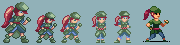 |
|
|
|
|
Logged
|
|
|
|
|
Relix
|
|
« Reply #56 on: December 16, 2010, 08:10:54 AM » |
|
Try making other stuff outside your comfort zone and get better at pixelart, then go back to that character.
I've been doing that actually, sometimes I spam them to pixel joint. ...that's...awesome... Something I could try to replicate. How did you decide to give her fingereless gloves btw? Because that's what they're supposed to be. |
|
|
|
|
Logged
|
|
|
|
|
caffeine
|
|
« Reply #57 on: December 16, 2010, 08:37:03 AM » |
|
Try making other stuff outside your comfort zone and get better at pixelart, then go back to that character.
I've been doing that actually, sometimes I spam them to pixel joint. ...that's...awesome... Something I could try to replicate. How did you decide to give her fingereless gloves btw? Because that's what they're supposed to be. Just because, and I guess it makes the hands more readable. |
|
|
|
|
Logged
|
|
|
|
|
ink.inc
Guest
|
|
« Reply #58 on: December 16, 2010, 08:39:17 AM » |
|
Notice that he simplified the shading. It makes it look a lot cleaner.
|
|
|
|
|
Logged
|
|
|
|
|
Relix
|
|
« Reply #59 on: December 16, 2010, 11:05:45 AM » |
|
Asd.  I was trying to keep it simpler...then it/I just asd'd. Maybe I should try something entirely different...or go back to the original. I just can't simplify and try to keep the same aspects intact as in the more detailed. |
|
|
|
|
Logged
|
|
|
|
|
 Developer
