|
Miko Galvez
|
 |
« Reply #20420 on: November 24, 2012, 09:26:09 PM » |
|
omg i miss you guys <3
|
|
|
|
|
 Logged
|
|
|
|
|
Delicious
|
 |
« Reply #20421 on: November 25, 2012, 12:39:58 AM » |
|
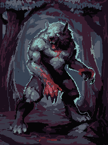
 WIP and I dunno if I shared this already...  |
|
|
|
|
 Logged
|
Blah Blah Blah <3
Twitter - Zjdelicious
|
|
|
|
dabrorius
|
 |
« Reply #20422 on: November 25, 2012, 02:20:47 AM » |
|
I've been working on Flee some more, here are few variations, feel free to share your thoughts.  |
|
|
|
|
 Logged
|
|
|
|
|
Dr. Cooldude
Guest
|
 |
« Reply #20423 on: November 25, 2012, 03:59:26 AM » |
|
Cavern dwellers. The one on the right is the shop keeper.   I love these |
|
|
|
|
 Logged
|
|
|
|
|
Happy Shabby Games
|
 |
« Reply #20424 on: November 25, 2012, 05:13:24 AM » |
|
I've been working on Flee some more, here are few variations, feel free to share your thoughts.  I liked the character design of the small one so I did an edit!:  -I made him a bit less robotty, but that's just a personal touch. I like how your guy is more machine-like. -got rid of the dithering and AA you were using because it was making the sprite blurry and didn't add a whole lot. -reduced the palette to four colors and tried to improve the silhouette -used the light source in front of the character to give him some volume |
|
|
|
|
 Logged
|
|
|
|
|
dabrorius
|
 |
« Reply #20425 on: November 25, 2012, 08:04:56 AM » |
|
I liked the character design of the small one so I did an edit!:  -I made him a bit less robotty, but that's just a personal touch. I like how your guy is more machine-like. -got rid of the dithering and AA you were using because it was making the sprite blurry and didn't add a whole lot. -reduced the palette to four colors and tried to improve the silhouette -used the light source in front of the character to give him some volume Yeah dithering was a bit unnecessary I'll get rid of it and shading on your version is much better, it gives a real feeling of volume, I'll try to do something more similar to that. I'd like to keep the robot more machine-like, I think that round stomach is what makes your design much more human-like. Thanks a lot for the input, I'll update the sprite and post it here soon  |
|
|
|
|
 Logged
|
|
|
|
|
namragog
Guest
|
 |
« Reply #20426 on: November 25, 2012, 08:30:36 AM » |
|
 WIP and I dunno if I shared this already...  Whoah, um. Wow. I like mr. buggy, and I love the colors in wolfy-kin's image.  |
|
|
|
|
 Logged
|
|
|
|
|
intmain
|
 |
« Reply #20427 on: November 25, 2012, 12:36:29 PM » |
|
 some things I doodled for a thing |
|
|
|
|
 Logged
|
|
|
|
|
saibot216
|
 |
« Reply #20428 on: November 25, 2012, 06:43:32 PM » |
|
   1600x900 (2x'ed) 1 hour and 49 minutes. bleh. Woah! Really cool! |
|
|
|
|
 Logged
|
|
|
|
|
Belimoth
|
 |
« Reply #20429 on: November 25, 2012, 06:52:28 PM » |
|
 some things I doodled for a thing Can't say I've ever seen a pixelly stapler before. Good work. |
|
|
|
|
 Logged
|
|
|
|
|
Code_Assassin
|
 |
« Reply #20430 on: November 25, 2012, 07:25:19 PM » |
|
snip
] Those are some pretty nice sprites  I like the duck. |
|
|
|
|
 Logged
|
|
|
|
|
Ashkin
Guest
|
 |
« Reply #20431 on: November 25, 2012, 09:14:26 PM » |
|
Please say those are for Step Off 2 :3
|
|
|
|
|
 Logged
|
|
|
|
|
Maud'Dib Atreides
|
 |
« Reply #20432 on: November 26, 2012, 01:28:35 AM » |
|
|
|
|
|
|
 Logged
|
Guy: Give me all of your money.
Chap: You can't talk to me that way, I'M BRITISH!
Guy: Well, You can't talk to me that way, I'm brutish.
Chap: Somebody help me, I'm about to lose 300 pounds!
Guy: Why's that a bad thing?
Chap: I'M BRITISH.
|
|
|
|
intmain
|
 |
« Reply #20433 on: November 26, 2012, 01:29:00 AM » |
|
Please say those are for Step Off 2 :3
 |
|
|
|
|
 Logged
|
|
|
|
|
Ashkin
Guest
|
 |
« Reply #20434 on: November 26, 2012, 01:45:34 AM » |
|
Please say those are for Step Off 2 :3
 yesyesyesyesYES |
|
|
|
|
 Logged
|
|
|
|
|
Geti
|
 |
« Reply #20435 on: November 26, 2012, 03:24:46 AM » |
|
 Largely studied from http://www.wayofthepixel.net/index.php?topic=7930.0 with a little bit of emulated fiddling. Amazing art on the environments. No art is ripped, in case that's unclear, I used a similar technique to their art for the trees though (4x4 meta-canopy tileset) Things I'm happy with: - tree detail - house detail - most of the paths - character style Things that I'd improve - path large block tiles look very tiled - door size somehow (its too small, but it takes half the screen otherwise) - make some other grass patches Characters in this break GBC restrictions because fuck the police. Its not GBC res either. Time: 3 hours on and off over the day. |
|
|
|
« Last Edit: November 26, 2012, 05:41:28 AM by Geti »
|
 Logged
|
|
|
|
|
rivon
|
 |
« Reply #20436 on: November 26, 2012, 03:56:43 AM » |
|
Geti: apart from the grass it looks great  |
|
|
|
|
 Logged
|
|
|
|
|
sublinimal
|
 |
« Reply #20437 on: November 26, 2012, 04:04:26 AM » |
|
The thing that bothers me is the path. The setting gives an impression that everything else is taken care of by people, so it's strange why the path looks like it's been neglected for years. Furthermore, there's problems with tile connectivity. I'd just suggest something like this:  |
|
|
|
|
 Logged
|
|
|
|
|
Geti
|
 |
« Reply #20438 on: November 26, 2012, 04:56:33 AM » |
|
Geti: apart from the grass it looks great  Haha, its neon in the shots it was based off I swear  I might try a more subdued hue config later on to further separate it from the trees and prevent eye-blistering on any screen with good colour reproduction. The setting gives an impression that everything else is taken care of by people, so it's strange why the path looks like it's been neglected for years. Furthermore, there's problems with tile connectivity.
It's meant to be a backwater house under investigation, so I'm glad the path comes off that way, heh. What makes the house look well kept? It's meant to be fairly overgrown, and to hint at having had 5 extensions by different owners with different visions. I don't like the tile dithering going on in your edit tbh, though I appreciate there's not much to work with. I don't think the discontinuities would get picked up in a larger area but it's good to know they stick out a bit. |
|
|
|
|
 Logged
|
|
|
|
|
Geti
|
 |
« Reply #20439 on: November 26, 2012, 05:46:25 AM » |
|
spent 40min before bed touching it up with crits in mind  hopefully reads as quite a bit more dilapidated with less eye-rape grass + better separation. "the case of the gigantic chest with no key" PROTAGONIST, HALP! ..yeah its bed time |
|
|
|
|
 Logged
|
|
|
|
|
 Developer
 Art
Art (Moderator: JWK5)show us some of your pixel work
 Developer
 Art
Art (Moderator: JWK5)show us some of your pixel work
