|
Code_Assassin
|
 |
« Reply #20640 on: December 17, 2012, 03:42:31 PM » |
|
snip
That's good for a first(mine was horrible - since then I have never attempted to do it again). I think the wings need more detail - but from a noobs perspective(I have no idea what I'm doing either when it comes to pixel art!  ), you used the technique of dithering pretty well. |
|
|
|
|
 Logged
|
|
|
|
mozzy
Level 1

The Wild Thing

|
|
« Reply #20641 on: December 17, 2012, 07:13:14 PM » |
|
 someone help me make this not look like shit ugh. I know the upswing looks weird but he needs to end in with an upswing to bring the hammer back to that ending pose. Frames: 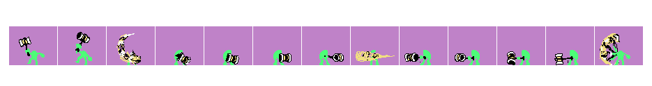 |
|
|
|
|
Logged
|
|
|
|
|
J. R. Hill
|
|
« Reply #20642 on: December 17, 2012, 07:46:33 PM » |
|
The problem you see is that you establish a ton of momentum with those blur frames, then slow the motion both on the upswing and the forward swing. Basically you've got the acceleration backward. The easiest fix is to just start removing frames.
Try removing and adding these frames:
0 1 2 3 4 5 6 (5) 7 8 9 10 11 12 13
Or if by ending pose you mean frame 0, then reduce the blur effect on the final frame, but change the delay on frame 0 so that it can be seen as a stopping point.
|
|
|
|
|
Logged
|
hi
|
|
|
mozzy
Level 1
The Wild Thing
|
|
« Reply #20643 on: December 17, 2012, 08:12:07 PM » |
|
Like this? I actually made the blur bigger because I needed to show that the attack has a slightly longish range without actually making the hammer longer.  Frames (the animated one has several frames deleted): 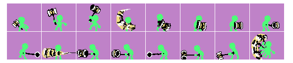 |
|
|
|
« Last Edit: December 17, 2012, 08:17:28 PM by mozzy »
|
Logged
|
|
|
|
|
SolarLune
|
|
« Reply #20644 on: December 17, 2012, 09:30:21 PM » |
|
I think it's odd in the first one because I can't quite see what attack he's doing. Is he swinging it just once, like raising it and then arcing it like a bat, or is he swinging multiple times? I think you shouldn't blur the upswing (unless that is part of the attack) and just draw the frames normally. Think of it like a bat - raise it up slowly, since it's heavy, then swing it around and forward, and keep the guy's back arched backward, like it's pulling him.
An easier way to animate it might be to just slam the hammer forward overhead, or swing it around while spinning his whole body, Kirby-style.
EDIT: That's my theory, anyway.
|
|
|
|
|
Logged
|
|
|
|
mozzy
Level 1
The Wild Thing
|
|
« Reply #20645 on: December 17, 2012, 09:33:52 PM » |
|
Its a 3 part attack. He swings the hammer downwards, then swings it horizontally, then swings it back up. So yeah, the upswing is a part of the attack. I considered doing just a single forward hammer attack, but it would just move too slowly for the style of game im making it for.
|
|
|
|
|
Logged
|
|
|
|
|
Ego_Shiner
|
|
« Reply #20646 on: December 17, 2012, 10:01:29 PM » |
|
yeah i think a lot of the trouble is that its really hard to tell what he's actually doing. the motion blur indicates that he is attacking to the left, but the hammer extends much further on the backswing than the actual attack, which is really confusing in the animation itself. on top of that, the continuity between the attacks is a little weird. it doesnt really make much sense to spin the hammer around then end with a weird uppercut thingy, and it kind of detracts from the weight you are trying to give the hammer.
|
|
|
|
|
Logged
|
Lo
|
|
|
|
ClayB
Guest
|
|
« Reply #20647 on: December 17, 2012, 11:36:34 PM » |
|
i dunno much about animating, but i think some rearranging of the frames reads better:  hope that helps? still room for improvement, as i just rearranged stuff |
|
|
|
|
Logged
|
|
|
|
|
Brother Android
|
|
« Reply #20648 on: December 18, 2012, 08:11:01 AM » |
|
This is an edited version of an image that I posted last week, along with a new picture showing a wolf sizing up a bison. I'm working hard trying to figure out a style for myself, and have really been enjoying working on the animals so far. What do you think? This is really amazing work. The style and colors of the landscapey bits really evoke a certain desolate part of the world... I'm reminded of the time I went to Yellowstone National Park in May and there was a blizzard. The atmosphere is thick and distinctive and it manages to be a bit cartoony without feeling at all silly. My only issue is that the wolf in the second one has the exact same pose as one of the wolves in the first one, which comes out looking a bit cheap when the pictures are right next to each other. |
|
|
|
|
Logged
|
|
|
|
mozzy
Level 1
The Wild Thing
|
|
« Reply #20649 on: December 18, 2012, 09:02:38 AM » |
|
Is this any better? I decided to take out the upswing as a part of the attack and instead, replaced it with a hammer jab. So it goes swing downwards, swing left, then jab forward. Then the brings the hammer back up to restart the cycle.  |
|
|
|
« Last Edit: December 18, 2012, 09:09:02 AM by mozzy »
|
Logged
|
|
|
|
Slow
Level 1
chirp
|
|
« Reply #20650 on: December 18, 2012, 01:33:49 PM » |
|
It needs more trails and less frames in my opinion. And the trails need to be wider. I think Zero In MMZ has the perfect reference.  Sort of what I'm talking about. I dunno. The .gif may or may not be slowed down/sped up. |
|
|
|
|
Logged
|
|
|
|
|
saibot216
|
|
« Reply #20651 on: December 18, 2012, 01:51:33 PM » |
|
I think I'm the only one that understood what was going on in the animation.
|
|
|
|
|
Logged
|
|
|
|
sega
Genesis
Level 2

I superdig

|
|
« Reply #20652 on: December 18, 2012, 01:56:18 PM » |
|
I think I'm the only one that understood what was going on in the animation.
Oh shit... you just made me realize he's attacking to the left. Not the right. I've been having trouble this whole time. |
|
|
|
« Last Edit: December 19, 2012, 05:28:23 AM by sega »
|
Logged
|
|
|
|
|
Cellusious
|
|
« Reply #20653 on: December 18, 2012, 03:10:39 PM » |
|
 "Escape to another universe is the next level of intelligence" |
|
|
|
|
Logged
|
|
|
|
|
Manuel777
|
|
« Reply #20654 on: December 19, 2012, 02:55:15 AM » |
|
I think the woman wears a costume, like this but with a full head mask and a stuffed tail. |
|
|
|
|
Logged
|
|
|
|
keoni29
Level 1
|
|
« Reply #20655 on: December 19, 2012, 06:38:55 AM » |
|
"Escape to another universe is the next level of intelligence" No it means we could not take care of our own planet. |
|
|
|
|
Logged
|
|
|
|
|
Quarry
|
|
« Reply #20656 on: December 19, 2012, 08:53:18 AM » |
|
^ so true
|
|
|
|
|
Logged
|
|
|
|
|
Jamo
|
|
« Reply #20657 on: December 19, 2012, 09:11:43 AM » |
|
This is really amazing work. The style and colors of the landscapey bits really evoke a certain desolate part of the world... I'm reminded of the time I went to Yellowstone National Park in May and there was a blizzard. The atmosphere is thick and distinctive and it manages to be a bit cartoony without feeling at all silly. My only issue is that the wolf in the second one has the exact same pose as one of the wolves in the first one, which comes out looking a bit cheap when the pictures are right next to each other.
Thank you! I'm glad you like the style, the cartoony but not silly tends to run through a lot of work that I do, it wasn't really intentional. It's funny you say that actually, a lot of the research that I have done has been about the wolves within Yellowstone, its a pretty amazing place for wildlife. I agree about the wolf being in the same pose not being ideal, I did just copy/paste him. It was more about doing the environment and the bison for that one as I was happy with how the wolves looked, might go back and change him later to make it a bit more interesting. |
|
|
|
|
Logged
|
|
|
|
|
Trystin
|
|
« Reply #20658 on: December 19, 2012, 03:35:15 PM » |
|
So here is something I did a little while back that I haven't really posted anywhere yet, it is kind of a fan art piece for Amon26's game Au Sable. I liked the character so I drew her..  |
|
|
|
|
Logged
|
|
|
|
|
|
|
 Developer
