|
Derek
|
 |
« Reply #21020 on: January 15, 2013, 02:18:33 PM » |
|
Better!  |
|
|
|
|
 Logged
|
|
|
|
|
Ridley
|
|
« Reply #21021 on: January 15, 2013, 05:21:10 PM » |
|
New to the forum, though I passed it by before. I'm actually hesitant to post my own work (anywhere) due to paranoia over it being stolen. But it isn't fair that I take advantage of a community without being a part of it, and besides, it seems close-knit! Sidenote: If anyone has ideas about image protection to toss my way, I'd be grateful. I'm clueless. Here's a set of animations for walking I revised this week.  |
|
|
|
« Last Edit: January 15, 2013, 10:05:29 PM by Ridley »
|
Logged
|
|
|
|
thekill473
Level 1


|
|
« Reply #21022 on: January 15, 2013, 05:47:57 PM » |
|
GAHHHH!!! It's pillow shaded... Anyways to be more helpful try choosing a direction the light source is coming from and adjust you're shading. http://www.derekyu.com/?page_id=225The animation is good though. |
|
|
|
|
Logged
|
|
|
|
|
Ridley
|
|
« Reply #21023 on: January 15, 2013, 05:52:58 PM » |
|
It isn't. Well, maybe the hair is inverted pillow shading? But look at the arms, legs, head, and feet.
The reason the torso may strike you as pillow-shadery is because I used the second-lightest of the three shades to taper the color on the near edge in an attempt to make it appear less flat. The shading is slightly heavier on the far side, and when it isn't, that's because his arm is casting a shadow on the body.
It's a one-pixel margin and indeed looks off. I'll change it and come back with the edit.
EDIT: Clarification: The light source is the imaginary horizon on the right (east).
|
|
|
|
|
Logged
|
|
|
|
|
ink.inc
Guest
|
|
« Reply #21024 on: January 15, 2013, 06:11:25 PM » |
|
no it's pillow shaded try to treat your drawings as 3d models that exist in a 3d world; shading then just becomes a series of processes that you apply to your character http://androidarts.com/art_tut.htmI'm actually hesitant to post my own work (anywhere) due to paranoia over it being stolen
a fear mostly unwarranted. don't be afraid to post your work; learning through critique is the fastest way to improve. |
|
|
|
|
Logged
|
|
|
|
|
|
|
poe
Guest
|
|
« Reply #21026 on: January 15, 2013, 06:20:25 PM » |
|
I like it  |
|
|
|
|
Logged
|
|
|
|
Slow
Level 1
chirp
|
|
« Reply #21027 on: January 15, 2013, 07:01:24 PM » |
|
The contrast between shades is really low and the colors look really lowly saturated(?). But I like it regardless. It would look a lot better if you fixed your colors though.
|
|
|
|
|
Logged
|
|
|
|
|
jiitype
Guest
|
|
« Reply #21028 on: January 15, 2013, 07:08:25 PM » |
|
The colors could be a bit more darker, but looks good!
|
|
|
|
|
Logged
|
|
|
|
|
PlantMonster
|
|
« Reply #21029 on: January 15, 2013, 07:17:58 PM » |
|
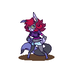
It looks good, but to me... it looks like some sort of rodent. This is probably due to the difference in color from the main body and the legs. I think most dogs have hair the same color on their legs as on the rest of their body. Rats and mice, however, have little or no hair on their hands/legs. So yeah, this looks more like a rodent than anything else.
Thanks for the feedback, I've tweaked it to make it a little more dog like. Will use reference next time  !  Nice tutorial. |
|
|
|
|
Logged
|
|
|
|
|
gggfhfdh
|
|
« Reply #21030 on: January 15, 2013, 09:15:58 PM » |
|
 thing for a person |
|
|
|
|
Logged
|
|
|
|
|
Ridley
|
|
« Reply #21031 on: January 15, 2013, 09:57:05 PM » |
|
With only the vaguest notion of what to fix, I set back to the template and did this with the forward-perspective one:  After a few ill attempts at texturing under the color palette constraints I made for myself, I decided to leave the dark in on the hair for the most part, although I adjoined it with the dark side and touched up the highlights, to make them directional. It communicates a thickness/central mass towards the center, and without looks decidedly flat. As for the torso, I did little but alter the shape of the shadow. Overall I made my shading less incremental, for less pillowed impressions. EDIT: There was a duplicate of his torso in some frame. It's fixed now. If there's any constructive criticism to be had, please tell me specifically what I should look at changing, or if I should do the rest over in a similar fashion. |
|
|
|
« Last Edit: January 15, 2013, 10:30:09 PM by Ridley »
|
Logged
|
|
|
|
|
Ridley
|
|
« Reply #21032 on: January 15, 2013, 10:03:54 PM » |
|
The contrast between shades is really low and the colors look really lowly saturated(?). But I like it regardless. It would look a lot better if you fixed your colors though.
Yes, desaturated. Choose a color palette with richer, complimentary tones for the most contrast, and to make them stand out for an illusion of depth between the top of the incline and the bottom. I'd try darker, red-stained rocks and lush greens--and also a more high-contrast texture for the grass, so that it doesn't blend as easily. Splashes of deeper green running through, or a bit of noise to make the grass look rough. But you're texturing is pretty brilliant on those rocks. Well done. |
|
|
|
|
Logged
|
|
|
|
|
Geti
|
|
« Reply #21033 on: January 15, 2013, 11:11:46 PM » |
|
With only the vaguest notion of what to fix, I set back to the template and did this with the forward-perspective one:
If there's any constructive criticism to be had, please tell me specifically what I should look at changing, or if I should do the rest over in a similar fashion.
I'd work more on my pixel technique before doing over anything - there are a lot of issues that could use fixing, namely the misuse of black outlines, the nonsense/blobby shading on the hair, the poor silhouette and the banded colours. Sorry for being blunt.  Here's an edit, took 15min of my time - plus yours on the right. Was not a forgiving base to work from I'm afraid :/ Slightly less boring colours - more reds and yellows in the light colours, more blues and purples in the darks. Simple trick that increases the interest of a piece, as it makes it seem like it's not in monochromatic light. Working on a grey background helps keep your art versatile, so it will work in any setting. Less "scribble then fill then colour aimlessly" hair - think about how hair falls. Face with more emotive possibilities - less huge eyes, added eyebrow and mouth so you can show emotion properly. My dude looks a little worried, rather than just "blank". Detail increase overall - try to describe the micro-detail of shapes as well as just the vague shape - hands have fingers, shirts have seams, etc. This should give you something to work on. |
|
|
|
|
Logged
|
|
|
|
|
beetleking22
|
|
« Reply #21034 on: January 15, 2013, 11:15:37 PM » |
|
thing for a person I want eat your style. |
|
|
|
|
Logged
|
|
|
|
|
ANtY
|
|
« Reply #21035 on: January 16, 2013, 05:56:59 AM » |
|
thing for a person loving it |
|
|
|
|
Logged
|
|
|
|
|
anselm_eickhoff
|
|
« Reply #21036 on: January 16, 2013, 05:58:04 AM » |
|
Changed the colors, redid the grass to be more leafy. You were right about contrast, thanks for the feedback. I want to keep it low for the grass though, so player sprites will pop out better.  Also, I am addicted now... |
|
|
|
« Last Edit: January 16, 2013, 06:05:53 AM by anselm_eickhoff »
|
Logged
|
|
|
|
Ozoh
Level 1
|
|
« Reply #21037 on: January 16, 2013, 06:29:33 AM » |
|
It's better, although the contrast still seems pretty low to my eye. Perhaps try darkening the ground a bit more?
|
|
|
|
|
Logged
|
|
|
|
|
egoitzOsa
|
|
« Reply #21038 on: January 16, 2013, 07:45:45 AM » |
|
*snip*
It still needs more contrast between different parts. You can also try applying different colors/contrast to each "floor" or ground layer, to give them more depth. |
|
|
|
|
Logged
|
|
|
|
|
Eigen
|
|
« Reply #21039 on: January 16, 2013, 07:54:14 AM » |
|
Both of these are very bright and washed out. I feel your screen isn't very well calibrated if they seem right to you.
The cliffs themselves are pretty nice for someone new to the thing. The grass might be a bit too detailed especially when you increase the contrast.
|
|
|
|
|
Logged
|
|
|
|
|
 Developer
