|
happymonster
|
 |
« Reply #21920 on: March 31, 2013, 12:45:31 AM » |
|
^ That is pretty cool! I like the colors. 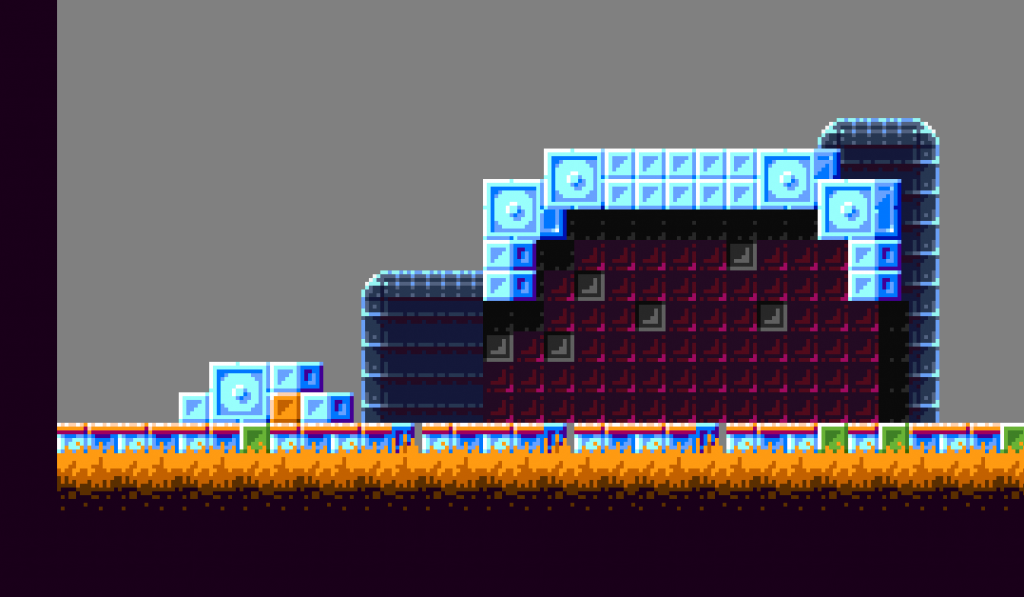 That's great!!  |
|
|
|
|
 Logged
|
|
|
|
|
Quarry
|
|
« Reply #21921 on: March 31, 2013, 04:32:38 AM » |
|
^ That is pretty cool! I like the colors. Reminds me of farmergnome's works |
|
|
|
|
Logged
|
|
|
|
|
Strife
|
|
« Reply #21922 on: March 31, 2013, 06:43:09 AM » |
|
^ That is pretty cool! I like the colors. For some reason, I keep imagining this as the tileset of a classic-styled Mega Man game where the sprites are all tiny and cutesy. And that's not a bad thing. Nice job with the shading! |
|
|
|
|
Logged
|
|
|
|
|
gggfhfdh
|
|
« Reply #21923 on: March 31, 2013, 02:52:40 PM » |
|
 shitty design + shitty sprite party time |
|
|
|
|
Logged
|
|
|
|
|
|
|
Carrion
|
|
« Reply #21925 on: March 31, 2013, 03:39:30 PM » |
|
I ment no offense by it, I love your work! it's just eerily similar to Cellusious. Your style looks like a more improved version of these.
-img-
Sorry for spamming but I thought it would be interesting to compare the styles.
Cellusious shits all over me yo.  He uses way more colors than I do and makes way more stuff. Have you seen his critters? Fresh stuff man. Either way, if everyone thinks we have such similar styles then I think proposing a big fat collab between the two of us is only fitting. What do you say Cell, wanna rule the internet with me?  |
|
|
|
« Last Edit: March 31, 2013, 03:57:51 PM by Carrion »
|
Logged
|
|
|
|
|
JobLeonard
|
|
« Reply #21926 on: March 31, 2013, 03:48:14 PM » |
|
I think you mixed up quote tags there. Or a post has gone missing  |
|
|
|
|
Logged
|
|
|
|
|
Carrion
|
|
« Reply #21927 on: March 31, 2013, 04:00:00 PM » |
|
Noticed that, fixed it. More pixel art tho...  |
|
|
|
|
Logged
|
|
|
|
|
ompuco
|
|
« Reply #21928 on: March 31, 2013, 04:24:14 PM » |
|
@Carrion I really like that, especially the simple details for the main facial features. I always dug using simple cartoony designs to show personality or expression, especially when it contrasts from within a highly detailed piece, but that's just me talking.
Also the colors and a lot of parts of the concept reminds me a lot of
It's almost uncanny how many things here make me think of it.
|
|
|
|
|
Logged
|
|
|
|
|
SolarLune
|
|
« Reply #21929 on: March 31, 2013, 07:14:00 PM » |
|
That's great!! Reminds me of farmergnome's works
For some reason, I keep imagining this as the tileset of a classic-styled Mega Man game where the sprites are all tiny and cutesy. And that's not a bad thing.
Nice job with the shading!
Oh a btw I LOVE that solarlune! Great colors and cool design!
Oh, hah, thanks.  I made a demo for it that you can play here (Flash), though the character (my avatar) doesn't really match the world. I envision a Wario's Woods / Metroid mash-up, and my character doesn't really match, though I still like him.  |
|
|
|
|
Logged
|
|
|
|
|
ink.inc
Guest
|
|
« Reply #21930 on: March 31, 2013, 09:32:33 PM » |
|
woah, that is mighty fancy John. Some sort of explosion-y thing?
yea i've been working on a few for throwman, trying to get them to feel right    the last one needs some tweaking |
|
|
|
« Last Edit: March 31, 2013, 09:40:59 PM by John Sandoval »
|
Logged
|
|
|
|
|
ANtY
|
|
« Reply #21931 on: April 01, 2013, 04:21:04 AM » |
|
pretty
I think the last one is fine, maybe the first one could use more tweaking than the last one
|
|
|
|
|
Logged
|
|
|
|
|
gggfhfdh
|
|
« Reply #21932 on: April 01, 2013, 07:18:42 AM » |
|
the last one needs some tweaking
other than a few minor problems that ur probably aware of, the way it disappears at the end makes it kind of look like it's being cut off by something, rather than that its disappearing |
|
|
|
|
Logged
|
|
|
|
Slow
Level 1

chirp

|
|
« Reply #21933 on: April 01, 2013, 10:28:10 AM » |
|
Might as well post uh old/new   |
|
|
|
|
Logged
|
|
|
|
|
Quarry
|
|
« Reply #21934 on: April 01, 2013, 10:43:21 AM » |
|
old > new
|
|
|
|
|
Logged
|
|
|
|
|
Hangedman
|
|
« Reply #21935 on: April 01, 2013, 10:46:08 AM » |
|
new moves better
old has more character
|
|
|
|
|
Logged
|
|
|
|
|
namragog
Guest
|
|
« Reply #21936 on: April 01, 2013, 01:00:57 PM » |
|
new moves better
old has more character
 |
|
|
|
|
Logged
|
|
|
|
|
Belimoth
|
|
« Reply #21937 on: April 01, 2013, 01:16:14 PM » |
|
I prefer the feet of the new one but I like how exaggerated the wing movement is on the old one. The new one just looks like it has arm-shaped wings with elbows and everything.
|
|
|
|
|
Logged
|
|
|
|
|
lame joe
|
|
« Reply #21938 on: April 01, 2013, 06:28:36 PM » |
|
shitty design + shitty sprite party time this is cool but the face is kinda bad |
|
|
|
|
Logged
|
|
|
|
|
|
|
 Developer
