|
surt
|
 |
« Reply #27240 on: July 09, 2014, 12:57:13 AM » |
|
Snake Plissken? Escape from New Pork? |
|
|
|
|
 Logged
|
|
|
|
|
DoomCube
|
|
« Reply #27241 on: July 09, 2014, 01:54:35 AM » |
|
Well spotted, Surt. The game's theme is playing with on old 80's and 90's sci-fi/action movie tropes. We're calling him Steak Blisterin for the time being. I like Escape from New Pork, though. I hadn't thought of that one.  |
|
|
|
|
Logged
|
|
|
|
|
s-spooky g-g-ghosts
|
|
« Reply #27242 on: July 09, 2014, 03:53:53 AM » |
|
I disagree. The pig's ship is actually very consistent. The problem is that this perspective gives an impression that the pig is positioned at a 90 degree angle to the cars while we know that it will move parallelly to them. Anyway I like that style, the cars remind me of old Cartoon Network style (like Dexter, Cow and Chicken etc.)  |
|
|
|
|
Logged
|
|
|
|
|
|
|
DoomCube
|
|
« Reply #27244 on: July 09, 2014, 05:06:49 AM » |
|
Thanks Spooky & NNWW. Really happy to hear you like it. Yeah, the issue with the pig's ship is the perspective. I think the quick fix is to flip the cars and change the lighting on the pig's ship so they all match up a little better. Thanks for the input.
|
|
|
|
|
Logged
|
|
|
|
|
08--n7.r6-79.84
|
|
« Reply #27245 on: July 09, 2014, 05:37:58 AM » |
|
Awesome work! Duke Snak'em? But surt's "Escape from New-Pork" is pretty good.
New pixels:  If you want to zoom just click it. |
|
|
|
|
Logged
|
|
|
|
|
DoomCube
|
|
« Reply #27246 on: July 09, 2014, 07:49:59 AM » |
|
Thanks a lot. Maybe we'll call it Duke Snak'em if the game ends up in development hell for the next 10 years  Stranger things have happened... |
|
|
|
|
Logged
|
|
|
|
|
|
|
Oleg Klishin
|
|
« Reply #27248 on: July 09, 2014, 12:14:20 PM » |
|
Honestly I don't see pigsie-flyer as an issue. Redrawing assets instead of just mirroring them will take too much work. What I'd like to see is more skin-shading, especially on the piggy. He is way too flat.
|
|
|
|
|
Logged
|
|
|
|
|
saibot216
|
|
« Reply #27249 on: July 09, 2014, 01:35:13 PM » |
|
The game's theme is playing with on old 80's and 90's sci-fi/action movie tropes.
I already want to play this game. Especially with the pig pilots. |
|
|
|
|
Logged
|
|
|
|
|
DoomCube
|
|
« Reply #27250 on: July 09, 2014, 01:39:03 PM » |
|
DoomCube I Love it. So much that I had a go at fixing the perspective issue (unfortunately the lemon colours do work better using less of the lighter tone in proportion to the darker tone and I was too lazy to fix that):
Thanks Lee. I'm delighted to hear you like the art so much. I really appreciate you taking the time to try and help me solve this small problem. Your solution is quite good and I understand what you mean about the lemon shading. This was the issue I was running into earlier when I was trying to change the lighting on the pig's hover bike (hog?). Here is my own solution which I think suits my needs better over all. I flipped the cars and changed the colours to take the electric lemon out of the bike which helped a lot. Now it should fit together a little better. Let me know what you guys think.  Cheers, Paul |
|
|
|
|
Logged
|
|
|
|
|
DoomCube
|
|
« Reply #27251 on: July 09, 2014, 01:45:11 PM » |
|
Honestly I don't see pigsie-flyer as an issue. Redrawing assets instead of just mirroring them will take too much work. What I'd like to see is more skin-shading, especially on the piggy. He is way too flat.
You're right about the mirroring, Phoenix. I think at this stage redrawing some assets is not too much of a big task, though. It may be worth the pay off if I take the extra time. |
|
|
|
« Last Edit: July 09, 2014, 02:06:13 PM by DoomCube »
|
Logged
|
|
|
|
|
|
|
jamsus
|
|
« Reply #27253 on: July 10, 2014, 12:27:00 AM » |
|
Hi! First post, i'm the typical software engineer trying to chase the dream of creating their own legendary platformer - in the mid of 10h-day work and other nerdy stuff.  This is a precarious attempt to make something "fast-to-make-good-to-look" but i don't feel really good with it - i think it's too much noisy. |
|
|
|
|
Logged
|
|
|
|
|
eigenbom
|
|
« Reply #27254 on: July 10, 2014, 04:48:31 PM » |
|
@Jamsus Yep, that's very noisy. You should typically try to avoid single isolated pixels, except when patterning or highlighting. Here's a simple figure I drew this morning, and its construction sequence. 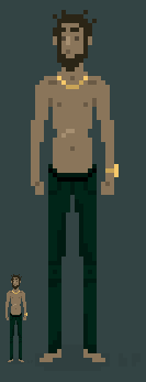 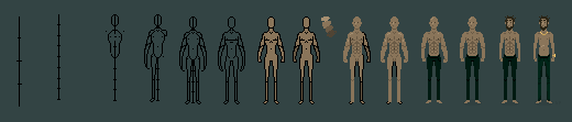 |
|
|
|
|
Logged
|
|
|
|
|
Gravitaria
|
|
« Reply #27255 on: July 10, 2014, 06:31:49 PM » |
|
Lots of experienced artists around! I am still getting the hang of the skill myself.  A tank meant for practice! |
|
|
|
|
Logged
|
|
|
|
|
eigenbom
|
|
« Reply #27256 on: July 10, 2014, 08:37:07 PM » |
|
Lots of experienced artists around! I am still getting the hang of the skill myself. A tank meant for practice! Pretty good, but I had to repaint it!  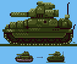 |
|
|
|
|
Logged
|
|
|
|
|
Gravitaria
|
|
« Reply #27257 on: July 10, 2014, 09:24:24 PM » |
|
Lots of experienced artists around! I am still getting the hang of the skill myself. A tank meant for practice! Pretty good, but I had to repaint it! Ohh your repaint looks great, I like the contrast between the aproaches  |
|
|
|
|
Logged
|
|
|
|
|
eigenbom
|
|
« Reply #27258 on: July 10, 2014, 09:27:10 PM » |
|
Thx. I find at this low resolution dark outlines should be used sparingly. Also your lighting needed some work to communicate the 3d form a little better.
|
|
|
|
|
Logged
|
|
|
|
|
jamsus
|
|
« Reply #27259 on: July 10, 2014, 10:50:23 PM » |
|
@Jamsus Yep, that's very noisy. You should typically try to avoid single isolated pixels, except when patterning or highlighting.
Thank you! I'v tried something else for a game-idea mockup! Didn't like the Yellow Guy but i'm pretty ok with the general style  |
|
|
|
|
Logged
|
|
|
|
|
 Developer
