|
happymonster
|
 |
« Reply #27860 on: September 02, 2014, 01:44:31 PM » |
|
Her left eye (our right) is too big still compared to the other one and looks a bit too high up.
|
|
|
|
|
 Logged
|
|
|
|
|
Sik
|
|
« Reply #27861 on: September 02, 2014, 02:35:51 PM » |
|
The two eyes are identical pixel-wise, so if anything it's a matter of perspective (but it's already at 1 pixel thickness, so that'd be hard to work around).
I wonder more about why these sprites seem smaller than the previous ones.
|
|
|
|
|
Logged
|
|
|
|
|
CyangmouArt
|
|
« Reply #27862 on: September 02, 2014, 03:27:37 PM » |
|
The two eyes are identical pixel-wise, so if anything it's a matter of perspective (but it's already at 1 pixel thickness, so that'd be hard to work around).
I wonder more about why these sprites seem smaller than the previous ones.
you mean the latest versions of the sprites or this version of creya compared with the 2013 version? well the eye perspective got somewhat lost in the changes, anyways it's a matter of subpixels. In the newest version I hope it's alright I tilted the head now a bit more in order to take advantage of fuller lips to get back more feminity. Also adjusted the eye positions according to the new tilt and edited the sideplane of the nose. The thing I am really unsure about right now is the size of the nose and size between nose and mouth. so which one does look best (or most beautiful / female) (1) (2) or (3) 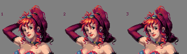 don't made a gif this time. |
|
|
|
|
Logged
|
|
|
|
|
BBreakfast
|
|
« Reply #27863 on: September 02, 2014, 03:53:12 PM » |
|
@ Cyangmou: Her face is looking a lot more feminine now, and quite pretty! I think 1 or 2 is the most attractive.. leaning towards 1 as my favorite.  Started this tree the other day. Haven't drawn a tree in like 3 years so it's exciting to see what I've learned since then! |
|
|
|
« Last Edit: September 02, 2014, 04:02:29 PM by BBreakfast »
|
Logged
|
|
|
|
|
Thomas Finch
|
|
« Reply #27864 on: September 02, 2014, 04:00:58 PM » |
|
@Cyangmou: I agree with BBreakfast, 1 is the most feminine and attractive.
@BBreakfast: Great job on the house! I think the windows on the left and right walls should be more horizontally centered though. EDIT: Aw, you removed it. I liked it!
|
|
|
|
|
Logged
|
|
|
|
|
eigenbom
|
|
« Reply #27865 on: September 02, 2014, 04:28:23 PM » |
|
@Cyangmou - nice to see you around here, I love your work  Btw if you ever want to drop by @Pixel_Dailies and submit something, that'd be really awesome. [/gushing] And speaking of Pixel_Dailies, tomorrow we hold another competition. The prize is a copy of Rex Rocket - a megaman-like. Hope to see you all submit something. Also here's a WIP I'm slowly putting together, based on a sketch by Marek Jarocki. Still a long way to go but I find it pretty relaxing to do an hour on it here and there. 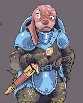 |
|
|
|
|
Logged
|
|
|
|
|
beetleking22
|
|
« Reply #27866 on: September 02, 2014, 05:05:29 PM » |
|
@Cyangmou 1 Looks best 3 has too small face compared to 1 and 2..
|
|
|
|
|
Logged
|
|
|
|
|
ANtY
|
|
« Reply #27867 on: September 03, 2014, 12:30:03 AM » |
|
eigengomb this is sum awesome stuff
|
|
|
|
|
Logged
|
|
|
|
|
CyangmouArt
|
|
« Reply #27868 on: September 03, 2014, 01:07:18 AM » |
|
@Cyangmou - nice to see you around here, I love your work Btw if you ever want to drop by @Pixel_Dailies and submit something, that'd be really awesome. [/gushing] Well I am on tigsource for quite a while now, usually I just don't have a lot to say =) also don't had a lot to show the last months. I prefer pencils for my daily sketches, but I remember the dailies from twitter, so if I have the urge to sketch with pixels I will participate  For your art: I think it's the most beautiful thing you showed off here. THe only thing which is really odd at the moment is, that you don't seem to have a global lightsource. The light direction on all forms as a whole isn't consistent and it gets really obvious because of the highlights. then I polished a few clusters and made a gif from version 1 (which I also preferred) 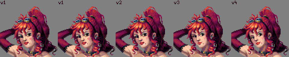 and I guess that is a good enough final version (also changed the ear slightly compared to the gif) 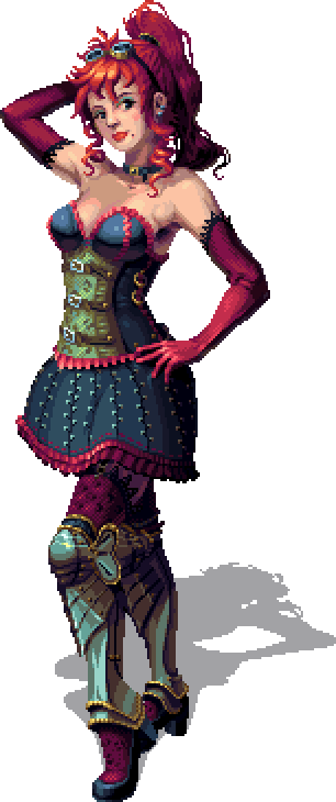 |
|
|
|
« Last Edit: September 03, 2014, 03:37:37 AM by CyangmouArt »
|
Logged
|
|
|
|
|
eigenbom
|
|
« Reply #27869 on: September 03, 2014, 01:51:01 AM » |
|
thx for the feedback cyang, your Creya is awesome |
|
|
|
|
Logged
|
|
|
|
|
SolarLune
|
|
« Reply #27870 on: September 03, 2014, 06:18:03 AM » |
|
Also here's a WIP I'm slowly putting together, based on a sketch by Marek Jarocki. Still a long way to go but I find it pretty relaxing to do an hour on it here and there.
SNAAAAAP That's a really good idea; I'm gonna try that with some people's art styles that I like, I think. @CyangmouArt - Really, REALLY well drawn. |
|
|
|
|
Logged
|
|
|
|
|
Geti
|
|
« Reply #27871 on: September 03, 2014, 07:42:11 AM » |
|
 yet another pixel knight, demo stuff. |
|
|
|
|
Logged
|
|
|
|
|
beetleking22
|
|
« Reply #27872 on: September 03, 2014, 12:42:22 PM » |
|
Boarman WIp.. The piece itself done but I need fix that Ugly weapon... Im not good drawing characters... so there might be a lot of anatomy problems, :D Update: Thank you Solar rune and thomas..  |
|
|
|
« Last Edit: September 03, 2014, 03:01:01 PM by beetleking22 »
|
Logged
|
|
|
|
|
Thomas Finch
|
|
« Reply #27873 on: September 03, 2014, 12:57:03 PM » |
|
Holy crap! That's awesome! |
|
|
|
|
Logged
|
|
|
|
|
SolarLune
|
|
« Reply #27874 on: September 03, 2014, 12:59:27 PM » |
|
It is indeed really cool. I think I'd make the tail thicker (currently, it looks like it would've broken a long time ago), add some shine to the large light patches of fur, and make the X on his belly look more overgrown with hair, but that's pretty sick already. Really nice furry look!
@Geti - Really slick stocky soldier. Good work!
|
|
|
|
|
Logged
|
|
|
|
|
Zanhuf
Guest
|
|
« Reply #27875 on: September 03, 2014, 01:20:40 PM » |
|
Apologies for bothering you guys, although i've posted this in my own Workshop thread, i have a feeling i might get more advice if i post it here:  Decided to go back to the medium sized base and see if i can change it, also made a bigger one. I took a look at the first one and then realised that the stomach of the medium base shouldn't look like it's being seen straight-on, but i was worried i warped it too much (in the second version). The sprite of Ash Crimson next to both versions is for comparison. For further comparison, compare the above to the last one i posted in this thread:  I've got a few questions: Is the AAing too much? Is it overdone? Does the shading convey the form of the body in a decent manner? Is the head for both sizes too small? I fear putting it out of preportion at this point, hence why it's at it's current size. Is the body consistant with the angle it's displayed at? I know i have had issues with this previously. I've been consulting anatomy books but if there's anything wrong please point it out, i'd really appreciate it. |
|
|
|
|
Logged
|
|
|
|
|
eigenbom
|
|
« Reply #27876 on: September 03, 2014, 02:54:29 PM » |
|
Another competition today, check the tweet, and good luck everyone! There's a mad looking megaman-like up for grabs.  |
|
|
|
|
Logged
|
|
|
|
|
Geti
|
|
« Reply #27877 on: September 04, 2014, 01:13:07 AM » |
|
 (related to above) Had a lot of fun with this one |
|
|
|
|
Logged
|
|
|
|
|
eigenbom
|
|
« Reply #27878 on: September 04, 2014, 03:09:13 AM » |
|
Great stuff max
|
|
|
|
|
Logged
|
|
|
|
|
beetleking22
|
|
« Reply #27879 on: September 04, 2014, 04:08:08 AM » |
|
@Geti
Looks good geti.. really like it!
|
|
|
|
|
Logged
|
|
|
|
|
 Developer
