|
Geti
|
 |
« Reply #28040 on: September 15, 2014, 04:29:33 PM » |
|
@Miguelito: looking great! Are these friends of the first two or from a different time? Loving the facial detail. Not sure about the highlights along the top edge of the man's hair though.
@indie11: you're probably going to want to face them to one side if they're for a platformer, 1bit stuff is a really good way to improve your silhouettes either way.
Just to address a couple of things after a bit of sleep and to avoid leaving this on a sour note (I'm pretty done with this too)
Lee; I don't see where I was slinging shit in my first post about this though? I could have been more amiable towards catguy after his criticism, but I felt it was presented in a reasonably mean spirited way and responded in kind.
Re: "hero" - med never suggested this, true. I made the assumption that they would be some kind of main character from their big colourful hair, flashy open jacket, cool gloves and so on; without any intent from the character shown from the pose or expression I just went with default game protagonist persona.
The purpose of the sword edit was never "definitely give them a sword", and the text in the image specifically pointed that out; it was to give them some kind of weapon or item showing their purpose. The big gauntlets in his current rendition fill this role nicely as a tell of the "athletic puncher" thing he's going for. As I said, subtlety in game art is obfuscation.
Catguy; if your problem was with my initial post and how it was presented or whatever, you should have said that rather than writing up a big thing picking apart the edits in relation to the wrong subject and attacking my position on women. Go read your original post again; you didn't include anything about my actions that you had a problem with.
I honestly didn't see your post as criticism of my art so much as my person after you started with a derisive summary and political quips, which is why I responded angrily - particularly after you cheerfully ignored the arbitrary facial structure changes in gggfhfdh's edit. If you left it after the "I did a quick/dirty edit" paragraph, I would have taken it as art crits, with the following tirade I took it personally.
Either way, I really don't see what was so authoritative/rude/whatever about the first post I made. Re-reading it, it's less coherent in places than I'd like (late night post) but doesn't really strike me as something to take offence at, particularly condescending or worth sarcastically picking apart. Would you rather I used the passive voice and disclaimers everywhere when making edits of anyone's work?
Re: double standards - honestly I think you're just in better touch with gggfhfdh/stan/hunter/name-of-the-week. If you didn't know him, it'd be easy to read his posts in the voice of a massive jerk. I feel like you might have projected that onto my original post and moved forward from there, there was honestly no condescending intent.
@gggfhfdh: I guess you're right on the style stuff. It's all pixel art to me though, and I included a bunch of text pointing out the "whys" in case the "hows" were irrelevant (which apparently they were). Your edits slowly slide away from his style towards your usual style as well; though including intermediates was a good call.
|
|
|
|
|
 Logged
|
|
|
|
|
jtfjtfjtf
|
|
« Reply #28041 on: September 15, 2014, 04:45:42 PM » |
|
There's a long history in video games of fighting characters just wearing gloves and sporty outfits. Street Fighter, Final Fight, Streets of Rage, SNK games, Tekken.
|
|
|
|
|
Logged
|
|
|
|
|
|
|
Raku
|
|
« Reply #28043 on: September 15, 2014, 06:36:57 PM » |
|
frogss   Love them! Especially the colors you used. |
|
|
|
|
Logged
|
|
|
|
|
Rat Casket
|
|
« Reply #28044 on: September 15, 2014, 08:58:31 PM » |
|
not all frogs 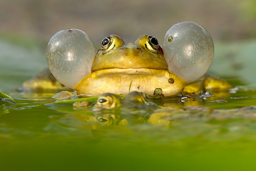 |
|
|
|
|
Logged
|
|
|
|
|
Geti
|
|
« Reply #28045 on: September 15, 2014, 09:02:38 PM » |
|
Wow, are those its eardrums? Crazy stuff.
|
|
|
|
|
Logged
|
|
|
|
|
Geti
|
|
« Reply #28046 on: September 16, 2014, 05:22:19 AM » |
|
2. let it go
Yeah I'm done. Back to art  |
|
|
|
|
Logged
|
|
|
|
|
beetleking22
|
|
« Reply #28047 on: September 16, 2014, 09:08:44 AM » |
|
2. let it go
Yeah I'm done. Back to art I like this! Lovely cluster and colors! |
|
|
|
|
Logged
|
|
|
|
|
ink.inc
Guest
|
|
« Reply #28048 on: September 16, 2014, 09:55:35 AM » |
|
|
|
|
|
|
Logged
|
|
|
|
|
joseph ¯\_(ツ)_/¯
|
|
« Reply #28049 on: September 16, 2014, 09:56:17 AM » |
|
great beetle, adorable frogs.
ty all for compliments. hopefuly the project's not dead! Cobralad woah, shame, you're super good at monsters/fantasy art.
|
|
|
|
|
Logged
|
|
|
|
|
Canned Turkey
Guest
|
|
« Reply #28050 on: September 16, 2014, 10:56:50 AM » |
|
|
|
|
|
|
Logged
|
|
|
|
|
Martin 2BAM
|
|
« Reply #28051 on: September 16, 2014, 12:25:45 PM » |
|
|
|
|
|
« Last Edit: September 16, 2014, 12:46:16 PM by Martin 2BAM »
|
Logged
|
|
|
|
|
standardcombo
|
|
« Reply #28052 on: September 16, 2014, 01:47:05 PM » |
|
Back to art Those are Zerg? Looks great. I feel like the little one is hard to read. Its some critter with 2 arms but not sure what the details are. |
|
|
|
|
Logged
|
|
|
|
|
Geti
|
|
« Reply #28053 on: September 16, 2014, 03:54:47 PM » |
|
Yup, SC2 Zerg - Swarm Host and Locust. Locusts are tiny things with a fat body and little arms/mandibles/??? that wave around when they shoot stuff from their mouths, it got a little noisy though trying to translate the details from the 3D into a sprite to-scale with the swarm host. Could potentially have got some team colour stuff in there too, but had other work to do  thanks for the feedback. |
|
|
|
|
Logged
|
|
|
|
|
SolarLune
|
|
« Reply #28054 on: September 16, 2014, 04:27:27 PM » |
|
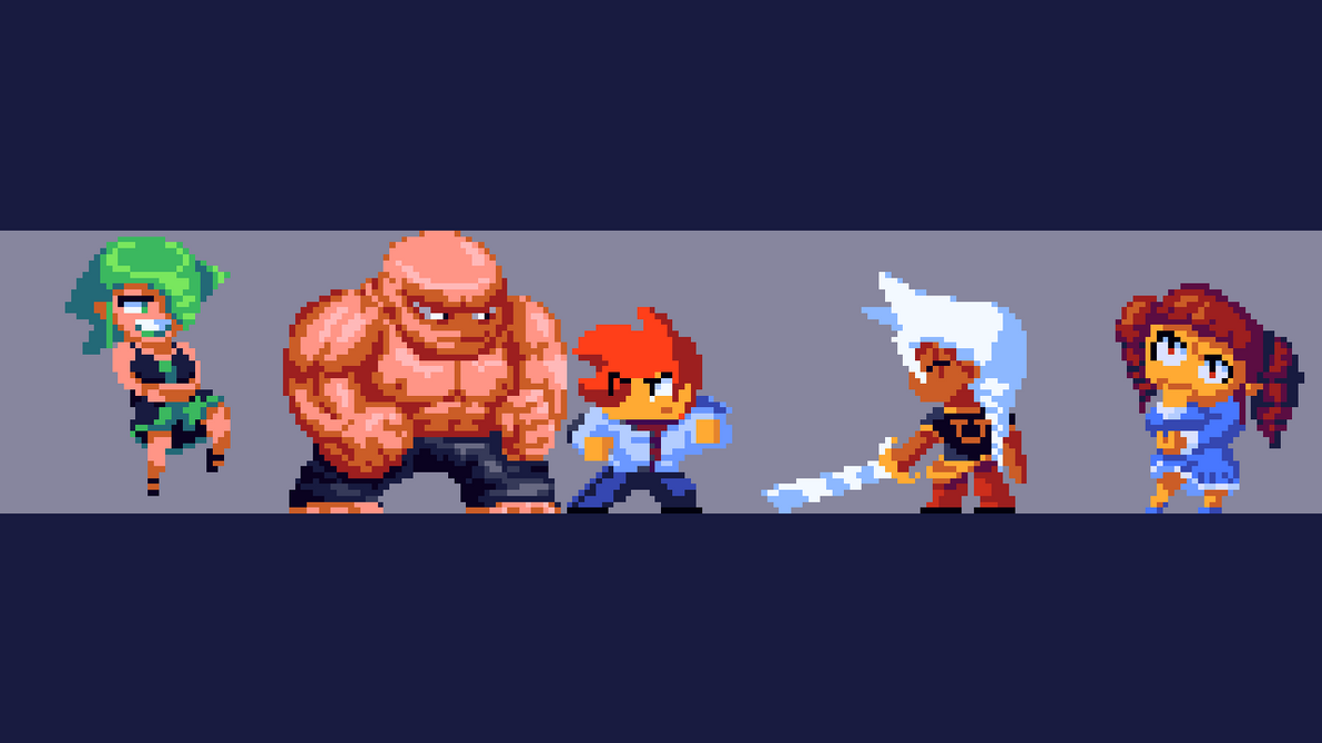 Made these doods (cept for the center guy; I made him awhile back). Made a WIP video showing how I pixeled the strong-man . Gonna upload WIP vids for almost all of them. @Martin - That looks pretty sick! @geti - Also nice work. It looks really clean. |
|
|
|
|
Logged
|
|
|
|
|
savethejets
|
|
« Reply #28055 on: September 16, 2014, 10:13:56 PM » |
|
Trying to get better at drawing landscapes. I think I like how the clouds turned out... however I'm not super crazy about the hills.  |
|
|
|
|
Logged
|
|
|
|
|
Thomas Finch
|
|
« Reply #28056 on: September 16, 2014, 10:47:49 PM » |
|
@savethejets: Those clouds are awesome! I don't think the hills are bad, they're good. It's just they sorta look like cloth. I'm not pixel expert but maybe making it less gradient and harsher will make it appear more rigid?
|
|
|
|
|
Logged
|
|
|
|
|
|
|
Lexonite
|
|
« Reply #28058 on: September 16, 2014, 11:39:06 PM » |
|
some work on graphics for a game  |
|
|
|
|
Logged
|
|
|
|
|
Saturator
|
|
« Reply #28059 on: September 16, 2014, 11:42:23 PM » |
|
Savethejets: I like those clouds. To me, they look more cartoony than the hills. What jumps out to me is that the hills seem to have a higher color count and a more of a painted feel. The edges between colors could be sharper. Smooth edges could contribute to the cloth look of the hills.
AlexHW: Looks great! Heavy Ultima vibes. The tree on the left should pop out more IMO. Maybe making it slightly off green or brighter would help.
|
|
|
|
« Last Edit: September 16, 2014, 11:50:48 PM by Saturator »
|
Logged
|
|
|
|
|
 Developer
