|
eliasdaler
Guest
|
 |
« Reply #28440 on: October 31, 2014, 10:24:52 AM » |
|
Happy Halloween, everyone! City of Undead is celebrating this holiday too.   |
|
|
|
|
 Logged
|
|
|
|
|
alvarop
|
|
« Reply #28441 on: October 31, 2014, 12:28:36 PM » |
|
 I posted an earlier version of this yesterday to the mockups thread, but i've done a bit of work on it since then, although i'm not sure it's getting better or worse. I kind of like it though, might make a little prototype of it if I can be bothered. I love it. Just enough detail and great colours. |
|
|
|
|
Logged
|
|
|
|
|
CandyFace
|
|
« Reply #28442 on: October 31, 2014, 12:34:40 PM » |
|
I'm trying to make a "satisfying" slash animation, still tweaking but i think it looks good so far.  I'll hopefully soon settle down on a theme, so i can start animating my characters properly... the character itself is obviously a placeholder :3 |
|
|
|
« Last Edit: October 31, 2014, 12:49:08 PM by CandyFace »
|
Logged
|
|
|
|
|
SolarLune
|
|
« Reply #28443 on: October 31, 2014, 09:26:32 PM » |
|
^ OK, so, here's some CC.
1) Arch his back more - he should lean into the attack.
2) Over-extend and exaggerate the animation more. Make it super obvious that he's slashing. This might be why when you think of slashing animations, usually they don't extend lengthwise initially, since it doesn't make a hugely obvious silhouette and motion. Just thinking out loud.
I like the blur and animation itself pretty well, though. It looks nice and smooth. Good work.
|
|
|
|
|
Logged
|
|
|
|
|
christopf
|
|
« Reply #28444 on: November 01, 2014, 01:53:14 AM » |
|
i agree on the leaning and the smoothness but i dont think its necessary to overextend the slashing. it can look quite cool but that way its looking cool too. i would make it depending on the setup around him and how the world looks. maybe a overextending animation doesnt match the rest. also you can push the animation with sound to make it more obvoius. i'm working on some shadows for mori again and am not so sure about the animation flow to now. what do you think?  |
|
|
|
« Last Edit: November 01, 2014, 03:38:54 AM by Christopf »
|
Logged
|
|
|
|
|
Fervir
|
|
« Reply #28445 on: November 01, 2014, 03:31:30 AM » |
|
After working on a bunch of my main character animations,  I thought it would be cool to try animating with larger sprites 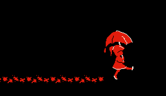 And then I wondered if I were to make a game with the same artstyle  @Carrion I really like the crow picture. Liking the details that you've put in. Especially in the grass and ground. |
|
|
|
|
Logged
|
|
|
|
|
CandyFace
|
|
« Reply #28446 on: November 01, 2014, 06:47:04 AM » |
|
I thought it would be cool to try animating with larger sprites And then I wondered if I were to make a game with the same artstyle "Excuse me child.. your umbrella seems to be dripping"  Love it! @Christopf Looking at the position of the eyes, I do not think you would be able to see them from the back. beside that i think it looks good  Second iteration of my slash animation, appreciate the feedback  I extended the swing a bit, it makes more sense if you look at the size of the knife, i also angled his body a bit more.  |
|
|
|
« Last Edit: November 01, 2014, 07:25:00 AM by CandyFace »
|
Logged
|
|
|
|
coah
Level 1


|
|
« Reply #28447 on: November 01, 2014, 10:39:56 AM » |
|
Is that the firelink shrine? Looks great by the way. |
|
|
|
|
Logged
|
|
|
|
|
Miko Galvez
|
|
« Reply #28448 on: November 02, 2014, 12:55:18 AM » |
|
 Protecting Dracula from the undead invaders of Castlevania Zelda, the legendary swordsman Mario, everyone's favorite carpenter Metroid, he's a really cool dude 60 Minutes Left and "What the ....?" |
|
|
|
« Last Edit: November 02, 2014, 03:04:40 AM by Medevenx »
|
Logged
|
|
|
|
|
Voltz.Supreme
|
|
« Reply #28449 on: November 02, 2014, 02:44:43 AM » |
|
Carrion.... Nice!
|
|
|
|
|
Logged
|
|
|
|
|
Sengi
|
|
« Reply #28450 on: November 02, 2014, 11:43:00 AM » |
|
To infinity and beyond! This is one of the first locations in the game, within it - the journey begins. Of course you must first complete some quest before leaving, and if you want - to speak with some characters) 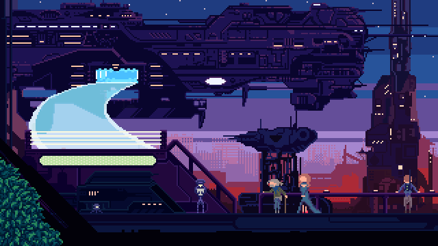 |
|
|
|
|
Logged
|
|
|
|
|
joseph ¯\_(ツ)_/¯
|
|
« Reply #28451 on: November 02, 2014, 05:18:09 PM » |
|
some thing  |
|
|
|
|
Logged
|
|
|
|
|
SolarLune
|
|
« Reply #28452 on: November 02, 2014, 05:59:59 PM » |
|
Protecting Dracula from the undead invaders of Castlevania
Zelda, the legendary swordsman
Mario, everyone's favorite carpenter
Metroid, he's a really cool dude
60 Minutes Left
and "What the ....?"
Hah, really nice sprites. They have a good, "chunky" feel about them. To infinity and beyond! This is one of the first locations in the game, within it - the journey begins. Of course you must first complete some quest before leaving, and if you want - to speak with some characters)
That's dripping with atmosphere. Nice work. some thing
This is cool so far. I think you need to push the chest and stomach back to align over her hips. Currently, it's wonky (as I'm sure you recognize). |
|
|
|
|
Logged
|
|
|
|
|
christopf
|
|
« Reply #28453 on: November 02, 2014, 11:42:59 PM » |
|
Her left foot could be a litte more in the front too,
@Sengi lovely atmosphere. i think it could have even more parallax (the moon especially)
|
|
|
|
|
Logged
|
|
|
|
Ninety
Level 1
turnip boy
|
|
« Reply #28454 on: November 02, 2014, 11:53:25 PM » |
|
Longtime lurker here. I've pixelled stuff for ages, just getting into animation. Turns out run cycles are pretty difficult if you've never done one before and you don't want your character to look like a marionette having a fit. This is about my fifth attempt at one. I found going for something more stylised and less realistic helped somewhat. WIP:     Haven't bothered with hair yet, also haven't figured out how to shade the legs in the crossover part to look readable. This is only 6 frames, I'd like to redo it as 8 at some point but I'm not sure where to add a frame. Probably I'd have to adjust the frames to accommodate extras. Criticism/advice would be really appreciated. |
|
|
|
|
Logged
|
|
|
|
|
SolarLune
|
|
« Reply #28455 on: November 03, 2014, 07:19:57 AM » |
|
^ Cool animation - it looks pretty good as of right now.For CC:
1) At that resolution, readability is key. Don't worry too much about realistic shading or things like that, for example - just make sure it's readable. With that in mind, you could do well to up your contrast of your colors. It's pretty desaturated (in a way that doesn't read well).
2) With the point about readability above, I'd go with shading the further limbs as purely darker, to, again, help encourage readability. That way, when the legs cross, the furthest leg and arm can be dark, like you have it now, but it'll follow and track a bit better in the other frames.
3) If you want to add frames, I'd add them before the crossing frames (his arms snap pretty quickly).
4) Perhaps in addition, move his arms after he begins "striking". They could be more "in" before the striking frame.
|
|
|
|
|
Logged
|
|
|
|
|
BBreakfast
|
|
« Reply #28456 on: November 03, 2014, 08:00:37 AM » |
|
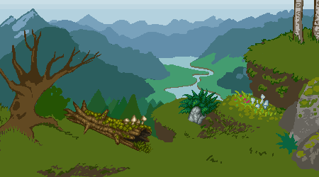 working on this backsplash pixel piece for my website. how is the composition looking to you guys? not sure if i'm gonna go with the mushroom/flower hill or the rock formation on the bottom right in the finished piece. |
|
|
|
|
Logged
|
|
|
|
|
SolarLune
|
|
« Reply #28457 on: November 03, 2014, 08:11:11 AM » |
|
It looks pretty natural as it is, to be honest. If you want to choose one or the other, I guess the rock is more visually interesting, but it also takes up more space in the piece overall, so perhaps the mushroom / flower hill would be better. Keep it up!
|
|
|
|
|
Logged
|
|
|
|
|
|
|
Cobralad
|
|
« Reply #28459 on: November 03, 2014, 09:59:07 AM » |
|
how is the composition looking to you guys? I think it would benefit from making objects not on the same line. Tree could be highter and log could be lower. |
|
|
|
|
Logged
|
|
|
|
|
 Developer
