|
b∀ kkusa
|
 |
« Reply #31000 on: March 20, 2016, 08:57:10 PM » |
|
that's some cool monster design  |
|
|
|
|
 Logged
|
|
|
|
|
Zencha
|
|
« Reply #31001 on: March 20, 2016, 10:28:47 PM » |
|
Spooky water cave bridge!  |
|
|
|
|
Logged
|
|
|
|
|
diegzumillo
|
|
« Reply #31002 on: March 21, 2016, 01:14:31 AM » |
|
Which cat you prefer?  I like the big one, but the smaller version will be easier to animate. |
|
|
|
|
Logged
|
|
|
|
|
Zorg
|
|
« Reply #31003 on: March 21, 2016, 01:15:47 AM » |
|
The big cat looks grumpy.
|
|
|
|
|
Logged
|
|
|
|
|
Ashedragon
|
|
« Reply #31004 on: March 21, 2016, 07:06:40 AM » |
|
Definitely the smaller one. The bigger one suffers from a lot more banding issues anyways, haha.
|
|
|
|
|
Logged
|
|
|
|
|
matriax
Guest
|
|
« Reply #31005 on: March 21, 2016, 09:07:54 AM » |
|
Remade with Big Resolution. Bigger Windows & Torchs. +1 item box added, + Esmerald item done. 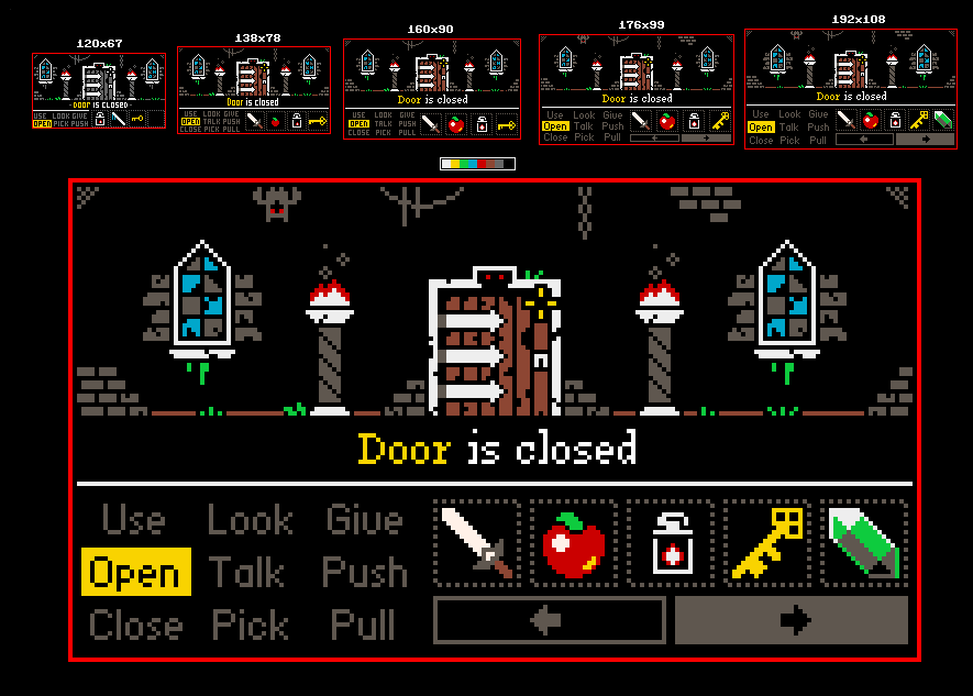 |
|
|
|
|
Logged
|
|
|
|
|
diegzumillo
|
|
« Reply #31006 on: March 21, 2016, 12:37:31 PM » |
|
The small cat won almost unanimously, I'm quite surprised. Except for a friend here. I asked him "which do you better see pushing an object off a table and watching it wreck something down there?" he said the bigger one wouldn't even look down after pushing it. I gotta say, that single vote for the big is pretty convincing.
What are banding issues, by the way?
|
|
|
|
|
Logged
|
|
|
|
|
sonder
Guest
|
|
« Reply #31007 on: March 21, 2016, 03:57:02 PM » |
|
Did it a long time ago for my pixelart website using demoscene logos as reference:  damn cool. i love demoscene stylings, when they're good. |
|
|
|
|
Logged
|
|
|
|
|
SolS
|
|
« Reply #31008 on: March 21, 2016, 05:26:35 PM » |
|
Go with the big cat! If you can find a way to use both in the game that would be cool, both look good.
|
|
|
|
|
Logged
|
|
|
|
|
Ashedragon
|
|
« Reply #31009 on: March 21, 2016, 08:29:38 PM » |
|
The small cat won almost unanimously, I'm quite surprised. Except for a friend here. I asked him "which do you better see pushing an object off a table and watching it wreck something down there?" he said the bigger one wouldn't even look down after pushing it. I gotta say, that single vote for the big is pretty convincing.
What are banding issues, by the way?
See this. |
|
|
|
|
Logged
|
|
|
|
|
diegzumillo
|
|
« Reply #31010 on: March 21, 2016, 10:16:54 PM » |
|
Thanks for the link! I struggle with pixel art and take anything I can find. But, to be honest, although I think I understand what he means by banding I don't see it in the examples he provides.
|
|
|
|
|
Logged
|
|
|
|
|
Zorg
|
|
« Reply #31011 on: March 21, 2016, 11:13:45 PM » |
|
The small cat won almost unanimously, I'm quite surprised. Except for a friend here. I asked him "which do you better see pushing an object off a table and watching it wreck something down there?" he said the bigger one wouldn't even look down after pushing it. I gotta say, that single vote for the big is pretty convincing.
What are banding issues, by the way?
See this. My antivirus software says this website contains: JS:Trojan.HideLink.A (Engine A), HTML.Riskware.HideLink.C (Engine B) |
|
|
|
|
Logged
|
|
|
|
|
b∀ kkusa
|
|
« Reply #31012 on: March 21, 2016, 11:24:28 PM » |
|
same here, trojan detected. Which cat you prefer? I like the big one, but the small one looks better because the smaller the less amateurism is noticed in the way you draw it. |
|
|
|
|
Logged
|
|
|
|
|
sonder
Guest
|
|
« Reply #31013 on: March 22, 2016, 05:35:49 AM » |
|
The small cat won almost unanimously, I'm quite surprised. Except for a friend here. I asked him "which do you better see pushing an object off a table and watching it wreck something down there?" he said the bigger one wouldn't even look down after pushing it. I gotta say, that single vote for the big is pretty convincing.
What are banding issues, by the way?
See this. Like I get the principle, but I couldn't see the things in the Spelunky art the article pointed out in that gif as flaws discernible by an average viewer. The extreme examples yes. But avoiding alignment of differently colored pixels to such an obsessive extent is limiting and unnecessary imo. |
|
|
|
|
Logged
|
|
|
|
|
Cobralad
|
|
« Reply #31014 on: March 22, 2016, 06:15:36 AM » |
|
haha i thought fool is in the forum but its some rando haha get out
|
|
|
|
|
Logged
|
|
|
|
|
CyangmouArt
|
|
« Reply #31015 on: March 22, 2016, 08:41:29 AM » |
|
Some old clientwork from 2014:  And something new for Tower 57:  |
|
|
|
|
Logged
|
|
|
|
|
sonder
Guest
|
|
« Reply #31016 on: March 22, 2016, 08:32:26 PM » |
|
serious take on a cute character.  |
|
|
|
|
Logged
|
|
|
|
|
Conker
Guest
|
|
« Reply #31017 on: March 22, 2016, 09:05:23 PM » |
|
 mock up |
|
|
|
|
Logged
|
|
|
|
|
aamatniekss
|
|
« Reply #31018 on: March 23, 2016, 01:53:17 AM » |
|
Self portrait 5 colours  |
|
|
|
|
Logged
|
|
|
|
|
Jad
|
|
« Reply #31019 on: March 23, 2016, 02:30:24 AM » |
|
 Some animation test. It feels like I've missed one hitstop frame somewhere, but I have no idea how to fix it. Maybe someone can point out what is off here. i did edits! it plays twice, once it stops on the frames I added that I think are crucial. if you don't show her bracing for attack there's not telling where the energy comes from, so it kind of looks like she's being carried by a wind and not her own muscles and whatnot.  her hand is much larger than it should be, because it's an educational edit and not an finalizing attempt! xoxoo |
|
|
|
|
Logged
|
|
|
|
|
 Developer
