|
nicked
|
 |
« Reply #31200 on: May 17, 2016, 12:50:19 PM » |
|
Probably my best tileset work to date: 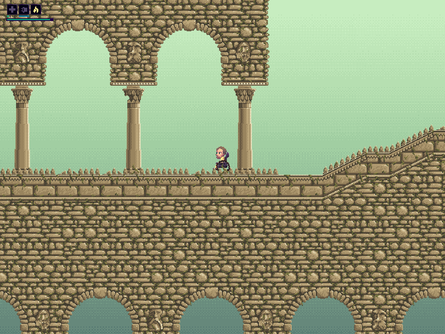 Also recent: 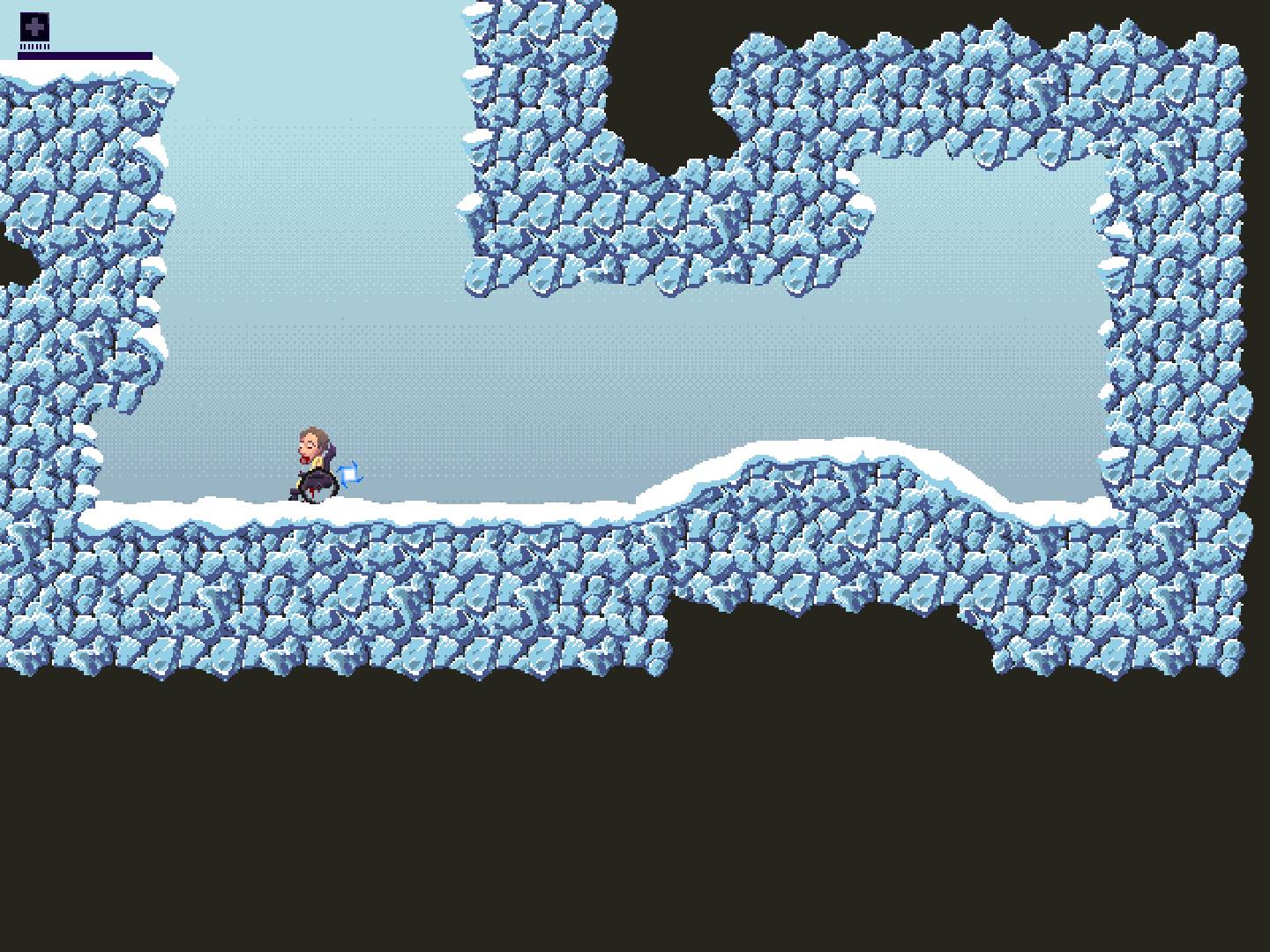 |
|
|
|
|
 Logged
|
|
|
|
|
|
|
|
|
maruki
|
|
« Reply #31203 on: May 17, 2016, 05:54:27 PM » |
|
That rowlet is the earnest I've seen so far
|
|
|
|
|
Logged
|
|
|
|
|
gimymblert
|
|
« Reply #31204 on: May 17, 2016, 08:53:43 PM » |
|
Here's another week's worth of pixel fonts  Again, my Twitter link is in my signature if you wanna follow along each day. I'd LOVE to hear your thoughts, critiques or otherwise  well I paged it, so here it is, it's good work I overshadowed  |
|
|
|
|
Logged
|
|
|
|
|
SolarLune
|
|
« Reply #31205 on: May 18, 2016, 09:02:17 AM » |
|
Those are really nice, chris. Making fonts can be kinda calming, right? Like, you know how they look, you know what you're going for, and with such a low resolution, it's pretty easy to get the right outcome (it's easy to nudge it in the direction you're looking for). Nice work! Here's a gate for Gearend that's already outdated as I've updated it. :|  Someone pointed out on Twitter that the specular highlights should fall when it goes in, not rise; that's probably true - I dunno, haha. EDIT: @eliasfrost - Nice dancing guy. @Conker - I like how simple and colorful everything looks. Nice work! I think the buildings in the background could fade out more towards the sky color, but it's solid work, nonetheless! @Sentionaut - Nice character. Looks pretty slick. I think I'd watch out for those "dots" where the lighting from his back appears - having "stubbly" lighting can look kinda messy. @nicked - Nice tiles. I especially like the ice; the rocks seem kinda messy (noisy), though. The faces are a nice touch, but it's hard to notice them alongside the tiled rocks. You could place them in a fitting, or a square or something, to help them to stand out. You could also darken the other tiles (or the faces). @inca - Sweet, clean art. Nice animation on the Rowlet, yeah. |
|
|
|
« Last Edit: May 18, 2016, 09:53:00 AM by SolarLune »
|
Logged
|
|
|
|
|
snarlydawg
|
|
« Reply #31206 on: May 18, 2016, 05:36:05 PM » |
|
|
|
|
|
|
Logged
|
|
|
|
|
chriswearly
|
|
« Reply #31207 on: May 19, 2016, 03:21:25 AM » |
|
Those are really nice, chris. Making fonts can be kinda calming, right? Like, you know how they look, you know what you're going for, and with such a low resolution, it's pretty easy to get the right outcome (it's easy to nudge it in the direction you're looking for). Nice work!
Thanks! I guess it can be calming. The way I look at it, is I'm good at it, and I love doing it. Win-win. It's fairly straight-forward, just making the same 26-80+ characters in a different style. I don't always know how they look. Some nights I choose to do a study, so yeah I have the letters right in front of me. Other times I'm doing it by scratch, which can be more difficult- but of course there are plenty of short-cutting techniques to get the rough draft of the font done (make the O, now you have C, G and Q. P to R. I to H, J and T. A to V and W, etc.) Pixel Fonts being in their very nature low-res actually has its problems. Often you can't get the lines/curves you desire perfectly. And depending on which restrictions you impose on each font, some sacrifices have to be made for consistency across the font as a whole. Every now and then, though, you get one that just looks great overall, and specifically each letter (I cite the Gothic one as one of the few from recent memory, however there are some things that still need tweaking, like the a and s). Thanks again Feel free to follow along on Twitter. Else, feel free to ask questions here if you have any. |
|
|
|
|
Logged
|
|
|
|
|
JobLeonard
|
|
« Reply #31208 on: May 19, 2016, 08:20:21 AM » |
|
snarlydawg, guess what immediately started playing in my head when I saw that gif:
|
|
|
|
|
Logged
|
|
|
|
|
SolS
|
|
« Reply #31209 on: May 19, 2016, 06:07:08 PM » |
|
Made a thing just for fun.  |
|
|
|
|
Logged
|
|
|
|
|
SolarLune
|
|
« Reply #31210 on: May 19, 2016, 09:06:57 PM » |
|
I feel like it's simply too bright, but I really do like the aesthetic nonetheless.
|
|
|
|
|
Logged
|
|
|
|
|
SolS
|
|
« Reply #31211 on: May 19, 2016, 10:21:19 PM » |
|
Thanks guys! Saw a video of someone playing Super Mario Bros. Special and was inspired to try and do something with the off colors and feel of that game.
|
|
|
|
|
Logged
|
|
|
|
|
sonder
Guest
|
|
« Reply #31212 on: May 20, 2016, 08:05:36 AM » |
|
Thanks guys! Saw a video of someone playing Super Mario Bros. Special and was inspired to try and do something with the off colors and feel of that game.
This is a wicked break from your usual ultra-dark aesthetic, dawg. I wanna play dat mockup. It's definitely "special"! |
|
|
|
|
Logged
|
|
|
|
|
SolS
|
|
« Reply #31213 on: May 20, 2016, 11:56:12 PM » |
|
Thanks KF. Not sure if or when I'll make it. In the meantime I'll just mess around and experiment with different things within the thing.  |
|
|
|
|
Logged
|
|
|
|
|
|
|
Ashedragon
|
|
« Reply #31215 on: May 21, 2016, 09:32:47 PM » |
|
Still trying to get better at pixel art while also trying to nail down the art style for my game, so this is a thing...  Considering scrapping his outfit altogether and trying something else. I think it makes him look a bit too poofy. |
|
|
|
|
Logged
|
|
|
|
|
GrumpyGiant
|
|
« Reply #31216 on: May 21, 2016, 11:45:52 PM » |
|
 Sent this little guy off adventuring today. I'm slowly trying to move from coder-art to not-quite-as-coder-art. I've found having some pre-made palettes like Arne16 here is helping a lot. I guess sometimes restrictions really do help with forcing creativity? |
|
|
|
|
Logged
|
|
|
|
|
woodsmoke
|
|
« Reply #31217 on: May 22, 2016, 01:01:45 AM » |
|
Im working on Mariovania like game with my brother. Im animating water first time and im really dont know what Im doing right and what Im doing wrong.. I would love to hear some criticism.. It looks busy right now because I was plan to add small waterfall..  Looks kind of like the water is boiling. Maybe try some wave movement. |
|
|
|
|
Logged
|
|
|
|
|
sonder
Guest
|
|
« Reply #31218 on: May 22, 2016, 11:19:42 AM » |
|
Still trying to get better at pixel art while also trying to nail down the art style for my game, so this is a thing... Considering scrapping his outfit altogether and trying something else. I think it makes him look a bit too poofy. yeah but personally i think it's not a bad thing, he's already a big guy it'd have to be skin tight to cut down on that |
|
|
|
|
Logged
|
|
|
|
|
GrumpyGiant
|
|
« Reply #31219 on: May 22, 2016, 11:45:27 AM » |
|
Still trying to get better at pixel art while also trying to nail down the art style for my game, so this is a thing... Considering scrapping his outfit altogether and trying something else. I think it makes him look a bit too poofy. You might find it looks better if you don't tuck it in at the belt, and also let his sleeves flap around more. The poofy look comes from trying to force the cloth to follow the same shape as the underlying person. |
|
|
|
|
Logged
|
|
|
|
|
 Developer
