|
Shoot-em-upper
Guest
|
 |
« Reply #380 on: April 03, 2008, 08:31:45 PM » |
|
One of my earliest sprites(pretty much everything that I did back then was monochrome):  I actually made almost 20 of these things - but they were accidentally saved as JPEGs.  I'm reconstructing them whenever I both have the time and remember to. A much more recent monochrome sprite that I made to retain my skills. It's in a different style, and I'm not sure if I like it as much as my older work. I still like it, though:  Here's a ship that somewhat inspired it(done in about 5 minutes at my piano teacher's house):  My first colored sprite! Note the weird cel-shaded effect that wouldn't reappear until Bouncin' Walrus of Magic(which, sadly, never made it past the graphics stage):  Speaking of which:  Here's one of my favorites(note my heavy use of dithering):  Recolored, as part of a joke(I actually like this version a lot more):  More dithering(all of these curves and shadows gave it a 90s look to me):  A vertical ship, in the same style:  An incredibly low-res ship that isn't detailed enough for an 8-bit look and has too much color for a 4-bit look:  I did this with doublewide pixels for the fun of it:  I tried to make a sprite with no pixels joined in both the x- and y-axes. This was the (ugly)result:  Two monochrome character sprites that I'll eventually get around to coloring(I started on the space trooper, but never got past his visor):   Wow, that's a lot. |
|
|
|
« Last Edit: April 03, 2008, 08:40:22 PM by Metroidvaniac »
|
 Logged
|
|
|
|
|
Jolli
Guest
|
|
« Reply #381 on: April 03, 2008, 09:12:00 PM » |
|
the wide pixel one looks purty  |
|
|
|
|
Logged
|
|
|
|
Alex May
...is probably drunk right now.
Level 10

hen hao wan


|
|
« Reply #382 on: April 03, 2008, 10:51:35 PM » |
|
Nice sprites. The dithering is somewhat lost due to the similarity of the colours you've dithered though - if you use more contrasted colours the effect will be more pronounced. As it is you might as well be using a gradient.
|
|
|
|
|
Logged
|
|
|
|
|
Shoot-em-upper
Guest
|
|
« Reply #383 on: April 04, 2008, 08:51:23 AM » |
|
the wide pixel one looks purty Thanks. I haven't done any more like that, but I probably will in the future. Nice sprites. The dithering is somewhat lost due to the similarity of the colours you've dithered though - if you use more contrasted colours the effect will be more pronounced. As it is you might as well be using a gradient.
Actually, I was trying to give the effect of a gradient. It worked pretty well, apparently. |
|
|
|
|
Logged
|
|
|
|
|
Corpus
Guest
|
|
« Reply #384 on: April 04, 2008, 03:41:52 PM » |
|
Here's my first try at a walking animation, freshly baked tonight. It's for Infinite Afro.  If you think I need to post x2 zoom, you're not trying hard enough. |
|
|
|
|
Logged
|
|
|
|
|
Zaphos
Guest
|
|
« Reply #385 on: April 04, 2008, 04:10:33 PM » |
|
If you think I need to post x2 zoom, you're not trying hard enough.
What does that even mean? |
|
|
|
|
Logged
|
|
|
|
|
Corpus
Guest
|
|
« Reply #386 on: April 04, 2008, 04:53:11 PM » |
|
What doesn't it mean?
EDIT:
For the sake of not being a dick, I will enlighten you. The image is quite small, and may be slightly difficult to actually see. I couldn't be bothered to make a version of it which was twice as large, so made an unfunny semi-joke.
|
|
|
|
« Last Edit: April 04, 2008, 04:54:55 PM by Corpus »
|
Logged
|
|
|
|
|
darthlupi
|
|
« Reply #387 on: April 04, 2008, 07:38:14 PM » |
|
Some of the foot soldiers of the Moot Brigade. On their own they can be a pest, but in a large group they be a lot of fun to carve up: The Moot Coward - Biggest threat is accidentally impaling itself when it gets scared:  The Moot Spear Man - If they make contact with with an enemy with will throw their spear, and the run like little nancy girls.  Armored Moot - When a Moot makes it to a point in his/her carrier where they have actually defeated an enemy, they are given their armor. With this armor they tend to be tougher, and they have a tendency to not run away so much. Oh, and a spear gun helps keep them motivated too.  Fak Argle - Prince of the Argle Clan, and leader of the Moot Brigade. Vicious combatant, and fearless leader. Sadly, he is somewhat lacking the area of gray matter.  Pesto - Chief advisor to the deceased King of the Argle. Skilled in the dagger, he prefers to strike from safety or have someone else do the striking.  Some of the concept art that inspired the dudes. http://darthlupi.com/images/concept_art/pesto.pnghttp://darthlupi.com/images/concept_art/faks.PNG |
|
|
|
|
Logged
|
|
|
|
|
ichi
|
|
« Reply #388 on: April 04, 2008, 11:13:27 PM » |
|
Those are alot of fun darthlupi  I dig the style, it reminds me a little of my own game! |
|
|
|
|
Logged
|
|
|
|
|
DIT
|
|
« Reply #389 on: April 05, 2008, 02:17:29 AM » |
|
@ darthlupi Those little guys are awesome. The armored one loses a little his "family feeling" though. I think it is because we cant see the distinguishing siluouhette of the other Moots heads. It looks smaller also, but parhaps it is just me...  @Corpus My eyes are bleeding (At 1600x1200 it's small, a lot), but i think your walk cycle is fine, and afro too. No, really, I mean it has the right flow in the animation to feel almost rithmic Good Job. |
|
|
|
|
Logged
|
|
|
|
|
difficultman
|
|
« Reply #390 on: April 05, 2008, 05:24:26 AM » |
|
 By difficultmanIntermission graphic for a short Contra-like that I want to do. |
|
|
|
|
Logged
|
|
|
|
|
darthlupi
|
|
« Reply #391 on: April 05, 2008, 07:38:57 PM » |
|
DIT - Don't know why I missed that completely. It's strange how you get too deep into something and miss the obvious. I did some retouching. Thanks!
difficultman - I really dig the detail in that low color work you have going on there.
|
|
|
|
|
Logged
|
|
|
|
|
DIT
|
|
« Reply #392 on: April 06, 2008, 02:14:00 PM » |
|
@ darth You're welcome! The same thing happens to me all the time. :D Now I am curious to see the new armored Moot @difficult I like the high contrast you used in your image, very powerful I would change the eyebrows thoug. Those small dots are not in line with the rest of your style. You used big flat color areas with hight constrast here, those small details look like drawn in a different style. |
|
|
|
|
Logged
|
|
|
|
|
difficultman
|
|
« Reply #393 on: April 06, 2008, 06:36:43 PM » |
|
Yeah I see what you mean. I originally had it in b&w and I haven't really thought to change that. He's intentionally ment to look scared shitless as the aim of the game is a brutal portrayal of war in an unrealistic NES-like format.
|
|
|
|
|
Logged
|
|
|
|
|
|
|
Melly
|
|
« Reply #395 on: April 09, 2008, 01:25:40 PM » |
|
Been working on this for I dunno 4 days? 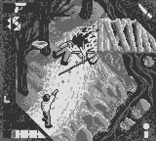 Points to who figure out what that is. X-tra points for the master pixelers out there who are willing to give me crude hard feedback. I pretty much kept trying to make stuff work while going blindly at it, but I'm fairly proud of what I accomplished. Yes, I'm aware that the fork is too damn huge.  I'll fix it eventually. Or keep it like that, to make it more menacing. o.o I'll fix it eventually. Or keep it like that, to make it more menacing. o.oEDIT: Fixed the fork. |
|
|
|
« Last Edit: April 09, 2008, 04:02:59 PM by Melly »
|
Logged
|
|
|
|
|
Xion
|
|
« Reply #396 on: April 09, 2008, 04:17:29 PM » |
|
Very nice, melly, but, for a critique, the hud blends in too much with the play area. Maybe some hilights or something to define its edges?
|
|
|
|
|
Logged
|
|
|
|
|
Melly
|
|
« Reply #397 on: April 09, 2008, 04:47:19 PM » |
|
I can see what you mean. It's hard to make a hud that would look unblended no matter what's on screen with only 4 colors, but I'll experiment.
|
|
|
|
|
Logged
|
|
|
|
|
Chris Whitman
|
|
« Reply #398 on: April 09, 2008, 05:12:20 PM » |
|
Maybe try a light outline then an additional dark outline? I recall reading some colour perception literature about something like that to introduce the appearance of additional colours.
|
|
|
|
|
Logged
|
Formerly "I Like Cake."
|
|
|
Golds
Loves Juno
Level 10

Juno sucks
|
|
« Reply #399 on: April 09, 2008, 05:18:12 PM » |
|
I like it but in general I think more contrast between tones would help the scene appear less muddy.  ? ? |
|
|
|
« Last Edit: April 09, 2008, 05:22:27 PM by Golds »
|
Logged
|
|
|
|
|
 Developer
