|
squidkid
|
 |
« Reply #6460 on: October 08, 2009, 06:44:34 PM » |
|
One more problem: Arms are too short. Imagine them all stretched out. They should be at the thighs, at least, but yours aren't close to that at all.
In the running animation or the id le one? I made his shirt a little long. Is that it? Running (couldn't resist the edit :D ) I was totally talking about the Japanese AV idol. Isn't he sexy? lol |
|
|
|
|
 Logged
|
Enough talk, have at you!
|
|
|
|
Sean A.
|
|
« Reply #6461 on: October 08, 2009, 07:14:54 PM » |
|
Hey guys, I was just working on a robber sprite and I can seem to get outlines down nicely (I think  ) but I seem to have trouble giving it some nice shading and depth to stop it from looking so flat. Here's the sprite that I have now, and I'm just looking for some helpful tips. Also note I haven't finished shading it myself but before I go on I would like some advice.  |
|
|
|
|
Logged
|
|
|
|
|
Xion
|
|
« Reply #6462 on: October 08, 2009, 11:24:13 PM » |
|
you gotta designate a lightsource, man. Like, put a circle or something above him somewhere just to indicate where the light is coming from, and then imagine that light spewing rays, and where those rays do not hit is where you put shadows. Don't be a-scared to have shadows that take up more than the little bit of space next to the outline, too. Maybe his entire lower legs are in shadow. Maybe a large majority of the bag is in shadow as well. But you won't know until you figure out where the lights coming from in the first place, yeah? Also you're using a bunch of colors that don't really make much of a difference. It'd be easier on yourself if you cut the colors down to maybe 2 or 3 shades max for each color, so's you wouldn't have to deal with alla dem shades and stuff. But don't just go straight up and down the value slider when you're making variations on a color, move it through the hues as well. Like make it get kind of bluish or purplish towards the shadows and more yellowy in the light, y' dig? Even just a slight change can make for a more interesting picture. anyway, I made a quick edit. Maybe it'll help.  |
|
|
|
|
Logged
|
|
|
|
|
Delicious
|
|
« Reply #6463 on: October 09, 2009, 06:28:46 AM » |
|
I like the font you used to resemble the light source. Good edit. |
|
|
|
|
Logged
|
Blah Blah Blah <3
Twitter - Zjdelicious
|
|
|
|
letsap
|
|
« Reply #6464 on: October 09, 2009, 01:46:12 PM » |
|
I tried to do something not-human for a the first time.   I mostly want to know how does the top part look and if there is some noticable flaws. Quoting because this is really cool. The top part's shading isn't as gradual and soft as the sides, but it blends well all the same. The only thing that looks off is the spikey edge bits. |
|
|
|
|
Logged
|
|
|
|
|
Sean A.
|
|
« Reply #6465 on: October 09, 2009, 02:48:52 PM » |
|
Thanks for the tips, I'll try and work on an edit myself. Also I did only use 3 shades (but I didn't use them well).
|
|
|
|
|
Logged
|
|
|
|
|
Xion
|
|
« Reply #6466 on: October 09, 2009, 02:51:27 PM » |
|
whoops, my bad.  |
|
|
|
|
Logged
|
|
|
|
|
Sean A.
|
|
« Reply #6467 on: October 09, 2009, 03:34:52 PM » |
|
Thanks cool, anyway I edited mine based on what you told me and applied it to my original outline (just test it out) and came up with this:  |
|
|
|
|
Logged
|
|
|
|
|
squidkid
|
|
« Reply #6468 on: October 09, 2009, 06:48:07 PM » |
|
One more problem: Arms are too short. Imagine them all stretched out. They should be at the thighs, at least, but yours aren't close to that at all.
 I haven't done the arms yet but, is that about where the hands should be? Thanks, I think this looks a lot better. I sure do learn a lot by posting my stuff here. |
|
|
|
« Last Edit: October 09, 2009, 06:52:45 PM by squidkid »
|
Logged
|
Enough talk, have at you!
|
|
|
|
Inanimate
|
|
« Reply #6469 on: October 09, 2009, 06:58:21 PM » |
|
Yeah, looks a lot better! Great job, and I like the simplistic lines you got going.  |
|
|
|
|
Logged
|
|
|
|
|
squidkid
|
|
« Reply #6470 on: October 09, 2009, 07:07:46 PM » |
|
Yeah, looks a lot better! Great job, and I like the simplistic lines you got going.  The arms don't take away from that, do they?... or should I more square them off? |
|
|
|
|
Logged
|
Enough talk, have at you!
|
|
|
|
Inanimate
|
|
« Reply #6471 on: October 09, 2009, 07:17:47 PM » |
|
You did the arms perfectly. Bit thick compared to the legs, though.
|
|
|
|
|
Logged
|
|
|
|
|
JaJitsu
|
|
« Reply #6472 on: October 09, 2009, 10:23:42 PM » |
|
squid kid that is looking so much better!
I think the arms dont look thick because its long sleeve and not just skin.
|
|
|
|
|
Logged
|
|
|
|
|
Kramlack
Guest
|
|
« Reply #6473 on: October 09, 2009, 11:47:43 PM » |
|
Some NPC's I've been working on with my friend Alejo and Pietepiet for a project.  |
|
|
|
« Last Edit: October 10, 2009, 05:02:32 AM by Kramlack »
|
Logged
|
|
|
|
|
Pietepiet
|
|
« Reply #6474 on: October 10, 2009, 02:27:00 AM » |
|
Great edits of the ones I did, dude  Love the grey girl especially |
|
|
|
|
Logged
|
|
|
|
Robotwo
Level 2

I'm a complicated being after all

|
|
« Reply #6475 on: October 10, 2009, 05:07:44 AM » |
|
needs more Pokémen |
|
|
|
|
Logged
|
What we are is simply a stepping stone to what we can become
|
|
|
|
Kramlack
Guest
|
|
« Reply #6476 on: October 11, 2009, 12:14:28 AM » |
|
LIM TANGDELL draws near! Three colours plus transparency on a black background. May edit it a bit more later on.
|
|
|
|
|
Logged
|
|
|
|
|
Lifesnoozer
|
|
« Reply #6477 on: October 11, 2009, 04:47:46 AM » |
|
Oh god save us! I hate crashes, and forgetting CTRL+S when animating. >_> Lucky it wasn't a big animation. But it also means I can't show you the animation. So I'll just show you some tiles instead. 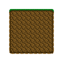 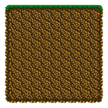 Not sure about the grass tiles, they need some work. |
|
|
|
|
Logged
|
|
|
|
|
Ego_Shiner
|
|
« Reply #6478 on: October 11, 2009, 06:57:58 AM » |
|
|
|
|
|
|
Logged
|
Lo
|
|
|
|
pixeltao
|
|
« Reply #6479 on: October 11, 2009, 11:36:16 AM » |
|
Oh god save us! I hate crashes, and forgetting CTRL+S when animating. >_> Lucky it wasn't a big animation. But it also means I can't show you the animation. So I'll just show you some tiles instead. Not sure about the grass tiles, they need some work. Your grass/rock tiles reminds me a bit of those of Blaster Master. You should take a look a it:
http://www.hardcoregaming101.net/blastermaster/blastermaster.htmRight now your tiles look very soft and uniform (which can be fine depending on the style you want to get), but if you want to make them look stronger, you could try using less shades of brown/green and change the hue of your shadows just a bit (make them more bluish for example). EDIT: Changed the link. |
|
|
|
« Last Edit: October 11, 2009, 12:36:33 PM by pixeltao »
|
Logged
|
|
|
|
|
 Developer
