|
Raku
|
 |
« Reply #160 on: May 02, 2011, 07:30:32 PM » |
|
you do realise you're all playing a month old version of the demo, correct?
I've been working on the engine as well as the graphics, etc.
Progress has been going slowly because of these fixes I've been doing to it, but I believe a new demo will come out very soon.
|
|
|
|
« Last Edit: May 03, 2011, 01:13:56 AM by Rakugaki-Otoko »
|
 Logged
|
|
|
|
|
mokesmoe
|
|
« Reply #161 on: May 02, 2011, 10:52:20 PM » |
|
I assumed you would say so if you had already done or tried things we are suggesting.
P.S. Use square brackets for BBcode. [ i ]blah[ /i ] blah
|
|
|
|
|
Logged
|
|
|
|
|
Raku
|
|
« Reply #162 on: May 03, 2011, 02:23:39 AM » |
|
(oops, fixed) I usually remember to say if I've tried suggestions, but sometimes it slips my mind.  |
|
|
|
|
Logged
|
|
|
|
|
gimymblert
|
|
« Reply #163 on: May 05, 2011, 07:38:02 AM » |
|
Other simple solution have a separate collision mask for hit and ground collision.
|
|
|
|
|
Logged
|
|
|
|
|
Raku
|
|
« Reply #164 on: May 06, 2011, 07:08:17 PM » |
|
Oh! interesting idea. How would I do such a thing in Gamemaker? From what I can tell, you can only assign one mask to an object.
|
|
|
|
|
Logged
|
|
|
|
|
mokesmoe
|
|
« Reply #165 on: May 06, 2011, 08:52:29 PM » |
|
You would have to have a second object follow the players coordinates to have a second hitbox.
You could make the mask an upsidedown T shape but that would be silly.
|
|
|
|
|
Logged
|
|
|
|
|
Raku
|
|
« Reply #166 on: May 14, 2011, 01:49:17 AM » |
|
Ah- Sorry, I haven't said anything in a while. I've been busy with things, and not much time for working on the game. Nevertheless, I've set aside some time each day to do stuff in the game, so I'm still making progress. A big problem of mine is than when I have to start making a boss or miniboss, I dread the starting of the programming and I procrastinate for as long as I can. Recently, I made a small miniboss before Boss #5, which took me a while. Now I have to start making boss #5 itself. In my procrastination of that, though, I did make several new stages with unique environments and elements. So, some good has come out of it. 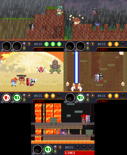 I'll try to be more active in my updates again. sorry. |
|
|
|
« Last Edit: May 15, 2011, 02:18:11 AM by Rakugaki-Otoko »
|
Logged
|
|
|
|
Ichigo Jam
Level 1


|
|
« Reply #167 on: May 14, 2011, 04:54:03 AM » |
|
I think you should go a bit higher contrast on your background tiles; some of them look kind of washed out to me. I did a quick edit on one of your screenshots (only changing the colours) - I hope you don't mind!  Anyway, keep up the good work  |
|
|
|
|
Logged
|
|
|
|
|
Raku
|
|
« Reply #168 on: May 14, 2011, 02:57:03 PM » |
|
Sorry, without the context of that screenshot, I can understand how you might think that.
The laser being fired actually makes the background much darker when it's active. Normally the background looks fine.
|
|
|
|
|
Logged
|
|
|
|
Ichigo Jam
Level 1
|
|
« Reply #169 on: May 15, 2011, 02:23:01 AM » |
|
Oh, that's good then! But I think the same criticism applies (to a lesser extent) to your sunset rock tiles (i.e. this ones in this post) The clouds in the background have much higher contrast than the rocky tiles and platforms in the foreground. That makes the foreground layer look a little bit flat and dull (to me, at least.) This is more obvious if you reduce the image to grey-scale in photoshop/gimp - which I think is a handy technique in general for checking readability of graphics. I'm sorry to keep criticising - I just think your (already well drawn) graphics could be made even nicer with just some small tweaks. |
|
|
|
|
Logged
|
|
|
|
|
Raku
|
|
« Reply #170 on: May 17, 2011, 12:05:07 AM » |
|
No, don't worry about it. Criticism is a good thing and it helps me understand if I'm doing something incorrectly. 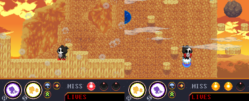 Is this better? I don't have Photoshop or Gimp, but gamemaker allows you to change images to grayscale. |
|
|
|
|
Logged
|
|
|
|
|
AndrewFM
|
|
« Reply #171 on: May 17, 2011, 08:52:32 PM » |
|
Man, I always love your updates. For me, your style has a latent nostalgia in it, that makes me feel great every time I see screenshots of new areas and enemies. How would I do such a thing in Gamemaker? From what I can tell, you can only assign one mask to an object. You could use the collision_rectangle() function. It lets you check for collisions with a certain object in a certain rectangular area. You can use it to simulate another bounding box. |
|
|
|
|
Logged
|
|
|
|
Ichigo Jam
Level 1
|
|
« Reply #172 on: May 18, 2011, 05:09:02 AM » |
|
No, don't worry about it. Criticism is a good thing and it helps me understand if I'm doing something incorrectly.
Is this better?
Yes, I think that's an improvement. I'd take it further though:  I raised contrast in the foreground (including the boulder sprite), and lowered it in the background. (Including making the shadows darker, and using some of the darker colours on the standable scenery.) I may have lost a bit much saturation for your taste, but I hope it's of some use to you. I don't have Photoshop or Gimp, but gamemaker allows you to change images to grayscale.
You know Gimp is free, right? Here's an example of how it looks greyscale (animating):  Hopefully the foreground elements 'pop' a little better in my edit |
|
|
|
|
Logged
|
|
|
|
|
Raku
|
|
« Reply #173 on: May 19, 2011, 07:20:39 AM » |
|
You know Gimp is free, right?
No, I didn't know that. I don't know if I'm comfortable bringing the contrast any higher. I liked the colors how they were the first time, and I never had any trouble differentiating between the foreground and background. Another thing I feel I should add is that that kind of less detailed rock you see in the pictures is in the distance and moves slower than the foreground. Although... that could use some color tweaking to show that it's in the distance at least. I'm in a bit of a rush right now, so I'll try to remember to take a screenshot of the edited version later. |
|
|
|
|
Logged
|
|
|
|
|
Nitromatic
Guest
|
|
« Reply #174 on: May 19, 2011, 09:06:53 AM » |
|
Dang, I've forgotten to check this project out! Quite suprised how far you are now with. Definitely one of the best indie platformers of 2011 to be!  |
|
|
|
|
Logged
|
|
|
|
Ichigo Jam
Level 1
|
|
« Reply #175 on: May 19, 2011, 11:42:14 AM » |
|
I don't know if I'm comfortable bringing the contrast any higher. I liked the colors how they were the first time, and I never had any trouble differentiating between the foreground and background.
Well, if you're happy with it then that's fine, really. It comes down to personal taste in the end, after all. Oh, and I didn't have a problem with actually seeing what was happening; my complaints were aesthetic, not functional. |
|
|
|
|
Logged
|
|
|
|
|
Raku
|
|
« Reply #176 on: May 19, 2011, 10:51:25 PM » |
|
Oh, and I didn't have a problem with actually seeing what was happening; my complaints were aesthetic, not functional. Oh, I see. Sorry, I assume no one's been really playing the demo. And, thank you very much, Blossom |
|
|
|
|
Logged
|
|
|
|
|
adamprack
|
|
« Reply #177 on: May 20, 2011, 09:06:56 PM » |
|
It's a fun game--I've had fun playing with the demo. Maybe I'm missing something, but is there a way to resize the window or go fullscreen? I understand that that's the native resolution, but it's quite hard to see and I couldn't find any reasonable way to make the screen area bigger.
|
|
|
|
|
Logged
|
|
|
|
|
moshboy
|
|
« Reply #178 on: May 21, 2011, 03:39:37 AM » |
|
I haven't had time to play the demo yet, however I watched the youtube vid and it really reminds me of a few arcade games I used to play (I think Willow comes to mind) so I'm digging the general retro style of this a bunch. Definitely one to look out for. Hope you stay motivated enough to keep going.
|
|
|
|
|
Logged
|
|
|
|
|
Raku
|
|
« Reply #179 on: May 21, 2011, 04:11:50 AM » |
|
Thank you very much, I appreciate the support. I will never stop being motivated to work on this game, and I doubt there is anything that could make me ever want to quit before finishing it entirely. It's a fun game--I've had fun playing with the demo. Maybe I'm missing something, but is there a way to resize the window or go fullscreen? I understand that that's the native resolution, but it's quite hard to see and I couldn't find any reasonable way to make the screen area bigger.
Pressing F4 at any time will toggle fullscreen. |
|
|
|
|
Logged
|
|
|
|
|
 Community
