|
Raku
|
 |
« Reply #480 on: April 08, 2013, 03:14:09 AM » |
|
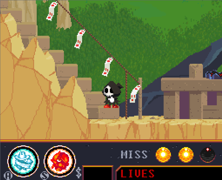 Current screenshot showing how Im starting to flesh out the level. now for replying: @ Zimonak, I see that a few of the things you mentioned are due to the downloadable demo being severely outdated. I think the last time I updated that was last year, mostly because people weren't really giving a lot of feedback when I did. I'll have to put out a current demo sometime soon, so everyone can see all the improvements that have been made. The first tree level doesn't break anymore if you get rid of the soul, and I believe I did spell "foliage" correctly on the map, I just checked. perhaps you misread it at first? Can you explain more about this "star-like thing" that got stuck in a wall? I'm not sure what that's about. The big enemy in that stage you're referring to is only a miniboss. Big bosses get their own stage to themselves. Thank you for your feedback and support. @ Jad, Can you explain what you mean? The sprites and foreground images in this game are meant to look simple and innocent (until later in the game), whereas the backgrounds are deliberately detailed and more realistic than the sprites. How are they not popping? Have you tried playing the demo? I'm sure seeing the game in motion is different from looking at the screenshots. I do appreciate the feedback, though, and I'll continue to improve the game. Also thank you for the compliment, I'm glad. |
|
|
|
|
 Logged
|
|
|
|
|
Jad
|
|
« Reply #481 on: April 08, 2013, 04:56:04 AM » |
|
I drew on top of some screenshots, note that I used fuzzy bullshit brushes in photoshop to prove a point about distribution of color in a given screenshot - I'm in no way implying this game would benefit from using fuzzy gradienty colors or the hues that you get when you paint on top of an image with an overlay brush x __ x 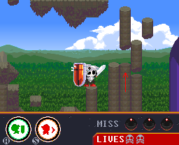 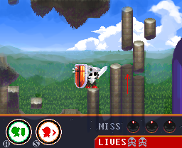 here's a little before-after comparison where I just put more blue into the ground below to give it more atmosphere (literally). I also defined the hell out of those pillars. More tiles would be needed to accomplish this kind of thing in-game, I'm aware. The tweak I produced is severely lacking in light saturated colors, but it's more readable (?).  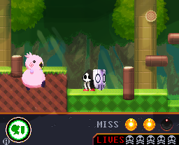 same thing here, I just bumped up the brightness on everything you can walk on, made the background a bit darker (lighting=atmosphere?) etc etc I know I made it look like kirby 64 or some shitty 3D prerendered stuff but that's not the point - the rendering method is obviously not correct (photoshop fuzzybrush) but the color values produced and their placement at least manages to help further my point. I did play the game (not too far though, I'm at work and shouldn't be doing this at all, really!) and somewhere along the way I started wondering if everything is just part of one grand plan to make the game like one of those quality kusoge games of the 90s (like pulirula etc) with its mix of styles and varied rendering - it feels remarkably like an older game. I wonder how much of the aesthetic disconnect is intentional - is it intentional that the title graphic you have on the front page looks so much better than the in-game art? (the reason for that is high resolution and outlines, btw, keeping everything wonderfully volumetric and crisp and allowing you to use colors more iconically and less as a tool to create definition) some things that create the aesthetic I'm criticizing: the bg elements and foreground and everything don't seem to have their colors matched against each other - everything is rendered very separately (I guess this is how the workflow also is) things have their own shadow 'color' - when they start coexisting in a tiled bg image they don't look like parts of the same world, they create a disconnect, like they're less of an emulation of a space within the video game and more just self-awarely a set piece (intentional?) the fact that this looks like a collage of nostalgically potent things rather than a self-contained look makes me wonder if this aesthetic is more thought through than I realize. So there you have it anyway, take a look at my images and see if I have any point at all or if I'm just ruining your vision of your game good day! <3 |
|
|
|
|
Logged
|
|
|
|
|
Jad
|
|
« Reply #482 on: April 08, 2013, 05:31:24 AM » |
|
the thing is I know you know how to shade stuff - the intro is fantastic on every level
|
|
|
|
|
Logged
|
|
|
|
|
Raku
|
|
« Reply #483 on: April 09, 2013, 12:23:59 AM » |
|
Oh my... this is all starting to make sense now. From the look of it, you're using screenshots (and possibly playing) from a very outdated version of the game. I can tell immediately because the atmospheric effect isn't present in the distant background in the first screenshot, and the ability icons are the old placeholder ones. Those screens don't even have the money slot on the HUD! Here, I've gone to those two places in my current version to show you that several of these problems you're listing have already been fixed months ago: 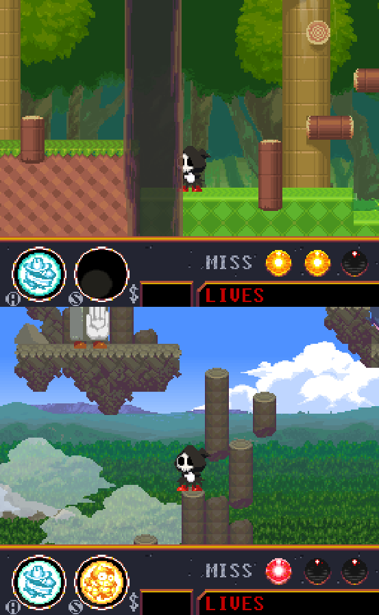 To be fair, the inner forest background does need to be darker/saturated, I agree. I wonder why you keep comparing the graphics to the promotional art I made, though. You can't compare an old game's graphics to its box art. If you didn't know, one of the reasons I'm making this game is as a big homage to my favorite snes games, and yes, it has been a conscious decision from the start that the foregrounds are to look like set pieces. You can see this by the fact that everything in the first 3/4 of the entire game has decorative patterns across the "front", as if they're made out of decorative plastic. It's supposed to look like you're a cute little toy fighting across these fake-looking foregrounds, while at the same time, still present in the real world of the background. It's made to feel light-hearted and welcoming when you first play the game while still being grounded in reality. This game's graphical style is to have no outlines at all, like many of the old games I take inspiration from had. It's interesting you bring up Pulirula, because the farther into this game you go, the more of that sort of thing actually does show up, mostly in the background objects. Not at all to the extent that Pulirula went, but some things reminiscent of that and games like Parodius (with giant human beings minding their own business in the distance and such) do appear. If I have to explain my motives, it's to literally make a disconnect, the farther you go, and the closer you get to the downed moon. Everything becomes more surreal the closer you get, something hopefully people understand is a subtle hint to the old belief that the moon caused madness, or more appropriately named "Lunacy". In this game, the real world rules of what we know about the moon are not supposed to be acknowledged, it's fiction. The dark parts on the moon's surface were once thought to be seas, so in this game, they are literal seas based on the ancient names given to each of them. I can entertain critique of my visual style, but certainly not my artistic vision. I hope you can understand that. |
|
|
|
|
Logged
|
|
|
|
|
Jad
|
|
« Reply #484 on: April 09, 2013, 02:53:49 AM » |
|
I'm not criticizing your artistic vision, I only brought it up since the more I understand it the better feedback I can get.
I bring up the box art because the box art looks perfect and the pixel art inside of the game isn't on the same ridiculously awesome level.
I see that you've indeed made a lot of changes to the things I brought up. I still think you could take it further and make it look better.
You don't have to explain the style to me, really, I can see what you're aiming for, I just think it can look better. I'm sorry if I'm very rude. I get very passionate because your game and style excites me very much. I'm very impressed.
|
|
|
|
|
Logged
|
|
|
|
|
Raku
|
|
« Reply #485 on: April 16, 2013, 08:43:08 AM » |
|
Sorry for the absence. I spent this last week dedicated to making another bonus stage that I got the idea for. I just now finished making it, and it was very fun to program and make the music/graphics for, due to the nature of it. I won't show any screenshots to avoid spoilers, this is just an update saying what I've been doing. If I can get the time, I'll scan in some of my concept art I've been drawing as well this past week, maybe at least that will be interesting for someone to see.
|
|
|
|
|
Logged
|
|
|
|
|
Connor
|
|
« Reply #486 on: April 16, 2013, 12:51:44 PM » |
|
wheres the download link? id love to download this onto my mac.  |
|
|
|
|
Logged
|
|
|
|
|
godsavant
|
|
« Reply #487 on: April 16, 2013, 01:29:28 PM » |
|
wheres the download link? id love to download this onto my mac. The download link is in the original post, but you can't run .exe's on Mac OS. |
|
|
|
|
Logged
|
|
|
|
|
Raku
|
|
« Reply #488 on: April 21, 2013, 02:09:08 AM » |
|
|
|
|
|
|
Logged
|
|
|
|
|
beetleking22
|
|
« Reply #489 on: April 21, 2013, 06:37:46 AM » |
|
Damn man this game looks Japanese Snes game! I really like it.. Its remind me of Kirby x Ganbare Goemon.. I really like your unique style.. I wish you success.. This game has very much potential.
|
|
|
|
|
Logged
|
|
|
|
|
Maud'Dib Atreides
|
|
« Reply #490 on: April 21, 2013, 09:07:05 AM » |
|
Good heavens, so glad I found your devlog, subscribing!
|
|
|
|
|
Logged
|
Guy: Give me all of your money.
Chap: You can't talk to me that way, I'M BRITISH!
Guy: Well, You can't talk to me that way, I'm brutish.
Chap: Somebody help me, I'm about to lose 300 pounds!
Guy: Why's that a bad thing?
Chap: I'M BRITISH.
|
|
|
|
Dr. Cooldude
Guest
|
|
« Reply #491 on: April 21, 2013, 09:22:19 AM » |
|
Posting to follow, looks great!
|
|
|
|
|
Logged
|
|
|
|
|
Conker534
Guest
|
|
« Reply #492 on: April 21, 2013, 12:57:56 PM » |
|
Welcome all.
To my favorite thread.
|
|
|
|
|
Logged
|
|
|
|
ashpd
Level 1

Umm... Hello!

|
|
« Reply #493 on: April 21, 2013, 01:22:21 PM » |
|
to Rakugaki-OtokoWHY ?!!! Why you so awesome?  Pixel-art is great, the demo is hardcore (well, maybe too much) and sounding is fantastic ! Man, you are cool  .
|
|
|
|
|
Logged
|
|
|
|
|
Raku
|
|
« Reply #494 on: April 21, 2013, 07:10:49 PM » |
|
Thank you, everybody, for your support and encouragement! I appreciate it a lot. @beetleking22, thank you very much! My goal is actually to have it seem like a Super Famicom game. And I'm glad my biggest influence, Kirby, has shown through. (The Super Goemon games were all amazing too, and I do draw some influence from them as well) @ashpd, the demo is very outdated. I would suggest waiting until I put up an updated one (very soon) which will have a lot of problems fixed, and there are some things that make the game a bit less difficult, though it's intended to be an difficult game. Also, as an update, I've been prepping the game for a new demo that I'll be putting up as soon as it's at a point where I'm comfortable with it. I've also been working on putting in a ton of new graphics, sounds, music, and even fixing old things that I've been meaning to fix. For example, earlier in this thread there was a complaint about the inner forest backgrounds being too bright, which I agree with, so I've redone the forest background graphics:  If you've seen the old screenshots, you may also notice in these ones here that I've added more detailed leaves to the foreground trees as well (don't worry, I've darkened the "behind" foreground trees so that the "in front" foreground trees stand out more. It was after these screenshots were taken.) as an added bonus, I remembered I have an old soundcloud account, and I put this up for you all to listen to. It's just one of the newer forest BGMs in the game: https://soundcloud.com/rakugaki-otoko/spirit-of-forest/s-ldup5 |
|
|
|
|
Logged
|
|
|
|
|
Maud'Dib Atreides
|
|
« Reply #495 on: April 21, 2013, 07:24:26 PM » |
|
Had a feeling someone would mention Goemon, the poster looks reminiscent of it
|
|
|
|
|
Logged
|
Guy: Give me all of your money.
Chap: You can't talk to me that way, I'M BRITISH!
Guy: Well, You can't talk to me that way, I'm brutish.
Chap: Somebody help me, I'm about to lose 300 pounds!
Guy: Why's that a bad thing?
Chap: I'M BRITISH.
|
|
|
|
HernanZh
|
|
« Reply #496 on: April 22, 2013, 09:44:48 AM » |
|
Go go Rakugaki-Otoko  |
|
|
|
|
Logged
|
|
|
|
|
DAISHI
|
|
« Reply #497 on: April 22, 2013, 09:54:04 AM » |
|
Taking some time aside to work on something in the game that's been suggested to me before. Finally thought of a way to make it work correctly, and I've already got the sprites done for one of them, shown here.  Almost reminds me of my favorite side scroller of all time, the N64 "Mischief Makers". |
|
|
|
|
Logged
|
|
|
|
|
Raku
|
|
« Reply #498 on: April 23, 2013, 04:16:47 AM » |
|
@HernanZh: Wow, thank you for the adorable fan art! @DAISHI: Is it because of the Clancer-like face mask? Regardless, I always loved and still own Mischief Makers. It might have had some subtle influences in my designs. Anyway, I put a new demo up! Check the first page of this thread for the updated download link. (Check the date, it's been updated today) I hope the people who have played previous versions will find that I've been doing a lot of hard work to improve the game in every way! New things I can think of off the top of my head: - music
- more sound effects
- lots of new special effects
- fixed tons and tons of bugs
- tweaked lots and lots of things that needed tweaking
- lots of refurnished backgrounds
- more new cutscenes
- etc
Now, if you keep playing, you'll find that the demo ends at a certain point. Also, any bonus exits you find will be un-enterable. This is because it's a demo, and I realized that I really shouldn't be showing the entire game already before it's even officially out. I'm sorry for the long wait. If there are any bugs or anything that causes the game to malfunction, please bring them to my attention as soon as possible, so I can correct them. edit: I'm sorry about the sloppy way I put the files into the zipped folder. You have to have all of them in the same folder for the game to function properly, and when I do release the game officially, I'll be using Gamemaker's built-in function that allows it to include files that only appear when the game is running. |
|
|
|
|
Logged
|
|
|
|
|
Jad
|
|
« Reply #499 on: April 24, 2013, 02:56:50 AM » |
|
I'd like to extend a significantly big thumbs up towards the changes in the forest backgrounds - it looks solid. Very good improvement. It's really nice to see how everything has improved over time. You're good at this, dude! And very inspirating - I think this game thread has been one of the most inspiring things I've seen on tigs in years. Like, I actually dreamt about browsing tigsource and looking at new screenshots and getting really jealous/fired up.
And then it happened for real like right now! Anyways, great job on the background change.
|
|
|
|
|
Logged
|
|
|
|
|
 Community
