|
Retro
|
 |
« on: February 21, 2011, 04:39:57 PM » |
|
Some time ago I decide to do some pixel art just to study different aspects. I finished shading my anatomy study recently and I would love to hear your critics. They're not art pieces and were created exactly for the purpose of improving, so don't worry to be too hard on me.  The legs and knees were especially hard and I know it's all wrong down there (especially on the largest scale). Reworked it 3 times, but then gave up.  So, your thought are most welcome. |
|
|
|
« Last Edit: February 26, 2011, 03:09:48 PM by Retro »
|
 Logged
|
|
|
|
|
Retro
|
|
« Reply #1 on: February 26, 2011, 03:08:30 PM » |
|
Sorry, the image was not appearing, I linked a little too deep into amazon's underlying cloud servers and the link expired.
Hope it works OK now and you can give me an advice or two.
|
|
|
|
|
Logged
|
|
|
|
|
caffeine
|
|
« Reply #2 on: February 28, 2011, 10:12:05 AM » |
|
You should get rid of the dithering "or at least most of it" to increase readability. It's also easier to block out the lit body shapes this way. 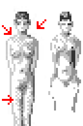 ps. Never save pixelart as .jpg |
|
|
|
|
Logged
|
|
|
|
|
Retro
|
|
« Reply #3 on: February 28, 2011, 01:57:17 PM » |
|
Thanks for the tip. I always use dithering, but I do notice that lots go without it (or almost none) and get a cleaner result. I dunno, I really love the process of creating the halftone pattern, maybe that's why I stick it in so much. I noticed a similar thing when I am digitally painting stuff. I use very soft brushes that blend all the colors into gradients. But when I look at someone who really knows how to paint, they use hard edged brushes, don't mix colors (so much) and get so much better results. I guess it's a typical mistake and I should follow a tutorial to fundamentally change the way I work (approach it more like painting). Blah, I wish I'd gone to an art college instead of computer science.  ps. Never save pixelart as .jpg I never do. It's all pngs on my side, that's what it gets transformed into when I upload to my blog unfortunately. Maybe the format will be kept for gifs, should change to that for uploads. |
|
|
|
|
Logged
|
|
|
|
|
Retro
|
|
« Reply #4 on: March 03, 2011, 04:34:50 AM » |
|
Damn, now I have to google what love handles are. No worries, that way I also learn new English phrases. |
|
|
|
« Last Edit: March 03, 2011, 04:49:01 AM by Retro »
|
Logged
|
|
|
|
|
thedaemon
|
|
« Reply #5 on: March 08, 2011, 09:41:50 PM » |
|
You have them right now at over 7 heads tall!!!!!!! That over superhero proportions. 5 1/2 to 6 1/2 is closer to human sizes.
|
|
|
|
|
Logged
|
|
|
|
|
Retro
|
|
« Reply #6 on: March 08, 2011, 10:33:37 PM » |
|
Yeah, it's exactly 7.5 heads tall. Just as my Anatomy for the Artist book shows.  That was my reference anyway. Maybe it's cultural difference? |
|
|
|
|
Logged
|
|
|
|
|
caffeine
|
|
« Reply #7 on: March 09, 2011, 12:20:07 AM » |
|
No it's not, a "perfect" adult human specimen should be 8 times it's own head.
|
|
|
|
|
Logged
|
|
|
|
|
Inane
|
|
« Reply #8 on: March 09, 2011, 12:49:04 AM » |
|
Mhm, where'd you read this Green? There's no defined human ideal and people that are 8 heads tall are at the very top of the proportions bell curve (I mean... err, to the right, a couple standard deviations to the right). Judging by my folder of photos of folks, the average is somewhere between 6.5 and 7 heads tall, though people in their late teens and early twenties are definitely closer to 6.5.
|
|
|
|
|
Logged
|
real art looks like the mona lisa or a halo poster and is about being old or having your wife die and sometimes the level goes in reverse
|
|
|
|
thedaemon
|
|
« Reply #9 on: March 09, 2011, 01:57:11 AM » |
|
Sorry, 7 to 7.5 is most accurate as I've googled it.
|
|
|
|
|
Logged
|
|
|
|
|
Retro
|
|
« Reply #10 on: March 09, 2011, 02:01:39 AM » |
|
No problem, great discussion and we all learn something. I never really thought about it, but yeah, with proportions you quite define the overall "heroesness" of the character.
|
|
|
|
|
Logged
|
|
|
|
|
caffeine
|
|
« Reply #11 on: March 09, 2011, 08:21:59 AM » |
|
Mhm, where'd you read this Green? There's no defined human ideal and people that are 8 heads tall are at the very top of the proportions bell curve (I mean... err, to the right, a couple standard deviations to the right). Judging by my folder of photos of folks, the average is somewhere between 6.5 and 7 heads tall, though people in their late teens and early twenties are definitely closer to 6.5.
There sure is. When talking art the ideal male and female body is approximately 8 times the height of the head as you can read in almost every book about drawing anatomy "loomis figure drawing for example". I don't feel like explaining the maths but if you feel intrigued you should read up on the so called "golden ratio". click here for more information. http://en.wikipedia.org/wiki/File:Human_body_proportions2_svg.svgIn reallife the body head ratio is quite different though. |
|
|
|
|
Logged
|
|
|
|
|
Retro
|
|
« Reply #12 on: March 09, 2011, 03:06:55 PM » |
|
That image gives me the creeps. |
|
|
|
|
Logged
|
|
|
|
|
thedaemon
|
|
« Reply #13 on: March 09, 2011, 08:27:10 PM » |
|
haha me 2, here are some loomis books in pdf format http://alexhays.com/loomis/ I highly recommend him. His skills are second to few. |
|
|
|
|
Logged
|
|
|
|
|
Retro
|
|
« Reply #14 on: March 10, 2011, 07:53:48 AM » |
|
Awesome! Now I have lots of reading to do (and it will be useful too, cos I have some bigger pieces with pixelated women on my mind ). |
|
|
|
|
Logged
|
|
|
|
|
 Developer
