|
Ferretypie
|
 |
« on: March 05, 2011, 06:05:07 PM » |
|
I've been set up to do some concept work for a university interview. I decided to do a sort've weird... piraty lady thing, hence the title. Anyway, Been working on this for a while because I'm not used to drawing full body OR clothes. Anyway, I feel like she's off balanced and theres some things messed up that I'm noticing but just can't quite put my finger on. It'd be great if any of you can notice and point out things that I need to fix, because this is uber important! Thanks  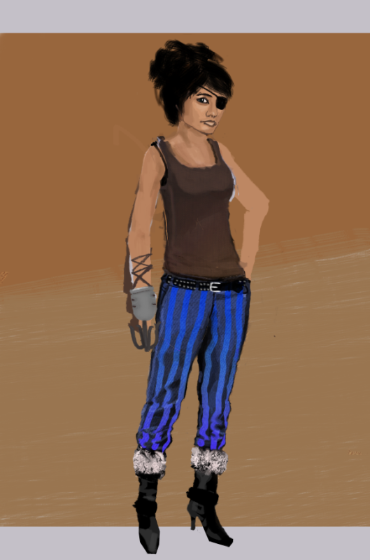 |
|
|
|
|
 Logged
|
|
|
|
|
Ferretypie
|
|
« Reply #1 on: March 05, 2011, 07:49:28 PM » |
|
Thank you thank you! I made the changes you suggested and added a background. Its just a WIP one at the moment but I'll probably add some more details. The random foreground brushstrokes were just to add atmosphere, they suck a bit. 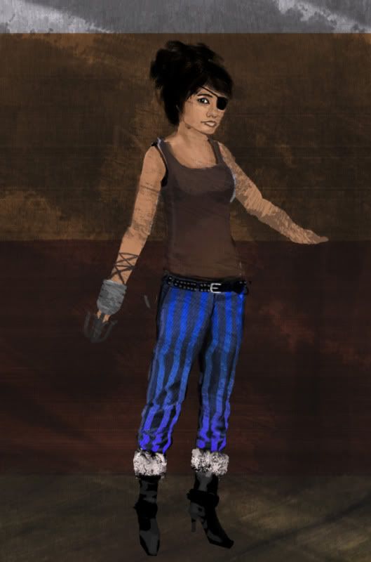 |
|
|
|
|
Logged
|
|
|
|
|
Theophilus
Guest
|
|
« Reply #2 on: March 05, 2011, 09:25:39 PM » |
|
I think you should put more emphasis on the contour of the female body. She looks like she has a more masculine waistline/hips.
|
|
|
|
|
Logged
|
|
|
|
|
ink.inc
Guest
|
|
« Reply #3 on: March 05, 2011, 09:26:49 PM » |
|
Proportions are a bit off; neck looks too short and thick.
|
|
|
|
|
Logged
|
|
|
|
|
Player 3
|
|
« Reply #4 on: March 06, 2011, 01:21:38 PM » |
|
I think you should put more emphasis on the contour of the female body. She looks like she has a more masculine waistline/hips.
I know this is a bit cliché, but no one really takes feminine pirates seriously. Proportions are a bit off; neck looks too short and thick.
They actually look natural to me. Some people actually just have necks like that. |
|
|
|
|
Logged
|
|
|
|
|
Kramlack
Guest
|
|
« Reply #5 on: March 07, 2011, 11:48:06 AM » |
|
Instead of repeating what everyone else has said, I'll just say that the design looks a bit boring, it really doesn't say much to the character. Is she good? Is she evil? Is she an anti-hero? Give her some more charm, a new expression for example, some accessories to show off her personality (classy riches for good karma, skulls and trinkets for negative karma), etc.
Not to sound completely negative, I liked the pants. The colours and texture was very eye catching.
|
|
|
|
|
Logged
|
|
|
|
|
Mipe
|
|
« Reply #6 on: March 07, 2011, 12:06:08 PM » |
|
Cut the bottom half of her shirt off. Instant +9 to sex appeal.
|
|
|
|
|
Logged
|
|
|
|
|
JaJitsu
|
|
« Reply #7 on: March 07, 2011, 12:12:56 PM » |
|
Okay well, I think you are way ahead of yourself in the design process. If you are going to design a character you need to do lots and lots of sketches. I'm guess by university you mean an Art college? If so they are probably be more interested in the sketches then final renderings like this. I'm not saying these a bad to include, but they want to see you think. Save the rendering for when you got the design down. There are tons of entertainment artists that have blogs online. Glen Keane: http://theartofglenkeane.blogspot.com/2006/06/beast.html-he has a lot of awesome characters to the side, but the beast has a lot of great concept sketches Jin Kim: http://cosmoanimato.blogspot.com/-this guy is seriously amazing and has a whole lot of concept art. And even check out the ones that he colored. Really simple shading and barely rendered. Really try to capture the personality in the character, and just try lots of things. I would love to see some drawings if you decide to take my advice. |
|
|
|
|
Logged
|
|
|
|
|
Ferretypie
|
|
« Reply #8 on: March 07, 2011, 12:30:32 PM » |
|
Thanks guys! I don't really have much time but I'll try to pump some character into her! And JaJitsu, yeah I kinda worked a bit badly!  I just got an image in my head and started working! But I'll definitely do a load of sketches and see what I can come up with. Thanks again! |
|
|
|
|
Logged
|
|
|
|
|
pen
|
|
« Reply #9 on: March 07, 2011, 06:09:16 PM » |
|
This is really nice as a start, you've got something fairly solid to work with and I really hope you keep working on it and give it some character. I've made a paint over, and I must say that your image was really easy to do something with, which just shows it's potential! **EDIT**Inane pointed out, like he always does, that when I draw heads they always become insanely big. I fixed that (thank you inane, without you all my characters would look retarded): 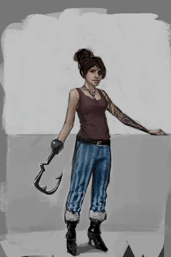 /**EDIT** /**EDIT**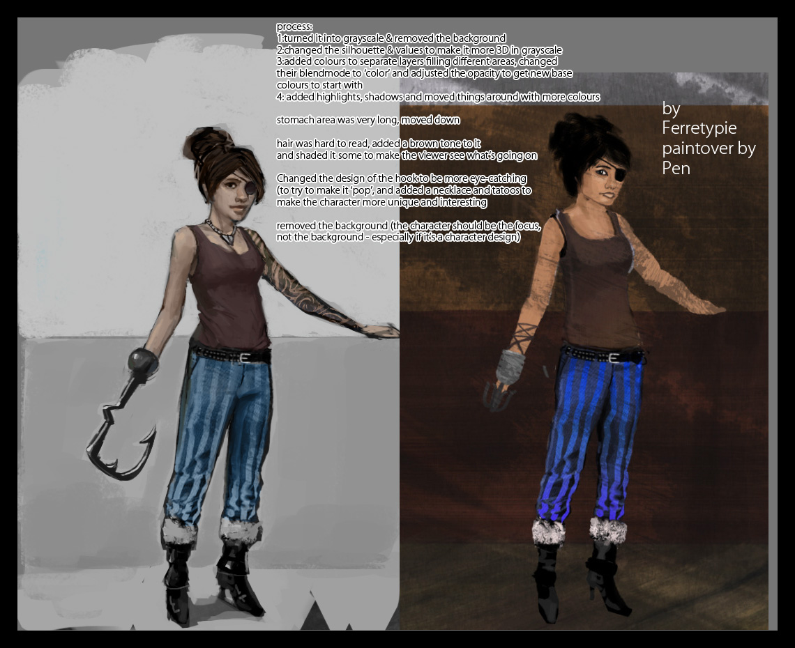 breakdown: 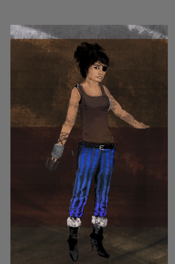 I barely touched the pants (except toning down the colours a lot) and the shoes were really nicely drawn before too, I just added latex-like highlights. I hope I didn't overwhelm you, good luck fellow TIGer    |
|
|
|
« Last Edit: March 07, 2011, 06:17:12 PM by pen »
|
Logged
|
I AM FREE!
|
|
|
|
Mipe
|
|
« Reply #10 on: March 07, 2011, 10:44:39 PM » |
|
Now that's something I can get behind.  |
|
|
|
|
Logged
|
|
|
|
|
Ferretypie
|
|
« Reply #11 on: March 08, 2011, 02:45:55 AM » |
|
 I am not worthy! But I am incredibly inspired! Thanks Pen! I'll try do as much work on this as I can before my interview!
|
|
|
|
|
Logged
|
|
|
|
|
Player 3
|
|
« Reply #12 on: March 08, 2011, 04:09:19 AM » |
|
Pirates need to learn to use their utility hook for everything. Why not a hand-hook? Or a sword-hook? So many possibilities for this character!
...A parasol-hook?
|
|
|
|
|
Logged
|
|
|
|
|
Ferretypie
|
|
« Reply #13 on: March 08, 2011, 05:08:07 AM » |
|
Okay, this is all I have time to do! I'm about to leave now and I don't have a laptop that can run CS4 I will however be doing a lot of sketching so hopefully they'll implant a bit more background character! 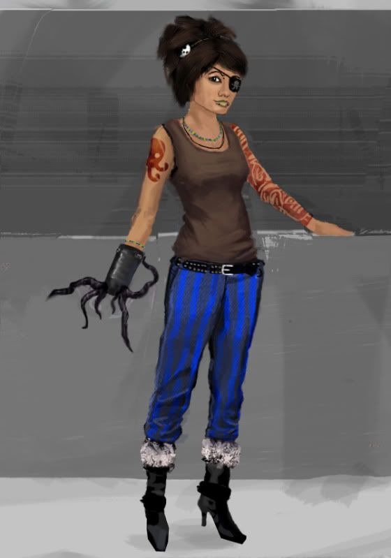 Not as good as Pens rendition but I don't think that was to be expected! Thanks again guys, its just fingers crossed now! Though I think I'll keep working on it when I come home in two days time! |
|
|
|
|
Logged
|
|
|
|
|
Theophilus
Guest
|
|
« Reply #14 on: March 08, 2011, 08:15:21 AM » |
|
Nice C'thlulu claw, adds a nice touch.  And in other terms, no longer will me or Mipe get behind And in other terms, no longer will me or Mipe get behind it her. |
|
|
|
|
Logged
|
|
|
|
|
 Developer
