|
buddy
|
 |
« on: April 15, 2011, 12:28:07 AM » |
|
Hi, First post ever! And also first (serious) attempt at pixelart. It's a fighter type cheracter for a roguelike game I am working on.  |
|
|
|
|
 Logged
|
|
|
|
|
Kramlack
Guest
|
|
« Reply #1 on: April 15, 2011, 12:36:32 AM » |
|
First issues that come to mind are the awkward light source and banding (most noticeable on the hand not holding the sword).
|
|
|
|
|
Logged
|
|
|
|
|
buddy
|
|
« Reply #2 on: April 15, 2011, 01:20:16 AM » |
|
Thanks for the feedback. My laptop screen gets superbright sometimes (driver error or something). After a reboot i noticed that the colors were much darker than intended. Edited (tried to fix banding on hand and shading on head):  |
|
|
|
|
Logged
|
|
|
|
|
buddy
|
|
« Reply #3 on: April 15, 2011, 10:18:18 PM » |
|
Worked some more on the warrior and also tried to make a mage and a goblin as well..  |
|
|
|
|
Logged
|
|
|
|
|
Ishi
|
|
« Reply #4 on: April 16, 2011, 12:26:20 AM » |
|
The warrior and mage read quite well at small size, but the goblin is becoming a bit muddy. I think his skin could do with higher contrast, maybe yellower highlights.
Something else to consider is to change proportions and features per character to get their job across more clearly. For example, not showing the mage's feet at all, just a sweeping cloak that reaches the ground.
Simplifying palettes would also improve them. The warrior's green trousers aren't really visible, so it would be better to focus on contrast + clarity in that area by just filling the trousers with a single dark colour, allowing the belt and shoes to stand out.
|
|
|
|
|
Logged
|
|
|
|
|
Miguelito
|
|
« Reply #5 on: April 16, 2011, 11:51:15 AM » |
|
Humans: Good to go, put'em in a game.  The Goblin: The green skin seems to reflect different light than the human skin. I'd suggest to make the bright zone brighter (and more yellow), or to make the dark zone darker (and more blue). I bet if you convert the goblin to grayscale, you'll find that your red and green have exactly the same value (=brightness). You might want to add a bit more contrast there... |
|
|
|
|
Logged
|
  (← new art twitter) |
|
|
|
buddy
|
|
« Reply #6 on: April 17, 2011, 11:41:00 PM » |
|
Thanks for the great feedback! I feel this is really helping me out. At first I had intended to find an artist to help with the game, but now .. maybe I can do it on my own Edited: Upped contrast on goblin. Made cloak bigger and removed feet completely on mage. (+ some shading changes)  Also - I intend to have the graphics at 2x in the game (retro pixel look ) |
|
|
|
|
Logged
|
|
|
|
|
Miguelito
|
|
« Reply #7 on: April 17, 2011, 11:56:34 PM » |
|
I don't see why you need an artist if all the graphics end up looking like that. Good luck! |
|
|
|
|
Logged
|
(← new art twitter) |
|
|
|
buddy
|
|
« Reply #8 on: April 18, 2011, 12:01:36 AM » |
|
I don't see why you need an artist if all the graphics end up looking like that. Good luck! Thanks for the praise! I'll keep working at it! |
|
|
|
|
Logged
|
|
|
|
|
kevglass
|
|
« Reply #9 on: April 18, 2011, 01:18:11 AM » |
|
Awesome stuff, makes me want to try! Kev |
|
|
|
|
Logged
|
|
|
|
|
buddy
|
|
« Reply #10 on: April 18, 2011, 02:55:58 AM » |
|
Awesome stuff, makes me want to try! Thanks! Actually the current dungeon generation algorithm in the game is inspired by the stuff from your webpage, so I'm glad i could inspire you |
|
|
|
|
Logged
|
|
|
|
|
kevglass
|
|
« Reply #11 on: April 18, 2011, 03:29:22 AM » |
|
Well brilliant, I'm using a similar system for Legends of Yore too These characters really are so cool kev |
|
|
|
|
Logged
|
|
|
|
|
buddy
|
|
« Reply #12 on: April 18, 2011, 04:24:28 AM » |
|
Two more quick ones, a bat and a ranger-dude. I'm not really happy with the bat, but not sure exactly what's wrong with it (it was quite quick though.. so i myght just need to work more on it..)  |
|
|
|
|
Logged
|
|
|
|
|
Miguelito
|
|
« Reply #13 on: April 18, 2011, 04:38:47 AM » |
|
You're going to hate me, but... Again, the green. If I could recommend something, don't make the dark part of the cap so saturated - make it more grey or blue. The idea is that skin never turns to grey in the shadow, but lifeless material does. Try it out, I think you'll be surprised The bat could maybe use less color variation (no one is going to notice the violet spots, I think), and more silhouette. But that's pretty much a matter of style and taste. |
|
|
|
|
Logged
|
(← new art twitter) |
|
|
|
Ishi
|
|
« Reply #14 on: April 18, 2011, 04:47:51 AM » |
|
The bat is a bit weird I think because the curve along the bottom of the wings flows into the body shape, so it's hard to distinguish where the wings end. For the archer I'd reduce the size of the feet so that the shoe and bow don't touch. The shading on the hat also feels a bit pillow-shadey, like the light is from the front rather than from above. I like how the mage turned out |
|
|
|
|
Logged
|
|
|
|
|
buddy
|
|
« Reply #15 on: April 18, 2011, 11:16:19 AM » |
|
You're going to hate me, but...
No I love all great comments! This thread is really helping me out big-time Again, the green. If I could recommend something, don't make the dark part of the cap so saturated - make it more grey or blue. The idea is that skin never turns to grey in the shadow, but lifeless material does.
I tried changing the two darker colors on the cap a bit to more gray(ish). I'm still not really happy with it.. For the archer I'd reduce the size of the feet so that the shoe and bow don't touch. The shading on the hat also feels a bit pillow-shadey, like the light is from the front rather than from above.
The feet looked weird when i tried to make them smaller, so I made the bow red instead to make it stand out more. What do you think?  |
|
|
|
|
Logged
|
|
|
|
|
buddy
|
|
« Reply #16 on: April 19, 2011, 10:52:12 AM » |
|
The fat and angry troll:  |
|
|
|
|
Logged
|
|
|
|
|
Ishi
|
|
« Reply #17 on: April 21, 2011, 11:16:07 PM » |
|
For the archer I'd reduce the size of the feet so that the shoe and bow don't touch. The shading on the hat also feels a bit pillow-shadey, like the light is from the front rather than from above.
The feet looked weird when i tried to make them smaller, so I made the bow red instead to make it stand out more. What do you think? Yeah that's a bit clearer, though I still think it could be more clear. Having said that, I tried a quick edit and wasn't able to improve. Plus it's readable anyway so it's not too important. I had a go at editing the troll:  Wanted to make him a bit more stocky, so I removed the indented pixels around his neck, so it looks like he doesn't really have a neck. Made the arms more chunky. I gave him more of a forehead and smaller eyes to give him that stupid troll look. |
|
|
|
|
Logged
|
|
|
|
|
Oddball
|
|
« Reply #18 on: April 22, 2011, 02:50:59 AM » |
|
Whilst I'm always in awe of your pixelling Ishi, I actually prefer the original troll shape. He's more portly and adorable. I like the big hands/head style of all these. To me it's mainly the shading that can be improve.
|
|
|
|
|
Logged
|
|
|
|
|
buddy
|
|
« Reply #19 on: April 22, 2011, 10:36:37 AM » |
|
I had a go at editing the troll: Wanted to make him a bit more stocky, so I removed the indented pixels around his neck, so it looks like he doesn't really have a neck. Made the arms more chunky. I gave him more of a forehead and smaller eyes to give him that stupid troll look. That is absolutely brilliant! Thanks for the edit, it will really help me out - I got some great ideas from it. That said, your edit no longer looks like the troll in my head, more like a golem of some sort 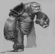 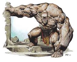 |
|
|
|
« Last Edit: April 22, 2011, 11:38:57 AM by buddy »
|
Logged
|
|
|
|
|
 Developer
