|
Glic2000
|
 |
« on: November 30, 2011, 12:13:28 PM » |
|
So I'm working on a 2D side-scrolling game and I'm trying to refine the game's art style. Originally, I planned to make it very retro and pixelated, but now I'm moving towards something a bit smoother. I'd like to hear any comments on the following image. Is it too pixelated? Or is that part of its charm? Any other comments welcome, thanks! 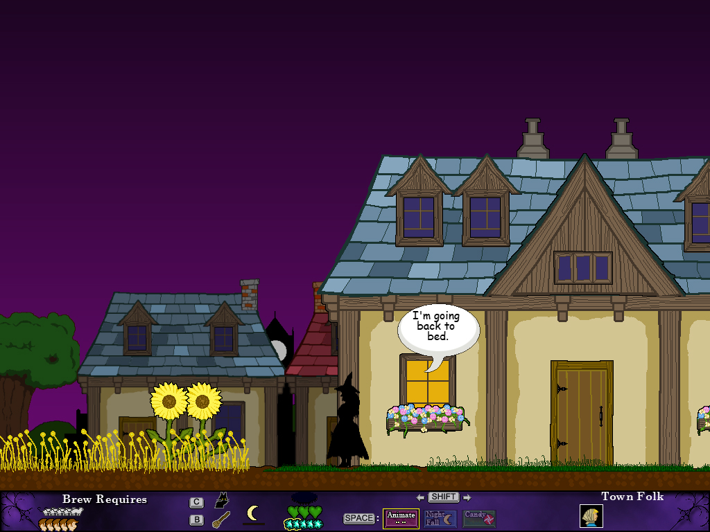 |
|
|
|
|
 Logged
|
|
|
|
|
ink.inc
Guest
|
|
« Reply #1 on: November 30, 2011, 02:01:54 PM » |
|
There's inconsistency in the outlining. Some things have a black outline, others don't. Of course, you could be using this to imply what objects are of importance, but then I don't know why the sunflowers would be outlined while the houses etc aren't. In addition, you will want to reconsider your color choices. There are various tutorials that explain the way color shifts as light is added/removed (hint: you don't just change the brightness slider). IE, if it's a nighttime scene, those sunflowers shouldn't be that shade of yellow. Aside from shading, the general color scheme doesn't really flow well. You've got super saturated colors, but dark, so everything looks somewhat muddy. Check out this: http://colorschemedesigner.com/ or this: http://www.colourlovers.com/ for some great ideas. Also, don't use fonts that come with windows (comic sans, times new roman, etc) because they make your game look cheap. I'll give you the benefit of the doubt and assume it's a placeholder, but you'll want to change that eventually. |
|
|
|
|
Logged
|
|
|
|
|
Glic2000
|
|
« Reply #2 on: November 30, 2011, 02:47:41 PM » |
|
Good advice; thanks.  Any suggestions on which fonts would look good? I'm capable of making my own fonts, I just need some ideas. |
|
|
|
|
Logged
|
|
|
|
|
moi
|
|
« Reply #3 on: November 30, 2011, 06:41:02 PM » |
|
yeah it looks inconsistent. Some things are crispy and some things are blurred.
Some things have huge outlines and some don't. The character is silhouette and everything else is blindingly saturated.
And I agree the colros are not very sexy.
|
|
|
|
|
Logged
|
subsystems subsystems subsystems
|
|
|
keoni29
Level 1


|
|
« Reply #4 on: December 01, 2011, 11:24:20 AM » |
|
Do some moar shading on the tiles
|
|
|
|
|
Logged
|
|
|
|
|
SolarLune
|
|
« Reply #5 on: December 02, 2011, 07:32:45 PM » |
|
Yeah, shading's really critical to give good feeling. It feels very flat and not very evocative of anything in particular - drawing the world to look like it's being lit at night, or just lit at all, would help. It's well drawn, though. |
|
|
|
|
Logged
|
|
|
|
|
Glic2000
|
|
« Reply #6 on: December 03, 2011, 09:39:53 AM » |
|
Well, the lack of shading was intentional. That is, I wanted it to have a flat, cartoon style... such as you'd see in a show like The Simpsons, or The Flintstones. I'm working on a new font right now and I'm still trying to decide how much outlining there should be. I'll probably do something like The Binding of Isaac: blacklining around the gameplay elements, and no outlining on everything else. Oh, and the character drawn as a silhouette is a gameplay mechanic (i.e. to show that she's hidden). I'll probably change that too, though (too hard to see). During gameplay, the setting gradually changes from day to night, unfortunately I don't have a proper lighting/shading engine to give night time the correct look. I guess I'll have to save that for the sequel.  It's beyond the scope of this project. |
|
|
|
|
Logged
|
|
|
|
keoni29
Level 1
|
|
« Reply #7 on: January 13, 2012, 01:41:36 AM » |
|
Well, the lack of shading was intentional. That is, I wanted it to have a flat, cartoon style... such as you'd see in a show like The Simpsons, or The Flintstones. I'm working on a new font right now and I'm still trying to decide how much outlining there should be. I'll probably do something like The Binding of Isaac: blacklining around the gameplay elements, and no outlining on everything else. Oh, and the character drawn as a silhouette is a gameplay mechanic (i.e. to show that she's hidden). I'll probably change that too, though (too hard to see). During gameplay, the setting gradually changes from day to night, unfortunately I don't have a proper lighting/shading engine to give night time the correct look. I guess I'll have to save that for the sequel. It's beyond the scope of this project. This style makes your game look very cheap. Binding of isaac is a completely different style since it has antialiasing  |
|
|
|
|
Logged
|
|
|
|
|
Goaticide
|
|
« Reply #8 on: January 13, 2012, 08:54:08 AM » |
|
Aside from what's already been said the use of gradients completely don't fit in. I personally hate gradient use most of the time but across the bottom bar and in the sky it's too much. In the wood you use the darker color for detail, in the sunflower it's for shading. I like the house for the flat aesthetic but it could probably drop the shading of the wall since there's no shading elsewhere on it. As everyone said, it's a consistency issue, in my job as a graphic designer I go ape sh*t over consistency.  Moving on from that ... should the icons overlap? The bar should have some padding so icons don't touch the edges. The space bar as a ":" after it but the C and B don't. For the font maybe something like http://www.dafont.com/aansa.font except a bit more done by hand and a bit more slanted. I just mean not sharp pixels with a very obvious gridded feel but rather something like from the games your referencing. Like the word CREDIT top center here http://www.arcade-history.com/images/game/2445_1.pngIn older games it was also more common for text to simply be in a box so I think that would be a lot more of the aesthetic appeal you're going for opposed to the circular bubble with the tail.  |
|
|
|
|
Logged
|
|
|
|
|
Glic2000
|
|
« Reply #9 on: January 13, 2012, 09:14:38 AM » |
|
Yeah, actually the font I'm working on right now looks a lot like the word "credit" in that picture! Oh, and the bottom bar isn't actually a gradient. But I guess if it looks like one, that's just as bad! Anyway, you make some good points, thanks! I honestly don't know where this game is going, frankly. |
|
|
|
|
Logged
|
|
|
|
|
Goaticide
|
|
« Reply #10 on: January 13, 2012, 02:57:25 PM » |
|
It doesn't look like a smooth color to color gradient, just that there's many values transitioning between lighter and darker purple. I'm just starting my own thing and I had to redo the floor a few times just to get it to match the sprite. I'm seeing it's quite a challenge to get the consistency right but even if it means reworking all of it I think it's well worth it and will be great satisfaction in the end. |
|
|
|
|
Logged
|
|
|
|
|
etcetera
|
|
« Reply #11 on: January 13, 2012, 06:17:08 PM » |
|
The houses in the background are a lot more blurry than the crisp edged one in front. In my opinion this looks pretty inconsistent. I won't mention the font as its already been talked about. Other than that, I like the style. |
|
|
|
|
Logged
|
|
|
|
|
 Developer
