|
eigenbom
|
 |
« Reply #60 on: January 11, 2012, 01:40:08 PM » |
|
Oh wut .. Blender?! Are you using the Blender game engine or is it just for level editting..?
|
|
|
|
|
 Logged
|
|
|
|
|
SolarLune
|
|
« Reply #61 on: January 11, 2012, 06:07:00 PM » |
|
@eigenbom - Yep, I'm using the Blender Game Engine for the whole game.  |
|
|
|
|
Logged
|
|
|
|
|
eigenbom
|
|
« Reply #62 on: January 11, 2012, 06:28:15 PM » |
|
Wah cool bananas, I'm a big fan of Blender, but haven't played with the BGE yet. One day...
|
|
|
|
|
Logged
|
|
|
|
|
SolarLune
|
|
« Reply #63 on: January 14, 2012, 01:23:44 AM » |
|
@eigenbom - Heh, the BGE's pretty cool. Pretty small update now. I updated the IndieDB page with some more info and quasi-programmer code. :p I've got joystick functionality working, and I've fixed a little bit of the jumping mechanic. It was a little sloppy - now it's pretty tight in most places. It felt pretty fun to run around with the gamepad. :D An issue that may arise is whether I should continue with diagonal movement, or have classic 'one of four directions'-styled movement. A gameplay demo should be coming soon so that I can get some feedback on this. Also, I uploaded the BGM to my SoundCloud account so that you can hear it correctly without the audio cracking. You can hear it here. So, that's it. I'm probably going to have to do something more major next, since I'd like to have something like enemy AI up soon... |
|
|
|
« Last Edit: January 14, 2012, 01:31:21 AM by SolarLune »
|
Logged
|
|
|
|
|
helgravis
|
|
« Reply #64 on: January 14, 2012, 10:46:33 AM » |
|
I don't know it it's going to be a pain in the ass, but it would look really nice if you can rotate the world. Might add more game elements too so you can hide stuff behind walls.
I like how some of the objects pop up but is still flat while the others are fully 3D. Reminds me of Super Paper Mario for some reason.
|
|
|
|
|
Logged
|
|
|
|
|
poe
Guest
|
|
« Reply #65 on: January 16, 2012, 12:34:32 PM » |
|
I don't know it it's going to be a pain in the ass, but it would look really nice if you can rotate the world. Might add more game elements too so you can hide stuff behind walls.
I like this idea, and I love this game. It looks amazing! |
|
|
|
|
Logged
|
|
|
|
|
eigenbom
|
|
« Reply #66 on: January 16, 2012, 01:38:50 PM » |
|
Just watched the devlog vid, lookin good!
Also I vote against @helgravis' suggestion of world rotation. Just design the levels so you don't need to. :D
|
|
|
|
|
Logged
|
|
|
|
|
SolarLune
|
|
« Reply #67 on: January 16, 2012, 03:16:31 PM » |
|
Thanks, guys. @helgravis - I actually have implemented that into other games before, and I like how it feels and looks. However, I think that it would be more work and less easy to play to work with that concept than to make it a fixed perspective game. So far, down is always 'south', so to speak, so you would never need a compass or get lost. However, that can happen if you twist the view. Also, you could never 'hide' items behind scenery or areas, as you can always just turn the view around. Thanks for the suggestion, though - I really appreciate that. I posted again on the IndieDB page. Did some work with the enemy guard AI and have it to a somewhat playable state - they follow you around (not really around obstacles). Now, thinking about it, I could have it where the player will drop nodes (or I could just place them) and the guards navigate using those nodes (I've done node-based pathfinding before), but I think that might be more work than it's worth, at least for right now. The AI has yet to fire at the Player, so that's something to do. However, in good news, I've finally got it working where there are no more 'Weapon' and 'Sub-Item' keys - just 'Item Primary' and 'Item Secondary'. Now, you can equip whichever items to whichever keys - a flashlight and grenades, a targeting system and jump-boots, whatever! One 'puzzle' in particular that I have in mind will require this. Now it's on to actually making the equipment menu GUI, which is starting to be a pain. I'm gonna have to figure out a nice way to navigate through it... Maybe I should make a separate function for it rather than trying to smush it in with all of the other GUI code... 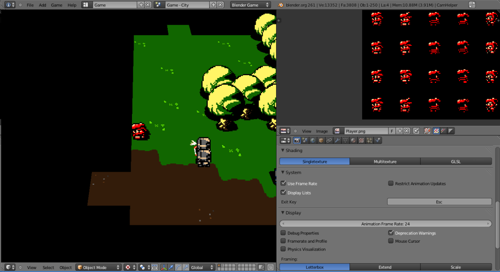 EDIT: Oh, and I pulled the camera out a bit to make it easier to keep a target tracked, as well as use your weapons at distance. |
|
|
|
« Last Edit: January 16, 2012, 05:28:25 PM by SolarLune »
|
Logged
|
|
|
|
|
Windybeard
|
|
« Reply #68 on: January 17, 2012, 03:41:56 AM » |
|
This looks really cool, i love the 3d adaption of the style plus the music is great, very atmospheric. looking forward to this one!
|
|
|
|
|
Logged
|
|
|
|
|
SolarLune
|
|
« Reply #69 on: January 17, 2012, 03:06:56 PM » |
|
@Windybeard - Thanks. So, I've finally gotten the GUI down a little more - you can now equip different items to different slots in the Equipment menu. It's still a little rough, and I want to add at least one other feature to the system, but it's working pretty well so far! 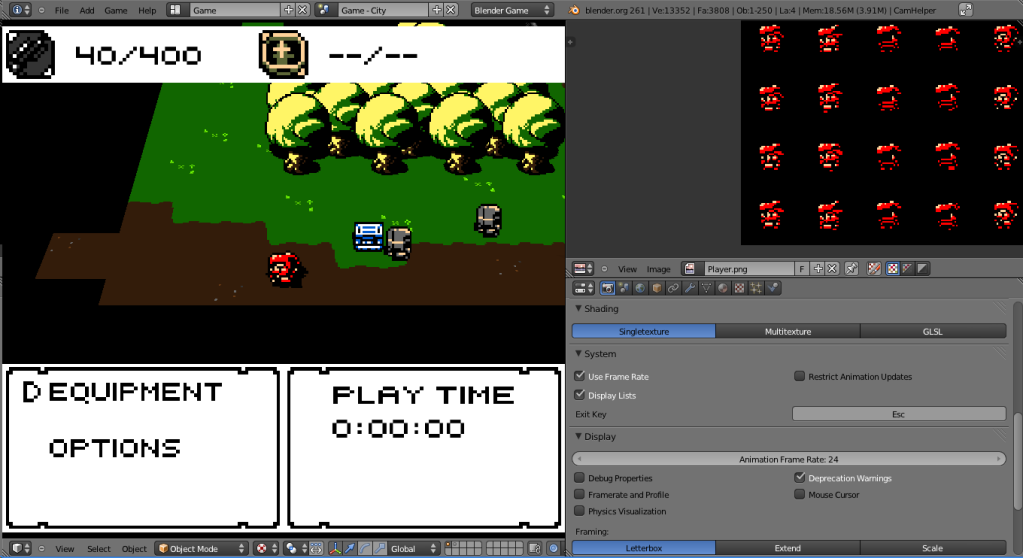 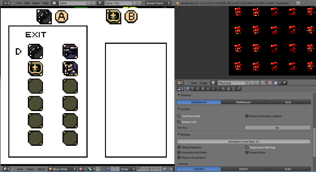 Do you think the icons are readable? EDIT: Looking at it now, the dark gray of the machine gun is pretty dark. I think I'll make that brighter. |
|
|
|
|
Logged
|
|
|
|
|
eigenbom
|
|
« Reply #70 on: January 17, 2012, 03:18:51 PM » |
|
I think the darkness in the main sprites is okay because the world is dark so your eyes adjust, but if you want a white background for the inventory you'll need to ramp up the icon contrast. I would advise against the white background, maybe make it the colour of the A,B icon background instead. And leave white for the occasional highlight.
|
|
|
|
|
Logged
|
|
|
|
|
Chris Pavia
Guest
|
|
« Reply #71 on: January 17, 2012, 03:43:45 PM » |
|
I can't really read any of the grey icons. I got that one is a boot after looking at it for a bit, but not at first glance. And for the one that's not grey, the only thing readable there is the +, everything else makes it look busier than it needs to.
|
|
|
|
|
Logged
|
|
|
|
|
SolarLune
|
|
« Reply #72 on: January 19, 2012, 11:27:59 AM » |
|
Thanks you guys - it wasn't very readable. Here's another test. 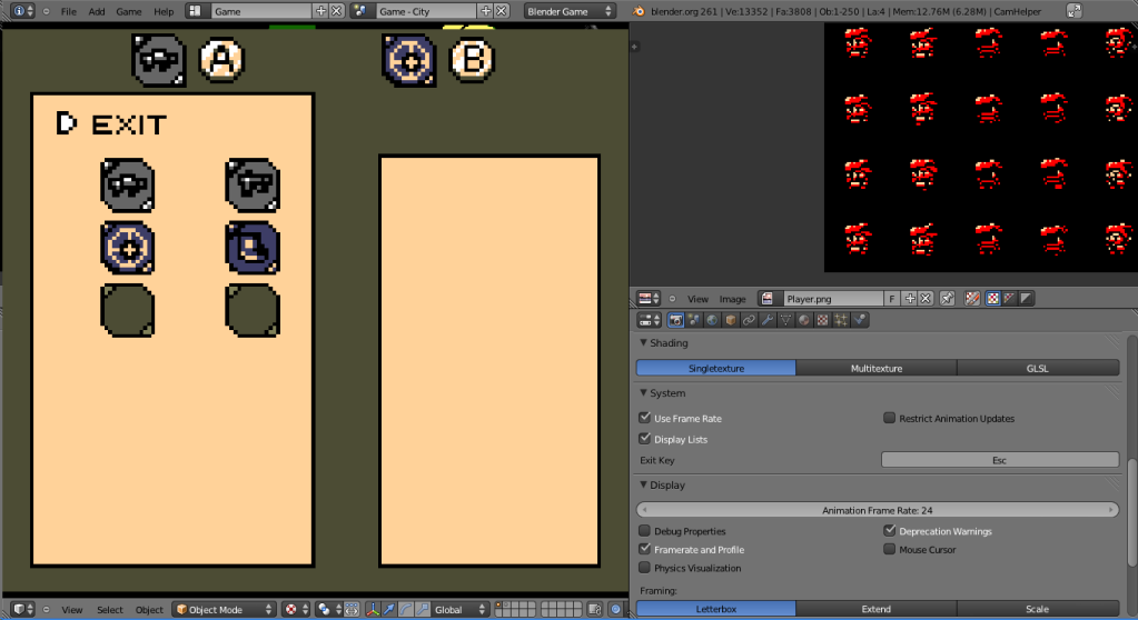 I'm not a fan of the colors - I think I'm going to go with yellow / white instead of green / yellow for the background. The icons are more readable, though. |
|
|
|
|
Logged
|
|
|
|
|
poe
Guest
|
|
« Reply #73 on: January 19, 2012, 11:32:32 AM » |
|
Like you said, bad color choices. other than that this looks great  |
|
|
|
|
Logged
|
|
|
|
|
SolarLune
|
|
« Reply #74 on: January 19, 2012, 11:36:25 AM » |
|
Thanks, poe. Here's the GUI again, but with the improved palette. 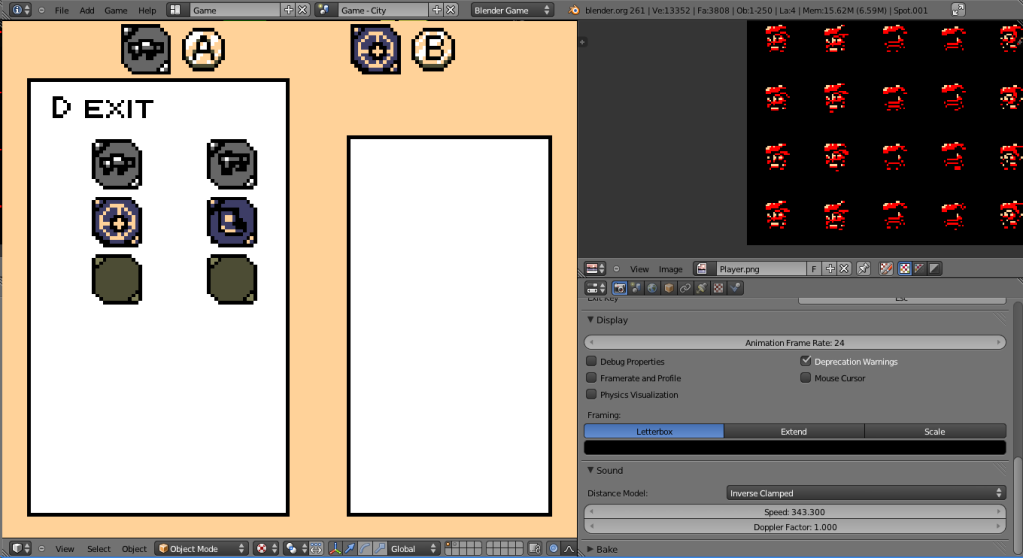 EDIT: Switched the colors again - instead of yellow / white, it's white / yellow. I think I'm going to stick with this setup - I like it. |
|
|
|
« Last Edit: January 19, 2012, 11:49:45 AM by SolarLune »
|
Logged
|
|
|
|
|
Chris Pavia
Guest
|
|
« Reply #75 on: January 19, 2012, 11:55:20 AM » |
|
In case you haven't tried it, http://kuler.adobe.com/ is a very useful resource. |
|
|
|
|
Logged
|
|
|
|
|
SolarLune
|
|
« Reply #76 on: January 19, 2012, 01:04:04 PM » |
|
Very interesting. I'm not really having a problem with color selection so much as just color placement on the GUI window, but I could definitely use this somewhere... Thanks! |
|
|
|
|
Logged
|
|
|
|
|
SolarLune
|
|
« Reply #77 on: January 20, 2012, 01:49:15 AM » |
|
So, here's another development log video. This one's number 5. It's already been over a month since I've started the devlog videos. I'm pretty happy with the amount of things I've implemented, though. |
|
|
|
|
Logged
|
|
|
|
|
BlueSweatshirt
|
|
« Reply #78 on: January 21, 2012, 01:28:26 PM » |
|
This is shaping up beautifully. |
|
|
|
|
Logged
|
|
|
|
|
Happy Shabby Games
|
|
« Reply #79 on: January 21, 2012, 02:08:07 PM » |
|
The only thing that looked strange/out of place to me were the lights in the sewer. What is the source of light supposed to be? Aside from that the game is looking great and it's cool to hear your commentary on things as you run around. Keep up the good work!
|
|
|
|
|
Logged
|
|
|
|
|
 Community
