|
jokubolakis
Guest
|
 |
« Reply #60 on: April 11, 2012, 04:36:34 AM » |
|
very nice, but I hate the screen shaking so much.
|
|
|
|
|
 Logged
|
|
|
|
|
I_smell
|
|
« Reply #61 on: April 11, 2012, 10:44:14 AM » |
|
I'm coming up with the 2 scientists who build the robot suit. When they're given the task to create a juggernaut-stopping man-tank, they come up with a quick fix to finish the final 10% that could get them torn asunder if anyone notices they aren't the world-saving geniuses they never asked to be painted as.  Top marks for guessing who they're based on!!! I'm gonna stretch their faces in all different ways now to prepare for the silly arguments and panic fits they'll get into. I hope I don't stick on this design, cos I don't think it's there yet.  |
|
|
|
« Last Edit: April 12, 2012, 02:31:39 AM by I_smell »
|
Logged
|
|
|
|
|
StephenM3
|
|
« Reply #62 on: April 11, 2012, 04:52:25 PM » |
|
Top marks for guessing who they're based on!!! Jerry and Mike of Penny Arcade, with an extra dash of "the tall thin one and the short fat one"? |
|
|
|
|
Logged
|
|
|
|
|
I_smell
|
|
« Reply #63 on: April 12, 2012, 02:21:24 AM » |
|
Yep.
I watch the 4th panel series all the time and those boneheads crack me up. So I said "That's good, I'll use that."
|
|
|
|
|
Logged
|
|
|
|
|
I_smell
|
|
« Reply #64 on: April 22, 2012, 04:03:52 PM » |
|
UPDATE! I've written down some new enemies and boss stuff in my lil pencil book, but the main thing I'm doing right now is making more art to solidify the world and the game's style.  The actual ART side of this image is kinda crummy, I should've picked one perspective n stuck with it- BUT it was a good excercise in trying out an art sensibility. Someone reminded me that Rtil existed, and I was like OH SHIT, I REMEMBER THAT GUY! And it turns out all he does all day is draw thick-cut chunky-ass females in space shooting pink lasers out o here there n everywhere. So I thought I should pay more attention to that guy.  The gravity on Mars is 38% that of Earth's, which is great news to me cos it FINALLY means I can have a world where little girls climb around and work on heavy machinery. In this and the last one I evidently can't draw hands, so... try n ignore that... I'm not usually an art person. Her face was originally this: 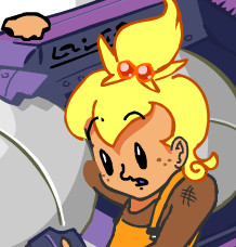 until I came up with what, in my mind, is a much funnier character. YES it's cuter if she's a Strawberry Shortcake character, but that's just not me.  Hopefully this is the kind of stuff you'll see in-game. I think this is the Horse-head nebula in the background, which I've already used, but I guess it's just my favourite nebula. Boy, isn't deep space pretty? That's a thing that exists in real life you're lookin at. It's billions of trillions the size of the sun, can you believe that? Again, I should say, I want most assets in this game to be polygonal- but with the kind of lighting I'm showing here. Everything has a distinct highlight rim to make it pop from the background, and the shadows are COOLER HUEs rather than just being darker. I learnt that from Team Fortress! Side-note: I hope to have boss fights take place in a letter-box screen, where the letter-boxing is an actual hitbox that you stop up against- but the bosses don't. Just a funny lil 4th-wall thing that'll hopefully make the boss fights feel bigger and more focused in more ways than one. |
|
|
|
|
Logged
|
|
|
|
|
Jay Tholen
|
|
« Reply #65 on: April 22, 2012, 05:08:58 PM » |
|
Oh man, this just went to a whole new level.  Love the character design. And I'm digging the alien language stuff. You should use that pervasively. |
|
|
|
|
Logged
|
Dropsy! Hypnospace Outlaw - You're a cop/moderator of the future-internet, which looks suspiciously like Geocities. Also you have a sweet car.
|
|
|
|
I_smell
|
|
« Reply #66 on: April 22, 2012, 05:33:10 PM » |
|
In No Time To Explain there was a part where I had to put some writing, so I just filled it with zig-zags and dots that connected to each other, and it looked pretty good. Since then I've used it on a couple other small things and I'm gonna keep usin it. I had a diagram that showed every character and symbol or name I make up on the spot usually crosses over into 2 or 3 other games without anybody noticing as a way to make it plausible that they all happen in the same world. but Imageshack low-res'd it over time  |
|
|
|
|
Logged
|
|
|
|
|
StephenM3
|
|
« Reply #67 on: April 23, 2012, 12:16:04 PM » |
|
I had a diagram that showed every character and symbol or name I make up on the spot usually crosses over into 2 or 3 other games without anybody noticing as a way to make it plausible that they all happen in the same world. but Imageshack low-res'd it over time 'swhy you use imgur now -- though it'll probably eventually turn shitty like imageshack did |
|
|
|
|
Logged
|
|
|
|
|
I_smell
|
|
« Reply #68 on: April 26, 2012, 04:10:34 PM » |
|
 I decided I should draw something that's not just "in space". The point of all these images is so I don't get halfway through the game and suddenly go "oh shit! what do I do next!?". The big decision for the art in this was that I wanted it to be 3D polygonal- which is crazy because I've never done a polygonal game before. I thought it was important so that everything would pick up highlights and shadows from all the flashes and lasers goin off. So I made this to demonstrate that. The cave background is actually just a flat 1-polygon plane. It's just a bump map that makes it look chunky, and a "self-illumination" map that makes it look glowy. There's no glow filter or anything, it just looks like there is. The bump map's pretty crummy but MISTAKES IS HOW WE LEARN!!!!!! These enemies are giant rock-worms that jump out from the background and try n get ya. You gotta beat em... try dropping a mine before they jump out or something. |
|
|
|
|
Logged
|
|
|
|
|
I_smell
|
|
« Reply #69 on: April 28, 2012, 02:46:27 AM » |
|
After so much playing around in 3DSMax, I learned that the options for lighting and materials aren't nearly as interesting in Unity. So I asked on the Unity forums and they said people make their own shaders and it's a coding thing that's completely out of my league. Well... I'LL SHOW THEM!!! 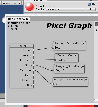 Properties on the left are linked to values on the right. There's a trillion different ways to set values here,and as soon as I figure out enough to link the Alpha of an Emission map to how lit up it is- I'll be GOOD AS GOLD. I've never done anything like this before, so I figured it was worth documenting. |
|
|
|
« Last Edit: April 28, 2012, 08:02:27 PM by I_smell »
|
Logged
|
|
|
|
|
Greg Game Man
|
|
« Reply #70 on: April 28, 2012, 06:48:12 AM » |
|
check out "stumpy shader editor" on the unity forums.
I think you should consider just doing the whole game in 3D. Simple robots like you're drawing just seem much better suited to 3D models, and it means you can REALLY take advantage of lighting/shaders/3D explosion effects/physics in Unity.
Also, have you played Vanquish? You'd like it.
|
|
|
|
|
Logged
|
|
|
|
|
I_smell
|
|
« Reply #71 on: April 28, 2012, 08:13:04 PM » |
|
I actually made a thread in the Unity forums asking "What should I do?" and the only reply was "Download the Strumpy Shader Editor and play around with it to learn about shaders". I'm doing most of the game in 3D! Robots and characters, enemies and backgrounds are all 3D, to take advantage of lighting like you said. The only 2D stuff is gonna be effects ( which I'm pretty confident with) and codec conversations with the humans inside the robots. I got that idea from Zone of Enders 2, where they had ALL the human stuff be hand-drawn, and ALL the robot stuff be smartly cel-shaded 3D. Because the robots were the size of skyscrapers, you never saw 2D assets standing next to 3D assets, so you never got that weird sense that everything looks dumb, but they still got the benefits from having both. Oh and shopping for weapons and in-between level stuff is all 2D. Why didn't I buy Vanquish the first time it came out... I can't remember... But yeah you're right, I would like Vanquish. More art: A LEGACY PASSED DOWN!!!  From the great and powerful arm of the resistance Chetakmunzikha who liberated the people of Mars from Earth, to the fearless leader Chetak, to Chet. Chet Jetset Jr. Jr. I was planning on sleeping hours ago, but then I started this and didn't wanna stop til I was done. |
|
|
|
|
Logged
|
|
|
|
|
ANtY
|
|
« Reply #72 on: April 29, 2012, 01:43:44 AM » |
|
Could use one more step between 2nd and 3rd generation anyway it's silly  |
|
|
|
|
Logged
|
|
|
|
|
I_smell
|
|
« Reply #73 on: May 02, 2012, 10:21:28 PM » |
|
 Above is the art I did in the Flash prototype, below is the 3D animation test. Wanna see the model close up? It's pretty awful! It's deliberately chunky and blocky for now. You can make sweet colours and materials in 3DSMax all day, but when you take that over to an actual game, I'm finding out it takes 10 times more effort to get 10% of what you wanted :/ Here's the concept btw, I might as well:  |
|
|
|
|
Logged
|
|
|
|
|
I_smell
|
|
« Reply #74 on: May 13, 2012, 04:18:24 PM » |
|
OH MAN THIS IS EXCITING!! 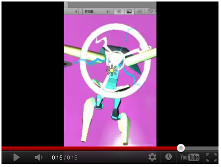 I'll save you all my complaining about how rough the transition into 3D games was, but finally getting here is pretty rewarding. Oh and uhhh... ignore the terrible messy textures in the background, that's me being bad at stuff, I'll get better at that at some point. EDIT- LIKE RIGHT NOW!!!!!  I practically do not use Photoshop, this is like my third attempt at this. I'm super happy with it. |
|
|
|
« Last Edit: May 14, 2012, 06:19:37 PM by I_smell »
|
Logged
|
|
|
|
|
I_smell
|
|
« Reply #75 on: May 24, 2012, 03:38:07 AM » |
|
Guys I need your help! 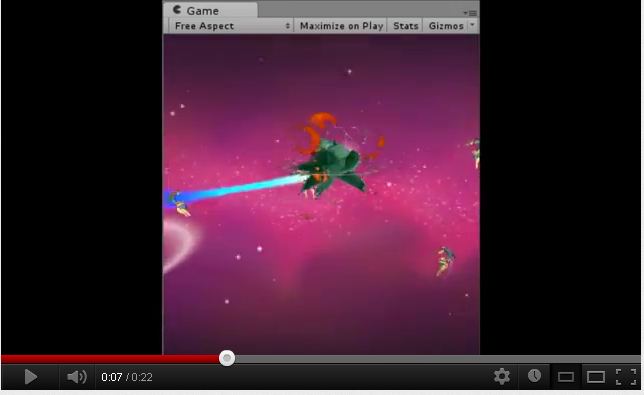 I added a blue jet to the enemies, and I can't tell if it makes everything look messy and stupid. Does it? Be honest. Does it look amatuer like a Photoshop filter? Pretty much all the "blue team" robots will have this, if I go along with it. Also consider whether or not the orange jet looks dumb. |
|
|
|
|
Logged
|
|
|
|
|
e-dog
|
|
« Reply #76 on: May 24, 2012, 04:20:50 AM » |
|
I added a blue jet to the enemies, and I can't tell if it makes everything look messy and stupid. Does it? Be honest.
Does it look amatuer like a Photoshop filter? Pretty much all the "blue team" robots will have this, if I go along with it.
Also consider whether or not the orange jet looks dumb.
Orange jet is okay. The blue one is great for spotting a sudden enemy attack, especially on that purple background. It looks somewhat off though. Maybe a richer gradient could help (the blue tail looks like it's a constant color), or maybe change that cyan in the middle a bit. |
|
|
|
|
Logged
|
|
|
|
|
I_smell
|
|
« Reply #77 on: May 24, 2012, 04:35:57 AM » |
|
Playing it full screen, the jet fire is kind of more of an attention grabber than the actual 3D models of the enemies.
It kind of feels like I'm fighting blue whips instead of robot dudes, so that's worrying.
|
|
|
|
|
Logged
|
|
|
|
|
bartholomew
Guest
|
|
« Reply #78 on: May 24, 2012, 05:05:40 AM » |
|
it's strange, i like pretty much everything about it, the activation telling you who will attack you next and from where, that you can have a lot of stuff going on and the trail will still tell you from where the danger comes etc. Still i think it has to change. Perhaps just a faster falloff?
|
|
|
|
|
Logged
|
|
|
|
|
I_smell
|
|
« Reply #79 on: May 24, 2012, 05:34:16 AM » |
|
I decided to keep the flash when they attack, but otherwise make it way smaller.
|
|
|
|
|
Logged
|
|
|
|
|
 Developer
