|
JLJac
|
 |
« Reply #3860 on: June 03, 2015, 11:44:15 PM » |
|
Check out this weird plant!  |
|
|
|
|
 Logged
|
|
|
|
|
oahda
|
|
« Reply #3861 on: June 03, 2015, 11:46:38 PM » |
|
I bet you haven't slept yet!
Now you need to name the plants! They look like wheels. And rollercoasters. And a little bit like Fibonacci spirals, some of them. And they're red~pink. And they're tall. WORK WITH IT.
Looks great. c:
|
|
|
|
|
Logged
|
|
|
|
|
Polyflare
|
|
« Reply #3862 on: June 04, 2015, 03:28:39 AM » |
|
That's definitely a weird plant.  |
|
|
|
|
Logged
|
|
|
|
|
lagdog
|
|
« Reply #3863 on: June 04, 2015, 03:29:38 AM » |
|
cant wait to play all this stuff ^^
|
|
|
|
|
Logged
|
|
|
|
|
tortoiseandcrow
|
|
« Reply #3864 on: June 04, 2015, 10:36:22 AM » |
|
Just remember to take days off, you guys! The perpetual crunch-cycle is no way to live.
|
|
|
|
|
Logged
|
|
|
|
|
JLJac
|
|
« Reply #3865 on: June 04, 2015, 01:23:42 PM » |
|
Update 433Working on visuals. How do you guys feel about this? Better? 
|
|
|
|
|
Logged
|
|
|
|
|
Christian
|
|
« Reply #3866 on: June 04, 2015, 01:43:15 PM » |
|
Idk, the second one seems very busy and cluttered and dim. The first seems more visually distinct; the depth of the environment is clearer, little details like pink plantlife and rust and the rivets/ruts in the metal structures pop out more. I do like the more dilapidated look of the environment in the second, but I feel the other environmental aspects are too obscured
|
|
|
|
|
Logged
|
|
|
|
|
Wlad
|
|
« Reply #3867 on: June 04, 2015, 01:43:46 PM » |
|
I like it...however isn't newer version's foreground too dark? Some details are completely gone.
|
|
|
|
|
Logged
|
|
|
|
|
gimymblert
|
|
« Reply #3868 on: June 04, 2015, 01:54:15 PM » |
|
clear version is best
|
|
|
|
|
Logged
|
|
|
|
|
alwex
|
|
« Reply #3869 on: June 04, 2015, 02:06:32 PM » |
|
I prefer the clear version, I find easier to differenciate background and playground in this version.
|
|
|
|
|
Logged
|
|
|
|
|
tortoiseandcrow
|
|
« Reply #3870 on: June 04, 2015, 02:10:16 PM » |
|
I like the additional depth to the background on the right-hand side of the screen, and how the pipes are more clearly part of the background (whereas before they were too similar in tone to the platform on the top-right, next to the transport tube), but otherwise there's too much visual clutter going on there. The spraypaint effect seems to flatten the background a lot on the left-hand side. Also, I like the purple! I think we'll probably get our fill of black in Shadow Urban, yes?
Honestly, the only change I'd make to the original is to move the pipes back a few layers so they are slightly lighter. The busted ropes and metal case that have been added in the bottom left-hand corner are a nice touch, though.
|
|
|
|
|
Logged
|
|
|
|
|
oldblood
|
|
« Reply #3871 on: June 04, 2015, 03:58:19 PM » |
|
I'm going to swim upstream. I like the darker version, feels more realistic. More "post-whatever apocalyptic thing" happened. And at some level, I always felts the colors in the alpha were bright and almost saturated. Maybe some middle ground between the two?
|
|
|
|
|
Logged
|
|
|
|
|
Ashedragon
|
|
« Reply #3872 on: June 04, 2015, 04:20:29 PM » |
|
I definitely also prefer the darker first version. It sticks with the general vibe way better, but it is rather hard to tell what's what.
|
|
|
|
|
Logged
|
|
|
|
|
lagdog
|
|
« Reply #3873 on: June 04, 2015, 04:49:52 PM » |
|
I like the cleaner version but it doesn't have the deep black value of the other which i feel adds more atmosphere.
maybe to much detail in 'wall' areas feels like they should be hidden
|
|
|
|
|
Logged
|
|
|
|
|
Lim-Dul
|
|
« Reply #3874 on: June 04, 2015, 11:22:55 PM » |
|
I don't know which version is newer (I assume the darker, more cluttered one) but I definitely prefer the lighter one. In the darker environment there's just too much stuff added to the background - in a platformer this could be a huge problem once the foreground starts blending in with the background and players lose the ability to distinguish where they can jump.
I find the light-dark contrast gives a very clean dividing line between foreground and background from a gameplay perspective.
|
|
|
|
|
Logged
|
War does not determine who is right - only who is left. - Bertrand Russell
|
|
|
|
JLJac
|
|
« Reply #3875 on: June 05, 2015, 12:00:32 AM » |
|
Thanks for the feedback guys! The darker palette is because I'm doing a thing where "inside" or "underground" rooms have an alternative darker palette, but I might have gone a bit too far with that. When it comes to how "clean" it is, that's a weird balance; obviously I want it to be an image of a dirty place, but it should be a visually clean image of a dirty place haha! I tried taking your comments into consideration and came up with this, what do you think?  |
|
|
|
|
Logged
|
|
|
|
|
chriswearly
|
|
« Reply #3876 on: June 05, 2015, 12:17:32 AM » |
|
Yeah I was gonna ask if you could you mix the two. And you've done that perfectly! Looks really good now :D
|
|
|
|
|
Logged
|
|
|
|
|
JLJac
|
|
« Reply #3877 on: June 05, 2015, 12:31:09 AM » |
|
Slightly subtler still:  |
|
|
|
|
Logged
|
|
|
|
|
Greipur
|
|
« Reply #3878 on: June 05, 2015, 12:34:38 AM » |
|
I must say that I like the original more, but I guess I've grown used to it for so long. I think this project have always looked interesting visually, but I think it's worthwhile to re-examine how you use textural (or detail) fidelity. I propose that you either reduce the detail fidelity in the foreground or the background. I think Lotte Reiniger's work is a good inspiration. She used more detailed backgrounds and simple silhouettes as the foreground. 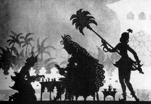  So what I'm suggesting is simply that I think your game would be more easily read if you decide to use details more sparsely, either in the background or in the foreground. I think it's worthwhile with making it darker though, and the purple/blue tint is very beautiful. |
|
|
|
|
Logged
|
|
|
|
|
oahda
|
|
« Reply #3879 on: June 05, 2015, 12:44:33 AM » |
|
The new one is pretty much what I was about to suggest. The last clearer one was good but had too little contrast between foreground and background IMO. New one seems to have fixed it.
|
|
|
|
|
Logged
|
|
|
|
|
 Community
