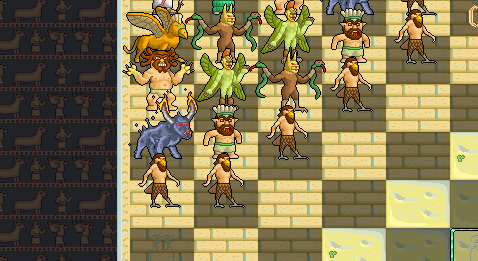
Too much saturation.
It pretty much works like so:
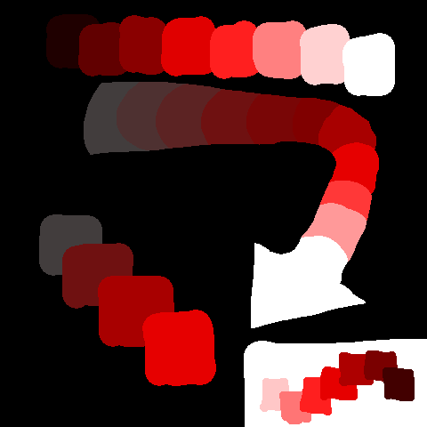
You progress in "layers" from dull (gray) to intense (i.e low saturation to high saturation) and if your background is dark you also progress dark to light (when your background is light you progress light to dark). Generally with hue you'd progress cold (violet, blue-violet, blue, cyan, green-cyan) to warm (green, yellow-green, yellow, orange, red, red-violet).
Think of your colors as sheets of light stacked on top of each other, if you want your background to appear at the bottom of the stack you need to adjust its hue, saturation, and value so that it is of weaker progression.
I did a little mini tutorial
here that shows a little more info.
 Developer
