|
ink.inc
Guest
|
 |
« on: April 12, 2012, 05:54:29 AM » |
|
LIST OF PAINTINGS/DRAWINGS/INCOMPLETE SHIT:APRIL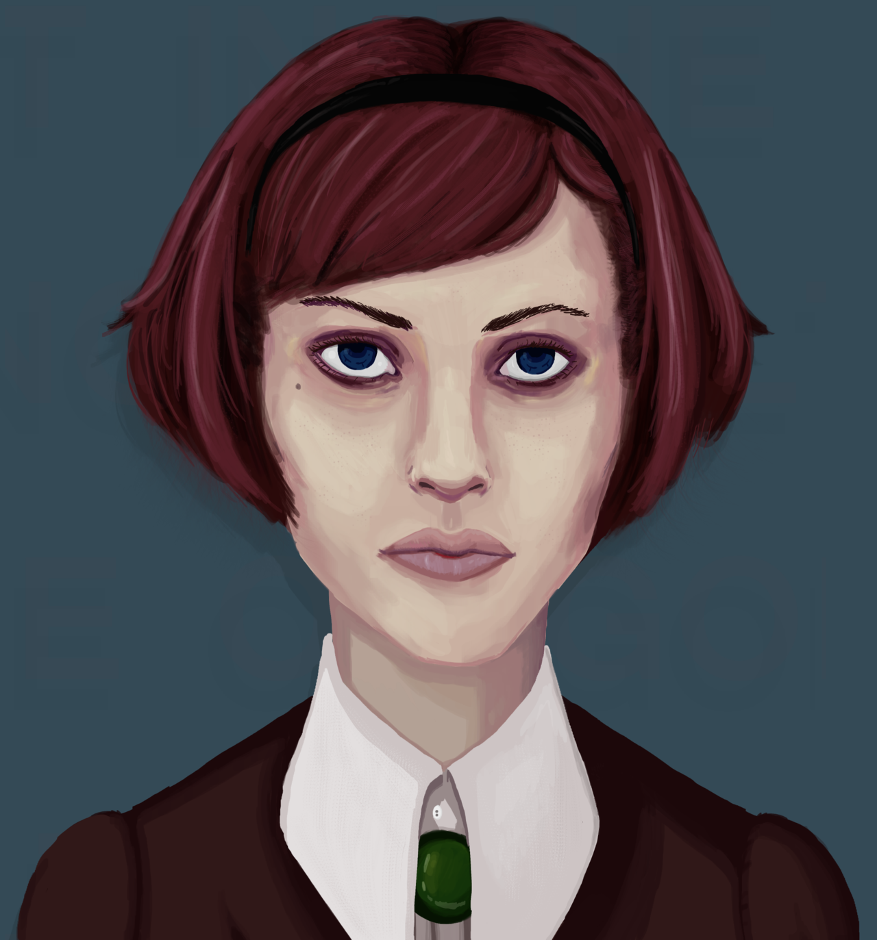 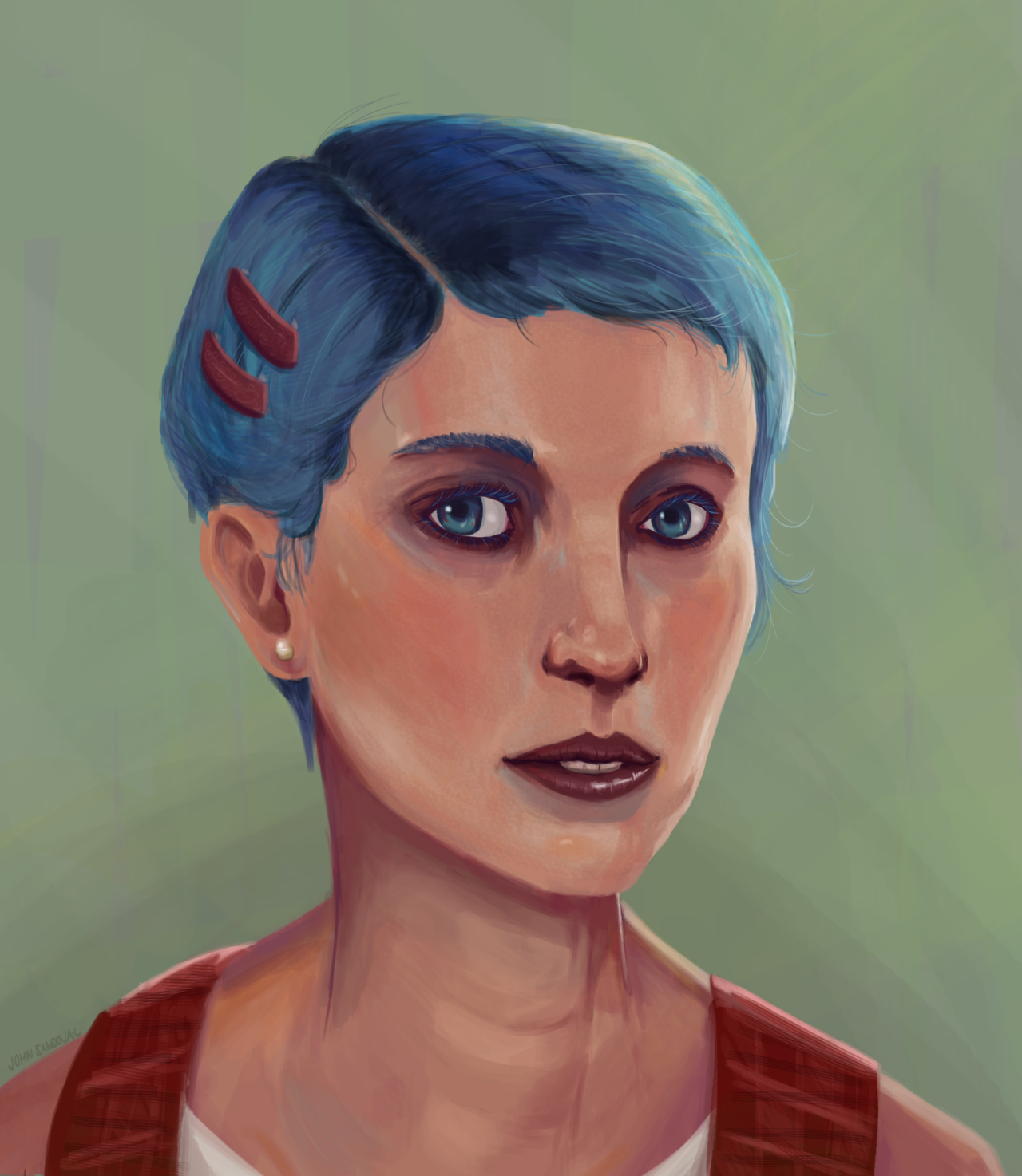  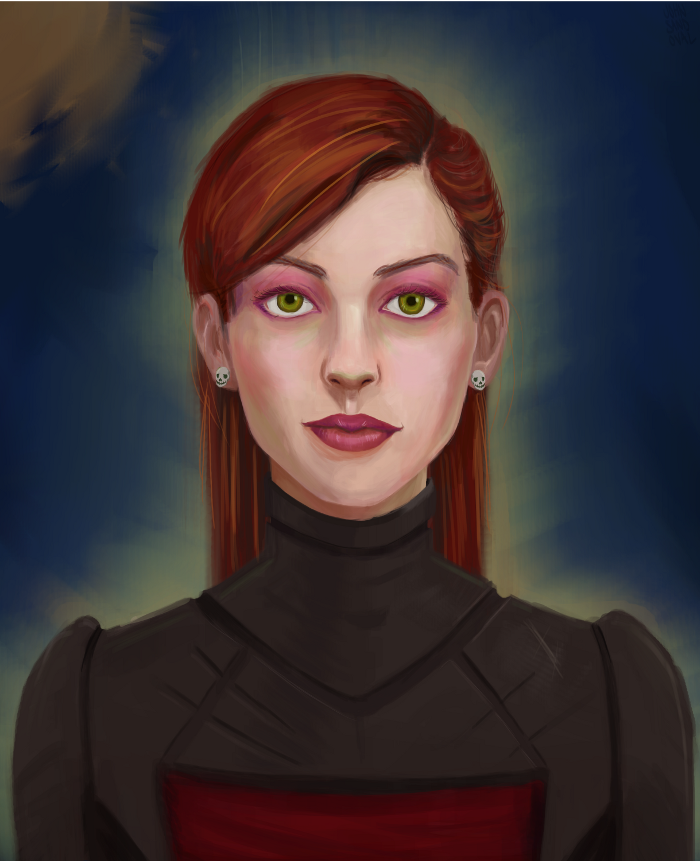 MAY MAY JULY JULY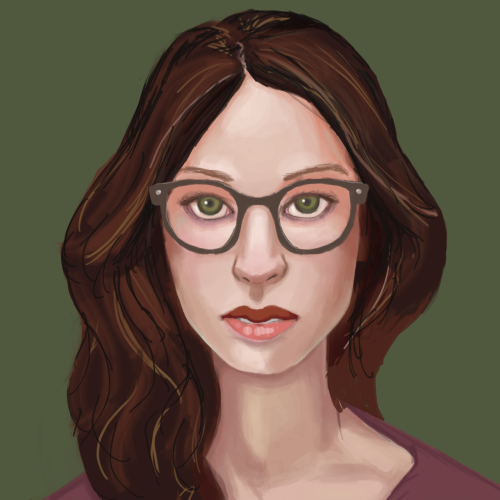 AUGUST AUGUST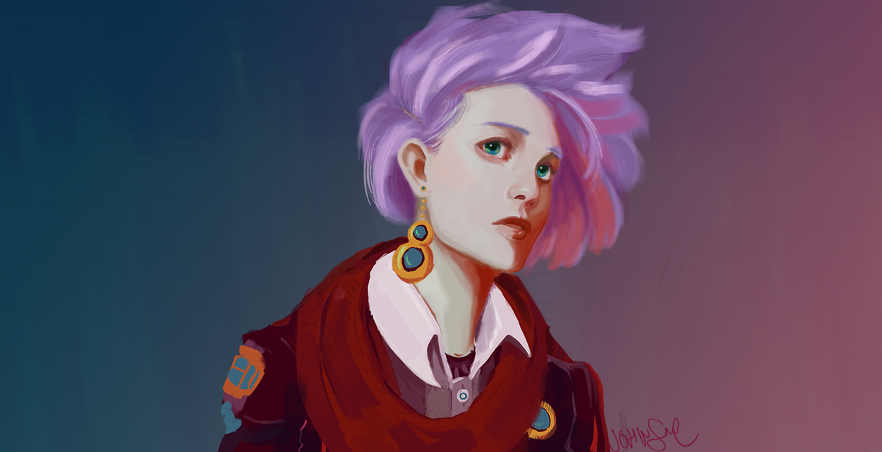 OCTOBER OCTOBER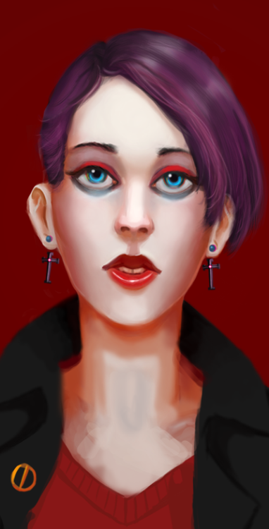 CURRENTLY WORKING ON:  _________________________________________________________________________________ _________________________________________________________________________________ _________________________________________________________________________________ Been wanting to learn how to paint a face; here I go! DAY ONE: 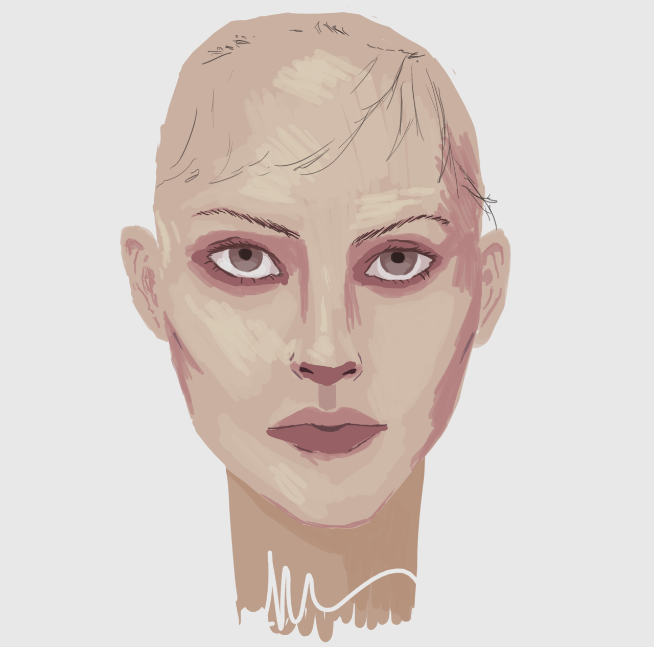 Following this step-by-step thingy. Guess I'm on step 3?  Have to figure out how to blend those skin tones... Pointers and tips would be greatly appreciated.
|
|
|
|
« Last Edit: October 22, 2012, 11:56:51 PM by John Sandoval »
|
 Logged
|
|
|
|
|
Ego_Shiner
|
|
« Reply #1 on: April 12, 2012, 05:58:41 AM » |
|
are you using a model? it seems like some of the shadows are kind of off, it would probably be a good idea to use one. also, it seems like you're trying to follow that chart a bit too closely, it will look better and you'll learn more if you try and do your own thing with it. mess with the colours and the style, that kind of thing, that way you'll be looking at why the shadows are where they are rather than just copying them. still, looks decent enough atm. the lips and nose especially look nice.
|
|
|
|
|
Logged
|
Lo
|
|
|
|
Nate Kling
|
|
« Reply #2 on: April 12, 2012, 02:33:43 PM » |
|
You jumped too far ahead you aren't really on any of the steps you are a little 3 and a little I don't know 6. I think you need to make sure to keep your brush big so you don't get the strokey look like you do now. You also went into detail way too fast, the great thing about the step by step you posted shows how they start with very little detail. I like to use the general rule that you use a very large brush at first and then as you progress your brush keeps getting smaller and smaller. Don't draw the eyes in or any details, just paint the forms and then allow those forms to create details. Just make sure not to rush, the head you have now isn't bad but it isn't following the methods shown in the guide.
|
|
|
|
|
Logged
|
|
|
|
|
ink.inc
Guest
|
|
« Reply #3 on: April 12, 2012, 10:21:36 PM » |
|
DAY 2 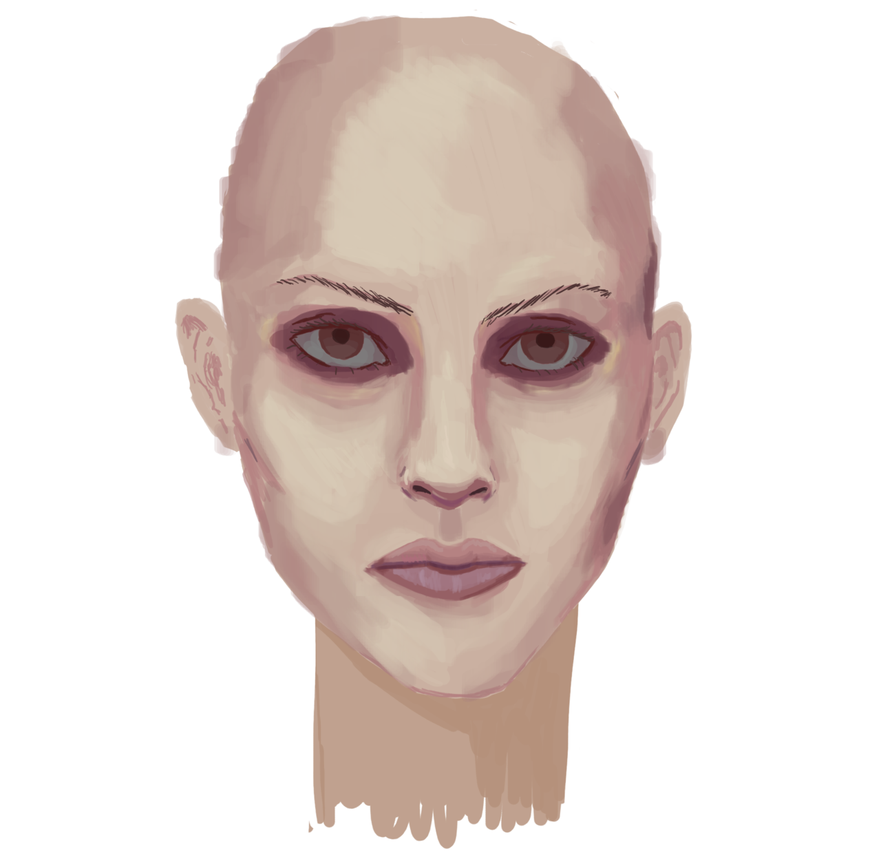  |
|
|
|
« Last Edit: August 21, 2012, 10:39:55 PM by John Sandoval »
|
Logged
|
|
|
|
|
ink.inc
Guest
|
|
« Reply #4 on: April 14, 2012, 03:24:04 AM » |
|
day tres  still got 2 days of this to go; then maybe i'll start up another one painting hair is tricky ;___; i must have restarted the process about 5 times before i could get it to not look like a helmet |
|
|
|
« Last Edit: April 14, 2012, 03:40:10 AM by John Sandoval »
|
Logged
|
|
|
|
kinoko
Level 0


|
|
« Reply #5 on: April 14, 2012, 04:27:02 AM » |
|
I think that looks absolutely amazing. I really like the slight asymmetries- they make the whole face look more natural. Amazing job. The work you've done with the shading since the first day is fantastic. Can't imagine how you could improve much more on it but I will look forward to seeing it!  2 things: Although they look amazing, particularly with the colour of the hair, I've never seen eyes that colour blue before. Takes away from the credibility of the rest of the face. Neck being more a more saturated hue than the face? I would have thought if anything that it would be the opposite, since the neck is more in shadow. And of course it's still a WIP but yeah, just my observations. |
|
|
|
|
Logged
|
|
|
|
|
ink.inc
Guest
|
|
« Reply #6 on: April 14, 2012, 07:40:22 PM » |
|
thank you theres always room for improvement added some freckles (which are pretty much invisible when its this zoomed out), some extra highlights to the hair, and some smoothening of the skin (but not too much; i like to see some roughness here and there). i could work on the fabric more but i think its time for me to start another one. and here's a gif of the whole process  |
|
|
|
|
Logged
|
|
|
|
|
|
|
ink.inc
Guest
|
|
« Reply #8 on: April 15, 2012, 10:59:24 PM » |
|
still omg-ing over that overpaint really, massively helpful much love, pen much love |
|
|
|
|
Logged
|
|
|
|
|
ink.inc
Guest
|
|
« Reply #9 on: April 16, 2012, 01:49:31 AM » |
|
I hope to approach the fidelity of Pen's paintover with this next piece. DAY ONE  I think I'd prefer to start with a rough linework first, and base future brushwork on that. |
|
|
|
|
Logged
|
|
|
|
|
jotapeh
|
|
« Reply #10 on: April 16, 2012, 11:23:26 PM » |
|
I'm excited to see this one develop. Painting has always been a weak point for me, hoping to gain some insight by hovering in this thread.
|
|
|
|
|
Logged
|
|
|
|
|
ink.inc
Guest
|
|
« Reply #11 on: April 17, 2012, 12:48:02 AM » |
|
DAY 2  |
|
|
|
|
Logged
|
|
|
|
|
ink.inc
Guest
|
|
« Reply #12 on: April 17, 2012, 05:26:47 AM » |
|
DAY 2.5  sleepy time UP NEXT: smoothing/blending the colors hair |
|
|
|
« Last Edit: April 17, 2012, 05:34:44 AM by John Sandoval »
|
Logged
|
|
|
|
|
pen
|
|
« Reply #13 on: April 17, 2012, 06:10:34 AM » |
|
looking good so far, you working with a ref? (show us!) Gonna be exciting to see how far you take this one, it's got much more depth to it than your last one  |
|
|
|
|
Logged
|
I AM FREE!
|
|
|
|
ink.inc
Guest
|
|
« Reply #14 on: April 17, 2012, 06:21:33 AM » |
|
Working from a combination of my girlfriend and this old photo of Mia Farrow.  This one is a bit tricky because I can't really tell what's shadow and what's freckle... Also I think theres ~3 light sources (judging from the 2 reflections in her left eye and the big bright one behind her)... So I kind of just winged it. |
|
|
|
|
Logged
|
|
|
|
|
pen
|
|
« Reply #15 on: April 17, 2012, 08:34:12 AM » |
|
yeah, it's an image with very diffused indoor lightnming and a very strong rimlight.  This is pretty much how you have to think about it, as if the face was a 3d-model. Then you can stray from the photograph a bit to give it more oomph! whilst still retaining somewhat correct lightning. |
|
|
|
|
Logged
|
I AM FREE!
|
|
|
|
ink.inc
Guest
|
|
« Reply #16 on: April 17, 2012, 08:42:16 AM » |
|
pen i
i love you
|
|
|
|
|
Logged
|
|
|
|
|
Alevice
|
|
« Reply #17 on: April 17, 2012, 08:45:56 AM » |
|
I would recoommend broader strokes so the result doesnt scream sketchy
|
|
|
|
|
Logged
|
|
|
|
|
pen
|
|
« Reply #18 on: April 17, 2012, 09:08:52 AM » |
|
pen i
i love you
I... It's not like I really like you or anything, you baka! G-geez. |
|
|
|
|
Logged
|
I AM FREE!
|
|
|
|
ink.inc
Guest
|
|
« Reply #19 on: April 17, 2012, 11:12:01 PM » |
|
Day FINAL   |
|
|
|
« Last Edit: April 17, 2012, 11:53:02 PM by John Sandoval »
|
Logged
|
|
|
|
|
 Developer
