|
ortoslon
Guest
|
 |
« Reply #20 on: May 21, 2012, 03:20:18 PM » |
|
|
|
|
|
|
 Logged
|
|
|
|
|
brettchalupa
Guest
|
|
« Reply #21 on: May 21, 2012, 03:55:04 PM » |
|
This thread is super awesome and useful. Thanks everyone for what they've posted. Radiant Historia is a game that always struck me with impressive menus and UI. I think a game that handles UI super simply (and maybe sometimes not so well) is the Dragon Quest games. I think DQIX stepped it up a little bit, as the UI seemed clean and worked well enough.  |
|
|
|
|
Logged
|
|
|
|
|
Hayden Scott-Baron
|
|
« Reply #22 on: May 22, 2012, 02:26:55 AM » |
|
Dragon Quest's GUI is really nice and clean. I'm a big fan of classic console GUIs with a limited amount of information on the screen. I can't enjoy 'western RPGs' because of the teeny tiny GUIs with lots of different information going on, such as those seen in Dragon Age and every MMORPG.
|
|
|
|
|
Logged
|
|
|
|
|
Azure Lazuline
|
|
« Reply #23 on: May 22, 2012, 04:46:56 AM » |
|
This thread is awesome. Menu design is still something I need to work on a bit more. (And +1 for the Swordcraft Story, even if the menus there aren't anything special.) Most of my favorite menus have already been mentioned, but I'd like to point out Battle Network again, since I think it looks really nice and is easy to navigate too. Knights in the Nightmare also has a really cool theme for GUI elements, really over-the-top stylish (like the rest of the game):   |
|
|
|
|
Logged
|
|
|
|
|
s0
|
|
« Reply #24 on: May 22, 2012, 06:08:42 AM » |
|
|
|
|
|
|
Logged
|
|
|
|
|
JWK5
Guest
|
|
« Reply #25 on: May 22, 2012, 01:08:39 PM » |
|
It's from some game called "Call of Thrones" that I happened across as I was browsing google. I am not a big fan of the color scheme (there is a lot of competing colors going on there) but I like how clean and readable the layout is.  The Shining Force games always had nice menu layouts that were uncluttered and very readable, and they meshed well with the bright and upbeat graphics that the series had.  |
|
|
|
« Last Edit: May 22, 2012, 01:16:30 PM by JWK5 »
|
Logged
|
|
|
|
|
Derek
|
|
« Reply #26 on: May 22, 2012, 01:42:19 PM » |
|
Blizzard always makes some attractive menus (Diablo 3): 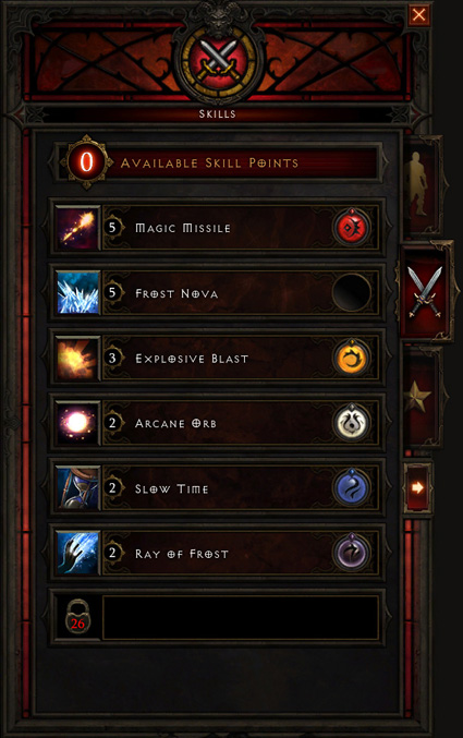 Etrian Odyssey 2:  |
|
|
|
|
Logged
|
|
|
|
|
JWK5
Guest
|
|
« Reply #27 on: May 22, 2012, 02:01:05 PM » |
|
BioShock had some really killer menus that not only were very readable but also fit the theme of the game really well.  |
|
|
|
|
Logged
|
|
|
|
|
craigtimpany
|
|
« Reply #28 on: May 22, 2012, 07:56:21 PM » |
|
Which platform are you on?
Press X
Because most of those console JRPG UIs are built to solve the problem of not being able to display many kanji on an SD display.
Press X
If you're on PC, you can show a lot more text than that. For example, you don't need to abbreviate the stat names!
Press X
Also, if you really must print out dialogue glyph by glyph, crank up the rate. Everybody can read much faster than that.
|
|
|
|
« Last Edit: May 22, 2012, 08:01:22 PM by craigtimpany »
|
Logged
|
|
|
|
|
Azure Lazuline
|
|
« Reply #29 on: May 22, 2012, 10:42:17 PM » |
|
I'd just be very careful with assuming everyone has a huge monitor. The worst thing ever is when you can't read important stat info or dialogue. If you really must have tiny text in your game, at least give an option to make it bigger.
My personal rule is that it should be crystal clear on 1024x768, and at least readable on 800x600.
|
|
|
|
|
Logged
|
|
|
|
|
JWK5
Guest
|
|
« Reply #30 on: May 23, 2012, 01:46:24 AM » |
|
Also, many JRPGs use dialog windows in the same manner comic books use word balloons, with the "press X" window shifting reflecting moments of pause between what the speakers are saying. One of my favorite uses of dialog window text is in Shining Force 3 where an NPC is talking to you about something terrifying and his dialog starts out normal text but then (without shifting windows) breaks into an animated "shaky" text as if he suddenly starts to tremble as he speaks. This sort of text-play is something you don't see enough in RPGs, especially western RPGs with their novel-like presentations, and I wish developers would start taking cues from comic book letterers. The look of text is often just as powerful as its meaning when it comes to expressing the speaker's emotions. It is was actually a big immersion killer for me in Neverwinter Nights (which is a game I otherwise enjoyed thoroughly) because the NPCs spoke at you in lifeless walls of text which really diminished the impact they otherwise could have had. "Plain" text is not quite as bad in games where there is a lot of spoken dialogue where the text is more like a subtitle (in NWN there was spoken dialogue, but only brief bits) and of course there will always be games that are better suited to novel-like presentations I just don't feel that most RPGs are (unless the game is graphically sparse as a whole, such as early PC RPGs).  In any case, here's a pretty straightforward but informative tutorial on comic lettering, created by TheMightyFro: Comics Lettering TutorialComics Lettering Theory Part 1Comics Lettering Theory Part 2 |
|
|
|
« Last Edit: May 23, 2012, 02:07:59 AM by JWK5 »
|
Logged
|
|
|
|
|
JWK5
Guest
|
|
« Reply #31 on: May 23, 2012, 11:19:11 PM » |
|
Theathrythm Final Fantasy  This is like an example of how to not to make a menu system. There is shit all over the place, competing colors galore, and some of the worst contrast balancing I've seen in a professional game in a very long time... |
|
|
|
|
Logged
|
|
|
|
|
s0
|
|
« Reply #32 on: May 24, 2012, 12:15:24 AM » |
|
also terrible game name
|
|
|
|
|
Logged
|
|
|
|
|
Azure Lazuline
|
|
« Reply #33 on: May 24, 2012, 12:48:30 AM » |
|
Oh yeah, on the topic of emulating other verbal things using text bubble variations. Different little effects are cool too - Paper Mario really stands out with its shaking text when the character is scared, and wavy text when the character is speaking teasingly. Phoenix Wright has cool text effects too, but they're more subtle. Stuff like that needs to be expanded on more, I think. Something I played around with in my game Copy Kitty is giving each character a different text box (prototype image, but it's the only one I had on-hand that shows two different boxes at the same time), even though there are like 2 cutscenes in the entire game. I'd love to see a more text-heavy game use something like that. I mean, characters all have different voices, so why shouldn't you try to represent that? |
|
|
|
|
Logged
|
|
|
|
|
BlueSweatshirt
|
|
« Reply #34 on: May 24, 2012, 04:11:49 AM » |
|
Theathrythm Final Fantasy
<snip>
This is like an example of how to not to make a menu system. There is shit all over the place, competing colors galore, and some of the worst contrast balancing I've seen in a professional game in a very long time...
That's very disappointing.  The layouts of the individual UI pieces look nice, but it feels like they didn't put any forethought into how everything would fit together on the screen as a whole. Yuck |
|
|
|
|
Logged
|
|
|
|
|
craigtimpany
|
|
« Reply #35 on: May 25, 2012, 10:12:12 PM » |
|
Also, many JRPGs use dialog windows in the same manner comic books use word balloons, with the "press X" window shifting reflecting moments of pause between what the speakers are saying. Yeah, classic JRPGs have a definite aspiration to being real-time rather than novelistic, but so often there's no character animation to go along with it. The button prompts are just being used as a dead-man's switch to pause the cutscene. You point out a lot of really cool typographical conventions that can convey emotion; you don't need to animate typing just so that you can do a pause now and then. People know what an ellipsis means without needing to see the dots individually appear. I wouldn't want anyone to go to the other extreme, a static wall of text. There's quite a lot of interactive fiction that uses press-a-key prompts intelligently, even though everything else is novelistic. Whenever they need to present a lot of non-interactive text they break it up into exchanges that are shorter than a screen. |
|
|
|
|
Logged
|
|
|
|
|
|
|
Theophilus
Guest
|
|
« Reply #37 on: June 01, 2012, 09:26:03 PM » |
|
this is my new favorite subsubforum on TIGs.
|
|
|
|
|
Logged
|
|
|
|
|
ink.inc
Guest
|
|
« Reply #38 on: June 01, 2012, 09:55:14 PM » |
|
And I hate to be that guy, but I think the persona menus are awful. There's so much color and so much going on
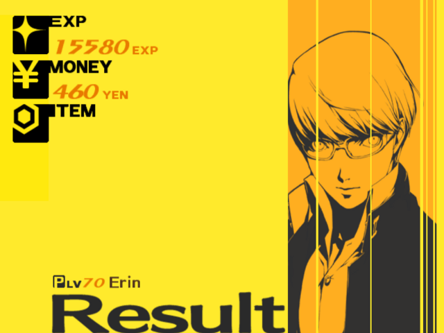 there are 3 colors in this menu idk about you but this looks pretty clean to me  in fact, all of these are pretty straight to the point idk, are we even looking at the same things or am i just going crazy |
|
|
|
« Last Edit: June 01, 2012, 11:08:25 PM by John Sandoval »
|
Logged
|
|
|
|
|
JWK5
Guest
|
|
« Reply #39 on: June 02, 2012, 02:45:35 PM » |
|
I think the brutally-saturated yellow is what he is referring to, which I have to agree. There are parts of the game where it is fairly dark and mute and then when you suddenly get an eye-full yellow it is like a spear going through your eyeballs. I like the pop-ish vibe of it, I just don't like how agonizingly saturated the yellow is. Yellow is one of those colors you've really got to be careful with and use moderately.
|
|
|
|
|
Logged
|
|
|
|
|
 Developer
