Welcome, Guest. Please login or register.

Login with username, password and session length

 
Advanced search

1411422 Posts in 69363 Topics- by 58416 Members - Latest Member: JamesAGreen

April 18, 2024, 11:20:06 AM

Need hosting? Check out Digital Ocean
(more details in this thread)
TIGSource ForumsDeveloperArt (Moderator: JWK5)Logo Reference
Pages: [1] 2
Print
Author Topic: Logo Reference  (Read 12859 times)
JWK5
Guest
« on: June 07, 2012, 02:54:18 PM »

I've been slacking on my reference posts lately (fucked up hand, my birthday, Radiant Historia, etc.) but Kramlack had asked me to do a topic on logos so I figured that now would be a good time to get back on track.

Before I post the reference sheets, I wanted to just break down a few things about logos real quick. My two biggest pet peeves are logos that don't include vital information about the subject (the game name, company name, etc.) which can make it difficult to search out more info about the subject if you are not overly familiar with it, and logos that are so obnoxiously stylized that you can't immediately understand what it is written. A good example of that last one is as follows:

GOOD:


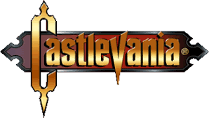
This is an absolutely beautiful logo, it has style but is clean and readable, it has a rhythm to it and it's colors balance nicely, and it carries the theme of its subject nicely. It looks equally good on just about any background you throw it on, light or dark.


BAD:


This is a terrible logo, the lettering is jammed together which only exacerbates the fact that it is far too stylized, which is then compounded by the fact that the gradient makes the whole thing run together. What should be the most important part of the logo (Castlevania, the brand name) instead loses impact due to turning into one big jagged gradient bar so instead "Order of Ecclesia" (which should play second fiddle to the brand name) immediately jumps out and takes focus. To be fair, it is not as bad when placed on a fairly dark background, but then that really limits what can be done with the logo.


When you are designing the logo it is not just what you are saying with it that is important but also how you are saying it. The best logos have a sort of hierarchy to them usually with the brand name or subject name taking precedence and then each other element follows in suit progressively. You want the logo to be readable almost instantly, especially the brand/subject, so you should not overpower it with distracting imagery. The rhythm and flow of a logo can be broken down pretty easily and using contrasting sizes, shapes, colors, etc. you really have a lot of control how the viewer interprets your logo. Take the following examples:


I have intentionally packed the logos in tightly together in the following reference sheet. A good logo should be able to stand out or at least hold its own in a crowd of logos (which is something it will be up against when placed on a website, store shelf, etc.). When you look at this reference sheet don't just look at the individual logos, zoom out and see which ones stand out the most. See which logos tend to "blend together" and which clash, and so on. When you do create your own logo a good test for it would be to add it to the reference sheet and see how it handles in the crowd. Move it around to different spots on the sheet and see how its impact changes.


I will be adding more reference sheets as I go, but in the meantime I've found that the best designed logos out there tend to be sports logos (which makes sense considering how much sports leagues invest into it) so that might be something worth searching up on Google Image. Comic book titles and restaurant logos can also yield some pretty interesting results too.

Logo Reference:


(Click for actual size)
« Last Edit: June 07, 2012, 03:13:19 PM by JWK5 » Logged
emacs
Level 10
*****

...


View Profile WWW
« Reply #1 on: June 07, 2012, 04:38:16 PM »

Read this blog.  It's good.
http://www.underconsideration.com/brandnew/
Logged

rek
Level 7
**


View Profile
« Reply #2 on: June 07, 2012, 06:14:42 PM »

There are three types of logos you should be aware of when you set out:

1. the symbol/icon logo
This is a logo that is just a symbol or image. The name of the company/product generally does not appear with the symbol. Think Apple or Nike or Red Cross or WWF – all international top brands. I can't think of a single video game (or publisher) that gets by on just a symbol, so leave this to the big boys.

2. the logotype/wordmark
This is a "logo" that is just the name of the company/product. It doesn't have to be very stylized (think of Facebook), but it can be (Coca-Cola, Mossimo). Using a custom typeface ("font") is recommended, because then it's less likely your logo will resemble someone else's set in the same typeface.

3. the combination mark
This is the combination of numbers 1 and 2. The two pieces, the symbol and wordmark, are combined in a specific way, called the lock-up. The wordmark component in a combination logo is generally not as stylized as a logo that is just a wordmark, and may in fact be rendered differently from how it would appear on its own (think of Starbucks' old logo: "Starbucks Coffee" encircled the mermaid, but when used on its own it was just horizontal).

A company/brand may have all three types of logos, and use them according to their own branding rules. Think of McDonald's: their trademark Golden Arches and the wordmark "McDonald's" appear by themselves in certain places and in combination in other places.

There is a fourth element you should be aware of, called the container. It is a shape (either solid or an outline) the logo sits within. They are useful for creating a combination logo (tying the wordmark and symbol together) and for giving a complicated logo a simple and easily recognized silhouette. Not all logos have them, and sometimes the container is only used in certain situations. Lego's red square, and Nintendo's rounded rectangle are examples of containers.


(I'm a graphic designer – I design logos (among other things) for a living – and would be happy to offer help/critique to anyone working on a logo for their game or studio or whatever. Message me or point me to the right thread for that.)
Logged
emacs
Level 10
*****

...


View Profile WWW
« Reply #3 on: June 07, 2012, 06:36:12 PM »

I can't think of a single video game (or publisher) that gets by on just a symbol, so leave this to the big boys.
Half-Life (2) - λ
Logged

ink.inc
Guest
« Reply #4 on: June 07, 2012, 06:41:03 PM »

The lambda symbol is hardly exclusive to HL2.
Logged
rek
Level 7
**


View Profile
« Reply #5 on: June 07, 2012, 06:49:13 PM »

I can't think of a single video game (or publisher) that gets by on just a symbol, so leave this to the big boys.
Half-Life (2) - λ

It has a symbol, but it also has a wordmark and a combination (HλLF-LIFE2).
Logged
Kramlack
Guest
« Reply #6 on: June 07, 2012, 10:02:29 PM »

Thanks for making this JWK5, I love you.

I'll be back with some game logo's I've found in a few days!
Logged
Miko Galvez
Level 7
**


Designer & Engineer


View Profile WWW
« Reply #7 on: June 09, 2012, 09:18:04 AM »


this one is hard to read for me..
Logged

ink.inc
Guest
« Reply #8 on: June 09, 2012, 12:17:23 PM »

canada
Logged
rek
Level 7
**


View Profile
« Reply #9 on: June 09, 2012, 12:57:53 PM »


The D-A kerning is bugging the hell out of me.
Logged
Alevice
Level 10
*****


View Profile WWW
« Reply #10 on: June 10, 2012, 09:13:34 PM »

i actually think it works great imo
Logged

Delko
Level 1
*


View Profile WWW
« Reply #11 on: June 11, 2012, 10:35:56 AM »

The kerning on the polytron logo is pretty painful too.
Logged

rivon
Level 10
*****


View Profile
« Reply #12 on: June 11, 2012, 10:46:37 AM »

I have to agree here about the kerning of both the Canada and the Polytron.
Logged
Player 3
Level 10
*****


View Profile
« Reply #13 on: June 11, 2012, 10:50:28 AM »

The keming's not too bad on either of them.
Logged
emacs
Level 10
*****

...


View Profile WWW
« Reply #14 on: June 11, 2012, 05:11:24 PM »

The CANADA one is really bothering me.  The polytron logo is bad too, but it's subtler than the "D A."
Logged

JWK5
Guest
« Reply #15 on: June 11, 2012, 06:20:51 PM »

I don't think the 'Polytron' one is too bad, at leat its got a rhythm to it that leads you to immediately decipher it, but the 'Canada' one to pretty obnoxious to me.
Logged
Kramlack
Guest
« Reply #16 on: June 12, 2012, 06:37:15 AM »


Logged
rek
Level 7
**


View Profile
« Reply #17 on: June 12, 2012, 07:50:36 AM »


Strong wordmarks with distinct style.
Logged
Kramlack
Guest
« Reply #18 on: June 12, 2012, 07:53:31 AM »

@Rek: Your wordmark logos remind me of taking a train ride home recently, where I noticed a lot of graffiti on the tunnels. It was really interesting to see the various shapes and sizes it came in, and how nice a lot of it looked, compared to your average tagging around cities. I feel like having a deeper appreciation for graffiti would be a good place to start in learning how to design incredible logos.
Logged
emacs
Level 10
*****

...


View Profile WWW
« Reply #19 on: June 12, 2012, 09:32:05 AM »

http://dribbble.com/search?q=logo
Logged

Pages: [1] 2
Print
Jump to:  

Theme orange-lt created by panic