|
Pixelulsar
|
 |
« Reply #20 on: October 24, 2012, 03:18:35 PM » |
|
That art looks great! Thanks a lot for all the suggestions and the art.
I am going to do different floor types like in Spelunky, was thinking something like: caves, labyrinth, ruins, aquifer, hell, infected mother-ship, but not all of those are definite, I'll come up with better idea's along the way.
I was thinking of a graphics overhaul, because I'm not too happy with the current graphics, but kept putting it off. What you did looks great, and has inspired me to re-consider the graphics. Any ways, it will be easier to change everything now before I get to far. I'm going do a mockup in the lower resolution style, and see how I like it.
The name is not set in stone, so I'm definitely open to new name suggestions.
Thanks again for all the great feedback, it's really helpful!
|
|
|
|
|
 Logged
|
|
|
|
|
caffeine
|
|
« Reply #21 on: October 25, 2012, 10:14:51 AM » |
|
I think I'm getting a bit too carried away with my help haha. But here's a quick labyrinth to show what can be achieved by just adding a couple of alternate floortiles. 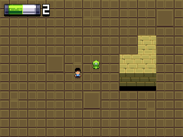 As you can see these little variations can still make a big difference. |
|
|
|
« Last Edit: October 25, 2012, 11:39:25 AM by green »
|
Logged
|
|
|
|
|
Pixelulsar
|
|
« Reply #22 on: October 25, 2012, 11:07:58 AM » |
|
I think you are getting too carried away, but it is really helpful. The new area you drew looks cool. There are alternate floor tiles in current version, so they will be easy to implement.
Mockup soon.
|
|
|
|
|
Logged
|
|
|
|
|
SolarLune
|
|
« Reply #23 on: October 26, 2012, 07:19:29 AM » |
|
Cool tiles. The bricks are nice. I think the ground tiles could be darker and redder, and the shadow under the blocks being pure black looks a bit odd, but it looks good overall. I love the GUI. The little guy's cool, too. @Pixelulsar - I wouldn't say he's getting too carried away. Help is good. It's good to study others' mockups or art to see proportions and styles. Everybody's style is different. |
|
|
|
|
Logged
|
|
|
|
|
Pixelulsar
|
|
« Reply #24 on: October 26, 2012, 12:21:27 PM » |
|
This is a mockup based on the examples the most helpful person ever did for me. I like this one a lot more, but what do you guys think?  Unfortunately this is only a mockup, so I still need to add it in to the actual game. That could take a bit because it is a total overhaul, but it will be worth it. At least I didn't procrastinate ans did this early, so there is not as much to change. Another positive of updating the graphics would be, these ones are way simpler which means it won't need to be automatically tiled. This will cut down on loading times. |
|
|
|
|
Logged
|
|
|
|
|
SolarLune
|
|
« Reply #25 on: October 26, 2012, 01:28:57 PM » |
|
That looks leagues better. I think the edges of the rock walls shouldn't be so square, and I think the shadows should extend further / not be pure black so they look less like they're obscuring all light, but overall, it's really very good. I think the main character's eye needs to extend further back for his side view, and the bat's wings feel a little 'pillow-shady' (maybe you could extend the wings another pixel or two downwards so they don't feel like strips), but I like the characters.
|
|
|
|
|
Logged
|
|
|
|
|
happymonster
|
|
« Reply #26 on: October 26, 2012, 01:32:17 PM » |
|
Yes, it's a lot better.  I'd ask Green to help with the rest of the graphics..  |
|
|
|
|
Logged
|
|
|
|
|
baconman
|
|
« Reply #27 on: October 27, 2012, 12:41:28 AM » |
|
That does look quite qwesome-sauce'm. |
|
|
|
|
Logged
|
|
|
|
|
Maverick Denizen
|
|
« Reply #28 on: October 30, 2012, 04:16:04 AM » |
|
As for your tile problem, I believe it's because you're displaying the game from a top-down, 45 degree angle view, but the floor looks like a rock wall. Try to adhere to perspective more for the floor tiles, like the tiles of the top of the wall you have now. Also, you've got the light source for the floor tiles being above the floor tiles, like a sun that's above everything. You might not want to highlight areas so much as shade areas.
EDIT: And yeah, this looks better overall than the other thread, to me, so you're improving.
I have to agree with SolarLune here, for quite some time I believed that the main character was floating instead of walking on the ground. I really don't know how this could be helped (I always sucked at drawig things in perspective) but try to address it if you can because as of now it's a bit confusing. Other than that the graphics are very nice, keep it up! (Edit: now that I come to think of it, it actually looks a lot less confusing with the new main character sprite, but it's still a bit weird. As far as I see it right now, it maybe has to do with the floor colour - since it's so blue and dark, it appears a bit more like a background or deep backdrop than an actual floor. Maybe you could consider making it look a bit more... well, floorlike.  Maybe make it a bit more bright, or change the texture entirely. These are merely some subjective thoughts though, keep that in mind.) |
|
|
|
« Last Edit: October 30, 2012, 05:46:35 AM by Maverick Denizen »
|
Logged
|
|
|
|
|
|
|
Pixelulsar
|
|
« Reply #30 on: October 30, 2012, 12:44:26 PM » |
|
Thanks for the positive feedback, and all the advice.
Still no updates, this is taking a lot longer then I expected, but I think it is for the best.
Just re-doing explosions now, and after that I only have the HUD. Might do something like the one in greens because it looks great, but it needs to display a lot of stuff so that could get cluttered. I will update when the redesign is done.
I don't plan on making the walls less square at the moment, but maybe in the future. However I will fix the bats. When I add them. In a few years when I'm done this graphics overhaul.
|
|
|
|
|
Logged
|
|
|
|
|
|
|
Pixelulsar
|
|
« Reply #32 on: October 31, 2012, 11:15:05 AM » |
|
Your stuff always looks so good!
I already added in a alien type bomb, and I was thinking about changing gold into scrap metal that you make into stuff instead of gold. Love that missile icon.
|
|
|
|
|
Logged
|
|
|
|
|
Pixelulsar
|
|
« Reply #33 on: November 01, 2012, 12:01:29 PM » |
|
Update 7 Finally got all the new art done and in game, so the game is finally playable with the new better graphics! Also added walls that don't get destroyed by bombs, those are the grey metal ones. The redone explosion looks way better, and I'm pretty happy with it.  Sadly, the old HUD doesn't fit with the new art so I still need to overhaul that  I'll probably do something like the vials that green drew as the HUD for health and ammo, but I'm not set on what I'm doing for bombs and money. I'm probably going to take a break from redoing stuff so the HUD changes won't be for a while. |
|
|
|
|
Logged
|
|
|
|
|
eigenbom
|
|
« Reply #34 on: November 01, 2012, 08:58:26 PM » |
|
following this |
|
|
|
|
Logged
|
|
|
|
|
Pixelulsar
|
|
« Reply #35 on: November 02, 2012, 12:08:19 PM » |
|
Update 8 Started working on the random gun generator. This is probably the most fun I've had on this project in a while. Still has to be refined some more, you can get some really overpowered stuff now, like in the picture. It fired off more then 100 bullets in less then a second. My guess is that I will have to keep rebalancing this throughout development.  |
|
|
|
|
Logged
|
|
|
|
|
JobLeonard
|
|
« Reply #36 on: November 02, 2012, 12:18:16 PM » |
|
a Damage Per Second limitation springs to mind. So bullets p/s times damage per bullet.
|
|
|
|
|
Logged
|
|
|
|
|
Pixelulsar
|
|
« Reply #37 on: November 02, 2012, 02:47:14 PM » |
|
a Damage Per Second limitation springs to mind. So bullets p/s times damage per bullet.
I already have something like that, but didn't realize it would stop overpowered guns. I guess I just thought lots of bullets = overpowered. Anyways, I made the range go down on guns like that, so they are more close range weapons now. I'm pretty sure it still won't be balanced, so I'll have to change it later, but there is no way of knowing until I add in stuff to shoot at. |
|
|
|
|
Logged
|
|
|
|
|
Pixelulsar
|
|
« Reply #38 on: November 03, 2012, 04:02:18 PM » |
|
Another mockup, this time showing what could be the HUD. What do you think?  |
|
|
|
|
Logged
|
|
|
|
|
happymonster
|
|
« Reply #39 on: November 03, 2012, 04:25:28 PM » |
|
Looks good to me!
|
|
|
|
|
Logged
|
|
|
|
|
 Community
