|
jO
|
 |
« Reply #440 on: April 02, 2014, 01:29:34 PM » |
|
Ahah, the poor grandmother don't change  Good job it's awesome ! I fact she got 1 pixel in height. It's true, she is small, but what she is missing in size, her lightsaber makes up. |
|
|
|
|
 Logged
|
|
|
|
|
jO
|
|
« Reply #441 on: April 04, 2014, 11:48:04 AM » |
|
Updates: We're doing some visual polishing, mostly to get rid of unwanted anti-aliased programmer art elements to improve homogeneity. Biggest offender so far is the brown border that separates the visible area from the map background. Here are some mockups that we did to find out what we want to achieve. Which one do you prefer? 1 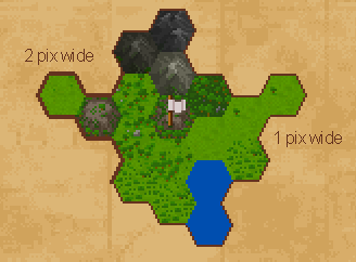 2  3 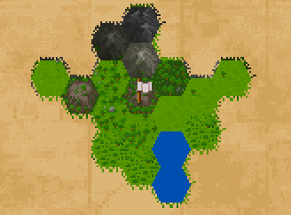 4 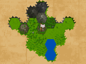 5 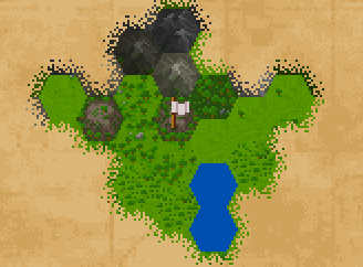 6  7 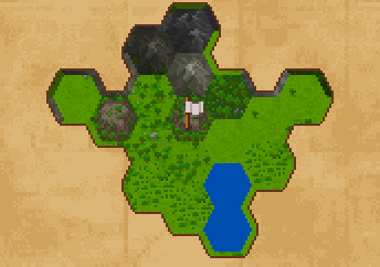 8 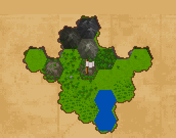 8b 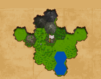 |
|
|
|
|
Logged
|
|
|
|
|
ananasblau
|
|
« Reply #442 on: April 04, 2014, 11:55:07 AM » |
|
Clearly 8b. I'd even go further by applying those noisy edge to every tile (some pseudo random generator would keep them consistent through reloads). subdivide every edge, and addd some offset to the midpoint.
|
|
|
|
|
Logged
|
|
|
|
|
Eigen
|
|
« Reply #443 on: April 04, 2014, 12:15:55 PM » |
|
I can't decide between 8 and 8b. 8b is a bit too strong I think. Bigger picture along with the other elements on the screen would help I guess. Actually, number 2 is really good as well... Damn you for giving us so many choices  Okay, I think I like 2 best. Possibly 2b: 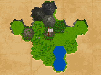 Is the map supposed to appear on the paper or are you (figuratively) cutting out the paper so that the map shows up beneath? |
|
|
|
|
Logged
|
|
|
|
|
jO
|
|
« Reply #444 on: April 04, 2014, 12:18:16 PM » |
|
I can't decide between 8 and 8b. 8b is a bit too strong I think. Bigger picture along with the other elements on the screen would help I guess. Actually, number 2 is really good as well... Damn you for giving us so many choices Okay, I think I like 2 best. Possibly 2b: Is the map supposed to appear on the paper or are you (figuratively) cutting out the paper so that the map shows up beneath? Hey thats a nice 2b! They idea is that we are revealing the landscape that lies underneath the map, so your mockup works nicely. Thanks <3 |
|
|
|
|
Logged
|
|
|
|
|
Chromanoid
|
|
« Reply #445 on: April 04, 2014, 12:32:34 PM » |
|
I like 8b, I don't like the highlights, paper with highlights looks too "nibbled out" to me. What do you think about hard shadows? They could change direction relative to the mouse coordinates. This would add some "explorer feeling" and would also help to recognize the edges of the unexplored tiles that would be dark with static shadows. Might be not that accessible with a tablet... Dirty mockup:   Maybe you could even cast a shadow directly from the mouse... disclaimer: at least the main menu of the German version of the game "Dark secrets of Africa" has a torch that casts a light on the menu's letters in a similar way. |
|
|
|
« Last Edit: April 05, 2014, 12:41:15 AM by Chromanoid »
|
Logged
|
|
|
|
|
jO
|
|
« Reply #446 on: April 05, 2014, 12:20:30 PM » |
|
I like 8b, I don't like the highlights, paper with highlights looks too "nibbled out" to me. What do you think about hard shadows? They could change direction relative to the mouse coordinates. This would add some "explorer feeling" and would also help to recognize the edges of the unexplored tiles that would be dark with static shadows. Might be not that accessible with a tablet... Dirty mockup: Maybe you could even cast a shadow directly from the mouse... disclaimer: at least the main menu of the German version of the game "Dark secrets of Africa" has a torch that casts a light on the menu's letters in a similar way. That's a super nice idea - very juicy! We'll certainly consider it, thanks a lot for that  |
|
|
|
|
Logged
|
|
|
|
|
jO
|
|
« Reply #447 on: April 05, 2014, 01:07:05 PM » |
|
Brought all (current) player units up to news scale 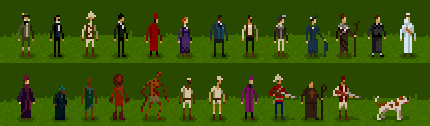 |
|
|
|
|
Logged
|
|
|
|
|
Chromanoid
|
|
« Reply #448 on: April 05, 2014, 02:01:21 PM » |
|
They look amazing! It's crazy how one can see huge bushy mutton chops in such a few pixels (I mean the guy in the top left corner). That's a super nice idea - very juicy! We'll certainly consider it, thanks a lot for that It was my pleasure . Maybe it feels too unsteady when controlled with the mouse. Alternatively the sun could "cast" the shadow. It could emphasize a day and night cycle and passing time while traveling. |
|
|
|
« Last Edit: April 05, 2014, 02:12:49 PM by Chromanoid »
|
Logged
|
|
|
|
|
PeteDevlin
|
|
« Reply #449 on: April 06, 2014, 12:31:23 AM » |
|
8b is absolutely the right one - With the day/night shadow mentioned above - Gorgeous idea
|
|
|
|
|
Logged
|
|
|
|
|
kleiba
|
|
« Reply #450 on: April 06, 2014, 02:47:29 AM » |
|
Brought all (current) player units up to news scale Love the dog! |
|
|
|
|
Logged
|
|
|
|
|
knifeySpoonie
|
|
« Reply #451 on: April 06, 2014, 05:37:20 AM » |
|
One of my biggest challenges on Rome 2 Total war was designing a system that disguised the fact our campaign map is made with hex's we came up with some cool ways to blend tiles together and disguise the seams over half a million tiles :S If your artists want to disguise the edges of hex's it should be pretty easy on this type of map. thats assuming you want to hide them.
I like the 8b shroud the most also.
|
|
|
|
|
Logged
|
|
|
|
|
quixotic
|
|
« Reply #452 on: April 07, 2014, 08:39:53 AM » |
|
I like 8b, I don't like the highlights, paper with highlights looks too "nibbled out" to me. What do you think about hard shadows? They could change direction relative to the mouse coordinates. This would add some "explorer feeling" and would also help to recognize the edges of the unexplored tiles that would be dark with static shadows. Might be not that accessible with a tablet... Dirty mockup: Maybe you could even cast a shadow directly from the mouse... disclaimer: at least the main menu of the German version of the game "Dark secrets of Africa" has a torch that casts a light on the menu's letters in a similar way. Thanks for the feedback! I like the dynamic shadow idea. I played around with some approaches for this idea. What do you think? 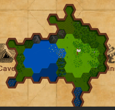 It might end up being a bit too noisy for our game. I'll play around with using the camera/scroll position instead of the mouse. I'll also look into parallax scrolling. I think that should be a really fitting effect. |
|
|
|
|
Logged
|
|
|
|
|
Chromanoid
|
|
« Reply #453 on: April 07, 2014, 12:09:41 PM » |
|
Thanks for the feedback! I like the dynamic shadow idea. I played around with some approaches for this idea. What do you think? Looks great, I like the 3D-ish outcome. It might end up being a bit too noisy for our game. I'll play around with using the camera/scroll position instead of the mouse. I'll also look into parallax scrolling. I think that should be a really fitting effect. Did you try to tie the day and night cycle/wandering time to the shadow position? You loose interactivity, but it might bring a better sense of time. |
|
|
|
|
Logged
|
|
|
|
|
gimymblert
|
|
« Reply #454 on: April 09, 2014, 08:01:08 PM » |
|
less harsh shadow might reduce the noisy effect too
|
|
|
|
|
Logged
|
|
|
|
|
AF
|
|
« Reply #455 on: April 09, 2014, 09:25:06 PM » |
|
The shadow samples are distracting, but they're also moving much faster (I asume) than they would in the game. Also decreasing their size and opacity would help.
I might be way off, but revealing the active environment through a hole in a map makes the game feel smaller to me.
The moving shadow is a cool effect, but I feel that unless it can be tied to gameplay in a meaningful way it's unnecessary.
|
|
|
|
|
Logged
|
|
|
|
|
Eigen
|
|
« Reply #456 on: April 09, 2014, 10:24:05 PM » |
|
I might be way off, but revealing the active environment through a hole in a map makes the game feel smaller to me.
Yeah, that bothers me too. That's why I liked mockup #2 best because it was the most neutral without any distracting depth. |
|
|
|
|
Logged
|
|
|
|
|
eobet
|
|
« Reply #457 on: April 10, 2014, 06:25:38 AM » |
|
I might be way off, but revealing the active environment through a hole in a map makes the game feel smaller to me.
Very good observation! I'd place the environment floating on top of the paper map, so if there is any shadow, I'd drop it down beneath the landscape. Remember all these cool movie intros where you see a map and then the landscape grows out of it? That's the effect I'd strive for. |
|
|
|
|
Logged
|
|
|
|
|
jO
|
|
« Reply #458 on: April 24, 2014, 02:59:59 PM » |
|
 We're going to participate in the upcoming Ludum Dare. If you are a musician / sound designer and interested in joining us, please get in touch. |
|
|
|
|
Logged
|
|
|
|
|
AF
|
|
« Reply #459 on: April 28, 2014, 08:13:44 AM » |
|
8 hours left. I hope it's going well!
|
|
|
|
|
Logged
|
|
|
|
|
 Community
