|
jO
|
 |
« Reply #80 on: February 07, 2013, 01:51:18 AM » |
|
|
|
|
|
|
 Logged
|
|
|
|
|
impulse9
Guest
|
|
« Reply #81 on: February 07, 2013, 01:55:26 AM » |
|
Great story.  |
|
|
|
|
Logged
|
|
|
|
|
jO
|
|
« Reply #82 on: February 07, 2013, 11:11:54 AM » |
|
Another thing are still the Hexfields. We know most of you prefer them, and so do we. However, once really starting to think about the very basics I wonder what proportions we should use. I tried creating a hexfield with a width / height ratio of 1 : 1 but that looks kinda odd...so I did a couple of variations. I must admit that my background knowledge on hexes is limited, so I might not be fully aware of what I am getting into here; so as usual, your input is highly appreciated. My thoughts on the variants: 1:1 Seems to be the most straight forward and probably will have the least problems, but it also looks kinda wrong to me. 1:1,1 Is the one I did for how I thought it should look like. This one looks right and more "square" than the 1:1, even though it should not. 1:1,2 Slightly broader than it feels right, but may be a good middle ground between the benefits of 1:1,1 and 1:1,3 1:1,3 This is kind of an extreme one. However, given the fact that most computer displays and tablets have a widescreen display it may make sense from a pure screenspace usage sense. 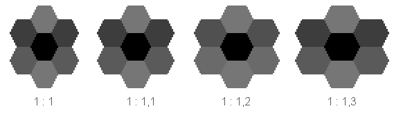 Thoughts? |
|
|
|
« Last Edit: February 07, 2013, 11:19:41 AM by jO »
|
Logged
|
|
|
|
|
Panurge
|
|
« Reply #83 on: February 07, 2013, 11:51:45 AM » |
|
My instinct is for 1:1.2, provided it doesn't skew the sense of distance too much when seen in a larger map. My knowledge of hexes is pretty limited too.
Love all the new additions, by the way, and the river generation story is way more interesting than a river generation story has a right to be!
|
|
|
|
|
Logged
|
|
|
|
|
Pixelulsar
|
|
« Reply #84 on: February 08, 2013, 10:18:28 AM » |
|
I prefer 1:1,1 because it looks the most like a regular hexagon, but I think they would all look good. The only one I don't like is 1:1 because I think it looks squished.
I like all the specialists and the descriptions of the ones you did so far. It's nice how they all kind of help in a certain things, like the anthropologist seemed to help with sanity, the botanist seemed to help with hunger and healing, and the occultist seemed to be about sacrificing health and units. Plus the occultist just seems cool.
The river story was great.
|
|
|
|
|
Logged
|
|
|
|
|
Jerom
|
|
« Reply #85 on: February 08, 2013, 12:30:28 PM » |
|
And about the 1:1 (my favorite variation) but by rotating the hexagons by 90 degrees?
|
|
|
|
|
Logged
|
|
|
|
|
jO
|
|
« Reply #86 on: February 08, 2013, 01:44:49 PM » |
|
And about the 1:1 (my favorite variation) but by rotating the hexagons by 90 degrees?
hmmmm......riiiiight.  Never thought about that lately. I somewhat initially chose this rotation for one very simple reason; that's how battle isle had them rotated Hmmm...I'll have to think about that one some more. I kinda internally settled on a 32x36 (1 : 1,125 ) version for now, but I guess I'll try a couple of variations once we have finished the technical transition from our currently square based grid to the hex version. Here's a small preview of some of our (still very WIP) tiles as hex with the 32x36 size:  |
|
|
|
|
Logged
|
|
|
|
|
jO
|
|
« Reply #87 on: February 09, 2013, 06:33:16 AM » |
|
Voting is over!
The Curious Expedition : 22 Votes (75.9%)
Here be Lions: 7 Votes (24.1%)
Total Voters: 29
I guess that's it then.
Stay tuned for updates concerning the name.
Thanks a lot again to all voters!
|
|
|
|
|
Logged
|
|
|
|
|
|
|
Eigen
|
|
« Reply #89 on: February 10, 2013, 02:36:39 PM » |
|
The Expedition part of it seems too modern to me somehow. Looks like one of those stencyl army fonts.
|
|
|
|
|
Logged
|
|
|
|
|
gimymblert
|
|
« Reply #90 on: February 10, 2013, 02:36:55 PM » |
|
had expected for carta icognita  |
|
|
|
|
Logged
|
|
|
|
|
tchassin
|
|
« Reply #91 on: February 10, 2013, 06:28:40 PM » |
|
The Expedition part of it seems too modern to me somehow. Looks like one of those stencyl army fonts.
My thoughts exactly. The "curious" looks great though  |
|
|
|
|
Logged
|
|
|
|
|
horsman
|
|
« Reply #92 on: February 10, 2013, 08:16:19 PM » |
|
I actually like the blocky font. It makes it feel a little cuter, a little more fun/ I expect this will increase the shock of the tragedy that will be the game.
|
|
|
|
|
Logged
|
|
|
|
|
jO
|
|
« Reply #93 on: February 11, 2013, 03:17:17 PM » |
|
still nothing really final; been playing around with a couple of different styles, from a VAST amount of possible candidates this is the one I currently like the most (an opinion which is very likely to be changed by tomorrow morning  ) 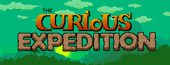 |
|
|
|
|
Logged
|
|
|
|
|
Lobotomist
|
|
« Reply #94 on: February 15, 2013, 01:31:58 AM » |
|
Just found about this game because you posted on Dungeon Dashers, and I was intrigued by the banner.
WoW...I love the concept :D
Cant wait to see the game !
|
|
|
|
|
Logged
|
|
|
|
|
Toen
|
|
« Reply #95 on: February 15, 2013, 06:28:37 AM » |
|
This looks so EPIIICCC  I love the arts, what an amazing style!! And the Idea is just marvelous!!! We'll be tuned for this :D!!!!! Awesome work, really!
|
|
|
|
|
Logged
|
|
|
|
|
jO
|
|
« Reply #96 on: February 15, 2013, 06:40:56 AM » |
|
@Lobotomist & @Toen
Thanks so much.
Having positive reactions such as yours really helps us chasing down our goal with even more confidence.
|
|
|
|
|
Logged
|
|
|
|
|
Joshua
|
|
« Reply #97 on: February 15, 2013, 07:49:00 AM » |
|
First off, I'm a fan. I'm really liking how this is shaping up. Concerning the logo, I really like the texture of the 'Expedition' part. It has a good weight/heft to it. It feels like the 'Curious' part isn't as strong. It could be the lack of depth, or selout. Not entirely sure. Keep up the good work!  |
|
|
|
|
Logged
|
|
|
|
|
quixotic
|
|
« Reply #98 on: February 17, 2013, 09:14:34 AM » |
|
Hey there, thought it might be time to introduce myself too.  I'm the other half of our small team. I'm handling the whole tech side of our project. Design is shared between us. Some tech notes for the curious (no pun intended).. the game is currently as a web game, running on HTML5. I'm using CoffeeScript to compile into JavaScript. It is comparable to Python and actually pretty fun. We're using a self build engine, using jQuery and Sugar.js as libs. The rest is standard CSS/HTML so far. I'm enjoying using a more dynamic language and playing around with web tech a lot, since my day job usually consists of C++ programming. Initially the current build was only meant as a quick way to get started and to evaluate the web platform. Turns it out its holding up more than well enough. We have the big advantage of being a turn based game, so performance issues haven't appeared so far. Although we experimented with a Unity approach in between, our current stance is to go as far as possible with our web tech. The advantage of plugin-less instant play-ability in your browser is just too tempting. Thanks a lot for all the replies, questions and ideas we got from you so far. It has been very helpful and motivating. If you have any questions about the tech side, let me know and I'll try to answer them as good as I can. Cheers |
|
|
|
|
Logged
|
|
|
|
|
Eigen
|
|
« Reply #99 on: February 17, 2013, 09:43:22 AM » |
|
How are you handling sound and music? Last time I checked there wasn't really any solid way to ensure sound was working in every browser. Has this issue come along recently?
|
|
|
|
|
Logged
|
|
|
|
|
 Community
