Welcome, Guest. Please login or register.

Login with username, password and session length

 
Advanced search

1411522 Posts in 69377 Topics- by 58431 Members - Latest Member: Bohdan_Zoshchenko

April 28, 2024, 12:38:44 PM

Need hosting? Check out Digital Ocean
(more details in this thread)
TIGSource ForumsDeveloperArtWorkshopFeedback on the layout (colours & consistency)
Pages: [1]
Print
Author Topic: Feedback on the layout (colours & consistency)  (Read 10283 times)
Chris Koźmik
Level 5
*****


Silver Lemur Games


View Profile WWW
« on: December 15, 2012, 02:16:46 AM »

How it looks colour wise and consistency wise? I ask especially about the spellbook page (the orangish one) and the right menu (3x3).

Overall, the game is rescaled x4 (every pixel = 4 pixels), except fonts. Also I made a few exceptions (the borders of some backgrounds).

I wonder about the right menu, the "Campfire" icon has no outline. Should it have one as the rest? Also "Menu" looks weird, not sure how to redesign it...
Ignote the green "T", it's for testing and won't be in final game.


Logged

Stellar Monarch 2 (dev log, IN DEVELOPMENT)
Stellar Monarch (dev log, released)
Chris Koźmik
Level 5
*****


Silver Lemur Games


View Profile WWW
« Reply #1 on: December 19, 2012, 09:28:10 AM »

Whoa! I didn't knew I was so talented, I designed such excellent piece of art no one was able to find anything worth improving Grin I'm wonderfully awesome, no doubt Wink
Logged

Stellar Monarch 2 (dev log, IN DEVELOPMENT)
Stellar Monarch (dev log, released)
Chris Koźmik
Level 5
*****


Silver Lemur Games


View Profile WWW
« Reply #2 on: December 24, 2012, 12:35:17 PM »

People, say something... What is wrong there? What needs fixing and how to fix it?
Logged

Stellar Monarch 2 (dev log, IN DEVELOPMENT)
Stellar Monarch (dev log, released)
Joshua
Level 5
*****


Be rad to one another!


View Profile WWW
« Reply #3 on: January 01, 2013, 01:22:52 PM »


Patience, sometimes the workshop thread is a bit slow.

I was a huge Might and Magic III fan when I was younger and your thread caught my eye. Here is a quick edit/paint-over of your screenshot, hopefully you find it helpful.

Concerning the layout: I think overall it is fine, many dungeon crawlers use a layout similar to this. I think you can make better use of screen space for the spellbook. My mockup uses a two-column layout with most of the user interaction/decisions on the left-hand side.

I'd be happy to chat about the design more, but I don't want to overwhelm you. Keep up the hard work!
« Last Edit: January 01, 2013, 01:31:59 PM by Joshua » Logged

caffeine
Level 5
*****


View Profile
« Reply #4 on: January 03, 2013, 01:50:20 AM »

Joshua has a firm grasp on interfaces like this it seems. Because he got all the important parts. The biggest change aside from the visual improvement is the oversimplification of the map. The coherent style of everything including the pixelfont. And introducing a click and play experience instead of typing everything (because typing feels counterintuitive and outdated).
Logged
Maikel_Ortega
Level 1
*


...and the stars, my destination.


View Profile WWW
« Reply #5 on: January 04, 2013, 01:24:10 AM »

@joshua: that looks really professional. The book and fonts are gorgeous.
Logged

Melee Studios:http://melee-studios.com<br />Forever WIP (ESP devlog): http://maikel.londite.es/devlog/
Chris Koźmik
Level 5
*****


Silver Lemur Games


View Profile WWW
« Reply #6 on: January 26, 2013, 03:35:26 AM »

Yay! I got a reply and a picture Smiley Thanks!


I was thinking about the mackup you made. It looks very nice and consistent. But it kind of reminds me of 8bit era, like consoles, GBA, Nintendo and so on. While my project is aimed at 16bit era nostalgia, Amiga, PC. Those people who played these Amiga/PC RPGs in 90s frequently loathed consoles... They would kill me if I went for that style :D
I should have said it from the beginning I guess (didn't think it would make that difference), my game is for PC (no Android/iOS port will be ever made) and it's aimed at hardcore western RPG freaks who dream of playing the way they played in 90s.

Thanks for the picture, it helped me realize that I should go for the 16 bit era feel even if it means secrifice of consistency...

Colours.
I know why you used reddish layout instead of grey (because all colours are in the warm scale then), I was thinking of trying it too. Personaly I find it better looking. But then I noticed that ALL RPGs of the old era I can remember always used pure grey there Smiley Somehow, a boring grey stone is the one that pops up in my mind when I recall my best young memories... I wonder if I should not stay with the grey (even though it would work that good with the orangish/yellowish parchment elements).


Questions:

1. Look below, there is this orangish area with statistics (it's used for everything, inventory, quest logs, and many more). Some needs buttons for other sections (like here is stats, stats2, inventory, quests, achievements and obligatory exit/leave/close button). I'm not sure how to make these...

2. Aliased fonts vs non aliased fonts. The first picture (below) has aliased fonts, the second non aliased. Which is better?


Edit: The photobucket resized it Sad Here is smaller one with fonts only (top aliased, bottom not antialiased).
Logged

Stellar Monarch 2 (dev log, IN DEVELOPMENT)
Stellar Monarch (dev log, released)
Joshua
Level 5
*****


Be rad to one another!


View Profile WWW
« Reply #7 on: January 28, 2013, 08:46:02 AM »

Thanks for taking the time to read my feedback, I appreciate the reply. I'm a bit disheartened that you are so beholden to a particular aesthetic that you dismiss advice out of hand. Good luck with your project.
Logged

Chris Koźmik
Level 5
*****


Silver Lemur Games


View Profile WWW
« Reply #8 on: January 30, 2013, 01:06:59 AM »

Sigh... I should have kept my mouth shut and stick to questions only, now I won't get any further feedback...
Logged

Stellar Monarch 2 (dev log, IN DEVELOPMENT)
Stellar Monarch (dev log, released)
Joshua
Level 5
*****


Be rad to one another!


View Profile WWW
« Reply #9 on: January 30, 2013, 02:40:42 PM »

I'm not trying to cause drama, and I really do appreciate the fact you did post a reply. Maybe we got off on the wrong foot?

Let's try again.

If you notice on my mockup, I changed the health and mana bars to red and blue respectively. Like it or not, this is something that is instantly understood by players. The past 20 years or so of gaming have reinforced this, and deviating from this can confuse players (I initially thought yours was some sort of poison counter).

What are your thoughts on this?
Logged

Vaxx
Level 0
**


View Profile
« Reply #10 on: January 31, 2013, 01:22:32 PM »

Sigh... I should have kept my mouth shut and stick to questions only, now I won't get any further feedback...

As a "target audience" gamer I can only say: please do not mix high res and low res. Like your crisp font and the minimap compared to the buttons and character portraits. It just feels overall wrong and "cheap".

Healthbars were already mentioned, green equals poison/disease since 1802.  Beer! Compared to the lighsource of the buttons, the highlights on the health bars are off to the right (should be top left).

Yellow text is hard to read on that flesh colored background. Why do you use the outline on the font? Black text should better work for this background. If you want to stay with white, then choose a darker background. Also a dropshadow instead of the outline could work too.

If that hand icon is for picking up stuff you should change the gesture. Reference: http://arcadeberg.com/files/2010/03/pickup_hand.jpg

What is that green T for?
Logged
Chris Koźmik
Level 5
*****


Silver Lemur Games


View Profile WWW
« Reply #11 on: February 04, 2013, 08:25:15 AM »

If you notice on my mockup, I changed the health and mana bars to red and blue respectively. Like it or not, this is something that is instantly understood by players. The past 20 years or so of gaming have reinforced this, and deviating from this can confuse players (I initially thought yours was some sort of poison counter).
It can't be seen on the picture, but these are not bars, but crystals (they change colours - fully, not parts of them - as you take damage/use mana; exactly as in M&M 3). The HP crystal is first green, then orange, then red (with shades). I did them this way for a silly technical reason, my engine does not allow copying parts of an image and I was lazy so I tried to avoid adding that functionality to the drawing engine :D That was the main reason, I'm indifferent both ways on this. I think I could change them to standard bars (then the HP would be red and MP blue of course).

But more importantly, is the shape and placement of these HP/MP areas OK? Becuase I can change the crystals to bars later easily, it would be a simple change of a picutre, but the space it takes needs to be determined now.
Also, what to do with the MP crystal/bar if there is a character that can't use magic (currently it's grey which does not look good)?


As a "target audience" gamer I can only say: please do not mix high res and low res. Like your crisp font and the minimap compared to the buttons and character portraits. It just feels overall wrong and "cheap".
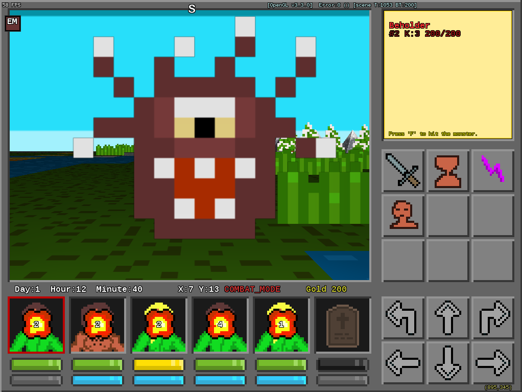
Well, that's the big problem. Take a look at the screen below. No matter what I do I still have this 3D which is highres 1x1 pixel. I stylized it as pixelated using low res non smooth textures, but it's still 1x1 at the far distance.

So, no matter what trick I do, it would still be mixed resolution in the main view area...


Compared to the lighsource of the buttons, the highlights on the health bars are off to the right (should be top left).
LOL, indeed. I should have noticed this.

Yellow text is hard to read on that flesh colored background. Why do you use the outline on the font? Black text should better work for this background. If you want to stay with white, then choose a darker background. Also a dropshadow instead of the outline could work too.
Fonts... The major source of my headache Smiley I hesitate on all the things you listed. I think maybe I should keep the background lightish/yellowish/orangish (BTW, my goal was to make it look like a parchment, not flesh, couldn't figure out the proper colour through yet :D), remove the outline and make the font darker (not sure about exact colours through, advice needed)? Or maybe leave some shadow on one side (right bottom) of the font?

If that hand icon is for picking up stuff you should change the gesture. Reference: http://arcadeberg.com/files/2010/03/pickup_hand.jpg

What is that green T for?
It's more complicated. The hand is for "interact". You go to a chest and click it to open, go to fountain and click it to drink, go to an NPC and click to talk, encounter a hut in wilderness you click to enter. An advanced player would press SPACE to interact instead, but a beginner might use that button. I was also thinking that it could change colour/flash a bit if you go next to an object you can interact with.
Hand was the only thing I could think of... But I'm not very happy with it.

T is for testing, it won't be in the real game.
Logged

Stellar Monarch 2 (dev log, IN DEVELOPMENT)
Stellar Monarch (dev log, released)
Joshua
Level 5
*****


Be rad to one another!


View Profile WWW
« Reply #12 on: February 04, 2013, 07:07:16 PM »

Ah, I didn't read the health gui elements as crystals. I can understand why you'd want the health to transition from green to red, and this convention is pretty common in the strategy genre. I still think red + blue would be your best bet here.

Concerning the health + mana layout, I think it is fine. The only other layout thing I'd address is the extra info you are stuffing in between the character profiles and main view. It makes the screen too busy, and I think it could live in a better place.

Your mixed pixel resolution is still an issue that I'd fix. If you are worried about the main view area I'd recommend that you:
  • Do the art for the enemies such that at the closest they render at 1:1 pixel ratio. Then either have several images based on distance from camera, or do a basic nearest neighbor downscale.
  • Look into using Frame/Render Buffer Objects to render at a lower resolution and upscale to maintain a consistent pixel density. Quarry has used this technique to good effect.

Thanks for hearing me out. I look forward to seeing where you take this.  Beer!
Logged

Chris Koźmik
Level 5
*****


Silver Lemur Games


View Profile WWW
« Reply #13 on: February 05, 2013, 09:56:03 AM »

The only other layout thing I'd address is the extra info you are stuffing in between the character profiles and main view. It makes the screen too busy, and I think it could live in a better place.
You mean the gold/time/coordinates display?

Health crystals - Yeah, these are extremely confusing on a screen if all of them are green... Maybe I should show in all screenshots (that the player sees first) a party in various states of damage. Especially the green one with full health is the ugliest...


Do the art for the enemies such that at the closest they render at 1:1 pixel ratio. Then either have several images based on distance from camera, or do a basic nearest neighbor downscale.
Way over my budget Sad The only reason I started this project (means me doing all alone this RPG with 3D graphics in a reasonable amount of time) is the trick of using 16x16 pixel textures (which I can draw reasonably well) as the main and only graphic asset for the 3D view. I'm simply unable to make bigger pictures that would look decent Smiley For that I would need to be an artist, not a coder who merely knows how to draw tiny icons Smiley Besides, even if I was able to draw them, these would take too much time Sad
My only hope is that players will see the 16x16 hiper upscaled pictures as a form of unique and original experimental art, not me being on a very low budget :D
Logged

Stellar Monarch 2 (dev log, IN DEVELOPMENT)
Stellar Monarch (dev log, released)
Pages: [1]
Print
Jump to:  

Theme orange-lt created by panic