|
Delicious
|
 |
« Reply #20 on: February 21, 2013, 03:05:12 PM » |
|
Cool insects! I like your colors and lighting.
The triangle guy looks pretty good too. Although,
1) The design you linked (which is missing a colon in the link after "http") has hexagons rather than triangles. It's obviously up to you, but I like the hexagon design more-so, for a reason that kind of ties into 2.
2) The second form looks more rock / meteor-ish in the design pic, where it looks more blob-ish in the sprite (I didn't see it as a rock / boulder-like creature). The hexagon head mark ties into the rock feel more - the triangle just seems like it's 'there' on the sprite a bit (though it's obviously not done).
Anyway, cool design, and really nice adaptation to the sprites! Keep it up!
Thanks for the suggestions, I'll fix it up. The triangle was done for readability purposes, I'll consider trying out the hexagon though. The problem is it could appear to just look like a circle at the size with pixels. Also, I agree. I'm fixing it to give it more rock texture, thanks.  Looks great! Maybe you want to change the gameplay a little from pokemon, though, as it'll mean you'll have to do thousands of animations.
Not quite, Pokemon just did various small animations only moving a separate effects sprite. Also, it'll be just a four direction movement for the character and some other actions if needed. The animation side isn't too bad compared to the sprites themselves. Thanks |
|
|
|
|
 Logged
|
Blah Blah Blah <3
Twitter - Zjdelicious
|
|
|
|
clockwrk_routine
Guest
|
|
« Reply #21 on: February 21, 2013, 11:11:26 PM » |
|
;love these
|
|
|
|
|
Logged
|
|
|
|
|
Delicious
|
|
« Reply #22 on: February 22, 2013, 10:54:50 PM » |
|
Thanks I think I'll stick with the triangle, was very odd with the hexagon.  Hopefully a bit improved. Still working on it. Also, I got a bit more done to these, I edited the second ones hair-do, it's smaller now. 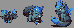 |
|
|
|
« Last Edit: February 22, 2013, 11:07:43 PM by Delicious »
|
Logged
|
Blah Blah Blah <3
Twitter - Zjdelicious
|
|
|
|
|
|
Delicious
|
|
« Reply #24 on: February 24, 2013, 10:53:19 AM » |
|
Some easter eggs fun from Palm Kingdoms
Looks neat. Maybe the thread title is a bit misleading, this is just suppose to be a home for my monsters specifically.  But they're more than welcome to hangout! |
|
|
|
|
Logged
|
Blah Blah Blah <3
Twitter - Zjdelicious
|
|
|
|
iosoftware
|
|
« Reply #25 on: February 24, 2013, 11:03:43 AM » |
|
Maybe you can lead me to a pixel art thread, that's what I was searching for...
Thanks :-)
Damn, I'm blind. It's right at the top. Duh...
|
|
|
|
|
Logged
|
|
|
|
|
Delicious
|
|
« Reply #26 on: February 24, 2013, 12:14:57 PM » |
|
This is grim, he may not have any other forms, but instead be rare  |
|
|
|
|
Logged
|
Blah Blah Blah <3
Twitter - Zjdelicious
|
|
|
|
Carefree games
Guest
|
|
« Reply #27 on: February 24, 2013, 04:45:34 PM » |
|
Killer!
A reaper character could go either way, I suppose. It'd be suited well to rarity & non-evolution, but at the same time I can imagine it's weaker & stronger versions looking particularly awesome. Hmm...
By the way, love the golems!
|
|
|
|
|
Logged
|
|
|
|
|
Delicious
|
|
« Reply #28 on: February 24, 2013, 05:31:02 PM » |
|
Thanks I'm trying to figure out how to do the "your monster" sprite. Should I make back versions per monster? This makes the work load much larger, but it would get rid of that awkward monster direction thing. super rough mockup 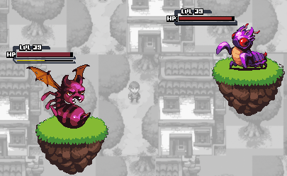 I just flipped the entire base for one. Also, background is just the snips I took and made black and white and blur. I'd like to keep the actual over-world background there during battle. |
|
|
|
|
Logged
|
Blah Blah Blah <3
Twitter - Zjdelicious
|
|
|
|
poe
Guest
|
|
« Reply #29 on: February 24, 2013, 05:55:33 PM » |
|
Why not just have them be on the same y axis and it can be a side view battle?
|
|
|
|
|
Logged
|
|
|
|
|
Delicious
|
|
« Reply #30 on: February 24, 2013, 06:04:21 PM » |
|
Eh, doesn't give much depth and looks a bit cheap in my opinion. Perhaps I'll do the back view of these eventually. |
|
|
|
|
Logged
|
Blah Blah Blah <3
Twitter - Zjdelicious
|
|
|
|
Carefree games
Guest
|
|
« Reply #31 on: February 24, 2013, 08:14:46 PM » |
|
If you bring the monsters slightly closer to the same vertical position there could still be enough depth without having to draw back view sprites. That might be worth a shot, if you havn't tried it already.
Interesting idea to have the overworld show behind battles - I like it but also think that it could be distracting. I'd try darkening the background, in addition to desaturation. A dark background would compliment your sprites well while also giving more focus to the battle. Yup. That's my input.
|
|
|
|
|
Logged
|
|
|
|
GentlestOfGentlemen
Level 1


|
|
« Reply #32 on: February 25, 2013, 11:22:24 AM » |
|
I genuinely cannot give crits because this is just the most perfect game I have ever seen and you are one of my favorite pixel artists. I just..I just can't...
|
|
|
|
|
Logged
|
|
|
|
|
Geti
|
|
« Reply #33 on: February 25, 2013, 06:22:25 PM » |
|
I'm trying to figure out how to do the "your monster" sprite. Should I make back versions per monster? This makes the work load much larger, but it would get rid of that awkward monster direction thing. If you want to keep the perspective the same (~half the workload for monster drawing) consider making the playing field symmetrical. 20min copy paste + scribble job:  This gives you space for interface crap below the battlefield, a known position for the enemy, the ability to flip and reuse attack animations (-> potentially allowing richer fighting), and lets you show the interface between the two biomes (or not, if they're the same). The alpha layers idea was kind of dropped in last minute but would allow you to frame the battle more without much extra work - some tree trunks and bushes for forest, rocks for dry/cave stuff. If you got ambitious you could procgen them each battle, potentially even from stuff around your challenger on the overworld. Adds some of the depth you were afraid of losing back in there. I figured it was mostly a game for the sake of looking awesome, so figured I'd make the suggestion. Either way I think a symmetrical battlefield is win-win for you if you've got the screen space, and it looks like you do. Keep it up. |
|
|
|
|
Logged
|
|
|
|
|
Radnom
|
|
« Reply #34 on: February 26, 2013, 01:28:28 AM » |
|
I'm trying to figure out how to do the "your monster" sprite. Should I make back versions per monster? This makes the work load much larger, but it would get rid of that awkward monster direction thing. If you want to keep the perspective the same (~half the workload for monster drawing) consider making the playing field symmetrical. 20min copy paste + scribble job: This gives you space for interface crap below the battlefield, a known position for the enemy, the ability to flip and reuse attack animations (-> potentially allowing richer fighting), and lets you show the interface between the two biomes (or not, if they're the same). The alpha layers idea was kind of dropped in last minute but would allow you to frame the battle more without much extra work - some tree trunks and bushes for forest, rocks for dry/cave stuff. If you got ambitious you could procgen them each battle, potentially even from stuff around your challenger on the overworld. Adds some of the depth you were afraid of losing back in there. I figured it was mostly a game for the sake of looking awesome, so figured I'd make the suggestion. Either way I think a symmetrical battlefield is win-win for you if you've got the screen space, and it looks like you do. Keep it up. ^ That looks great, incredible mock-up and edit I really like your monsters, Delicious. |
|
|
|
|
Logged
|
|
|
|
|
Delicious
|
|
« Reply #35 on: February 27, 2013, 10:31:04 PM » |
|
Thanks! -
Hey! That's a great suggestion, however that doesn't fix the view issue. Some monsters will need to be flipped to face the direction (such as what I had to do with Buzzkill)The highlight comes from the top left on all, and if one monster is faced a different direction corresponding with the light source it'll look odd. I'll consider the idea though, it looks nice. Thanks! |
|
|
|
|
Logged
|
Blah Blah Blah <3
Twitter - Zjdelicious
|
|
|
|
Geti
|
|
« Reply #36 on: February 28, 2013, 02:18:54 AM » |
|
No worries. The lighting issue is less important than the perspective being consistent I think - the lighting in my mock appears to be coming from the center because of the flipped "player" pokeman. If you light the surrounds that way (as though light is radiating from center top of screen) it would make the lighting consistent and allow you to have the battles take place on equal footing.
Double battles and the like would also work fine, because the perspective the monsters are drawn at already would let you offset the extra pokemon a little to fake distance.
Either way keep the art coming ;^)
|
|
|
|
|
Logged
|
|
|
|
|
JaJitsu
|
|
« Reply #37 on: February 28, 2013, 06:17:02 PM » |
|
Hey Delicious! Your monsters are coming out amazingly! I just wanted to say, though, that this grim is way too typical to be a pokemon-type monster. one easy fix would be to have a cool color scheme. here are some quick examples:  Also I wanted to say that Geti's idea for the battle plane looks seriously awesome. I hope you are still considering the idea. |
|
|
|
|
Logged
|
|
|
|
|
KinzyBW
Guest
|
|
« Reply #38 on: February 28, 2013, 06:42:05 PM » |
|
These are looking incredibly awesome, a lot of personality in each one.
Definitely agree with what Geti said about lighting, it will fix itself if you're flipping them and assume the lighting is coming from the top center, instead of top left(for the battle) and probably not bother anyone. This also works for flipping biomes as well, but also like Geti said, perspective is really important to not look clunky.
Maybe consider making the battle field a bit bigger(unless the game screen is smaller) you don't want to have too much blank area around the edges of the fight, maybe some scaling should happen.
Best of luck, these are awesome!
|
|
|
|
|
Logged
|
|
|
|
|
Xion
|
|
« Reply #39 on: February 28, 2013, 09:08:11 PM » |
|
I just wanted to say, though, that this grim is way too typical to be a pokemon-type monster.
kinda agree with this. You know what'd fix it? More eyes. More eyes fixes everything. |
|
|
|
|
Logged
|
|
|
|
|
 Developer
