|
Thaumaturge
|
 |
« Reply #5180 on: June 05, 2017, 12:03:36 PM » |
|
That does look better, to my eye! ^_^
|
|
|
|
|
 Logged
|
|
|
|
|
alvarop
|
|
« Reply #5181 on: June 05, 2017, 12:14:38 PM » |
|
Looks much better, I would just not abuse the vignetting so much, it looks tacky.
|
|
|
|
|
Logged
|
|
|
|
|
absolute8
|
|
« Reply #5182 on: June 05, 2017, 03:03:44 PM » |
|
Looks much better, I would just not abuse the vignetting so much, it looks tacky.
Hue hue hue sector z-1_233345 7 clicks west of alfafa.  But all joking aside, thanks for the feedback, guys. |
|
|
|
|
Logged
|
|
|
|
|
Alec S.
|
|
« Reply #5183 on: June 09, 2017, 11:14:39 AM » |
|
|
|
|
|
|
Logged
|
|
|
|
|
absolute8
|
|
« Reply #5184 on: June 15, 2017, 07:08:32 PM » |
|
|
|
|
|
|
Logged
|
|
|
|
|
UnparalleledDev
|
|
« Reply #5185 on: June 17, 2017, 08:25:00 AM » |
|
The current working Title Screen  |
|
|
|
|
Logged
|
 Unparalleled Unparalleled - A solo game dev's adventure into an over scoped project. |
|
|
|
|
|
Richard Kain
|
|
« Reply #5187 on: June 19, 2017, 04:11:55 PM » |
|
The current working Title Screen
The animation on the buttons needs to be quicker, and tighter. Right now the extremes that the buttons go to while moving in is a bit disorienting. I'm also not feeling the flow. They don't snap into position with a satisfying feel. The erase button is definitely taking too long. The overall graphics look fine. I'm liking the pixelated star-scape in the background. The colors are a little bit on the bland side, but I think that might be an intentional stylistic choice. And I've certainly seen far worse. The color choices for the background elements I actually quite like. A decent and subtle application of purples and pinks that complement each other without overpowering the foreground. If there's anything I would change it would be the text logo. I think it needs to be just a tad brighter and more vibrant to stand out from the background a little more. Possibly some manner of dark outline or drop-shadow behind it could help with this, but might be overkill, I'd experiment with it to see how it ended up. |
|
|
|
|
Logged
|
|
|
|
TimeSlip
Level 1


|
|
« Reply #5188 on: June 21, 2017, 08:52:25 AM » |
|
The current working Title Screen Looks pretty nifty. Nice work! |
|
|
|
|
Logged
|
|
|
|
|
Thaumaturge
|
|
« Reply #5189 on: June 26, 2017, 10:46:41 AM » |
|
Some tidbits of traversal:  |
|
|
|
|
Logged
|
|
|
|
|
AaronB
|
|
« Reply #5190 on: July 02, 2017, 06:37:59 PM » |
|
Creating particles at the end of a signal chain:  |
|
|
|
|
Logged
|
|
|
|
|
dT_
|
|
« Reply #5191 on: July 04, 2017, 11:12:44 AM » |
|
|
|
|
|
|
Logged
|
Follow me on twitter. I'll follow you too C: |
|
|
|
Alec S.
|
|
« Reply #5192 on: July 04, 2017, 11:50:58 AM » |
|
|
|
|
|
|
Logged
|
|
|
|
|
goshki
|
|
« Reply #5193 on: July 06, 2017, 03:13:47 AM » |
|
There's a rocket-jumping potential. |
|
|
|
|
Logged
|
|
|
|
|
Zireael
|
|
« Reply #5194 on: July 10, 2017, 10:40:14 AM » |
|
I tried my hand at Tron glow lines effect:  (As a matter of fact, I'd prefer it if it was an outline of the car, not every edge... is that possible with shaders?) |
|
|
|
|
Logged
|
|
|
|
|
Thaumaturge
|
|
« Reply #5195 on: July 10, 2017, 04:55:28 PM » |
|
The second section of the "pit" in the first level:  |
|
|
|
|
Logged
|
|
|
|
|
oyog
|
|
« Reply #5196 on: July 12, 2017, 08:32:10 AM » |
|
The second section of the "pit" in the first level:
This is giving me the fear. |
|
|
|
|
Logged
|
|
|
|
|
Thaumaturge
|
|
« Reply #5197 on: July 12, 2017, 10:36:50 AM » |
|
The second section of the "pit" in the first level:
This is giving me the fear. Heh, I'm not sure of whether I should be glad of that or not! XD;; Be an adventurer: meet that fear, conquer it, climb the stony platforms, and find what waits beyond!  |
|
|
|
|
Logged
|
|
|
|
|
kenit
|
|
« Reply #5198 on: July 13, 2017, 06:27:30 AM » |
|
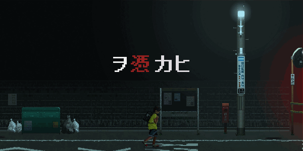 2D side scroller horror game. |
|
|
|
|
Logged
|
|
|
|
|
|
|
 Developer
