|
08--n7.r6-79.84
|
 |
« Reply #100 on: August 19, 2013, 12:05:18 PM » |
|
They are all great! Perhaps I feel the first ones closer to the actual game, probably for the character proportions than the other ones. But as I said, I like all of them. Are you going to use them as the "cover" for Maze ?
Agreed about the first one, and yes, this work will be used as a cover. Also i very like this one:  actually I like redhaired girls so that's why I love arts.
Frankly, I prefer redhaired girls too :D |
|
|
|
|
 Logged
|
|
|
|
|
Belimoth
|
|
« Reply #101 on: August 24, 2013, 02:30:46 AM » |
|
I have been reading chin-guy's chin as a duckbill this entire time.
|
|
|
|
|
Logged
|
|
|
|
|
08--n7.r6-79.84
|
|
« Reply #102 on: August 28, 2013, 03:05:01 AM » |
|
I have been reading chin-guy's chin as a duckbill this entire time.
Duckbill? Ahahah, good idea!
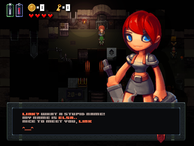 Lighting/dialogs mockup (based on screenshot of game map). |
|
|
|
|
Logged
|
|
|
|
Keops
Level 6

Pixellin' and Gamedev'n


|
|
« Reply #103 on: August 28, 2013, 03:59:40 AM » |
|
Lighting/dialogs mockup (based on screenshot of game map). I love the pixels and I love the artwork, but the heavy pattern dithering applied to the art looks disjointed from the art direction of the rest of the screen. I think I know what you're trying to achieve, some sort of retro vibe, but having so many colors on the portrait and then dithering them doesn't achieve this old-school feel. It ends up looking rather noisy / untidy, and doesn't mix well with the clean, edgy pixel art. However this is just a small, nitpick. Love the look of this since day one. |
|
|
|
|
Logged
|
|
|
|
|
kleiba
|
|
« Reply #104 on: August 28, 2013, 05:00:32 AM » |
|
Lighting/dialogs mockup (based on screenshot of game map). I find the font hard to read. |
|
|
|
|
Logged
|
|
|
|
|
dhontecillas
|
|
« Reply #105 on: August 28, 2013, 07:26:14 AM » |
|
From my point of view, I think that the girl appearing with the message doesn't need to be in pixel art, it would be perfectly fine with her beeing hi-res. (although I find that she is getting too much screen space and she has too much dithering - but thats a matter of taste, I guess). I must say that I'm a coder, so don't take my artistic opinion too seriously  Ah, and I have no problems with the font. |
|
|
|
|
Logged
|
|
|
|
|
08--n7.r6-79.84
|
|
« Reply #106 on: September 10, 2013, 11:25:24 PM » |
|
I love the pixels and I love the artwork, but the heavy pattern dithering applied to the art looks disjointed from the art direction of the rest of the screen. I think I know what you're trying to achieve, some sort of retro vibe, but having so many colors on the portrait and then dithering them doesn't achieve this old-school feel. It ends up looking rather noisy / untidy, and doesn't mix well with the clean, edgy pixel art.
However this is just a small, nitpick. Love the look of this since day one.
Yes, it was a failed attempt. I have to do it by hand, without using software algorithms of dithering. Thanx for reply! I find the font hard to read.
I still have to work on that! From my point of view, I think that the girl appearing with the message doesn't need to be in pixel art, it would be perfectly fine with her beeing hi-res. (although I find that she is getting too much screen space and she has too much dithering - but thats a matter of taste, I guess). I must say that I'm a coder, so don't take my artistic opinion too seriously Ah, and I have no problems with the font. Thanx for feedback! Well I think girl appearing with the message must be in pixel art, but I don't have time to do it. T__T |
|
|
|
|
Logged
|
|
|
|
|
Raku
|
|
« Reply #107 on: September 11, 2013, 06:19:21 AM » |
|
Wow, I really love the graphics for this, especially the earthy tones on everything. The brighter tiles really stand out nicely against them as well. The characters are nice-looking, too!. Gameplay looks smooth from that recent video, and the only gripe I really have (though I know this is a work in progress) is the sound effects, they seem really generic-sounding to me. Other than that, keep up the great work on this! It's looking good!
|
|
|
|
|
Logged
|
|
|
|
|
08--n7.r6-79.84
|
|
« Reply #108 on: September 12, 2013, 04:29:42 AM » |
|
Wow, I really love the graphics for this, especially the earthy tones on everything. The brighter tiles really stand out nicely against them as well. The characters are nice-looking, too!. Gameplay looks smooth from that recent video, and the only gripe I really have (though I know this is a work in progress) is the sound effects, they seem really generic-sounding to me. Other than that, keep up the great work on this! It's looking good!
Thank you! At this point gameplay is compromise between two main parts - Maze exploration and solving puzzles on maps. 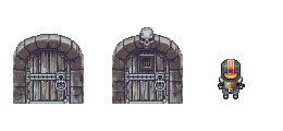 Each map in Maze has one key and 2-4 doors with 1-3 different types. This key can open a usual door (first door type) or can open the chest with skull-key inside, which opening the door with the skull (second door type) or can open the chest with treasures. 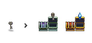 For example Elsa have a little of Health Points, the player have a choice - don't risk it and go into the usual door, but then he gets fewer coins. Or take a chance and break through the crowd of enemies and get a lot of coins. 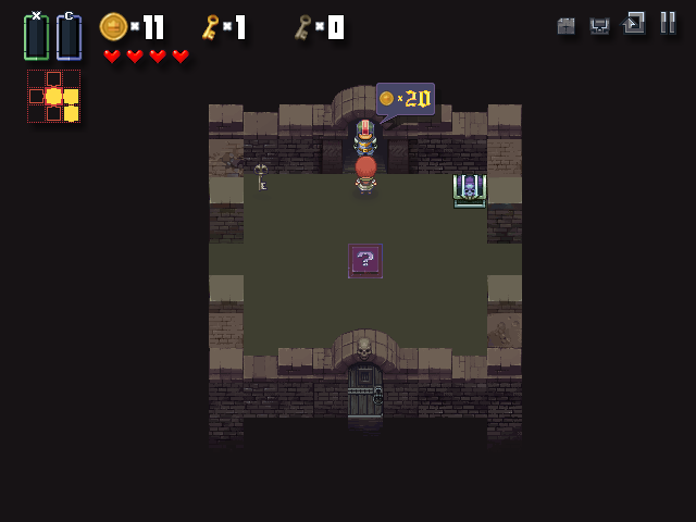 There is a third type of door - a guard who takes cover charge. Behind this guards placed a town where player can fill health of Elsa or shop where player can buy potions. In other words there is a motive for the player to collect more of these coins and there is reason to think twice before spending a single key. Fragment of Maze: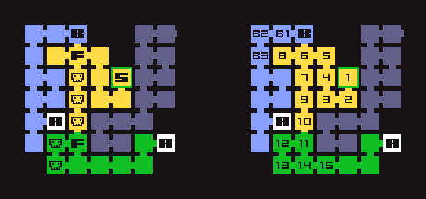 S (map 1) - starting map. S (map 1) - starting map.
B - the beginning of the second branch
F (map 6 and 11) - the place of forks
A - map with artifacts (on global map, they will be marked with "?" signs)
Skulls labeled maps with enemies / death traps (card number 7, 9, 10, 12, 13).On the other hand, behind danger door with skull can be places a branch of Maze leading to artifact ( artifacts are needed to complete the game , it's main quest ) or a dead end. The player doesn't know it and and thus the choice between doors more dramatic for him. |
|
|
|
« Last Edit: September 12, 2013, 04:44:49 AM by 08--n7.r6-79.84 »
|
Logged
|
|
|
|
|
dhontecillas
|
|
« Reply #109 on: September 12, 2013, 10:42:57 AM » |
|
I won't say anything about the blurry coin and keys in the top display  Seriously, you are doing a great work. I would like to have something to criticize, but, your art is awesome and I also think that you are building your game with fun mechanics. Come on! You don't really need to sleep so much.. an hour a day is enough. Finish the game and take my money !! hahahah |
|
|
|
|
Logged
|
|
|
|
|
blackarm
|
|
« Reply #110 on: September 12, 2013, 10:48:04 AM » |
|
best art I've seen. very jealous! nice work.
|
|
|
|
|
Logged
|
|
|
|
|
Tuba
|
|
« Reply #111 on: September 12, 2013, 10:54:01 AM » |
|
OMG only now I've acknowledged this! Looks amazing  Zelda is my favorite series so, looking forward to this |
|
|
|
|
Logged
|
|
|
|
|
08--n7.r6-79.84
|
|
« Reply #112 on: September 14, 2013, 12:13:13 AM » |
|
I won't say anything about the blurry coin and keys in the top display We are used a software shadow generation and it blurred some gui elemnts. But we'll fix it! Come on! You don't really need to sleep so much.. an hour a day is enough. Finish the game and take my money !! hahahah Ahaha, I can't jump over my head!  blackarm blackarm, thank you! OMG only now I've acknowledged this! Looks amazing Zelda is my favorite series so, looking forward to this Well, it's not really a zelda-like game, it's like if we removed action elements and left puzzles in Zelda. |
|
|
|
|
Logged
|
|
|
|
|
Tuba
|
|
« Reply #113 on: September 14, 2013, 04:42:03 AM » |
|
Well, it's not really a zelda-like game, it's like if we removed action elements and left puzzles in Zelda.
I'm ok with that, still looking forward to it. |
|
|
|
|
Logged
|
|
|
|
|
08--n7.r6-79.84
|
|
« Reply #114 on: October 05, 2013, 12:43:58 AM » |
|
After new gameplay testing, started to create npc and work on storyline. One of fisherman's sketches: 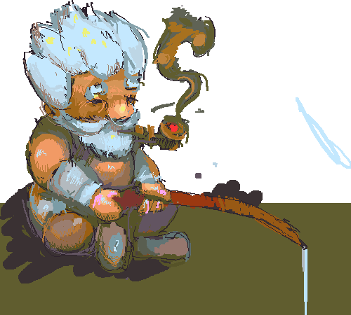 |
|
|
|
|
Logged
|
|
|
|
|
08--n7.r6-79.84
|
|
« Reply #115 on: October 05, 2013, 07:33:59 AM » |
|
..And pixel-art version of this dude: 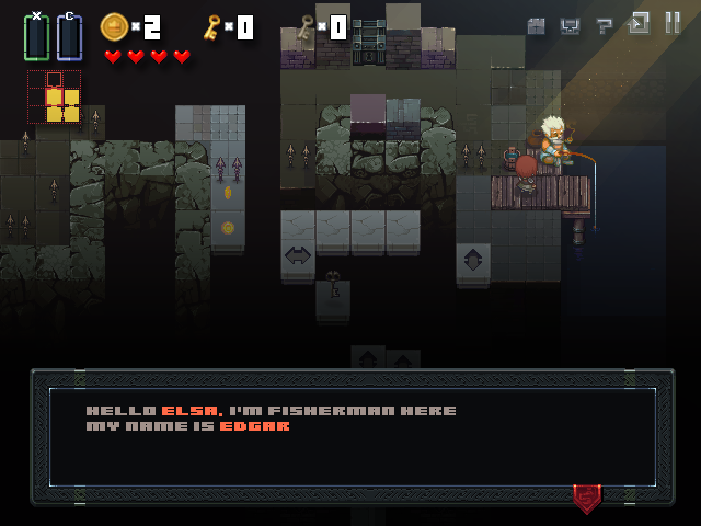 |
|
|
|
|
Logged
|
|
|
|
|
poe
Guest
|
|
« Reply #116 on: October 06, 2013, 02:20:01 PM » |
|
Have I told you I really want this inside me yet?
|
|
|
|
|
Logged
|
|
|
|
|
08--n7.r6-79.84
|
|
« Reply #117 on: October 08, 2013, 08:39:12 AM » |
|
Have I told you I really want this inside me yet?
Not sure what you meant, you want this inside you? Inside your imagination? My english is bad, sorry for misunderstanding =)
Little progress of work: 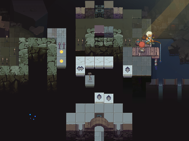 Better viewed with x2 zoom. |
|
|
|
« Last Edit: October 08, 2013, 08:45:27 AM by 08--n7.r6-79.84 »
|
Logged
|
|
|
|
|
Rat Casket
|
|
« Reply #118 on: October 08, 2013, 12:40:28 PM » |
|
Am I the only one who can't read the environment in this game? I seriously can't tell where floors end and walls begin.
|
|
|
|
|
Logged
|
|
|
|
Cunnah
Level 1

|
|
« Reply #119 on: October 08, 2013, 12:44:15 PM » |
|
Individually the art work is top notch but it needs a little definition to aid readability.
Having said that great work!
|
|
|
|
|
Logged
|
|
|
|
|
 Community
