|
gimymblert
|
 |
« Reply #240 on: May 31, 2017, 07:21:36 PM » |
|
Then why are you explaining that I'm right? :D The context of my original post was all about the relativity of color regarding color space, that is IN SOME COLOR SPACE that contrast make sense, you make the error of assuming universality when there is none. SO yes, relative to substantive type it's a contrast, it does not exclude color blind color space. On top of that you argue that perceptual is subjective, ie relative to who is perceiving stuff, which reinforce the notion I was going for, ie that it's ... relative. You are not wrong, but you miss my point.  Also why would you make the error of excluding people that aren't colorblind, that's still a good contrast for them. We aren't discussing application and I was pointing at how COMPLEX dealing with color truly is. But maybe I can concede that my former post wasn't enough explicit enough about that, color is still a fucking rabbit hole and your intervention demonstrate that!  |
|
|
|
|
 Logged
|
|
|
|
|
JobLeonard
|
|
« Reply #241 on: June 01, 2017, 12:13:41 AM » |
|
you make the error of assuming universality when there is none. SO yes, relative to substantive type it's a contrast, it does not exclude color blind color space. No, YOU are the one assuming universality of perceptive color space by stating red and green are acceptible color contrasts, because it DOES SPECIFICALLY exclude color blind space. Also why would you make the error of excluding people that aren't colorblind, that's still a good contrast for them. HOLY SHIT JIMBO LEARN TO FUCKING READ. Red and Green are NOT good contrasts for color blind people. Stop saying that they are. Who is the one missing the point here? |
|
|
|
|
Logged
|
|
|
|
|
ProgramGamer
|
|
« Reply #242 on: June 01, 2017, 02:07:51 AM » |
|
JobLeonard, re-read the second quote in your reply very carefully. You're understanding the exact opposite of what it's actually saying.
|
|
|
|
|
Logged
|
|
|
|
|
Torchkas
|
|
« Reply #243 on: June 01, 2017, 02:48:51 AM » |
|
btw just because red and green do contrast in normal vision doesn't make them opposite colors in the color spectrum. black and white contrast too.
red and green also do not turn into grey in a true subtractive color space.
red = magenta + yellow (RgB - RGb -> R)
green = yellow + cyan (RGb - rGB -> G)
RgB - RGb - RGb - rGB
It should give you a dark yellow-ish color because green and red get equally absorbed in the final color mix but blue gets absorbed more.
|
|
|
|
|
Logged
|
|
|
|
|
JobLeonard
|
|
« Reply #244 on: June 01, 2017, 06:59:45 AM » |
|
JobLeonard, re-read the second quote in your reply very carefully. You're understanding the exact opposite of what it's actually saying.
... oh, right  I still stand by my earlier statement that claiming red/green is a good contrast is ignorant, and a terrible rule of thumb. Especially since it's almost always used as THE default colour map (like traffic lights and everything involving start/stop, and maps. Those two alone already cover a shitton of options) |
|
|
|
|
Logged
|
|
|
|
|
ProgramGamer
|
|
« Reply #245 on: June 01, 2017, 07:06:54 AM » |
|
Relying on color for communicating information is flawed anyways, that's a known fact. You should use shapes and movement, which are more accessible and just more interesting in general. I think this discussion is more about art style though, is it not? Like, how to use color while defining your game's art style.
|
|
|
|
|
Logged
|
|
|
|
|
gimymblert
|
|
« Reply #246 on: June 01, 2017, 02:07:54 PM » |
|
btw just because red and green do contrast in normal vision doesn't make them opposite colors in the color spectrum. black and white contrast too.
red and green also do not turn into grey in a true subtractive color space.
red = magenta + yellow (RgB - RGb -> R)
green = yellow + cyan (RGb - rGB -> G)
RgB - RGb - RGb - rGB
It should give you a dark yellow-ish color because green and red get equally absorbed in the final color mix but blue gets absorbed more.
Too bad practice does validate that, hands on. I realized I kind of mix up color discussion on multiple thread too, but all color don't have the same area in the color spectrum, which mean that color mixing must take into account the weight (coloring power) of each primary color, hence why some 16bit encoding was 565 giving more bit to green and also why bayer sensor have half of their sensor dedicated to green.  Bryce Bayer's patent (U.S. Patent No. 3,971,065[6]) in 1976 called the green photosensors luminance-sensitive elements and the red and blue ones chrominance-sensitive elements. He used twice as many green elements as red or blue to mimic the physiology of the human eye I'm out of this discussion it's all about misreading and putting intention where there is none. I just wanted to point at color space and how common sense about color isn't that easy. And that twitter thread was people realizing just that, you need different colorspace depending on what you are doing. And if we need to go to universality, only monochrome contrast cover most of the need (still rude to blind people according to jobleonard). All your design must work at this level. I'm out of the discussion because it's damn rabbit hole, the more you learn, the more there is stuff to understand, I have book with hundred pages, written dryly, just about the basic, let's not start about monochromy (brightness) because it's even worse to define than color. You would think it's simple because it's about the percent of light reflected right? Well think again, myself is out. |
|
|
|
|
Logged
|
|
|
|
|
|
|
JobLeonard
|
|
« Reply #248 on: June 05, 2017, 09:20:25 AM » |
|
And if we need to go to universality, only monochrome contrast cover most of the need (still rude to blind people according to jobleonard) Don't complain about "putting intent where there is none" if you're going to be like that. |
|
|
|
|
Logged
|
|
|
|
|
gimymblert
|
|
« Reply #249 on: June 05, 2017, 10:10:49 AM » |
|
This one was a bit of tease on purpose  color discussion is always fun, it's so much subjective and objectivity don't help because it's equally messy, though there is best practice base on consensus, to avoid running in circle fighting each other over technicality (like we just did). I was raised in an infography company, while they hd just adhere to "standard" the discussion could never be actually resolve on other basis lol. |
|
|
|
|
Logged
|
|
|
|
|
JobLeonard
|
|
« Reply #250 on: June 05, 2017, 03:10:41 PM » |
|
No, we weren't fighting over a "technicality", and I'm sorry but you still come across as unaware of how privileged you are acting in this discussion. I mean this all started because I did not agree with the statement "green vs red is acceptable", because that "consensus" has been causing me and about 8 percent of all men loads of grief, and I think I pretty clearly signalled that when pointed out I was annoyed as a colourblind person to read that. You may think this is a fun discussion, and it's just a "technicality" to you that people who do not have "colornormal" vision cannot distinguish the colours that you can. To me, it's a reminder that I cannot use a shitload of things for no other reason than lazy, bad design practices. And falling back on "well perception is all relative anyway man" is both missing the point, and not fucking good enough. though there is best practice base on consensus Yes, and my point was that this consensus is mostly one of ignorance, one of "if it works for me, it works for everyone else!" And instead of engaging with that point of discussion you somehow managed to believe I claimed universality. A complete misreading you have yet to concede, but supposedly I'm the one missing your point here. You were too busy trying to show that I'm somehow proving you're "right" when I'm not even arguing about what you think I'm arguingLook, maybe if I explain by analogy it becomes more obvious. Here's a TED talk by a blind architect arguing that thinking about people with disabilities in architecture improves architecture for everyone:If as a developer you take a moment to think about how someone without normal color vision would perceive your game, or how someone who can only use keyboard input, and so on, the result is generally more accessible graphics and UI for eveyrone. Instead of just relying on color codes, one can include shape and texture too, and perhaps even sound cues if it fits the gameplay. People with "normalvision" also benefit from that. I just spent a week or two at work improving computer accessibility for a web-app we're building. Guess what? We got tooltips, keyboard accessibility, and easier to distinguish graphics, which benefits everyone. That's my point and somehow you manage to entirely miss it for two pages now. And yes, I'm sincerely annoyed by it. And no, I'm not putting intent anywhere, I'm pointing out your ignorance. |
|
|
|
|
Logged
|
|
|
|
|
ProgramGamer
|
|
« Reply #251 on: June 05, 2017, 03:30:51 PM » |
|
I thought Gimmy's point was just that red-green contrast is acceptable for art styles, as in, it's aesthetically pleasing for most people. I don't think anyone's arguing that communicating information purely through color is a good idea.
|
|
|
|
|
Logged
|
|
|
|
|
gimymblert
|
|
« Reply #252 on: June 05, 2017, 03:52:38 PM » |
|
@jobleonard
You are confused and confuse things:
1. I never said green/red was best practice but it is a contrast THAT DO exist in SOME color space, it say nothing about its used. That's not contestable. It's a not pick at any blindness.
I never use best practice as a way to justify red/green contrast, but in relation to color discussion AND BEST PRACTICE INVOLVE BLINDNESS ALREADY in professional circle and even AAA game are catching up, so it's not about shutting down that discussion. And even people like total biscuit are noting that in their review of a product.
I never say you CLAIM UNIVERSALITY, I'm saying you are pushing this ON ME as in my statement are devoid of any context at all, ie we are speaking of color space in general and how that makes discussing color hard.
It's a technicality because that's not the discussion is about and it's not excluded in the discussion. YOU DO MISS THE POINT. You could have extended the discussion to color blindness with other mean, that would have supported the context and the point being made, instead you misconstrue my point. ANd you still miss it, so hey!
It's like I would have said that "you are saying that green/red contrast does not exist", it's not that you are saying, you are saying don't use it for your design because it makes color blind people's life miserable. It exist, and understand how and why is also a way to help color blind by understanding its importance for non color blind (ie the bayer matrix, or natural occurrence of fruits against chlorophyll background).
For example you could have used that point about relative color space to introduce color blindness without having to counter a point that wasn't made at all, and advocate for better design in game and put resources in a resource thread.
@Programgamer
Not even, I'm just saying it's a thing that merely exist and here how it works, and I'm adding to that it's hard anyway because in color nothing is absolute because the basics change based on color space. It's also entirely an answer to a remark from torchkas that has nothing to do with any application (which JobLeonard is arguing against).
|
|
|
|
|
Logged
|
|
|
|
|
ProgramGamer
|
|
« Reply #253 on: June 05, 2017, 04:02:54 PM » |
|
So, it's a discussion for the sake of discussing color space?
|
|
|
|
|
Logged
|
|
|
|
|
gimymblert
|
|
« Reply #254 on: June 05, 2017, 04:09:52 PM » |
|
|
|
|
|
|
Logged
|
|
|
|
|
gimymblert
|
|
« Reply #255 on: June 05, 2017, 04:26:19 PM » |
|
FOr example consider this color space based on Red/green: https://en.wikipedia.org/wiki/Rg_chromaticityThe rg chromaticity space, two dimensions of the normalized RGB space,[1] is a chromaticity space, a two-dimensional color space in which there is no intensity information.
In the RGB color space a pixel is identified by the intensity of red, green, and blue primary colors. Therefore, a bright red can be represented as (R,G,B) (255,0,0), while a dark red may be (40,0,0). In the normalized rgb space or rg space, a color is represented by the proportion of red, green, and blue in the color, rather than by the intensity of each. Since these proportions must always add up to a total of 1, we are able to quote just the red and green proportions of the color, and can calculate the blue value if necessary. I think it's important how that works to also help color blindness. Because there is interaction and it's a huge component of non color blind people. Many color space have opposition of Red and green in their decomposition (like YUV or YDdDr). Also red and green are close in term of the median "eye sensitivity" of people 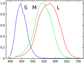 Which may or may not be responsible to the vibration when they are in direct contrast to each other (that hurts). For non color blind that's a rather lively contrast, removing it entirely make everything dull, that's not the point of designing with colorblindness anyway, there is many communication channel to do the same as Jobleonard demonstrated with his UI example, and those benefit everyone. They can and DO coexist. |
|
|
|
|
Logged
|
|
|
|
|
gimymblert
|
|
« Reply #256 on: June 06, 2017, 03:14:30 PM » |
|
The Importance of Nothing: Using Negative Space in Level Design
|
|
|
|
|
Logged
|
|
|
|
|
|
|
JobLeonard
|
|
« Reply #258 on: June 20, 2017, 04:41:01 AM » |
|
@jobleonard
You are confused and confuse things I avoided this topic for a few days to calm down and upon re-reading with fresh eyes am ready to admit that this was all the consequence of an initial misreading, followed by a few more that were likely the results of me already being upset. My apologies. But perhaps my itchy trigger finger when it comes to drawing incorrect conclusions shows how serious of a deal this can be for colourblind people; as well as how frustrated we are with people downplaying the issues because, you know, they're not life-threatening disabilities. As a simple example, the amount of virtually-indistinguishable red/green not ready/ready signal lights on appliances is too damn high! |
|
|
|
|
Logged
|
|
|
|
|
gimymblert
|
|
« Reply #259 on: June 20, 2017, 04:20:13 PM » |
|
As a simple example, the amount of virtually-indistinguishable red/green not ready/ready signal lights on appliances is too damn high! The God damn truth! |
|
|
|
|
Logged
|
|
|
|
|
 Developer
