|
Hangedman
|
 |
« on: April 03, 2013, 09:40:19 AM » |
|
This is a thread for fonts! Post your fonts, link useful free fonts, ask for font recommendations. FONTS!
FONT RESOURCES:FONTSTRUCT: Make your own fonts FONTSQUIRREL: Great free for commercial use fonts DAFONT: Tons of fonts, free and licensable, always read the readme GLYPHTRACER: a GPL font tool that can turn your handwriting/images into font, with help from a couple other little free programs
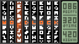
My fonts: HNG NO NAZOMy retro font, that I made because I wanted a retro font that was every retro font in one. Get it on my site, regular or monospace.  MARVELOUS 3x3 MARVELOUS 3x3My 3x3 font that I made for Merveilles. Get it here if you like.  |
|
|
|
« Last Edit: April 04, 2013, 06:56:02 AM by Hangedman »
|
 Logged
|
|
|
|
|
Belimoth
|
 |
« Reply #1 on: April 03, 2013, 09:53:26 AM » |
|
Wooooo font party! Final revision of my 3x3 font, concessions were made.  Fuck digits. Fuck digits.
|
|
|
|
« Last Edit: April 03, 2013, 09:59:10 AM by Belimoth »
|
 Logged
|
|
|
|
|
Hangedman
|
 |
« Reply #2 on: April 03, 2013, 10:06:25 AM » |
|
Remember anyone who posts fontstruct links:
Non-fontstruct-users can't get to them, iirc.
|
|
|
|
|
 Logged
|
|
|
|
|
sublinimal
|
 |
« Reply #3 on: April 03, 2013, 10:41:59 AM » |
|
Why would anyone use a 3x3 font? Those look terrible.  |
|
|
|
|
 Logged
|
|
|
|
|
Belimoth
|
 |
« Reply #4 on: April 03, 2013, 10:44:48 AM » |
|
I think it's time for you to leave.
|
|
|
|
|
 Logged
|
|
|
|
|
powly
|
 |
« Reply #5 on: April 03, 2013, 10:45:42 AM » |
|
I find it interesting that my M is Belimoths A! The only letter I'm not quite happy with in my own is G - it might not be instantly obvious, especially without some context. Besides readable, I tried to keep this rather blocky and use strict 3x3 letters, otherwise P and Q would be less wide. I also tried to go for uppercase where possible, q and n being the only clear exceptions.   |
|
|
|
|
 Logged
|
|
|
|
|
happymonster
|
 |
« Reply #6 on: April 03, 2013, 10:50:20 AM » |
|
I like Powly's the best so far.  |
|
|
|
|
 Logged
|
|
|
|
|
herror
|
 |
« Reply #7 on: April 03, 2013, 10:53:00 AM » |
|
 wip. |
|
|
|
|
 Logged
|
|
|
|
|
powly
|
 |
« Reply #8 on: April 03, 2013, 11:16:23 AM » |
|
herror, nice style - though you're using space suspiciously carelessly! (: Inspired by this thread, I gave another try at 3x4, which I always thought was a more interesting thing to do since there's actually space to do nuances and different kinds of letters. I'm not sure about the distinction, though - most of the "capital" letters somehow don't seem a lot more capital and some of the letters should be lower or at a shorter distance than they are so these can't just be pasted one after the other when using it in a program. Oh, and the capital N sucks, no idea what to do with it.   |
|
|
|
« Last Edit: April 03, 2013, 11:23:40 AM by powly »
|
 Logged
|
|
|
|
|
ompuco
|
 |
« Reply #9 on: April 03, 2013, 11:51:17 AM » |
|
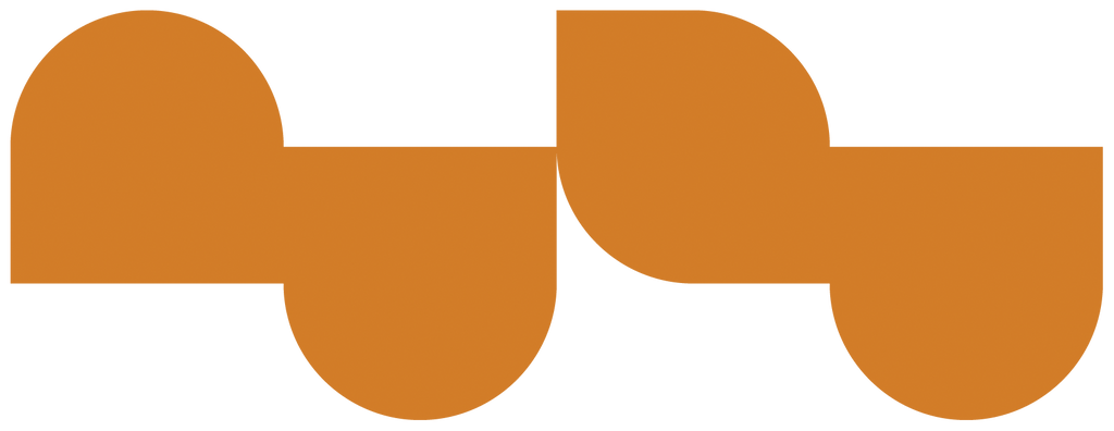
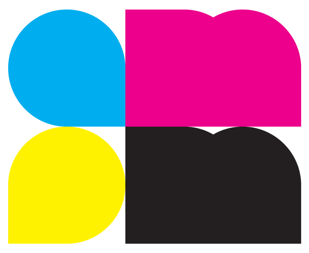
I've made a 3x3 font and spent some time figuring out what would work best. I'll put together an organized image with all the characters, but I do have this mockup using some of those scrambled and some other 3x5 characters I made on the spot on the side.  I've also experimented with some sort of minimal geometrically-based font, but I don't know if I'll make it into a full set:  Text: NuZu  Text: AMPM  Text: CMYK I might try making an actual type font, but I don't own the necessary software to make one just yet. |
|
|
|
|
 Logged
|
|
|
|
|
Belimoth
|
 |
« Reply #10 on: April 03, 2013, 12:03:08 PM » |
|
I find it interesting that my M is Belimoths A!
The restrictions I converged upon to make it interesting were: 1. construct the letters by subtraction from the 3x3 block 2. use symbolic clusters consistently 3. avoid diagonals 4. derive letters from other letters that are similar in form or phonetics, prioritizing phonetics 5. when two letters could be represented by the same glyph, prioritize by letter frequency #1 is self explanatory. #2 is for example using a 3x2 block to represent a squashed loop or a region with implied negative space in the middle, evident in the A, B, and P. This results in the W being a nonsense glyph if read that way which is okay, as long as it can't be interpreted as another letter. Didn't immediately occur to me to use this for the Q but then saw that you and others had done it that way. #3 X cannot be done without diagonals, and while unique glyphs without diagonals can be made for K that preserve at least it's symmetry, they are very abstract. #4 You M was originally both my M and my A! I hadn't noticed that I'd used the same glyph twice and I had gotten it from inverting the W glyph, which I suspect you have too. My current M glyph doesn't follow any of these rules but I think it reads well. I had originally derived the J from the I but changed it to what it is because of the symmetry with G. #5 http://en.wikipedia.org/wiki/Letter_frequency This is why A got the M glyph. Since there was only ever going to be one case, I didn't think of the letters as upper- or lower-case until I had to choose a better D. I find it interesting that Hangedman and I happened on similar solutions for S and Z but in the opposite order. Why would anyone use a 3x3 font? Those look terrible.  I don't know if I'll use it but it was a great design exercise. |
|
|
|
« Last Edit: April 03, 2013, 12:12:24 PM by Belimoth »
|
 Logged
|
|
|
|
|
happymonster
|
 |
« Reply #11 on: April 03, 2013, 12:03:59 PM » |
|
My 3x3 font (a little different as it uses two shades of grey)  |
|
|
|
|
 Logged
|
|
|
|
|
Belimoth
|
 |
« Reply #12 on: April 03, 2013, 12:06:00 PM » |
|
3x3 is almost as minimalist as it gets, and yet we have so many different approaches.  It is inspiring. |
|
|
|
|
 Logged
|
|
|
|
|
powly
|
 |
« Reply #13 on: April 03, 2013, 01:11:43 PM » |
|
happymonster: Oh shit, never even thought about grayscale. This could change everything!
Belimoth: Wow, you really put some thought into this. The loops make sense, but why avoid diagonals? Got to think about some other solutions for the A/M issue, though - I think that while the A of your font reads probably the best, the M isn't that clear to me.
Sajextryus: The smallercase type R is a good idea, but why make it so long? I also had that at some iteration, but it wasn't as wide. The larger geometric font things seem very cool too, but don't read too well with that little detail.
|
|
|
|
« Last Edit: April 03, 2013, 01:17:21 PM by powly »
|
 Logged
|
|
|
|
|
sublinimal
|
 |
« Reply #14 on: April 03, 2013, 01:16:16 PM » |
|
Why would anyone use a 3x3 font? Those look terrible.  I don't know if I'll use it but it was a great design exercise. Fair enough. I remember doing something similar before, except on paper. 3x3 is almost as minimalist as it gets, and yet we have so many different approaches.  It is inspiring. I have to admit it's neat from that perspective, but I hope I won't have to try deciphering these in actual games in the era of HD screens. happymonster's take on 3x3 is the most readable by far, the anti-alias makes a huge difference. |
|
|
|
|
 Logged
|
|
|
|
|
powly
|
 |
« Reply #15 on: April 03, 2013, 01:23:36 PM » |
|
We're going to fill that whole 1920x1080 pixels with dialog in one of these fonts!
|
|
|
|
|
 Logged
|
|
|
|
|
sublinimal
|
 |
« Reply #16 on: April 03, 2013, 01:27:03 PM » |
|
I will audibly grunt at it.
|
|
|
|
|
 Logged
|
|
|
|
|
ompuco
|
 |
« Reply #17 on: April 03, 2013, 06:29:31 PM » |
|
@powly Thanks for the comment! Originally, the r acutally wasn't all that long, but I wanted it to be monospaced for the use it was in. There's a few characters that work in 2x3 spaces that I couldn't quite show there. You can also see the 2x3 r in the visible logo for my project's devlog in my signature. Now, here's a proper image of my somewhat recent take on 3x3 fonts, with some alternate characters as well.  Monospaced characters on the first line, slimmer and alternate versions below. Some of the alternate versions look weird because they were made to be used inside a logotype or whatever. I feel it works well when you use a good variety of each character. Sorry about contributing to the spam of 3x3 fonts, but it is interesting to compare them. |
|
|
|
|
 Logged
|
|
|
|
|
|
|
Belimoth
|
 |
« Reply #19 on: April 04, 2013, 05:29:21 AM » |
|
fffuuuuuuck that's cool.
|
|
|
|
|
 Logged
|
|
|
|
|
 Community
 Townhall
 Forum Issues
 Archived subforums (read only)
 Creative
 Fonts And Font Accessories
 Community
 Townhall
 Forum Issues
 Archived subforums (read only)
 Creative
 Fonts And Font Accessories
