Welcome, Guest. Please login or register.

Login with username, password and session length

 
Advanced search

1411507 Posts in 69374 Topics- by 58429 Members - Latest Member: Alternalo

April 26, 2024, 01:52:51 AM

Need hosting? Check out Digital Ocean
(more details in this thread)
TIGSource ForumsCommunityDevLogsCogmind (sci-fi robot-themed roguelike) - BETA RELEASED
Pages: 1 ... 33 34 [35] 36 37 ... 71
Print
Author Topic: Cogmind (sci-fi robot-themed roguelike) - BETA RELEASED  (Read 236843 times)
Kyzrati
Level 10
*****


View Profile WWW
« Reply #680 on: January 30, 2016, 01:31:48 AM »

Hehe, well, I do actually put a lot of time into those posts, and they're nearly on par with my blog posts, I'd just need to do another hour or two of polishing each before they'd be ready for my main blog. Only the highest quality is acceptable!

It makes more sense to do that slightly less formal writing over there for the wider exposure, and doing it along with other devs is also a lot of fun. It is Reddit, and therefore not my own site, plus it has a bit less permanence, but I am aiming to keep the information from being buried and forgotten by always linking to the full TOC, and occasionally putting out summaries. There's also the advantage of it being less spammy to link what many devs are doing rather than just me Tongue

I do want to keep my dev blog alive, but every one of my posts now is like 5,000 words with images all over the place... It's getting out of hand as I keep trying to outdo myself SOMEONE STOP ME Shocked

I'm planning to revisit many of the better FAQ topics and put them on my blog. This summer I'll be on vacation for a few weeks so digging up and polishing "old" material might be the most efficient use of limited time to just keep Cogmind info floating around out there... gotta be thinking ahead Wink
Logged

JobLeonard
Level 10
*****


View Profile
« Reply #681 on: January 30, 2016, 02:36:29 AM »

Brevity is the source of wit Wink

(might give parse errors due to being too terse though)
Logged
Kyzrati
Level 10
*****


View Profile WWW
« Reply #682 on: February 01, 2016, 06:22:23 PM »

Designing Cogmind's World Map
[Cross-posted from the devblog here--follow link for better formatting and light-on-dark style.]

Cogmind began as a 7DRL based around a simple fight (or flight!) from your subterranean starting location directly to the surface. As the new Cogmind works its way towards 1.0, a big part of its departure from those humble origins is the significantly expanded world. (For an initial discussion about the layout of the world, see this post from last year.)

As that world increases in size, the chances of feeling lost without a map increase along with it.

This isn't such a huge deal for current alpha players, as new areas are added two or three at a time so there's an opportunity to gradually expand one's knowledge, but I can imagine that future players joining at 1.0 will be overwhelmed by the dozens of different locations, and it will overall feel more maze-like.

The fact that exits will only ever take you upwards towards the surface or sideways into a branch, and you aren't allowed to backtrack, means that theoretically you can just look for exits and will eventually reach the surface one way or another. But there are some advantages to adding a map that provides an overview of the route you're taking throughout that process.
  • A map enables players to form a better mental picture of how areas are connected in the world, and which areas are branches vs. non-branches. This will help gain an early understanding of the direct relationship between ascension and evolution.
  • Even more importantly, once the full-sized world is realized, players can take advantage of new mechanics to learn approximately where certain locations are to better plan out a route. Right now most players tend to wander around and allow their route to be determined mostly by what exits they happen to find. With experience (and especially later on when there are even more routes to choose from) players will in some cases attempt to seek out certain areas when possible, for whatever benefits they might provide for that player's style or strategy.
  • Similarly, players can also get a better grasp on whether or not they've passed the depths in which a given branch might be located (even without access to explicitly obtained knowledge).
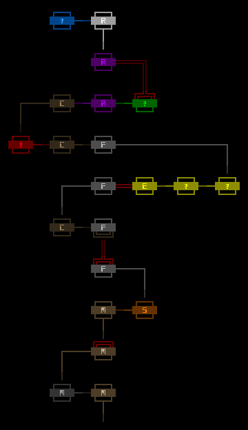
As of now this map has been fully implemented, and will be coming to Alpha 7. See it in action:


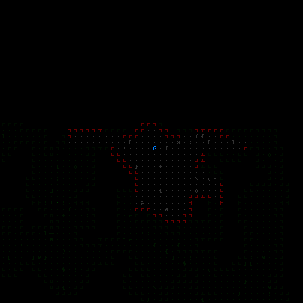
Cogmind's animated world map in action. (As usual, for this and all other images click to view at full size.)

Beyond this point, this post is mostly about examining the process behind the creation of the world map and its functionality, followed by some discussion of related mechanics.


World Map Design
A majority of the world map design process was carried out in REXPaint via mockups, which saved a huge amount of time that would've been wasted testing out variations that ultimately wouldn't satisfy all necessary conditions. Below you can see how and why the design evolved over time.


First world map concept.

In April last year I put this together mostly as a quick demonstration of what a theoretical world map might look like, as a part of the world layout discussion, and note here that "world map" at this point really meant nothing more than the route you took through the world on a particular run. In that sense it's more of a route map.

I really liked the aesthetics of that one, but on revisiting it for a proper review it was simply too wide for the area in which it would be placed--the standard map view. One option would be to block out the entire UI and replace it with the world map when opened, but this would ruin the immersion created by a deliberately dense and subdivided multi-part UI, especially in cases where the world is mostly unexplored and therefore the world map/route itself doesn't take up much space. Another alternative would be to use the narrower text grid for the design, but because the world map appears over the local map view and is just another type of map, I wanted it to match the local map font's own square ratio.

So the first aim was to reduce the map width, where the easiest solution would be to drop the three-letter abbreviation for representing each map, replacing it with a single letter instead.


Reduced-width world map concept.

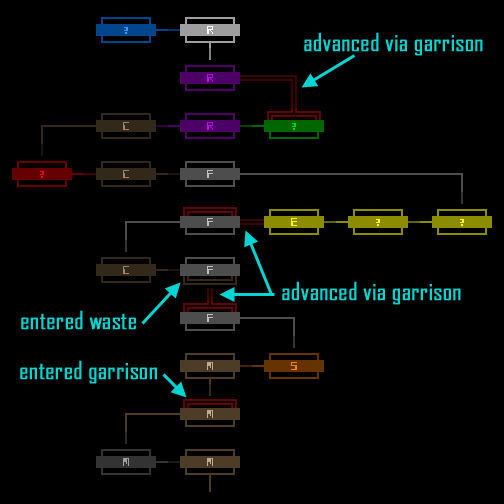
Then there was a more fundamental problem with this particular design: The style is not very flexible. This becomes apparent when considering Waste and Garrison. These special areas may be entered multiple times from any number of locations and do have an impact on your route, but don't really count as maps in the normal sense, characteristics that should be reflected on the world map.

To this end I reexamined the first two concepts for ways to incorporate these "maps between maps."


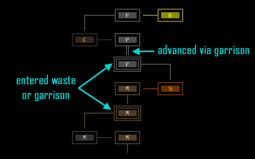
Concept 2 excerpt with Waste/Garrison examples.

Unfortunately without additional colors beyond each map-associated color, this design doesn't distinguish between situations like entering both Waste and a Garrison on the same floor. Some amount of modification to the shape and or color rules would be necessary.

So I went on to explore an alternative style that could clearly distinguish special maps while still keeping each map within a small area.


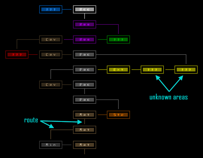
Detailed world map concept.

That looks fairly good and provides more information in the same amount of space.

Despite the earlier reduction in width, however, assuming that branches on either side can extend outward by as far as four areas (which happened as of the most recent release and now looks to be what will become the upper limit), even this is not enough to fit within the minimum 50x50 map view--a theoretical route that visited up to four maps outward on both sides would require a width of 61.

Fortunately the new style can more easily be squeezed yet further:


Narrower concept.

This both looks nice and fits better with Cogmind's "dense data" aesthetic, while also turning each area into a square, tempering the map's extreme flatness.

It does feel a bit too cramped, though. At a maximum height of 40 (4x10 depths) out of an available 50 rows in the map view, with the world's 10 depths we have an extra row available for each depth and it will still fit. Perfect.


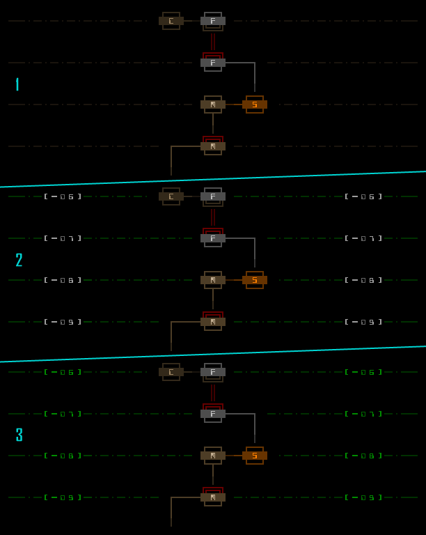
Finalized world map route style.

Overall, having a world map was planned from the beginning, but it's taken this long to get one because as a general rule I put off implementation of overarching and inclusive systems (especially those requiring a complex dedicated UI) as long as possible to avoid wasting development time when other contributing elements inevitably change during the iterative process.

In this case, one example would be Waste and Garrison areas, which were not a part of the original design doc ("special maps between maps" were, but weren't confirmed nor had a specific form until after alpha release and some public playtesting). Another example is the recently-decided limit on the maximum width of branches (4), which naturally had a bearing on the space available for each individual map indicator. And there are also a couple other late developments in terms of world layout that I can't reveal for spoiler reasons, but they, too, had to be taken into consideration. With regard to the UI as a whole, the world map design also couldn't be finalized until the main interface's aspect ratio was itself finalized, as discussed in the previous post.

All in all, game development is all about attempting to identify dependency upon dependency, resolving them in the most logical way to keep everything from falling apart before it's even complete! :D

But back to the world map... we still haven't finished it yet!

It's too empty, too black, and needs some sort of unintrusive background. At first I thought of using a visually altered version of the local map itself as a background, a purely aesthetic approach, but then I decided it should ideally be something functional as well. Why not depth indicators?


Depth indicator concepts.
  • I started with sepia lines because, you know, you're underground Tongue. That works okay on its own, but together with the complete main interface, sepia as a UI element doesn't really fit (it's not used that way anywhere else that). Hm, what color to use... I know, green! Okay, it was obvious. Sepia was perhaps my subconscious attempt to use something other than green. But consistency is king, plus green works. Regarding the semi-dotted style, using full lines is too many pixels and attracts extra attention to them, while also unnecessarily stratifying the depths a bit too strongly; a purely dotted line is to weak, harder to follow, and... dotty. A mix of the two feels just right here (though notice the pattern changes at the ends to give them a little more strength there).
  • I wanted the depth values themselves to stand out so for those I started with white. It turns out that's far too distracting from the route itself.
  • The answer, of course, is more green. Just a brighter green in that case, and if you'll notice I also slightly darkened the meaningless placeholder zeros, included to maintain horizontal alignment regardless of the value.

Final world map concept, showing only route and depth indicators.

All of the above images were taken directly from REXPaint, created before writing any code at all. That made it much easier to implement, since I could see exactly what I wanted it to look like and do beforehand.


Interaction
The world map is easy to access--for mouse users there's a new button in the bottom right corner of the main UI that reads "<MAP>", and both Backspace and F9 open and close the map (mouse users can click anywhere to close it).

Mouse users can hover the cursor over a map location for information; keyboard players can use the movement keys (numpad, arrow keys, vi) or numpad -/+ to cycle through the map. When an area is selected, the box shows its full name, depth, and a list of any other known areas not yet visited at that same depth.


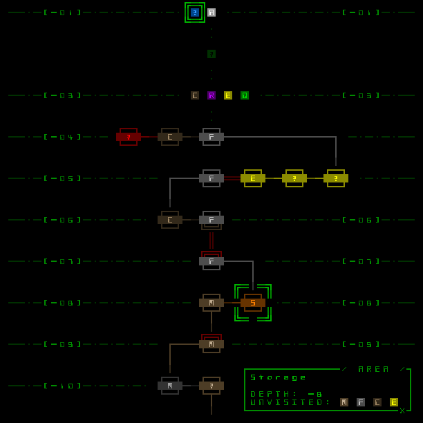
Final world map concept, showing all components. (Two different types of selection indicators are shown.)

The next section talks about what those little letter blocks at the top mean and how you get them. (Actually my young son wandered in while I was working on these mockups and blurted out "letters!")


Mechanics
As mentioned in the introduction, the "world map" is not purely a representation of what you already know (i.e. the route you've taken up to that point); it's also possible to learn about areas in advance, to get an idea of how the world is organized and therefore maybe adjust your planned route. While you won't learn precisely how to reach them, knowledge of other areas will at least let you know what depth they're at (though that's enough information for more experienced players to be able to locate them sooner or later).

Thus the world map also ties into the mechanics. There are initially two primary ways to find area locations in the world:
  • Encounters with other robots might reveal a specific area during dialogue.
  • Recycling Unit systems are now susceptible to a new type of brute force hack, one that outright destroys the system in an attempt to simultaneously override its defenses and tunnel through the recycling network to find what other areas it's hooked up to. This is more likely to discover areas closer to the Recycling Unit in question.
Once you learn of an area, its block will appear at the appropriate depth, and you can hover over it all the same to see the basic info for it and other areas at the same depth. Any intermediate depths about which nothing is known are represented by dark question marks as placeholders.

There will likely be one or more additional methods to obtain area data and build a picture of the world. This will become more important soon as the current three branches expands to four or five in the next release or two!

A Note about Structure
While you are capable of learning about areas in advance, and to enable that feature the layout of the entire world is determined when it's first created, that layout is generated anew procedurally with each run. How branches are connected to the main complex, and to one another, follows a set of rules that you can gradually learn as you play more runs, and as stated the world map view is a tool to help in that regard, but there is no persistence between runs.

For example, you'll quickly learn that the first/lowest three areas in the main complex are always Materials, and that there are always entrances to the Mines located within each of the first two Materials areas. Those relationships are fairly obvious, but later some of the more interesting outlying areas may not be so easily learned (even if only because you'll visit them less often), so having a world map handy will be useful in clearing up more obscure relationships.

Your complete route is also now recorded in the score sheet produced at the end of a run.
« Last Edit: February 01, 2016, 09:09:47 PM by Kyzrati » Logged

whilefun
Level 1
*


Making games


View Profile WWW
« Reply #683 on: February 01, 2016, 07:13:17 PM »

I love this game's aesthetic  Kiss
Logged

JobLeonard
Level 10
*****


View Profile
« Reply #684 on: February 05, 2016, 04:04:18 AM »

I keep being amazed not just by the amount of thought you put into this, but also how well you document it.
Logged
Kyzrati
Level 10
*****


View Profile WWW
« Reply #685 on: February 05, 2016, 05:28:38 AM »

I keep being amazed not just by the amount of thought you put into this, but also how well you document it.
Documenting it helps me get my own thoughts straight, and more importantly serves as a reference when either others ask me about XYZ, or I forget what the hell I was thinking. I'm all about being meticulous and having a specific reason for every decision I make, so it's nice to share some of those on the way, while also leaving a record for myself. I look back at and link to my old blog posts quite a lot Wink. I have soooo many documents with stuff like this over here, but they're not polished enough to share without a lot of extra work, so I just pick the ones that are more interesting, and that are suitable to accompany with lots of images Tongue

I love this game's aesthetic  Kiss
Thanks, I give it my all Grin
Logged

TheWing
Level 1
*


View Profile WWW
« Reply #686 on: February 05, 2016, 06:46:11 AM »

I have soooo many documents with stuff like this over here, but they're not polished enough to share without a lot of extra work, so I just pick the ones that are more interesting, and that are suitable to accompany with lots of images Tongue

You should release those at some (very distant) point too, information about how a developer develops his game is always cool, be it how messy and 'unformatted'. That's why people like concept art and prototypes and whatnot, they give insight into what the game has gone through!

Logged

- - - -
Kyzrati
Level 10
*****


View Profile WWW
« Reply #687 on: February 05, 2016, 06:51:32 AM »

I've thought about doing that before! And in some cases I do release excerpts in the form of occasional images via my blog or posts on /r/roguelikedev, but on a larger scale I'd feel the need to redact a lot of sections I wouldn't want to be public :/

I do really like seeing this sort of thing, so by extension I know others would as well, but releasing it would be stressful Tongue
Logged

Kyzrati
Level 10
*****


View Profile WWW
« Reply #688 on: February 07, 2016, 09:01:01 PM »

I'm changing Cogmind's default font to this new one for now:

(That's at size 12, but it's available at all sizes--see sizes 18, 20 for more samples.)

More changes may come in the future depending on feedback and usage data.

Either way, there are now more than 100 fonts available :D
Logged

JobLeonard
Level 10
*****


View Profile
« Reply #689 on: February 08, 2016, 01:21:45 AM »

Nice touches with the capital A, H, K, P and R, making sure they don't look alike too much.
Logged
Kyzrati
Level 10
*****


View Profile WWW
« Reply #690 on: February 08, 2016, 04:01:48 AM »

I think most of them look distinct enough, except for the H vs K, which worry me a bit but any further changes to the K seem to bring it too far from the style :/. That distinction got to be especially tough as size 20 for that reason...
Logged

JobLeonard
Level 10
*****


View Profile
« Reply #691 on: February 08, 2016, 05:28:17 AM »

I guess you mean the smallcaps versions? You could play around with lowering the horizontal bar in either of them - although that really changes where the "weight" of the font appears to be:

Logged
Kyzrati
Level 10
*****


View Profile WWW
« Reply #692 on: February 08, 2016, 05:35:43 AM »

Yeah I preferred having bars centered or higher in almost all cases because the weight looked better. The main problem isn't really there, though, it's the lack of any differences except for one pixel on the right, but that's how this style theoretically should work...
Logged

JobLeonard
Level 10
*****


View Profile
« Reply #693 on: February 08, 2016, 05:41:40 AM »

TBF, I don't think they're easily confused, despite only differing by a single pixel. If you're really worried I would break the bar-height consistency and change it in one of the two (in which case my preference would be lowering the bar in the K)
Logged
Kyzrati
Level 10
*****


View Profile WWW
« Reply #694 on: February 12, 2016, 06:04:16 PM »

Some of this week's developments:

Animated Machine Concept

I've long planned to animate one type of machine in particular, but I hadn't yet reached that area of the game, until now. So yesterday I spent a while brainstorming to come up with a generic way to script flexible animations for ASCII machines. Having solved that problem, I then decided it wouldn't be worth implementing such a feature because it's likely I'm only going to use it once, so instead I hardcoded the above sample to see whether the concept would actually work. (I.e., that machine will not be the one animated in game.) Looks pretty good, I think.

Cave Generation Concept

The new part of the game that's on the way is the cave areas, so getting deeper into how they'll be structured and populated was a big part of this week's planning work. The above cavegen will end up with a greater variety of shapes and sizes in terms of overall layout, but I like the style itself pretty much as is.
Logged

Kyzrati
Level 10
*****


View Profile WWW
« Reply #695 on: February 22, 2016, 06:13:39 PM »

Dialogue UI
[Cross-posted from the devblog here--follow link for better formatting and light-on-dark style.]

I recently added the third and final dialogue-related UI feature to Cogmind, so it's time for a review of what all these different ways of displaying who says what are doing in the game :D


Message Log
This is the obvious one--any NPC dialogue is added to the message log for future reference if necessary, especially useful if you're told something that might be important, like a unique terminal access code you didn't bother to write down Smiley.

Like most other uses of the message log, however, it plays a secondary role with regard to dialogue, while the primary method of display depends on whether the speaker is a minor or major NPC.


Sample dialogue text in the message log.

I'll write more about message log itself and its design another time.


Transmission Window
Major NPCs open a modal dialogue box when they talk to you, reflecting their importance to the story. They also get their own window because they're likely to have a lot more to say at once than the average NPC.


Listening to Revision 17 when you first awaken.

Players already familiar with a given conversation can just ESC out of it.

One significant advantage of putting this dialogue in its own window, besides modality, is tighter control over pacing. By dividing a longer conversation into segments on separate pages rather than having it all suddenly visible in the log, each page switch can represent a pause in speech which is reflected directly in the player's UI experience, even just for the moment it takes to advance the conversation, which can be useful for conveying feeling beyond the words alone. Revision 17's initial dialogue includes an example of this technique (and a glaringly explicit one at that):

"If I know the one behind it this can only be bad. And trust me, I know that one all too well..."
"..."
"I give you a hook like that and get nothing? You know, you're pretty boring to talk to."


On-Map Dialogue
This is the newest one, showing dialogue from minor NPCs, and might even be considered redundant since the message log has always shown this same content, but there are good reasons for wanting these to appear on the map as well.

Cogmind's message log is afforded relatively little space, and the overall interface design intentionally de-emphasizes the log by providing the same useful information elsewhere in the interface via more convenient, accessible, and relevant means. But even a minor NPC might tell you something valuable or interesting. I know I tend to ignore the log for 99% of play time, so when something does come along there's a chance I'll miss it. Thus the non-log parts of the UI are responsible for re-emphasizing anything that should be known, dialogue included (which is kind of a special case, anyway, since there's only so much of it).

My original concept for on-map dialogue had a secondary goal as well--use a larger font to make the dialogue more readable than when squished into the log, but the map font is a square font and therefore not exactly more readable despite being technically larger, so that approach was scrapped. (Later testing showed that wider space available for dialogue displayed over the map was already somewhat better for readability compared to the log window, anyway.) At least the fact that these lines appear on the map rather than only alongside mundane messages in the log achieves the primary goal of emphasizing them.

There are other unique advantages to map-based dialogue, but before we go there let's look at the first implementation:


First fully-implemented concept for on-map dialogue (click for full size).

The first test looked pretty good. You'll see a quick line flash between the speaker and the new line, to indicate their position, and the spoken dialogue flashes in. New lines are added to the bottom, since reading downward is more natural, and it looks better when old lines fade upward into the map. (These lines are not modal, and will simply fade away with time.)

This first test also took into account the need to differentiate between dialogue from different speakers (or wrapped lines from a single statement), by alternating between slightly different hues.

There were still several subtle ways to improve on the animation, so I tweaked the short-lived speaker position indicator line to appear smoother, and added a very fast swipe to each new dialogue line, originating from where it's connected from the initial indicator line. The latter addition makes it a little more obvious which and how many dialogue lines are new, plus it just looks cooler Tongue


Final appearance of on-map dialogue.

More colors are also helpful--the color of on-map dialogue messages reflects the relationship of the speaker with Cogmind, making them more informative than the log (which can't effectively do the same because there are already other uses for those colors there!). As one would expect, green dialogue is from friendlies, gray from neutrals, and red from hostiles. (Note that the swipe speed also had to be tested on wider map view settings, which is what the speed values are based on, since there's more distance to cover under those circumstances.)


Dialogue appearance mockup work done in REXPaint prior to implementation.

As you can see in that mockup, there's also some blue in there. After finishing the dialogue feature I couldn't resist giving "scene descriptions" the same treatment. Sometimes the log will show a cyan description of a unique encounter or event (these are often accompanied by dialogue, shown in sky blue), and these, too, will now appear over the map.


Sample scene description.

Future posts will look at the role of NPCs and story in Cogmind and roguelikes, though I might not get to those in the near term, as those parts of the game are still taking shape. (I'll also have to tread carefully around those topics, because I don't want to spoil anything!)
Logged

JobLeonard
Level 10
*****


View Profile
« Reply #696 on: February 23, 2016, 12:49:12 AM »

Will we be able to overhear conversations between regular bots? Shocked

(by which I mean: not specific NPCs but random bots)
Logged
Kyzrati
Level 10
*****


View Profile WWW
« Reply #697 on: February 23, 2016, 12:54:59 AM »

Nope, scrapped that idea early last year Tongue

Quote
For the past year or so the concept for the final multi-console mode was actually called “signals,” and looked like this:


“Signals” multi-console concept (mockup)

The idea is the console is normally filled with junk data representing encoded transmissions Cogmind is picking up from the environment, and you could attach components capable of deciphering what other robots in your vicinity are thinking/planning, as well as whatever other information can be intercepted, including the number of enemies currently tracking you.

While fun, intel filter management offers a much broader range of possibilities, and serves as a bridge between the terminal hacking system and map overlays (which could even be further expanded in the future). The signals idea could technically still be added, though it might end up being too complicated a mechanic (?).

For now we’ll relegate it to the list of many (though fewer than there probably should be) cut features.
Logged

JobLeonard
Level 10
*****


View Profile
« Reply #698 on: February 23, 2016, 12:58:13 AM »

Ok good, because you have enough feature creep as is :D
Logged
Kyzrati
Level 10
*****


View Profile WWW
« Reply #699 on: February 23, 2016, 01:05:01 AM »

Heh, exactly Smiley. This particular dialogue UI feature was just another way to show something that already existed.
Logged

Pages: 1 ... 33 34 [35] 36 37 ... 71
Print
Jump to:  

Theme orange-lt created by panic