|
godsavant
Guest
|
 |
« Reply #60 on: November 18, 2008, 04:21:19 AM » |
|
I have to agree with you on the zoom thing...when I'm working with photoshop or MS Paint, I’ll often have to zoom out to get a sense of the whole picture, and having to select a different tool w/ the mouse to do that gets really annoying after a while.  On Pixen, at least there is a zoom bar directly in the corner, but the problem is that the mouse’s scroll wheel zooms the picture in and out, instead of moving it up and down, forcing me to use the scroll bars (and causing some serious motion sickness).  A thing to take from Pixen's book, however: allow different tools to be assigned to each mouse button, i.e. color dropper w/ right mouse button and brush w/ left is unstoppable combo. |
|
|
|
|
 Logged
|
|
|
|
Annabelle Kennedy
Awesomesauce
Level 8

♥Android Love♥

|
|
« Reply #61 on: November 18, 2008, 04:23:50 AM » |
|
color dropper w/ right mouse button and brush w/ left is unstoppable combo.
this is the truth, idraw 3 has this and i live by it... but lots of other programs offer this |
|
|
|
|
Logged
|
|
|
|
|
Renton
Guest
|
|
« Reply #62 on: November 18, 2008, 04:28:46 AM » |
|
|
|
|
|
|
Logged
|
|
|
|
|
sereneworx
|
|
« Reply #63 on: November 18, 2008, 04:45:30 AM » |
|
Actually, I just realized, while photoshopping, that you can also zoom out by holding ctrl and scrolling the mouse wheel. Pretty easy to do if you ask me, especially since I almost ALWAYS have a finger on ctrl when I'm arting. Also, I was bored, and this happened:  |
|
|
|
|
Logged
|
|
|
|
|
Renton
Guest
|
|
« Reply #64 on: November 18, 2008, 04:47:17 AM » |
|
Pretty good. I say go for capital letters. Maybe put a reverse L as T.
|
|
|
|
|
Logged
|
|
|
|
|
sereneworx
|
|
« Reply #65 on: November 18, 2008, 04:50:32 AM » |
|
I actually tried that while messing around, trying to get some symmetry happening. Just makes it look like Jixel.
>_>
|
|
|
|
|
Logged
|
|
|
|
|
Renton
Guest
|
|
« Reply #66 on: November 18, 2008, 04:54:04 AM » |
|
|
|
|
|
|
Logged
|
|
|
|
|
Renton
Guest
|
|
« Reply #67 on: November 18, 2008, 04:54:42 AM » |
|
Yeah, you're right. Maybe like this?  |
|
|
|
« Last Edit: November 18, 2008, 05:08:48 AM by Renton »
|
Logged
|
|
|
|
|
Robotacon
|
|
« Reply #68 on: November 18, 2008, 11:07:05 AM » |
|
I've also thought about making a pixel program simply because of the game I'm making (Arcade Academy) where I have to "bake" all the graphics using different layers (depth or normal maps, texture maps, reflection maps, etc).
I guess Z-brush is the closest to what I need but I want it to work with the color control of Promotion.
I'm no painter so I can't mix/select colors. I'm more of a sculptor who know the shape of things and can model pixels that way. What I need is help with light/shadow/reflections etc.
|
|
|
|
|
Logged
|
|
|
|
|
Michael Buckley
|
|
« Reply #69 on: November 18, 2008, 11:09:37 AM » |
|
Some general OSX design guidelines: - Make it pretty.
- Make it look like an OSX program.
- Make it feature-efficient - don't overload with unnecessary bulk.
- Make it elegant - there should be as few user preferences as possible, because they shouldn't need to change them.
I think that's a pretty good list, but there are a few things that don't developers on other systems might not be aware of, like the fact that quit goes in the Application menu (and that there is an Application menu, for that matter), and that they should use OS X's built-in Open Recent functionality instead of implementing their own. That way the number of items in the Open Recent submenu is set by the user's system-wide preferences. Speaking of preferences, I think a program like this will have quite a few, no matter how hard you try to eliminate them. A program like this just needs to be customizable. As Annabelle Kennedy mentioned, she would like z and x to be mapped to zoom in and out. I would prefer to use the scroll wheel for that. Others have mentioned other ways to do that. Some people might want to map the 0-9 keys to tools. For others, it might be more beneficial to map those keys to palette colors. I still agree that it's a good idea to minimize preferences and make them as clean and easy as possible. |
|
|
|
|
Logged
|
|
|
|
|
Corpus
Guest
|
|
« Reply #70 on: November 18, 2008, 11:22:55 AM » |
|
Oh, sure. Programs like XCode still end up with quite a few preferences. The idea is only to include those preferences that are absolutely necessary, though.
Rather than create a pixel program that panders to every user, IMO, it would be better to try to create the best pixel program ever. Obviously. To me, though, that means putting time into thinking about and honing the user interface and interaction model to the point that only the whiniest of internet whiners have anything to complain about, once they've adapted to the program. Adaptation isn't necessarily a bad thing and, of course, will be much smoother in better-designed programs.
|
|
|
|
|
Logged
|
|
|
|
|
Michael Buckley
|
|
« Reply #71 on: November 18, 2008, 11:54:49 AM » |
|
I think in the end though, we might have a different view of what "best" is. Different strokes for different blokes and all that. Adaptation can only go so far because people are going to use the tool for different things.
For example, one artist might be using the tool to create artwork for a paletted (indexed color) game, while another might use it for an RGBA game. Obviously, palette creation, manipulation and selection are going to be very important for the first artist, and not important at all for the second.
There are three ways we could go. Obviously, the person doing paletted work needs the palette, but the person working in RGBA doesn't need to not have it. So we could optimize for the paletted artist and force the other to adapt.
Second, we could introduce modes. True, we'll already need a different mode internally for paletted and RGBA, so we could have different interfaces for those modes.
Third, we could allow interface customization. Although modes might work well in this case, they won't always work well. Interface customization allows each person to create the best workflow for what they're doing. Yes, we should design it so it's as efficient as possible by default, and there's no much they'd need to change, but I think for an artwork program, you need to cater to the individual artist, and artists are very individual people.
|
|
|
|
|
Logged
|
|
|
|
|
Corpus
Guest
|
|
« Reply #72 on: November 18, 2008, 01:02:57 PM » |
|
Yeah, but there's still a theoretical ideal implementation that's good for everyone, and the closer you manage to move towards that, the fewer preferences you'll need. Obviously you can never actually reach it, but you can edge towards it.
Also, the paletted vs. RGBA distinction would be a per-image setting, just like the placement of the pixels, as opposed to a software preference, if you get what I mean. The program could still remember which mode you tend to work in, of course.
That's pretty much just like the difference between working on a PHP or a JavaScript file (well, not so much on the internal operations side of the picture.) The interface wouldn't need to be much different, with the exception of the colour selection tools.
I don't think we actually disagree significantly here :D
|
|
|
|
|
Logged
|
|
|
|
|
FoxBlitzz
|
|
« Reply #73 on: November 18, 2008, 02:20:39 PM » |
|
I don't think there's anything wrong with binding a zoom function to both the keyboard and the mouse. Windows had similar design goals for Windows 95 through XP. I really think it helps make programs easier to pick up and use, regardless if someone is mainly using the mouse, or likes the keyboard. Speaking of adaptation, a "Tip of the Day" window might also provide useful information to users just starting out with the program.
I also think that the layout should be designed to require as little effort in mouse movement as possible for an experienced user, but still show the controls in the UI for beginners. This means both logical and convenient arrangement of tool palettes and, once again, mouse "sweet spots". Does this all conflict with OS X philosophy?
agj: I don't want to feel like I'm commanding people to do my work, so I'm going to work closely with the design of the program, listening to what others say and incorporating them somehow into the final product. I can do the design mockups. In fact, let me make a basic one right now.
|
|
|
|
|
Logged
|
|
|
|
|
sereneworx
|
|
« Reply #74 on: November 18, 2008, 03:10:29 PM » |
|
Yeah, you're right. Maybe like this? It's really hard for the eye to follow through that one, the outlines are really jarring. I think that people should be able to customize their keyboard/mouse shortcuts, because everyone likes things done differently. Perhaps there could be presets though. Like, depending on what you are using the application for, you could choose the preset that suited you the most. (And then further customize it) |
|
|
|
|
Logged
|
|
|
|
|
Michael Buckley
|
|
« Reply #75 on: November 18, 2008, 03:36:28 PM » |
|
Also, the paletted vs. RGBA distinction would be a per-image setting, just like the placement of the pixels, as opposed to a software preference, if you get what I mean. The program could still remember which mode you tend to work in, of course.
That's pretty much just like the difference between working on a PHP or a JavaScript file (well, not so much on the internal operations side of the picture.) The interface wouldn't need to be much different, with the exception of the colour selection tools.
I don't think we actually disagree significantly here :D
I do agree that a mode approach could work for this particular problem. However, you need to make it very clear which mode the person is using. You don't want to make it possible for someone to make color indexed image and think they're making an RGBA image. At the same time, you don't want new users frustrated when the program doesn't work the same on two different images. There's also the detail of which mode to choose by default for new images. I think that would certainly have to be a preference. Sure, you can pop up a window asking for the dimensions and color mode of the image, but by default, some mode should be selected, and it should be user-configurable. We can make people adapt to changing it every time, but overall that takes more time for them to get set up and impacts their workflow. I think what I'm saying is that while it's a good principle to minimize preferences, for a project like this, we're going to end up with more preferences than you'd think. I also think that the layout should be designed to require as little effort in mouse movement as possible for an experienced user, but still show the controls in the UI for beginners. This means both logical and convenient arrangement of tool palettes and, once again, mouse "sweet spots". Does this all conflict with OS X philosophy? I don't know what you mean by "sweet spots", but OS X reserves the corners of the screen for itself, so don't expect to trigger actions by moving the mouse to the corner of the screen. Other than that, I don't think that minimizing mouse movement is bad, just as long as it doesn't look cramped. |
|
|
|
« Last Edit: November 18, 2008, 04:05:59 PM by Michael Buckley »
|
Logged
|
|
|
|
|
FoxBlitzz
|
|
« Reply #76 on: November 18, 2008, 03:45:13 PM » |
|
Michael Buckley: I'm referring to the edges (left, right, top, bottom), etc, not necessarily corners. I don't really see this kind of thing working too well on OS X since you typically don't maximize windows on that system. Oh well. At least it'll be a nice addition for Windows/Linux. On the logo: What about taking the border off the white letters, and changing their color to match the pencil? It might look interesting. Anyways, here's a reaaaallly basic mock-up I made so far: 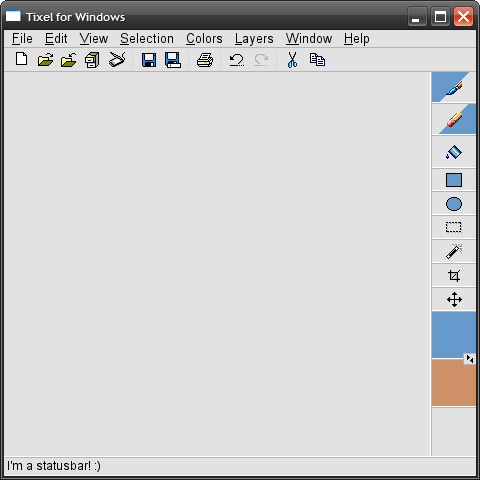 None of that stuff is in reference to the program's visual style. Heck, I pretty much straight ripped a lot of the graphics from Paint Shop Pro 8 (please don't sue me, Corel). It's just there to give a basic idea of what the layout might look like on a Windows/Linux system. In general, take a gander at the panel on the right. The tool icons are sized fairly large (like Pixen), except you will be able to just ride the mouse along the right side (assuming the window is maximized) to grab tools, since their bounding boxes would be extended all the way to the right. I'm thinking less frequently-used tools or tools with multiple options should have a somewhat smaller clickable area vertically, in order to conserve screen real-estate somewhat. The blue triangle stuff is there to show their mouse button associations, and that small gray panel in between the two colors swaps them between the two mouse buttons (although it might be a good idea to just move it to another location, change it to say "Swap", and have the action affect the tools as well). On a somewhat unrelated note, I think the selected colors region should be especially large since your perception of a small colored rectangle may be different from what color you'll see after you've painted the image. The color palette will likely be located on the left side, possibly multi-column, except that the mouse wheel will scroll through the different columns, thus you can still sidle the mouse along the side and get the choice you want. I also designed that particular shot with a small window in mind. For larger displays, a program option could be useful to enlarge those regions (and probably the icons shown on them). Anyone is welcome to modify this or even suggest an entirely different design. |
|
|
|
|
Logged
|
|
|
|
|
Michael Buckley
|
|
« Reply #77 on: November 18, 2008, 04:21:40 PM » |
|
Michael Buckley: I'm referring to the edges (left, right, top, bottom), etc, not necessarily corners. I don't really see this kind of thing working too well on OS X since you typically don't maximize windows on that system. Oh well. At least it'll be a nice addition for Windows/Linux. Actually, a lot of graphics applications maximize to fill the screen on OS X. Window zoom behavior is entirely up to the programmer. The design guidelines say to not take up more space than you need, but for graphics work, you can make a case for needing the entire screen. However, the Dock rests at one of the screen edges. Users can pick between having their dock on the left, right, or bottom of the screen. If the user has dock hiding on, moving the mouse to that edge will show the dock, and if the window is maximized, the dock will cover part of the window. On Windows, you have almost the same issue with the taskbar. It also won't work well if the user is not maximized on any platform. There's also the literal corner case of what happens if the mouse is in the corner. Is a mouse in the bottom-left activating the left or the bottom command? If you exclude the corners, you make the edges harder to hit, potentially frustrating users. You also end up moving the mouse a lot on large monitors, and all you gain from it is an extra 4 commands that could be mapped to the keyboard anyway. In general, I think the concept of minimizing mouse movement would eliminate this kind of thing, along with mouse gestures. Anyways, here's a reaaaallly basic mock-up I made so far: By far the most common multi-display Photoshop setup I see maximizes the image on one display, and places the tool windows next to it on the other display. Any setup where the tools are attached to the image would prevent this kind of thing. The colors are, IMO, a bit too large, and the swap colors button is a bit too small. |
|
|
|
|
Logged
|
|
|
|
|
Titch
|
|
« Reply #78 on: November 18, 2008, 05:00:51 PM » |
|
Like Annabelle I'm an IDraw3 user, partly through familiarity but also because its nice to make a silly big canvas without using more than 1mb of memory. Been trying to get into graphics gale so I can utilize layers and onion skinning for animation, but I just find it darn awkward. Particularly setting an alpha channel (although this could just be me, I've not been using Gale as my main editor for long, I could just be doing it the awkward way). I do love the IDraw selection tools, particularly select border which selects an entire area up to where it meets your secondary colour and the expand/contract edge tools. Something that made creating compound sprites easier would be very welcome too. Often I find myself tearing sprites apart so I can put them back together in a not really exact fashion in flash. I'm not very well practiced in hardcore programming (I've done a bit of C#, Ruby and VB), but I'm ready and willing to help if I can.  |
|
|
|
|
Logged
|
|
|
|
|
FoxBlitzz
|
|
« Reply #79 on: November 18, 2008, 05:04:11 PM » |
|
Michael Buckley: The point of "sweet spots" is to make objects easier to click, since you won't have to worry so much about delicate positioning with the mouse. It's not really intended to give any other kind of functionality. In this case, the corners aren't even involved since the tools palette doesn't reach that far. It doesn't reach that far because it doesn't need to, and even if you're going to move your cursor violently enough to hit the other side, you'll still land in the general area.
I understand that larger displays require more mouse movement. I personally use Microsoft IntelliPoint software, so the acceleration feature makes this more tolerable for me. I also use keyboard shortcuts for most of my activities. The main purpose of this, though, is to make the program easier to use for those who do prefer to use the mouse - that is, a user looking to move off of MSPaint might not be accustomed to the keyboard, and having the tools available on-screen for the mouse will instill a sense of familiarity.
You make a valid point on multi-display editing. I think it would be wise to have the tools palette undockable. This could transform the button layout to also being multi-column, or could be sized to stay single-column at the user's preference. However, when docked within the image editing window, I believe it should allow for "sweet spots".
Also, remember that the toolbars within this design are thin so that there is more space available to viewing the image itself even when all the controls are docked inside the main window. Most conventional users will be working on a single display, and screen estate should be balanced between viewing the image, and having enough clickable room to choose items with the mouse.
Just my two cents.
|
|
|
|
|
Logged
|
|
|
|
|
 Jobs
Jobs
