|
Michael Buckley
|
 |
« Reply #80 on: November 18, 2008, 05:11:38 PM » |
|
Michael Buckley: The point of "sweet spots" is to make objects easier to click, since you won't have to worry so much about delicate positioning with the mouse. It's not really intended to give any other kind of functionality. In this case, the corners aren't even involved since the tools palette doesn't reach that far. It doesn't reach that far because it doesn't need to, and even if you're going to move your cursor violently enough to hit the other side, you'll still land in the general area.
I understand that larger displays require more mouse movement. I personally use Microsoft IntelliPoint software, so the acceleration feature makes this more tolerable for me. I also use keyboard shortcuts for most of my activities. The main purpose of this, though, is to make the program easier to use for those who do prefer to use the mouse - that is, a user looking to move off of MSPaint might not be accustomed to the keyboard, and having the tools available on-screen for the mouse will instill a sense of familiarity. These two paragraphs made it totally obvious that I misunderstood the concepts of sweet spots, so you can ignore the arguments I made on these points. |
|
|
|
|
 Logged
|
|
|
|
|
Inane
|
|
« Reply #81 on: November 18, 2008, 06:19:35 PM » |
|
 ?? |
|
|
|
|
Logged
|
real art looks like the mona lisa or a halo poster and is about being old or having your wife die and sometimes the level goes in reverse
|
|
|
|
agj
|
|
« Reply #82 on: November 18, 2008, 07:38:20 PM » |
|
Hey, good job on this one! Here's my own reinterpretation, to add to the bunch:  |
|
|
|
|
Logged
|
|
|
|
|
sereneworx
|
|
« Reply #83 on: November 18, 2008, 08:34:09 PM » |
|
I find that where you've put the tool bar is really weird, almost all programs I know have it on the left side. Even better would be to have it independant from everything else, so you can move it around to where you want, for quick access. |
|
|
|
|
Logged
|
|
|
|
|
FoxBlitzz
|
|
« Reply #84 on: November 18, 2008, 09:15:05 PM » |
|
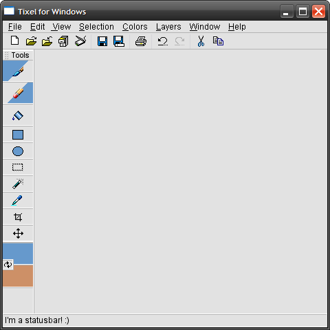 Shazam! Changes: - Tools palette now defaulted on the left, with handle for undocking. - Added Eyedropper tool so that it can be used with right-mouse button. - Shrunk selected color boxes, enlarged Swap Colors button, added bigger separator between selected colors and tools. agj: The one issue with your design is that if you right the pencil so it's standing straight, the X becomes a +. Just looks kinda funny, is all.  |
|
|
|
|
Logged
|
|
|
|
|
sereneworx
|
|
« Reply #85 on: November 18, 2008, 09:23:28 PM » |
|
I don't know about other people, but personally, I never EVER use those 'new' 'save' etc... icons up the top, I just use the file menu. So those seem to be a waste of space.
Also, I hope you aren't going to use those icons, they don't really have much style to them, they're very.... 90s.
|
|
|
|
|
Logged
|
|
|
|
|
Saker
Guest
|
|
« Reply #86 on: November 18, 2008, 09:31:43 PM » |
|
Hey, good job on this one! Here's my own reinterpretation, to add to the bunch:  |
|
|
|
|
Logged
|
|
|
|
|
Michael Buckley
|
|
« Reply #87 on: November 18, 2008, 09:34:41 PM » |
|
I don't know about other people, but personally, I never EVER use those 'new' 'save' etc... icons up the top, I just use the file menu. So those seem to be a waste of space.
I never use those either. One of the many common interface designs in OS X is to allow users to hide the toolbar. This is done using an oblong button on the title bar, opposite from the close/minimize/zoom buttons as well as a menu item, but could be menu-only on other systems. |
|
|
|
|
Logged
|
|
|
|
|
FoxBlitzz
|
|
« Reply #88 on: November 18, 2008, 09:37:46 PM » |
|
One of the many common interface designs in OS X is to allow users to hide the toolbar. This is done using an oblong button on the title bar, opposite from the close/minimize/zoom buttons as well as a menu item, but could be menu-only on other systems.
On Windows it's typically View -> Toolbar or something similar, or you right-click one of the toolbars and deselect the one you don't want. Hmm, I'll look into ways to switch the toolbar icons around. Or the toolbar could simply be made optional (hey, this is really more like the default layout, and nobody ever said you wouldn't be able to adjust a few things to your own taste). For this mockup I really just tore out an existing toolbar and pasted it in to show how it would look for a small-ish window. Which leads me to my next point... Also, I hope you aren't going to use those icons, they don't really have much style to them, they're very.... 90s.
Already covered that. None of that stuff is in reference to the program's visual style. Heck, I pretty much straight ripped a lot of the graphics from Paint Shop Pro 8 (please don't sue me, Corel). It's just there to give a basic idea of what the layout might look like on a Windows/Linux system. |
|
|
|
|
Logged
|
|
|
|
|
Loren Schmidt
|
|
« Reply #89 on: November 18, 2008, 11:53:27 PM » |
|
I've been thinking about paint program usability off and on, so this project sparks my interest. I've got a couple of unconventional selection tool ideas you might be interested in. (1) paint or add to a selection with a brush (like quick mask, only less cumbersome) (2) a 'nudge' selection tool. It uses a brush, and lets you push around all the pixels within the brush with a single click. Useful for roughing out animation, adjusting proportions, and tweaking sketches (3) shrink / grow selection with keypresses (Modo does this in 3d, and it's amazingly useful) I think one could simplify things a lot and improve the design. For instance, what's an eraser for in a pixel art program? Why not just draw with 'transparent'? That would work much better with the dropper / brush workflow. Just use the eyedropper over a transparent region to sample the 'transparent' color and begin erasing. I also question the usefulness of the line, ellipse, rectangle, crop, and paintbucket tools. I think ellipses are largely useless, rectangles should be created with rectangular selection + fill, and the paintbucket should likewise be magic wand + fill. I don't know about other people, but personally, I never EVER use those 'new' 'save' etc... icons up the top, I just use the file menu. So those seem to be a waste of space.
Seconded, I think even for users unfamiliar with the program, putting such basic functions in menus is the better choice. Please allow binding single keypresses to zoom. I hate how Photoshop requires that keystrokes include a modifier key. While we're at it, there definitely need to be keyboard shortcuts for next frame / previous frame in an animation. I'd also really like to see layer groups and multiple layer selection (ctrl - click). These are really basic features, but are one of the main reasons I use Photoshop instead of the GIMP. Also, since this is a pixel art program, how is the color palette going to handle? And is the palette going to replace the foreground / background system when in indexed mode? Also, here's my humble submission to the growing pile of neat logos.  A pox on Firefox 3 applying bilinear smoothing to everything.  |
|
|
|
|
Logged
|
|
|
|
|
Xion
|
|
« Reply #90 on: November 18, 2008, 11:56:38 PM » |
|
I don't know about other people, but personally, I never EVER use those 'new' 'save' etc... icons up the top, I just use the file menu. So those seem to be a waste of space.
for serious? why would you go through the trouble of a menu when you can just click a single button? More commonly though, I just use ctrl+s to save stuff, but I never ever use the file menu. I like Saker's Icon best. And I totally haven't read this entire thread 'cause it grew way too fast but just to make sure, since I don't see it in the mockup - you gotta have a nice palette organizer, selector, and manipulator. And as for the tool positions, I don't really care where stuff is, as long as it's got a shortcut or at the very least is movable and lockable to the left/right/top/bottom of the workspace. I prefer my tools to be at the top and hate how MSPaint has them to the left. Anyway. Just make sure you got shortcuts for everything. |
|
|
|
|
Logged
|
|
|
|
|
sereneworx
|
|
« Reply #91 on: November 19, 2008, 02:10:52 AM » |
|
Hey, good job on this one! Here's my own reinterpretation, to add to the bunch: No logo has ever looked faster!  However, I miss the fuschia.  |
|
|
|
« Last Edit: November 19, 2008, 04:48:15 AM by sereneworx »
|
Logged
|
|
|
|
|
medieval
Guest
|
|
« Reply #92 on: November 19, 2008, 04:23:39 AM » |
|
Xion has a great point; Windows should be repositionable/redockable and everything should have a shortcut.
|
|
|
|
|
Logged
|
|
|
|
|
Gold Cray
|
|
« Reply #93 on: November 19, 2008, 07:30:27 AM » |
|
A pox on Firefox 3 applying bilinear smoothing to everything.
I'm using firefox 3 and I've never encountered any of this smoothing. Is it different for different operating systems? I also question the usefulness of the line, ellipse, rectangle, crop, and paintbucket tools. I think ellipses are largely useless, rectangles should be created with rectangular selection + fill, and the paintbucket should likewise be magic wand + fill.
A pox on Firefox 3 applying bilinear smoothing to everything.
I think it's already been mentioned, but I agree that the amount of mouse movement needs to be reduced as much as possible. With the paint buck, you move to the tool bar, then move back to the canvas and you're done. With magic wand + fill, you move to the tool bar, move back to the canvas to select, move back to the tool bar, and then move back to the canvas to fill. I also think that the line tool is useful to reduce the amount of time spent calculating and rasterizing slope. Ellipse is a similar case. As for crop, I've never missed it in paint, but I think it could be useful as a shortcut or a menu item just because it's faster to select and area and crop than it is to move the whole image and then resize the canvas. |
|
|
|
|
Logged
|
|
|
|
Annabelle Kennedy
Awesomesauce
Level 8

♥Android Love♥

|
|
« Reply #94 on: November 19, 2008, 11:58:03 AM » |
|
line and rectangle are really useful if you take them out thats really lame.
|
|
|
|
|
Logged
|
|
|
|
|
Michael Buckley
|
|
« Reply #95 on: November 19, 2008, 12:51:19 PM » |
|
I really think it would be cool to have a hybrid raster-vector program. Layers could be raster or vector, and the vectors would be rasterized when output to an image.
|
|
|
|
|
Logged
|
|
|
|
|
FoxBlitzz
|
|
« Reply #96 on: November 19, 2008, 02:14:03 PM » |
|
I included the rectangle and ellipse tools because the whole business about making a selection and then filling it felt too cumbersome (plus, no control over border unless you stroke the selection, which seems a little out of scope for a program like this), and it also wouldn't really attract users from more conventional programs (again, MSPaint). Minimizing awkwardness should be an important design goal here. We need to make a program that will be inviting to a large amount of people. Though, if I included rectangle and ellipse for this reason, I guess I ought to also include a line tool. I would have simply assigned it to Shift + Click with the Pencil, but in compliance with a design focused on both the mouse and keyboard, a mouse user won't be able to figure out line drawing from the get-go.
The crop tool is useful because it's more visual than using a menu item to do it, thus more intuitive. Though having a Canvas Size as a menu item would also be helpful. They both have usage for different situations.
Saker's logo is creative to say the least, though I think the pencils should be different colors. They looked like some weird thunderbolt cross when I first saw that gray shape.
|
|
|
|
|
Logged
|
|
|
|
|
Tanner
|
|
« Reply #97 on: November 19, 2008, 07:13:20 PM » |
|
i think we need to slow down before we outdo ourselves
make it modular or something so it's easily expandable and start with something basic and go from there.
|
|
|
|
|
Logged
|
|
|
|
|
agj
|
|
« Reply #98 on: November 19, 2008, 09:49:35 PM » |
|
Here's an idea. Photoshop has expandable tool buttons (when you hold your click) for related tools. Tixel could have those, for instance, for the pencil tool + line tool, which could also be accessed by pressing the corresponding key several times (B once for pencil, twice for line tool), or perhaps by holding a modifier key, like shift+click would result in drawing a line. Having the expandable buttons means less clutter, but we keep accessibility and functionality.
|
|
|
|
|
Logged
|
|
|
|
|
Hideous
|
|
« Reply #99 on: November 19, 2008, 10:29:35 PM » |
|
shift+click should result in drawing in 45-degree angles.
|
|
|
|
|
Logged
|
|
|
|
|
 Jobs
Jobs
