|
Nate Kling
|
 |
« Reply #20 on: August 14, 2007, 02:15:04 PM » |
|
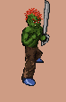
I started working on some other stuff and had to pause work on that because HCR needed some other graphics first.But now I've finally gotten some time to work on him again. I brightened up the colors of the level. You can see the inventory in there. The idea is when an item is highlighted by the cursor a larger picture of the item will appear on the empty area above it displaying the weapon, item , armor's stats and what not. I also need some crits on the inventory screen cus' i think its missing something or maybe it needs some kind of color adjustment. What do you think about the stance, fixed? almost? not even close? 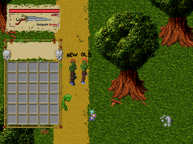 ...And I needed to test out what he would look like with amour and weapons equipped so i threw together this little outfit real quick. (This is just a real quick sketch up of the armor and weapons it will be much more neat and clean looking when i really make it.)  Thanks for the help. Crits or comments on anything in the image are welcome. |
|
|
|
« Last Edit: August 14, 2007, 02:18:26 PM by nizzate »
|
 Logged
|
|
|
|
|
Ishi
|
|
« Reply #21 on: August 14, 2007, 02:58:32 PM » |
|
Might be nice to get some colour variation in the shading rather than just using solid black for the shadowed areas (I'm mainly looking at the tree). This tutorial has a look at the shading in one of the Secret Of Mana games: http://www.gas13.ru/v3/tutorials/sywtbapa_de-mystifying_greats_1.php . The blue shading on the tree sounds horrendous in theory, but works really nicely and creates a very fantasy feel IMO. As for the character stances, the new one does work better I think. Looks like it's going well so far, keep us posted with updates  |
|
|
|
|
Logged
|
|
|
|
|
Pigbuster
|
|
« Reply #22 on: August 14, 2007, 10:49:09 PM » |
|
I actually kinda like the solid black shading. Though it's always a good thing to experiment with different artistic techniques. Maybe blue shading would look better. Won't know until you try. |
|
|
|
« Last Edit: August 14, 2007, 10:54:00 PM by Pigbuster »
|
Logged
|
|
|
|
|
Nate Kling
|
|
« Reply #23 on: September 02, 2007, 08:30:30 PM » |
|
 Here is the attacking animation, I'll still probably add some lines to show motion with the sword. The sword isn't final, I just used it to test although a version of it is bound to show up. Now i just have to draw the same thing in 2 more directions  . Also there are still some small things i need to fix up with the pixels. Feel free to post any things you think could help it or let me know if you like it. I'm eventually going to add some more different types of swings in but I just need to get one done right now so they basics of the combat system can get done. |
|
|
|
|
Logged
|
|
|
|
|
György Straub
|
|
« Reply #24 on: September 09, 2007, 03:00:44 AM » |
|
hey all, I'm working on a run animation for the main character of my game. could anybody be so kind to point me in the right direction with the legwork (it sucks and keeps sucking)?   (delays are 20, 25, 20, 25ms respectively) |
|
|
|
« Last Edit: September 09, 2007, 04:00:49 AM by !CE-9 »
|
Logged
|
|
|
|
|
Ishi
|
|
« Reply #25 on: September 09, 2007, 08:31:14 AM » |
|
Couple of points-
-Adding more frames in between the current ones (so it's 8 frames) would make the movement a lot clearer I think. At the mo the jumps between frames are too big so it's not very clear what's going on.
-Making the front leg a bit brighter would help with distinguishing the two legs. There's a shadow in there on the back leg currently but it's not very obvious as the trousers are quite a dark colour to begin with.
-On the first and third frames, the leg with the foot on the floor is really short. His other leg is bent pretty much at a right angle but is the same length.
|
|
|
|
|
Logged
|
|
|
|
|
Guert
|
|
« Reply #26 on: September 10, 2007, 06:53:13 PM » |
|
Take a look at these frames...  It could help you a bit... |
|
|
|
|
Logged
|
|
|
|
|
György Straub
|
|
« Reply #27 on: September 14, 2007, 05:03:28 AM » |
|
thanks Guert, the chart is pure brilliance!=) I've been looking for something like this - but without any success. Ishi, thanks for the suggestions. The tweaks that I've made in the meantime include additional frames (only two though, I'm still bloody lazy=( ), and now I've increased the differenc between the brightness of the two legs. now the animation looks like this (delay values are equally 120ms): is it much better or still not quite right? /btw, the forum system didn't notify me about the replies although I've checked the box... stra(yyy)nge/ EDIT: removed colours until I manage to settle for the 1, palette I'll use; 2, the backbone of the animation |
|
|
|
« Last Edit: September 14, 2007, 09:12:44 AM by !CE-9 »
|
Logged
|
|
|
|
|
Headmade
|
|
« Reply #28 on: September 14, 2007, 10:32:46 AM » |
|
You have to make him lean forward. The way it is now he could aswell be runnig backwards.
|
|
|
|
|
Logged
|
|
|
|
|
György Straub
|
|
« Reply #29 on: September 19, 2007, 12:40:42 AM » |
|
@Tinarg: awesomeness unparalelled, sir.=) thanks for the hint, it made a difference!
|
|
|
|
|
Logged
|
|
|
|
|
Radnom
|
|
« Reply #30 on: September 21, 2007, 11:11:47 PM » |
|
Seeing as how this thread has sorta turned into a general 'What's wrong with my animation?' thread, I'll post this here rather than making a new one:  Here's my running animation. Before I do anything fancy with it, like colour it properly or something (which I may or may not do), I'd like to know if it's a decent running animation. I'm thinking of making a game that'll either be something like Abuse, or a concept of my own invention, or a mixture of the two. Because you'll be looking at the main character running a lot, it'd be great to get my sprite as perfect as I can. So, comments? criticism? All greatly appreciated. |
|
|
|
|
Logged
|
|
|
|
|
can-o-spam
|
|
« Reply #31 on: September 26, 2007, 12:44:54 PM » |
|
Hey. Looks alright, but the knees come up kinda high. I think the lower legs need to extend further/faster.
Looking at it again I also think that the foot comes up too high after leaving the ground at the back. This might be what caused the knees to go so high.
|
|
|
|
« Last Edit: September 26, 2007, 12:46:49 PM by can-o-spam »
|
Logged
|
|
|
|
|
Guert
|
|
« Reply #32 on: September 26, 2007, 08:25:31 PM » |
|
My main issue with this animation is how the feet touche the ground. It's heel to toe and not the other way around... But why use words when we can use images? Very crude, far from perfect and done pretty fast but still...  Later! |
|
|
|
|
Logged
|
|
|
|
Average Higgins
Level 1

Huh? What?

|
|
« Reply #33 on: September 27, 2007, 04:49:30 PM » |
|
My main issue with this animation is how the feet touche the ground. It's heel to toe and not the other way around... But why use words when we can use images? Very crude, far from perfect and done pretty fast but still... Later! Oh my God, this is perhaps one of the most awesomely useful things I have ever seen. Thank you so much, Guert! |
|
|
|
|
Logged
|
|
|
|
|
ravuya
|
|
« Reply #34 on: September 27, 2007, 06:48:00 PM » |
|
Guert, you've taught me more than just how to animate a run cycle -- you've taught me how to love again.
|
|
|
|
|
Logged
|
|
|
|
|
Alec
|
|
« Reply #35 on: September 27, 2007, 06:52:14 PM » |
|
Guert, you've taught me more than just how to animate a run cycle -- you've taught me how to love again.
Quite possibly the greatest TIGS quote ever! |
|
|
|
|
Logged
|
|
|
|
|
Guert
|
|
« Reply #36 on: September 27, 2007, 07:40:29 PM » |
|
Quite possibly the greatest TIGS quote ever!
And my name's on it! Yes! Seriously, it's not that great... Is it? I mean, could "love" be misinterpreted by some?  Later! |
|
|
|
« Last Edit: September 27, 2007, 07:42:51 PM by Guert »
|
Logged
|
|
|
|
|
Outer God
|
|
« Reply #37 on: October 02, 2007, 12:17:21 AM » |
|
excellent stuff Guert!
@Radnom:
to tell the truth, ur animation looks pretty awesome. it's not a run, more like those old school cartoon walks where the deformed character prances around.
it's very easy to make mistakes with spacing, especially with walks and runs as beginners tend to evenly distribute the movement per frame. once they realise their folly, they try to cover it up by increasing the frame rate (which is not good practice). notice in Guert's animation that his spacing allows him to utilize only 4 frames per step to convincingly portray a run animation. in the first two frames, the back leg stays bent at less than 45 degrees, even bending further on the 2nd frame (more concerned with the red leg, as it highlights this alot better). then what happens? wham! the leg is stretched out instantly. the 4th frame adds some weight as the leg outstretches fully, kinda like a snap. that's the magic of spacing! it's all an illusion, why draw 20 frames when it can be done in 10? etc.
the best advice i can give you for walk/run animations is to act it out yourself...not so much with running, but u know what i mean. watch how people walk and run.
@!CE-9:
try add a frame between frames 3 and 4, as well as 6 and 7 (frame 1 is when he's standing), then increase the frame rate a bit if it looks too slow. it still looks like he's hopping/jogging to me...unless that's what u want, but judging by the swing of his arms, it's more a hop...without the bobbing that is. still, keep it up! ur doing fine.
|
|
|
|
|
Logged
|
|
|
|
|
Melly
|
|
« Reply #38 on: October 04, 2007, 10:10:52 AM » |
|
In my head, Love has a hundred meanings.
They all deal with sex.
|
|
|
|
|
Logged
|
|
|
|
|
|
|
 Developer
