|
ANtY
|
 |
« Reply #8040 on: September 12, 2012, 09:18:51 AM » |
|
another chapter from my journey to the vector art mastery  |
|
|
|
|
 Logged
|
|
|
|
|
Chromanoid
|
|
« Reply #8041 on: September 12, 2012, 11:49:47 AM » |
|
Reminds me of a harpy
Yes, it is a harpy! But I didn't wanted mix up birds and mammals, so I put bat-like wings. i like it! since harpies sometimes are also described as chimera created by black magic it would be ok, but as a real species it seems much more authentic this way. i hate it when artists give everything female breasts without thinking about the fact that only mammals need them. |
|
|
|
|
Logged
|
|
|
|
|
Chromanoid
|
|
« Reply #8042 on: September 12, 2012, 11:57:50 AM » |
|
 im thinking about adding a guy in front of him so he has someone to fight... not sure though i like it this way, great picture, i love the character. maybe you can add more details to the ground? a dead/dying horse might be an interesting addition. i think many oil paintings of war scenes feature very detailed "ground scenery" to show the beaten ones. i have something like this in mind http://www.oceansbridge.com/paintings/museums/new-hermitage/Keyser_Nicaise_de-ZZZ-Battle_at_Seneffe.jpg |
|
|
|
« Last Edit: September 12, 2012, 12:03:51 PM by Chromanoid »
|
Logged
|
|
|
|
|
antoniodamala
Guest
|
|
« Reply #8043 on: September 13, 2012, 04:39:27 AM » |
|
 These are the three movimentation frames of a monster i'm doing for a game with my friends. I will do more as soon as my right arm gets better  |
|
|
|
|
Logged
|
|
|
|
|
Geti
|
|
« Reply #8044 on: September 13, 2012, 07:23:00 AM » |
|
Fun little doodle to explore the background of a knight in KAG, before bed. Anatomy issues galore :D  |
|
|
|
|
Logged
|
|
|
|
|
Dom2D
|
|
« Reply #8045 on: September 13, 2012, 07:56:32 AM » |
|
 Logo of sorts for our game dev team :D |
|
|
|
|
Logged
|
|
|
|
|
CK
|
|
« Reply #8046 on: September 13, 2012, 08:25:54 AM » |
|
Logo of sorts for our game dev team :D Yes, yes, yes. As a nevernude it's always been a dream of mine to be nude. I dislike the orange colour. Try again. (My opinions) |
|
|
|
|
Logged
|
|
|
|
|
Dom2D
|
|
« Reply #8047 on: September 13, 2012, 09:47:44 AM » |
|
Updated version with simpler colors and larger stroke, to make it pop more when in small form.  |
|
|
|
|
Logged
|
|
|
|
|
kyn
|
|
« Reply #8048 on: September 13, 2012, 10:05:59 AM » |
|
You should probably only use the nevernude dude. In terms of identity everything around it seems superfluous.
|
|
|
|
|
Logged
|
|
|
|
|
ANtY
|
|
« Reply #8049 on: September 13, 2012, 11:07:14 AM » |
|
Updated version with simpler colors and larger stroke, to make it pop more when in small form. leave only the guy and the controller above him, make the guy put his hands up and the eye a little higher and it'll look badass |
|
|
|
|
Logged
|
|
|
|
|
errik
|
|
« Reply #8050 on: September 13, 2012, 10:42:15 PM » |
|
No I haven't, thanks! Will check them out  |
|
|
|
|
Logged
|
|
|
|
|
Xion
|
|
« Reply #8051 on: September 14, 2012, 02:53:05 AM » |
|
Updated version with simpler colors and larger stroke, to make it pop more when in small form. leave only the guy and the controller above him, make the guy put his hands up and the eye a little higher and it'll look badass (quoted full image for paged'ness) I mostly agree with this sentiment, but I think the five top icons are nice, and would be maybe neat to keep and get rid of the bottom three so you have a nice arc thing going on. Also it seems kind of weird to take the well known identities of other things and incorporate them into your own identity. The top five are generic enough but the mushroom and triforce...? also, quick 'n dirty attempt to tackle my (current) biggest weakness:  environmentssss. Nothing super, just getting in the mindset for environments. I always only ever think about characters, but locations and backgrounds almost completely escape my musings except for in the vaguest of senses. |
|
|
|
|
Logged
|
|
|
|
|
CK
|
|
« Reply #8052 on: September 14, 2012, 08:52:15 AM » |
|
my (current) biggest weakness: environmentssss. Nothing super, just getting in the mindset for environments. I always only ever think about characters, but locations and backgrounds almost completely escape my musings except for in the vaguest of senses. Is this because of what lantti said? Also, I like it. The "bright" spot on the ground kind of looks cheap. |
|
|
|
|
Logged
|
|
|
|
|
Μarkham
|
|
« Reply #8053 on: September 14, 2012, 02:27:54 PM » |
|
LALALALALALALA 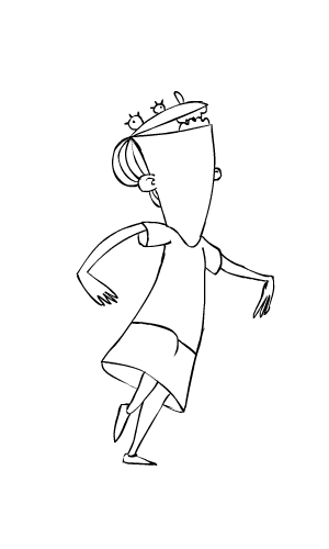 |
|
|
|
|
Logged
|
|
|
|
|
Xion
|
|
« Reply #8054 on: September 14, 2012, 03:12:12 PM » |
|
Is this because of what lantti said? Also, I like it. The "bright" spot on the ground kind of looks cheap.
what'd lantti say? I am and have always been horrible at environments. Trying to fix this. Also yes I should work on the ground texture. Also thank you. |
|
|
|
|
Logged
|
|
|
|
|
Quarry
|
|
« Reply #8055 on: September 14, 2012, 10:53:11 PM » |
|
LALALALALALALA Stunned for a minute |
|
|
|
|
Logged
|
|
|
|
|
AlexMdle
|
|
« Reply #8056 on: September 15, 2012, 02:04:07 PM » |
|
 First picture done completelly in SAI. Sort of. |
|
|
|
|
Logged
|
|
|
|
|
CK
|
|
« Reply #8057 on: September 15, 2012, 05:29:19 PM » |
|
Is this because of what lantti said? Also, I like it. The "bright" spot on the ground kind of looks cheap.
what'd lantti say? I am and have always been horrible at environments. Trying to fix this. Also yes I should work on the ground texture. Also thank you. Something in IRC about people commonly disregarding environment design. I don't know if he meant aesthetically or in the actual design and iniquity of an environment. Again, this forest is nice. |
|
|
|
|
Logged
|
|
|
|
|
Shackhal
|
|
« Reply #8058 on: September 17, 2012, 02:25:56 PM » |
|
First picture done completelly in SAI. Sort of.
Sr. Slender "Death" Man. Don't kill me please...  |
|
|
|
|
Logged
|
|
|
|
|
McMutton
|
|
« Reply #8059 on: September 17, 2012, 02:41:10 PM » |
|
First picture done completelly in SAI. Sort of. Ah, Chzo mythos. I recall watching some pretty good playthroughs of that. |
|
|
|
|
Logged
|
|
|
|
|
 Developer
