|
mankoon
|
 |
« Reply #9060 on: June 03, 2013, 08:38:55 PM » |
|
wow now that I can see it. That is really rich.
|
|
|
|
|
 Logged
|
|
|
|
|
stickadtroja
|
|
« Reply #9061 on: June 04, 2013, 02:03:04 AM » |
|
cool stuff but i agree with JLJac, the character needs to stand out more
|
|
|
|
|
Logged
|
|
|
|
|
JLJac
|
|
« Reply #9062 on: June 04, 2013, 02:08:33 AM » |
|
"deep in shit"'ish
Here you might have another communication problem, even when seeing the character I didn't understand that this was a combat situation, I thought is was a landscape (robot graveyard kind of thing). You have created a wonderful look for it, but at least to me you didn't really communicate what you wanted. I read it as "an abstract landscape with maybe a character standing in it", but now you tell me it's "a guy fighting a bunch of robots". I think you should try to make the objects, subjects and verbs of what's happening clearer, i.e put more emphasis on the action. Once again though, those colors are gorgeous. |
|
|
|
|
Logged
|
|
|
|
|
Cellusious
|
|
« Reply #9063 on: June 04, 2013, 03:19:30 AM » |
|
"deep in shit"'ish
Here you might have another communication problem, even when seeing the character I didn't understand that this was a combat situation, I thought is was a landscape (robot graveyard kind of thing). You have created a wonderful look for it, but at least to me you didn't really communicate what you wanted. I read it as "an abstract landscape with maybe a character standing in it", but now you tell me it's "a guy fighting a bunch of robots". I think you should try to make the objects, subjects and verbs of what's happening clearer, i.e put more emphasis on the action. Once again though, those colors are gorgeous. No robots, dude killed chutulu. |
|
|
|
|
Logged
|
|
|
|
|
mankoon
|
|
« Reply #9064 on: June 04, 2013, 07:49:47 AM » |
|
cool stuff but i agree with JLJac, the character needs to stand out more
Oh crap I didn't see the character in there. I should have read more. - You could put a little rim light along his front side and accentuate his form with out giving too much detail |
|
|
|
|
Logged
|
|
|
|
|
Cellusious
|
|
« Reply #9065 on: June 04, 2013, 11:18:48 AM » |
|
cool stuff but i agree with JLJac, the character needs to stand out more
Oh crap I didn't see the character in there. I should have read more. - You could put a little rim light along his front side and accentuate his form with out giving too much detail ye ye  |
|
|
|
|
Logged
|
|
|
|
|
stickadtroja
|
|
« Reply #9066 on: June 04, 2013, 01:05:26 PM » |
|
^shitty reply to someone taking time to criticize your stuff. but maybe you meant it in a ironic and tounge-in-cheek kind of way
|
|
|
|
|
Logged
|
|
|
|
|
Cellusious
|
|
« Reply #9067 on: June 04, 2013, 01:18:16 PM » |
|
^shitty reply to someone taking time to criticize your stuff. but maybe you meant it in a ironic and tounge-in-cheek kind of way
I got no idea what i'm doing when it comes to concept art. I just randomly clash stuff all over and try to sketch (which i fail at). I didn't mean "yeh yeh" as in "f off", but as in "ok point taken, will keep in mind". Just the lazy typer's way. |
|
|
|
|
Logged
|
|
|
|
|
stickadtroja
|
|
« Reply #9068 on: June 04, 2013, 02:05:00 PM » |
|
alright i got the wrong impression of your post obviously.
heres a honest advice though; make it a habit to change the things which are criticized as soon as possible. this is not me trying to give you lecture or anything, just speaking from personal experience. i feelt that i made great progress when i acted on peoples criticsm, and its always so much easier to do it straight away, than to dig up an month old painting and change stuff. another bonus is that it's very nice as a critic-giver to see someone acting on and changing things you pointed out. which makes you more keen to help out and comment in the future.
|
|
|
|
|
Logged
|
|
|
|
rickardwestman
Level 1

--- Visiontrick Media --- P A V I L I O N


|
|
« Reply #9069 on: June 05, 2013, 02:18:41 PM » |
|
Always fun to  in here. Found this laying around...  |
|
|
|
|
Logged
|
|
|
|
|
astrospoon
|
|
« Reply #9070 on: June 05, 2013, 06:06:43 PM » |
|
rickardwestman- I'm diggin' it. Might be neat to add a few bits of fine detail to a couple of areas to contrast with all the flat color sections. (pin stripes on the pants maybe?) I posted this on my twitter yesterday, but I figured I'd post here too. A little fan art to take a break from Spelunky coding:  |
|
|
|
|
Logged
|
|
|
|
tanner bananer
Level 1
aspiring train conductor
|
|
« Reply #9071 on: June 05, 2013, 07:10:26 PM » |
|
astrospoon - for a little bit i thought you were the bad books/manchester orchestra andy hull. But anyways, awesome art.
EDIT: Oh wait, it's fan art.
|
|
|
|
|
Logged
|
|
|
|
|
astrospoon
|
|
« Reply #9072 on: June 05, 2013, 07:18:31 PM » |
|
tanroar- Yeah, I get that sometimes. Different Andy Hull though. But yeah, I made fan art for my own game. (Which I think is allowed, since I was mostly just programming on it.  ) |
|
|
|
|
Logged
|
|
|
|
|
greenlig
|
|
« Reply #9073 on: June 06, 2013, 01:14:17 AM » |
|
A pleasure to stroll through this thread when I leave it for a while. Inspiring stuff in here. Did a new painting today - "Untitled" 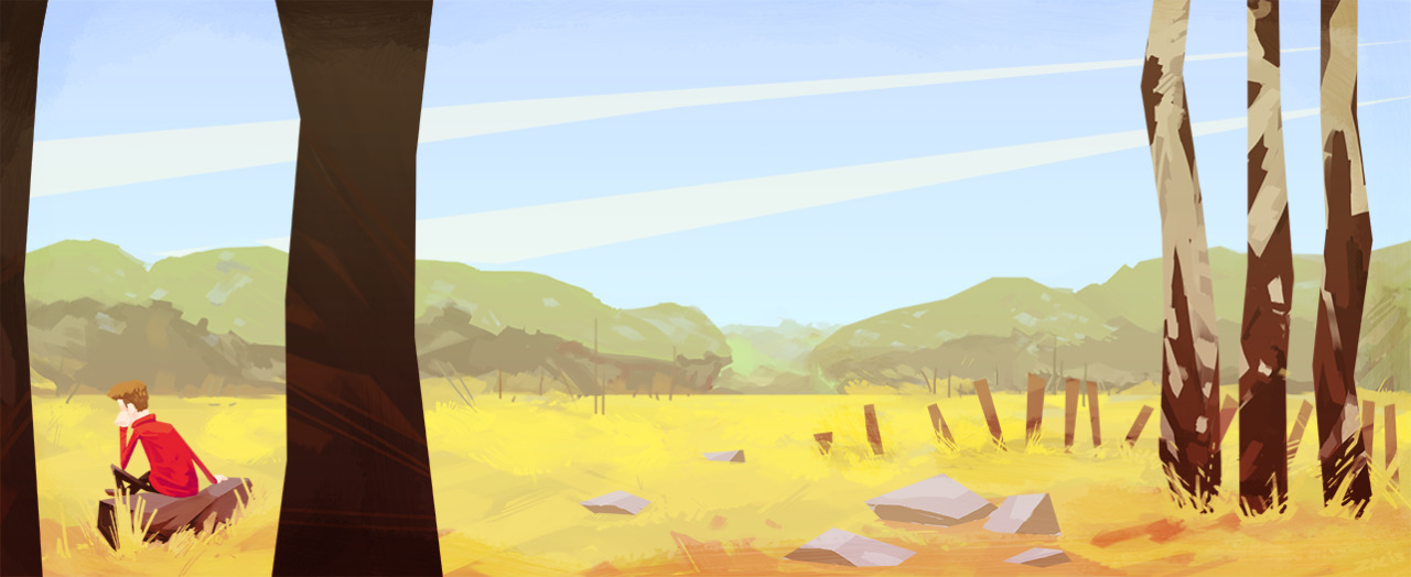 Cheerio, Greenlig |
|
|
|
|
Logged
|
|
|
|
|
|
|
joseph ¯\_(ツ)_/¯
|
|
« Reply #9075 on: June 06, 2013, 09:23:58 AM » |
|
Rickard, greenlig, delicious.
|
|
|
|
|
Logged
|
|
|
|
|
Cellusious
|
|
« Reply #9076 on: June 08, 2013, 07:42:22 AM » |
|
|
|
|
|
|
Logged
|
|
|
|
|
Elliott D.
|
|
« Reply #9077 on: June 08, 2013, 08:03:17 PM » |
|
beauty, Olav. I think you've got to render out something like this in layers and just do a paralax test; start moving into some interactive works.
|
|
|
|
|
Logged
|
|
|
|
|
agersant
|
|
« Reply #9078 on: June 08, 2013, 08:16:14 PM » |
|
Inspiring picture and text Cellusious!
|
|
|
|
|
Logged
|
|
|
|
|
muki
|
|
« Reply #9079 on: June 09, 2013, 12:19:38 PM » |
|
Started as a mockup for something I want to work on, but mid-way I decided towards a slightly different direction. 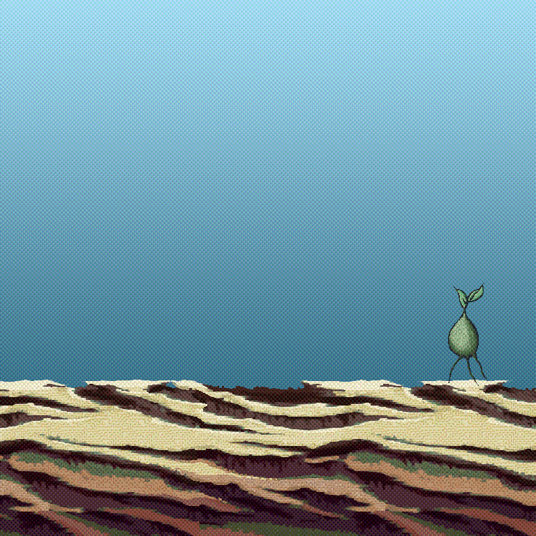 |
|
|
|
|
Logged
|
|
|
|
|
 Developer
