|
Tuba
|
 |
« Reply #160 on: May 02, 2016, 12:54:04 PM » |
|
I also find that far camera kinda weird... a little too far. But the battle looks pretty cool, changing the camera constantly is something nice, makes it more dynamic.  |
|
|
|
|
 Logged
|
|
|
|
|
Joh
|
|
« Reply #161 on: May 02, 2016, 02:03:46 PM » |
|
Yes, if you talk to him just after the first battle, he will say this, still working and not even looking at the player:
"Giant Spiders? Come on kid, I don't have the time to play!".
There are 3 variations for this dialogue depending on the moment you talk to him: Before the battles (working and super busy), after the first battle and after the boss. All of this just for this first part of the game, there will be others later.
that's pretty cool, I like how you even thought of dialogue about it. But I guess the others and wanting a live reaction have good point too. that whould be pretty cool. I have to agree with the distant camera being a bit too far, but this whole dynamic camera is a nice feature too! Still looking impressive, keep it up! |
|
|
|
|
Logged
|
|
|
|
|
neko.works
|
|
« Reply #162 on: May 06, 2016, 03:54:45 PM » |
|
Thanks guys I've updated my stereo 3D gallery on Phereo with a few recent screenshots: phereo.com/nekodotworksThe cool thing about Phereo is that you can output the image in the 3D format you need: Anaglyph, side by side, 3D vision, rift, ect. so please give it a try! Bonus, here's a shot from a location I recently updated  |
|
|
|
|
Logged
|
|
|
|
|
neko.works
|
|
« Reply #163 on: May 08, 2016, 08:50:44 AM » |
|
Hi guys I've been redesigning the UI with a new sci-fi look, as the old one didn't make much sense in this game. Here's comparison shots, old on the left, new on the right + zoomed-in on the bottom. I'd love having feedback on this, so please give me your thoughts: Is it better now, what do you like / dislike ect. |
|
|
|
« Last Edit: May 09, 2016, 06:26:25 AM by neko.works »
|
Logged
|
|
|
|
|
io3 creations
|
|
« Reply #164 on: May 09, 2016, 12:05:24 PM » |
|
I like the 3d images. Some colors seem to work better with the red/cyan glasses than others. Do you upload similar to YouTube - i.e. side by side format and the website takes care of the rest?
In a way, even the old UI looked fairly good but I agree that the new sci-fi looks and fits better.
|
|
|
|
|
Logged
|
|
|
|
|
neko.works
|
|
« Reply #165 on: May 09, 2016, 12:35:26 PM » |
|
Thanks! My games have a built-in side-by-side stereo 3D mode that works well with 3DTVs ect. so I just have to make a screenshot and upload it to Phereo. It will be converted automatically to all the other formats, such as anaglyph. I've been working on a new title logo in this sci-fi style, and would love early feedback. Any thoughts? |
|
|
|
|
Logged
|
|
|
|
|
Zorg
|
|
« Reply #166 on: May 11, 2016, 02:39:24 AM » |
|
First: Good work! I like it.  Some critic, based on personal preferences, of course: I'd move the chevrons slightly to the left and you could use a white glow instead of a dark shadow in combination with the blue chevron. For the inactive "help", i'd recommend to use black or white at ~60% opacity without any shadow (not very readable). I'd rearrange the title screen in this direction:  |
|
|
|
|
Logged
|
|
|
|
|
neko.works
|
|
« Reply #167 on: May 11, 2016, 05:49:13 AM » |
|
Thanks for the critique! Actually, I was using a white glow initially, as you can see on the comparison shots. It does look better, but I think it's not as readable. I will experiment with your ideas! |
|
|
|
« Last Edit: May 11, 2016, 11:51:29 AM by neko.works »
|
Logged
|
|
|
|
|
io3 creations
|
|
« Reply #168 on: May 11, 2016, 09:56:47 AM » |
|
This is one of those things where a lot of things are very subjective.
Is the title screen static? I mean, do those blue circles move by any chance or are those stationary? I could see them moving to add a nice little movement but isn't necessary.
I was also going to suggest to move the title up - probably even move it up a bit more. I would also use at least the same size font for the menu options (New Game, Continue, etc) as for "Arrows: Use KEYBOARD" so the eye is attracted to those first (at least after the title).
|
|
|
|
|
Logged
|
|
|
|
|
neko.works
|
|
« Reply #169 on: May 11, 2016, 10:15:41 AM » |
|
Yes, the bubbles in background are animated, going up on 3 layers with each one having a different speed, scale, opacity and depth (if you're playing in stereo 3D).
I'll probably try to align the help with the menu, with the same font size and rows.
|
|
|
|
|
Logged
|
|
|
|
|
io3 creations
|
|
« Reply #170 on: May 11, 2016, 10:54:54 AM » |
|
Yes, the bubbles in background are animated, going up on 3 layers with each one having a different speed, scale, opacity and depth (if you're playing in stereo 3D).
Nice! |
|
|
|
|
Logged
|
|
|
|
vitorlanna
Level 1


|
|
« Reply #171 on: May 11, 2016, 01:42:26 PM » |
|
Hi guys I've been redesigning the UI with a new sci-fi look, as the old one didn't make much sense in this game. Here's comparison shots, old on the left, new on the right + zoomed-in on the bottom. I'd love having feedback on this, so please give me your thoughts: Is it better now, what do you like / dislike ect. I really liked the blue UI, it has a really nice contrast! |
|
|
|
|
Logged
|
|
|
|
|
neko.works
|
|
« Reply #172 on: May 11, 2016, 01:55:54 PM » |
|
I really liked the blue UI, it has a really nice contrast! Well, the blue UI is still there! You can choose between 3 color schemes currently, I'll probably add even more! Now the question is, which one should I use for the screenshots / promotion The white one fits the game's title and theme, but the blue one seems to be much more popular for some reasons |
|
|
|
|
Logged
|
|
|
|
|
Lares Yamoir
|
|
« Reply #173 on: May 12, 2016, 03:25:18 PM » |
|
Now the question is, which one should I use for the screenshots / promotion The white one fits the game's title and theme, but the blue one seems to be much more popular for some reasons I'd go with the blue one. It adds a bit of color to the current screenshots. I believe the blue one would also work for the title screen, if you want coherency. |
|
|
|
|
Logged
|
|
|
|
|
neko.works
|
|
« Reply #174 on: May 12, 2016, 03:46:57 PM » |
|
Yep, I will probably switch to the blue theme for now on |
|
|
|
|
Logged
|
|
|
|
|
|
|
neko.works
|
|
« Reply #176 on: May 18, 2016, 01:01:58 AM » |
|
New improved battle gameplay video: Any thoughts? |
|
|
|
|
Logged
|
|
|
|
|
EvilDingo
|
|
« Reply #177 on: May 18, 2016, 03:33:04 AM » |
|
I'm not sure how to explain it, but the battles didn't seem very dramatic. Maybe a little sterile? The music is dramatic, but the battles feel flat. I think the distant camera is too far. I think magic needs a more emotive animation. In the spider queen battle, I don't think you should be told to attack only the queen right from the start. Let the player kill a few spiders and have them re-appear to understand that it is futile. Then maybe have the other character pipe up about killing the queen only. The queen dying with by scaling it down is anti-climatic. Making death animations for lots of enemies is a ton of work, but maybe fading out like the early Final Fantasy games would work better. I like the text effects. The slowing down on some parts is really cute. In my opinion, these are all pretty easy fixes and it gets more right than wrong. |
|
|
|
|
Logged
|
|
|
|
|
neko.works
|
|
« Reply #178 on: May 18, 2016, 11:20:35 AM » |
|
Thanks for your feedback!
These are the first battles, and like in most JRPGs, there's nothing much to do here appart from "attack" and "magic" (orb).
The camera is randomized during the actions, there's 3 view currently: on the side, behind the enemies and far away (location based).
The help cutscene in the boss battle is inspired from classic JRPGs, such as the first boss battle in FF6, which was explained the same way.
There's actually death animations for each enemy including the queen, then there's that scaling animation + a bit of camera shake for the boss, which I think works better that opacity fade as I experimented. I could add a red color overlay for some retro effect!
|
|
|
|
« Last Edit: May 19, 2016, 01:02:03 PM by neko.works »
|
Logged
|
|
|
|
MegaTiny
Level 1
Wew lad
|
|
« Reply #179 on: May 19, 2016, 03:47:27 PM » |
|
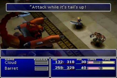
You could do it like the classic ff7 screw up caused by the slow text loading. In case you don't know it during the first boss Barret tells you to 'Attack while it's tails up' as the enemy robo-scorpion raises it's tail, so you then attack. Then the next bit of text loads: 'And it's gonna counter attack with it's laser' before the boss absolutely demolishes your health with it's beam attack. So in your case: - "Attack the small spiders first"
- Player attacks
- "And they'll just keep coming back"
 |
|
|
|
|
Logged
|
|
|
|
|
 Community
