Another (hopefully final) post on the game's manifest crew sketch.
Manifest Sketch, Part FinalThe latest manifest contains three gameplay-critical sections: the crew list, the crew sketch, and the deck map. Each one serves a different purpose and the sketch is probably the most important for actually tracking identities. There are three sketches in this section, each of a different scene. All together, they contain every single character from the game exactly once. I played with a few different arrangements before settling on these scenes:
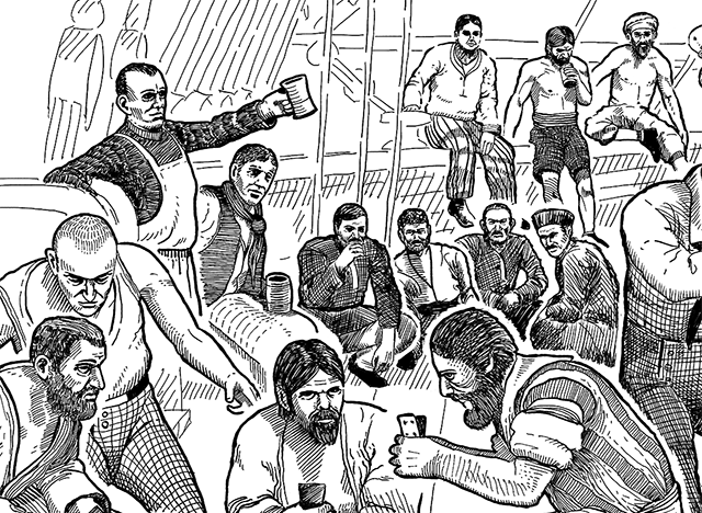
1. "Under Way" - A view of the top deck where crew and passengers celebrate with games, drinking, and dancing.
2. "Formosan Royalty" - An interior view of the 4 Formosan passengers.
3. "Justice At Sea" - A wide view of an unknown character's execution for an unknown crime, witnessed by officers and crew.
The three scenes arranged as they appear in the manifest
The purpose of these sketches is to allow the player to remember and correlate characters with their names and fates, outside of the flashbacks. There's also several clues about identity packed in here. Being able to recognize the characters in the sketch is important and we're working against the translation to 1-bit in-game, which is pretty brutal.
There were no cameras in 1800 and from the beginning these renders were intended as concepts of how the sketches should appear, to be later drawn by hand in the style of an old fountain pen sketch. With just the wrong mix of bravery and naivety, I originally planned to draw these myself.
Fail Hard, EarlyBefore even getting the final scene concepts I tried just tracing over a test scene render by hand. The result was not pretty:
Ummm
Later, I got the actual manifest scenes all posed up in 3D (without clothing) and gave it another shot. This time with tracing paper and an honest to god fountain pen. The kind you need to dip in a bottle of ink:
Jesus...
My lack of skill is obvious here. Thoroughly deterred, I tried another tack. Instead of tracing the whole thing by hand, I shaded a few characters with even contour lines and experimented with procedurally applying this hand-drawn element to the render itself.
...Christ
I won't show the results because I didn't save them. And the idea didn't work at all. Ok, next step. Hire a professional.
ProfessionalsLooking for help, I asked three pro artists to sketch the smallest scene with just four characters. TIG's very own
Paul McClintock approached me first and we were able to work through some stylistic choices that looked best under the game's limitations.
Carl Frank and
Ahmed Omar both cold-emailed the ratloop.com site offering their skills. All three are excellent artists. Paul's portraits are especially amazing and Carl and Ahmed cover a wide variety of styles deftly.
The trial was based on this render of the 4 Formosan characters. Like the other renders, this one is pretty rough and needs cleanup (buggy cloth sim on the girl) or additions (spears for the guards, a stool for the old fella) during sketching.
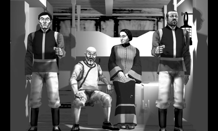
Render used for the artist trial
"Make this render look like an old-timey sketch." I gave each artist the concept render, information about the game setting, presentation limitations, and direction about artistic style. I asked for something close to the rough pen & ink ensemble sketches of the period.
Some sketches included in the style guide
ResultsEach artist was able to do a few revisions based on my feedback. Their final results are below along with how they appear in-game.
I consider these all excellent and it was great working with everyone. To make a choice on who to hire for the full job, I broke it down into plusses and minuses for each.
Paul McClintock + Detailed shading translates well to 1-bit low resolution
- Characters are nicely detailed but likenesses diverge from the render
Carl Frank + Bold lines work perfectly in 1-bit low resolution
+ Character likenesses are dead on
- Feels very modern, more "Archer" than "old fountain pen sketch"
Ahmed Omar + Matches the period style perfectly
+ Done on actual pen and paper
+ Character likenesses catch the salient features without overloading on detail
- Hard to get it legible in 1-bit low resolution
- Lack of detail makes it less useful for the player
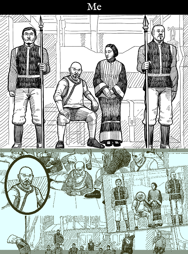
Full SketchAt the end, I decided to go for Ahmed's less gameplay-functional but more period-appropriate work. He came back very quickly with the full sketch of all 3 scenes.
Ahmed's sketch of all 3 scenes
This looks great in your hand but unfortunately the roughness that I liked in his first sketch works heavily against legibility in the other denser scenes. We tried a few revisions to tighten up the details but nothing translated that well to the game.
Second TryAt this point, PAX Australia had passed and there was less time pressure. I decided to take another crack at it myself. Studying the pro artists' work taught me a few things and helped define exactly what I wanted:
- A trace of the render (to get the likenesses as close to the in-game models as possible and maximize the sketch's utility)
- Detailed shading similar to the period and medium (for the right feel while zoomed, and varied shades while zoomed out)
- Clear separation of the characters from each other and the background (to help legibility while unzoomed)
I also collected some supplies:
- A book: "Rendering in Pen and Ink" by Arthur L. Guptill
- Hardware: iPad Pro with Apple Pencil
- Software: "Procreate" drawing app
iPad Pro + Apple PencilIn my normal efforts, I use an old Wacom Bamboo tablet for hand-drawing stuff. It works well enough and I actually prefer it over something like the Cintiq for small things. For this sketch though I knew I'd want to draw directly on the image and not have any screen/tablet separation. Years ago I had an
HP TC1100 "Pen PC" which was pretty hot shit at the time. The iPad Pro and Apple Pencil are the new and well-reviewed hotness these days so I decided to try that. Damn. It's good.
The Killer Combo
The pen tracking speed is extremely fast and the glass is super thin, so you draw pretty much exactly where the tip is. And because it's totally self-contained you can spin and adjust the iPad itself while drawing, which I find really convenient and is not possible with a big wired Cintiq or similar. Together with the "Procreate" app they give you a great drawing environment. Photoshop's app is also good but I found the pen options in Procreate better - the fountain pen brush I made looked and behaved better than Photoshop's alternatives.
There are two negatives to the iPad/Pencil combo that I found. One, the screen is too slick, and two, the Pencil nub is too fat. I added a matte screen cover that takes care of the slick screen and makes it very pleasant for drawing. The fat Pencil nub can't be fixed but I got used to it ok enough.
My SketchEven with all the helpful guidance and expensive hardware, it still took a good bit more experimentation and practice to get a result I could manage and was happy with. My final sketch is probably closest to Carl Frank's work, but with more classic, woodcut-style shading and rougher, more homogenous backgrounds. I also separate each character from others with a narrow void, not visible in this 4-character sketch.
My experiments with real fountain pens taught me a little about the wide range of line thicknesses that are possible naturally. For this digital version I made sure to keep the pen's base thickness fixed for all characters near and far and rely on pressure differences to adjust the width slightly up or down. Hopefully that helps sell the idea a little more that it could've been done by hand on real media.
And not to be confused for actual skill, I consider my direct tracing to be skill-adjacent at best. Some concept artists sorta work this way but not to the extreme degree that I'm doing here. There's a tiny bit of solace in the knowledge that I also modeled, textured, and posed all these characters but it would've been nice to have enough freehand skill to make the sketch feel more natural. Oh well.
My 4-character sketch
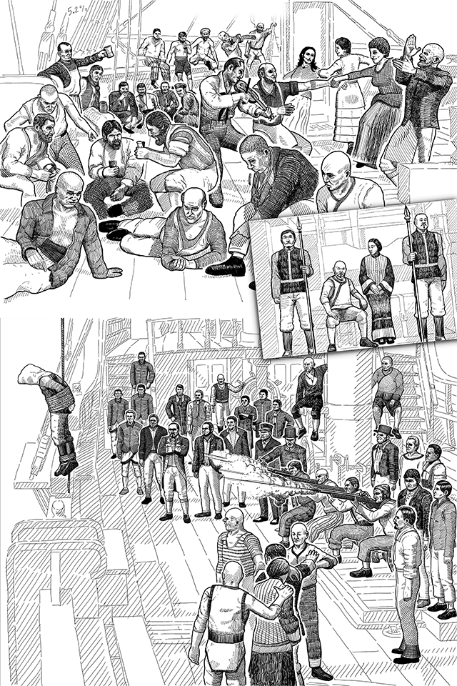
The whole thing. Several weeks of work.
Closeup
This is "finished" in the sense that I'll move on to other stuff now. There are still a few details and changes pending. Some characters will get tattoos, tri-corner hats for the officers, those goofy dudes are meant to be playing dice, maybe redraw some faces. Also I need to add titles to each sketch and the in-game artist's signature.
Looking at it as is, I'd say it's way too clean and precise for the period. Especially if I want to suggest that it was drawn on a ship at sea. Tracing a 3D render makes it just too well-rendered for something that's supposed to be entirely hand drawn. One of the lessons from the pro artists though was that it's best to start with something clean, then distress/rough it up later. The game's 1-bit low res presentation totally shits all over the source data, often in unexpected ways, and it's better to go in being too clean than too rough.
TimelapseOne nice bonus of using Procreate is that it automatically captures a timelapse video for everything drawn in the app. It's a pretty low resolution by default (I fixed this much later in the recording) and loses some sessions inexplicably, but it's good enough for me to post up on YouTube. You can see me trying a bunch of different styles at the start before settling on a more refined woodcut-ish style.
First sketch timelapse in GIF form
youtu.be/Zpe2Ivnei14
All sketches. Slower + closeups.
 Community
