|
nimbusstev
|
 |
« Reply #80 on: May 31, 2014, 09:34:35 PM » |
|
If anyone's interested, I can post a more detailed breakdown of the current rendering technique. Yes, please do! This rendering is blowing my mind! I really love how the different areas have such diverse pattern styles. |
|
|
|
|
 Logged
|
|
|
|
|
dukope
|
|
« Reply #81 on: June 01, 2014, 12:10:42 AM » |
|
RenderingOk! By request, here's how I'm doing the rendering. It requires two passes and one final combine shader: Pass 1: SurfacesThis is the same pass described before. Each face is colored based on the object position and the face normal. These values are amplified to keep adjacent normals from being too similar. The one addition since last time is the ability to manually dampen the influence of the normal; useful to prevent gradual smooth surfaces from generating lots of edges. For that, I use the the vertex color red channel, which is multiplied by the calculated normal before combining it with the object position to make the final face color. Pass 2: Lighting+TexturesThe Unity-calculated lighting gets put in the red channel, the green channel is currently unused (1.0), and the blue channel has the texture. This all works in single channels because the source images/calculations are grayscale. In order to keep the lighting and texture influences completely separate, the lighting is generated against a fully white albedo. This separation allows me to use different dither curves for lighting and texture later on in the combining stage. Also, since I have the vertex colors handy from the surfaces pass (which only uses the red channel), I also multiply the vertex color blue channel against the texture channel here. That let's me avoid actually creating textures for things that should just be a little bit darker overall, like the skylight windows. CombiningIn the final shader, I take these two outputs and combine them together. The surfaces buffer is used to generate the wireframe edges; the lighting+textures buffer is used for the rest. Because lighting and texture are in different channels, I can give them different dither curves now. I want the lighting to be sharp, with only 3 values: black, 50%, and white. The texture channel is overblown a bit to push it towards white, then it uses the full range of shades. You can see how sharp the lighting is while the texture has more varying dither patterns. To keep the edges visible in darkness, the lighting value determines which shade of line to use, black or white. The texture might be a little too blown out here, but I can tweak that later when more details get added. Shared Dither CurveThis is what you get if the lighting and texture share the same dither curve: It looks ok in an artsy way but I find it much harder to read. The dithering starts to interfere with the edge lines. For now I prefer the clarity of stronger lighting and subtler texture.
|
|
|
|
|
Logged
|
|
|
|
|
Cakeypigdog
|
|
« Reply #82 on: June 01, 2014, 11:59:18 AM » |
|
Love this. Such invention!!
|
|
|
|
|
Logged
|
|
|
|
|
kleiba
|
|
« Reply #83 on: June 01, 2014, 01:13:19 PM » |
|
A few people have posted links to related projects/games, and I'd just like to weigh in and mention another one, namely the beautiful Pioneers. Eigen has been active in this thread himself, and I think it's worth mentioning his great work. Even though his game is 2D, the general setting of the game as well as the reduced fidelity approach in the visuals are very reminiscing. 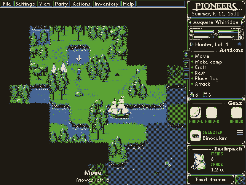 |
|
|
|
|
Logged
|
|
|
|
|
EmilMeiton
|
|
« Reply #84 on: June 01, 2014, 01:36:18 PM » |
|
But how does it look in motion?.., It would be interesting to see it in the same static style as an early myst game. With totally static images that you navigate through. I'm thinking the realtime movement aspect of it might "ruin" the feeling. I'm probably/hopefully wrong but it would be interesting to limit the movement too just to try it out.
What does it look like if you stand still and move your mouse around now?, is it flickering?
Great work!
|
|
|
|
|
Logged
|
|
|
|
|
|
|
thatjaneng
|
|
« Reply #86 on: June 01, 2014, 05:42:44 PM » |
|
hi there Lucas, thanks for posting the rendering breakdown. I really enjoyed reading your devlog for Papers Please so I'm really looking forward to following your problem solving + experiments with Obra Dinn because 3D environments + lighting is what i personally obsess about. I'm also new to Unity, and new to making a first person game as well. fun times. First of all, love the look you are going for. I know you are after the old mac game look, but personally I find it very reminiscent of era appropriate engravings. Check out this awesome guy for example:  I have a few questions/suggestions/thoughts: - I noticed you are generating your lighting against a full white albedo. Is there a reason why you are not generating it against 128 gray? seems like generating against mid-value will give you a wider range of shading to then abstract from. - Have you considered using one of your unused channels to store ambient occlusion? It might be worth experimenting with to help readability especially when you have more objects that otherwise have similar shading from your abstracted lighting. I guess the simplest way to quick test the idea is to just bake AO as a vertex color in Maya (as G in your surface pass perhaps, since you already have that working) but I guess the downside is you will have to adjust your modeling to get good AO even for a test. The other option would be to use Unity's lightmapper to give you an AO-only lightmap, but that might be a worse pain in the ass. - just curious, are you using UnityPro? I am really interested in how this will hold up for interior cabins of the ship (which I am assuming you will venture into). In my experience, all my interiors end up having a totally different lighting approach than my exteriors because there is no reasonable directional light available indoors.  I guess there is always lighting stuff with lots of point lights but still, it is worth experimenting with earlier rather than later, esp if the strong contrast lighting is so key in your visual style. also, yay to being excited and terrified at the same time! |
|
|
|
|
Logged
|
|
|
|
|
Eigen
|
|
« Reply #87 on: June 01, 2014, 09:47:41 PM » |
|
I'd need to see it in motion but are you worried this will become tiring for the eyes after a while? Maybe it's just me cause my eyes've become quite sensitive recently but when reading or looking something this contrasting my vision starts to flicker when looking away and I'd rather not endure that. Colors this strong is certainly not what you'd experience on an actual CRT. So yeah, options for different softer color combinations would definitely be welcome.  And maybe you've mentioned it already, but the game won't be fixed resolution / windowed-mode, right? I'm asking because for full-screen ideally you'd want pixel perfect dithering meaning using native screen resolution but how overwhelming might the effect become at that size? Or how fast even. Then there's always scaling of course .. Nice game! |
|
|
|
|
Logged
|
|
|
|
coah
Level 1


|
|
« Reply #88 on: June 02, 2014, 02:56:54 PM » |
|
It looks really interesting, would love to see it in motion like Telephant mentioned.
Just posting to keep an eye on the thread though.
|
|
|
|
|
Logged
|
|
|
|
alain_gloc
Level 0

|
|
« Reply #89 on: June 02, 2014, 03:11:41 PM » |
|
Hi Lucas, Great project. Just a few ideas for the story side. Not that you need them, but maybe they can serve as inspiration (and at least writing them down stops me from daydreaming about them) -The ghost ship story has a million amazing angles to it. First of all, the sheer idea of a ship sailing alone for a long time has a eery world-after-man feeling. I mean, just look at the Ryou-Un Maru (sinking video and Gabriel Lubell *quartet music* included) http://en.wikipedia.org/wiki/Ghost_shiphttp://en.wikipedia.org/wiki/Ryou-Un_Maru-Then the "mysterious trades going on in the high seas" angle. Think of the Jian Seng, the *80 meters* tanker found abandoned with hige amounts of rice on board (was it a base for slave trade?) http://en.wikipedia.org/wiki/Jian_Seng-Then the mad captain angle. Donald Crowhurst, single handed sailor driven to madness by giult. Also, four movies made about it for inspiration. Crowhurst's behaviour as recorded in his logs indicates a complex and conflicted psychological state. His commitment to fabricating the voyage reports seems incomplete and self-defeating, as he reported unrealistically fast progress that was sure to arouse suspicion. By contrast, he spent many hours meticulously constructing false log entries, often more difficult to complete than real entries due to the celestial navigation research required.
The last several weeks of his log entries, once he was facing the real possibility of winning the prize, showed increasing irrationality. In the end, his writings during the voyage – poems, quotations, real and false log entries, and random thoughts – amounted to more than 25,000 words. The log books include an attempt to construct a philosophical reinterpretation of the human condition that would provide an escape from his impossible situation. It appeared the final straw was the impossibility of a noble way out after Tetley sank meaning he would win the prize and hence his logs would be subject to scrutiny.
Enough said http://en.wikipedia.org/wiki/Teignmouth_Electron-If you plan to carry the narration through diaries and notes, there's the possibility of playing mindscrew with the audience like in Dear Esther. Which by design was meant to trick you into making your own cake of madness and eating it. Really, any explanation you ever heard of the story of Dear Esther was 100% a mind trip of the person giving it. That (and the "your avatar is not what you think" angle) might be a bit overdone now, but it's definitely a technique I would keep in mind (even just for some transitions and side materials) http://www.gamasutra.com/php-bin/news_index.php?story=24217-Pidgin. Background: when translating Papers Please we searched into real eastern european speech patterns and found a study on the italian translation of Spiegelman's Maus. And it blew our mind, because a *real* pidgin is incredibly lively and fascinating. Take a normal sentence, twist it according to a few simple rules (that the audience will interiorize just as easily) and you have a whole texture to a character just through the way they speak, a whole story in each word. Given the setting, not playing the "international crew" card would be a huge loss and this might be a great card to get out of it without stepping into cliché. Needless to say, billions of studies on pidgin are within reach inside google scholar http://en.wikipedia.org/wiki/Chinese_Pidgin_Englishhttp://scholar.google.jp/scholar?hl=it&q=pidgin&btnG=&lr=Best of luck with this fascinating project! Bonus: multihull wrecks on Google Earth, with photos of the Teignmouth Electron (talk about a ghost ship... breathtaking if you think what happened in there) http://forums.sailinganarchy.com/index.php?showtopic=141395http://www.photo-hh.com/Photos-I/Pages/Teignmouth_Electron.htmlAnd Scapa Flow, my goodness Scapa Flow http://en.wikipedia.org/wiki/Scuttling_of_the_German_fleet_in_Scapa_Flow |
|
|
|
« Last Edit: June 02, 2014, 04:26:45 PM by alain_gloc »
|
Logged
|
|
|
|
|
premonster
Guest
|
|
« Reply #90 on: June 02, 2014, 04:32:43 PM » |
|
What can you do in this game?
|
|
|
|
|
Logged
|
|
|
|
SamLouix
Level 1
Solo Game Developer

|
|
« Reply #91 on: June 02, 2014, 07:49:11 PM » |
|
Nice, I'll be keeping an eye on this |
|
|
|
|
Logged
|
← Avatar from my Healing Process: Tokyo. 3 years in so far. Daily dev-log is here. I have advice for composers looking for work, join here, I'll tell you. |
|
|
DavidCaruso
YEEEAAAHHHHHH
Level 10

|
|
« Reply #92 on: June 02, 2014, 10:35:20 PM » |
|
That shader is so cool. I can't wait to play this, just to move around and observe the lighting's effect on the dithering patterns, haha. I bet water effects in 1-bit look super stylish.
I wonder if you could achieve some compromise between the current "clean" look and the more heavily dithered shared-curve look. Maybe some sort of weighting function? I don't know, it'd just be cool.
|
|
|
|
|
Logged
|
|
|
|
|
dukope
|
|
« Reply #93 on: June 02, 2014, 11:21:59 PM » |
|
@kleibaI've been following Pioneers for a long time and absolutely love the look of it. @thatjaneng- I noticed you are generating your lighting against a full white albedo. Is there a reason why you are not generating it against 128 gray? seems like generating against mid-value will give you a wider range of shading to then abstract from. There's no specular component, so starting with 50% grey has the same effect as just making everything darker. In some places it looks better and in some places worse. I'll definitely have to tweak this along the way. - Have you considered using one of your unused channels to store ambient occlusion? I experimented with Unity's light mapping, which is very good. It looks great in grayscale but the end result when dithered to 1-bit is just a lot more dithering. Dithering, especially near edges where most AO/GI is, interferes with the edge lines. I may come back to that but for now I'm happy with the simpler direct lights. For readability, the lined edges really help - especially when in motion. - just curious, are you using UnityPro? Yeah. I need render targets for these post effects. I am really interested in how this will hold up for interior cabins of the ship (which I am assuming you will venture into). This is a good point. My plan right now is to have the player hold a lamp for the interiors. The lined edges mean this is only necessary to see textures though. I'll need to experiment here. One thing I do want to capture is just how dark the lower decks will be; especially at night. @EigenI'd need to see it in motion but are you worried this will become tiring for the eyes after a while? Not personally. I played years of mac games with no ill effects. I have poor vision though, and I've always preferred higher contrast to lower. The pure black/white maybe couldn't be done on a typical CRT, but the classic macs had a tuned monitor for it. I guess it would've been more like dirty white and black. Another vote for user-selectable colors. And maybe you've mentioned it already, but the game won't be fixed resolution / windowed-mode, right? Right now I'm working in 640x360 with pixel doubling. Because it's a 3D game though, I have a lot more flexibility with the scaling. All the post effects (dither, edges) happens on the final buffer before doubling. Papers Please was basically locked to multiples of 570x320 with black bars due to the fixed art and layout. For this game, I can just tweak the camera viewport to fill any black bars semi-naturally. I've tried running in native res and as you say, the performance suffers. It also doesn't have the right look to me - too sharp. @alain_glocHi Alain! :D Thanks for all the great links. I'm going to try my best to avoid lots of reading in this game. I know there's a strong temptation to tell the story through notes but hopefully I can find a compelling alternative. Not entirely though, I'm pretty sure I'll need some written material; I just want to keep it to a minimum. As for the narrative, I have most of the big points worked out but I'm keeping it flexible for when I get to prototyping the gameplay. @premonsterWhat can you do in this game? I'll let you know when I figure it out. @DavidCarusoI bet water effects in 1-bit look super stylish. I'll probably punt on the water effects and use a very simple shader like in the title screen. At least that's my hope. Now that I think about it, that may not work out so well....
|
|
|
|
|
Logged
|
|
|
|
|
dukope
|
|
« Reply #94 on: June 03, 2014, 08:49:38 PM » |
|
By the way, is it pronounced Obra Dihn or Obra Deen?
Ohbra Dihn. Like Cobra Tin.  |
|
|
|
|
Logged
|
|
|
|
|
dukope
|
|
« Reply #95 on: June 04, 2014, 06:15:05 AM » |
|
Gettin BusyWith more detailing, the scene is starting to get pretty busy. It's much more readable in motion but I don't want static scenes to be indecipherable. I experimented with lodding the lines out at a certain distance. It looks ok but not great. Luckily, this problem isn't unique to the rendering style. Lots of 3D games have to deal gracefully with details and the easiest solution is to keep the player from seeing too far. I already know the ship decks will be full of occluders and blocking geometry so I'm not too worried about muddled details in the distance. Yet. Also I added a simple skybox. Makes the thing feel almost like an actual level. FramingAfter testing out the details, I've decided to go back and frame the ship up properly. Most of my research about old sailing ships leads to the sordid world of wooden ship models. Model enthusiast books and sites are a great resource for exactly what I'm trying to build. Unfortunately I'm not copying an exact ship, so I've gotta mix and match different elements while trying to get the style and time periods right. There's a lot of second guessing and stressing about accuracy that I should probably care less about. In models and with the real thing, construction starts with the keel and vertical ribbing before planking the hull. I've already modeled the outer hull so I'm working a little bit backwards to create the ribbing and decks. But at least I'll finish out the structure of the hull and the decks before adding any more details.
|
|
|
|
|
Logged
|
|
|
|
|
Scott
|
|
« Reply #96 on: June 04, 2014, 06:26:18 AM » |
|
Honestly it's quite very readable just like that.
|
|
|
|
|
Logged
|
|
|
|
|
EmilMeiton
|
|
« Reply #97 on: June 04, 2014, 10:39:04 AM » |
|
ooh, this is my fauvorite thread now! Can't wait to get to play it |
|
|
|
|
Logged
|
|
|
|
|
thatjaneng
|
|
« Reply #98 on: June 04, 2014, 11:59:16 AM » |
|
yeah I agree with Scott, I find the scene very readable right now. It's good to hear that it is even more so when in motion. I really love how the stairway on the right is looking.
I see what you mean when you said more dithering will only detract from the structural lines (re possibly adding in AO). I like the minimal texture details on the floor, just enough to suggest a tangible material and that's it. I also like that the vertical walls do not have any textural dithering in that shot. Maybe there is only ever textural details on horizontal surfaces but not vertical ones? Might help differentiate other more cramped spaces and keep the noise low, while still suggestive of surface material.
Are you using "real" measurements off the plans you found? I am interested to konw if you have to start fudging the scale since this is first person. When I was making a 14'x14' cabin, I had to adjust the width and depth to about 130% of the real dimensions for the space to start "feeling" spatially accurate (but interestingly didn't need to increase the height by much). We are using a FOV of 45.
Regarding stressing about accuracy, I struggled with that as well. I had a breakthrough when I realized that by constraining myself to model with accurate parts, whatever I ended up assembling felt really real, because I approached it from the mindset of "how would I build it if I were a carpenter in this space given these tools and parts". By accurate parts I mean, oh, 2x4 for lumber etc, for my modern construction. While a 1800 ship won't have that kind of standard parts (maybe they do? no idea!) but a similar perspective might be helpful when you are trying to melt different ship designs together.
|
|
|
|
|
Logged
|
|
|
|
alain_gloc
Level 0
|
|
« Reply #99 on: June 04, 2014, 05:48:46 PM » |
|
Ohbra Dihn. Like Cobra Tin. Incidentally, am I the only one who instantly linked it to the old Beatle's song Obla-di Obla-da? http://youtu.be/pJhcGepfG04?t=1m09s |
|
|
|
|
Logged
|
|
|
|
|
 Community
