|
s-spooky g-g-ghosts
|
 |
« Reply #240 on: December 08, 2014, 02:39:22 AM » |
|
You should try other forms of animation after this project, you seem to have a good sense of it. Or perhaps stick to ASCII, I could easily see things like that waving thing in a video clip or something.
Personally I only animate my game, but I've been into animation for quite a while and these things here are really unique. I'm tempted to try it myself one day.
|
|
|
|
|
 Logged
|
|
|
|
|
standardcombo
|
|
« Reply #241 on: December 08, 2014, 08:28:33 AM » |
|
In case you missed, I posted tutorial links a few pages back. Good place to start. Your illustrations are hella good. My fav is aqualung tshirt  |
|
|
|
|
Logged
|
|
|
|
|
Torchkas
|
|
« Reply #242 on: December 08, 2014, 08:30:39 AM » |
|
I honestly don't really like the monochrome visual style. ASCII symbols can have colors too.
|
|
|
|
|
Logged
|
|
|
|
|
standardcombo
|
|
« Reply #243 on: December 08, 2014, 08:43:25 AM » |
|
I've been wanting to do some work with color, but I haven't been happy with any of the tools I tried, so I stuck to plain text editor which is very productive but difficult to edit colors. At this point however, Stone Story has been designed to be monochrome and wouldn't be the same otherwise. Cogmind does a great job of showing what is possible with colors and I will try Kyzrati's REXPaint as soon as I get ahold of a windows machine (first world problems lol). |
|
|
|
|
Logged
|
|
|
|
|
s-spooky g-g-ghosts
|
|
« Reply #244 on: December 08, 2014, 08:46:23 AM » |
|
Hah, thanks man. I'm starting my adventure with serigraphy now, one day I might create an ASCII t-shirt, if you'll like it I can send you one :D or perhaps any other tshirt, we'll see how it goes.
@Torchkas: It's like you'd say "I don't like b&w photography, I prefer mcdonalds"
|
|
|
|
|
Logged
|
|
|
|
|
Torchkas
|
|
« Reply #245 on: December 08, 2014, 11:07:48 AM » |
|
No it's not.
|
|
|
|
|
Logged
|
|
|
|
|
standardcombo
|
|
« Reply #246 on: December 08, 2014, 11:18:36 AM » |
|
I think spooky means there's a lot more to a visual style than just the fact it's monochrome or color. But I get it. Some people prefer anime vs manga. I have a personal prejudice against ww2 games. If the theme is ww2 it already lost a couple of points from me.
If you have some personal favorite colored ascii work I let me know, reference art is always welcome.
|
|
|
|
|
Logged
|
|
|
|
|
Kyzrati
|
|
« Reply #247 on: December 08, 2014, 02:54:18 PM » |
|
I've been wanting to do some work with color, but I haven't been happy with any of the tools I tried, so I stuck to plain text editor which is very productive but difficult to edit colors. At this point however, Stone Story has been designed to be monochrome and wouldn't be the same otherwise. Cogmind does a great job of showing what is possible with colors and I will try Kyzrati's REXPaint as soon as I get ahold of a windows machine (first world problems lol). I agree that Stone Story looks great as is. In a way, using a single color allows both the creator and the viewer/player to focus purely on the shapes and how they're moving, without worrying about colors and what each individual part is. It leaves the overall design a little more abstract, which I believe is a pretty good thing in this medium. When I draw parts for Cogmind, I always do it in grayscale first in order to focus on the shapes, and later found that adding too much color actually made it worse, so I intentionally limit most of the art to only two base colors (often using a few shades of each, but still the same hue and saturation). To me, ASCII art is a lot more about shape than color. Anyway, you can always consider color for your next title |
|
|
|
|
Logged
|
|
|
|
|
JobLeonard
|
|
« Reply #248 on: December 09, 2014, 12:52:39 AM » |
|
It's kind of like the difference between painterly art and line art
Although Cogmind is probably more typographic or symbolic or... I dunno, it's kinda hard to classify.
(actually, I'm not sure if those are the English terms for it - I translated this from my Dutch art vocab)
|
|
|
|
|
Logged
|
|
|
|
|
standardcombo
|
|
« Reply #249 on: December 09, 2014, 11:00:10 AM » |
|
Since we're on the subject, an important part of the Stone Story art style is the use of empty space, the brain fills in that space. This is what makes it possible to create recognizable characters with such few symbols and makes everything more 'relatable' because you are filling in the blanks with things you know. When you throw animation on top of that, it's possible to express many details that are not visible on a single frame, as the different frames overlap and deliver variation on the shapes and empty space.
In a way, the line art is mostly a guide for the empty space.
|
|
|
|
|
Logged
|
|
|
|
|
Kyzrati
|
|
« Reply #250 on: December 09, 2014, 02:33:23 PM » |
|
Very good point. As an art professor my grandma was always talking about the importance of so-called "negative space," even in non-abstract art. I take that into account with my photography as well.
|
|
|
|
|
Logged
|
|
|
|
|
JobLeonard
|
|
« Reply #251 on: December 09, 2014, 04:14:22 PM » |
|
Ah yeah, I remember discussions with fellow art students going like "give it some space to breathe" or "that's dead space, crop it out"
|
|
|
|
|
Logged
|
|
|
|
|
standardcombo
|
|
« Reply #252 on: December 09, 2014, 09:29:07 PM » |
|
This conversation got me thinking a lot during the train today and I figured it's worth elaborating on the subject of negative space with a few examples, within the specific constraints of the ascii style I'm following. Will post on the next so it doesn't get paged.
|
|
|
|
|
Logged
|
|
|
|
|
standardcombo
|
|
« Reply #253 on: December 09, 2014, 09:40:18 PM » |
|
Negative Space ExamplesNegative space is intrinsic to the visual style used in this game. Compared to how it is usually defined, as surrounding or between objects, in ascii it also applies to the space between the symbols. It allows us to keep shrinking, making characters smaller and smaller, and they are still recognizable. Link to the original Bronze Guardian animation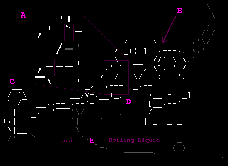 A. Even at this high resolution we have to make a choice between defining the arm, hand or shoulder. There simply isn't enough room or appropriate symbols to draw all 3. By dropping information on the arm, we delimit it with a single slash and make a stronger contour for the hand and shoulder, to communicate that the negative space belongs to the arm. The negative space above and below it makes it seem like it is behind the hand and shoulder, creating depth and perspective. The viewer's brain has a pretty good idea what an arm looks like, so it fills in the rest. B. Again, we had to make a choice, and the foreground item wins. We *could* have used the space to define both shoulder and helmet, but it's not necessary. The negative space works to our advantage as a shaded region. C. For the hammer we quite intentionally don't draw the 2 internal diagonal lines. Those are replaced by the small ` details which add some texture and hopefully the viewer imagines some dents or imperfections. The hammer's eye applies the same idea. D. Where did the end of the handle go? Once more, the foreground object gains priority. It's quite impossible to draw both arm and handle in this case, and even if we managed to squeeze a couple of lines in there, it would decrease the readability. Not needed. We can all imagine the end of the handle right? E. Context is important. The negative space on both sides of the 'E' look the same, but the animated bubbles, the Bronze Guardians' legs cut off, and the shape of the bank all communicate that to the left it's solid ground and to the right it's some kind of boiling liquid (supposedly copper).
|
|
|
|
« Last Edit: June 30, 2018, 11:46:26 PM by standardcombo »
|
Logged
|
|
|
|
|
Kyzrati
|
|
« Reply #254 on: December 09, 2014, 09:53:09 PM » |
|
Excellent description! When working on ASCII art, what isn't shown is just as important as what is. It's all too easy to confuse the viewer with too much detail when we can all, as you say, imagine what fills in the blanks. Of course this style won't appeal to everyone--it's probably better received by those players with more creative tendencies.
|
|
|
|
|
Logged
|
|
|
|
|
Nilanjan
Guest
|
|
« Reply #255 on: December 09, 2014, 10:06:19 PM » |
|
Wow haven't seen such lovely animations in ASCII until now!!!  Great work!!! |
|
|
|
|
Logged
|
|
|
|
|
standardcombo
|
|
« Reply #256 on: December 09, 2014, 10:09:28 PM » |
|
Thank's Nilanjan. Without overthinking this too much, here's another example on a smaller character. It also introduces something I mentioned before, where the various frames of animation deliver parts of the information to establish the shape. So missing information in a specific frame is filled in by the brain: 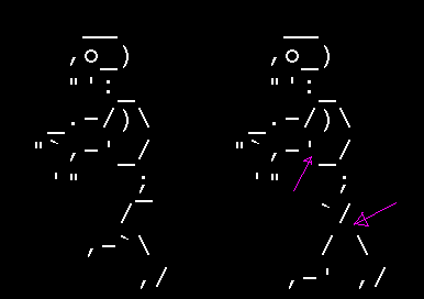 In the Epic Snail attack I tried something different with the blinking eyes, that extends this idea. Since most of the animation establishes the shape of the eye as round, the quick hyphen accurately represents the eye closed. There is another mind trick at play here. The strong contrast between the white and black 'burns' or 'exhausts' your retina cells, so when it draws the hyphen you can still see the circle for a brief moment as your eyes adjust to the black. Like this illusion.  |
|
|
|
« Last Edit: June 30, 2018, 11:46:48 PM by standardcombo »
|
Logged
|
|
|
|
|
JobLeonard
|
|
« Reply #257 on: December 10, 2014, 12:13:28 AM » |
|
I'm realy curious now how your ASCII animation skills would translate to "regular" animation - probably quite well
|
|
|
|
|
Logged
|
|
|
|
|
standardcombo
|
|
« Reply #258 on: December 10, 2014, 09:06:46 AM » |
|
I did some 3D animation
. I can manage a bit of pixel art, in lower res, but hand-drawn would take a long time ramping back into shape.
I'd rather leave it to the pros and only do animation when there is nobody with time to do it. The first goal should be to finish the project! Hobby time, well, that's Stone Story.
|
|
|
|
« Last Edit: December 10, 2014, 10:08:07 AM by standardcombo »
|
Logged
|
|
|
|
blocks
Level 0


|
|
« Reply #259 on: December 13, 2014, 03:54:49 AM » |
|
This looks incredible! I've done ascii art sprites and small animations before so I'm really stunned by the art and animation - really fluid and expressive in so few bytes! Sorry for posting not too useful a comment but I just wanted to wish you good luck on this.
|
|
|
|
|
Logged
|
|
|
|
|
 Community
